Brief
"To create a brand new website for 'The Charitable Foundation for the Education of Nepalese Children' ('CFENC') organisation which will be professional and visually attractive, ultimately encouraging more people to donate or become interested in the charity"
Overview
During my third and final year at university, one of the projects I chose to undertake included creating a new website for a charitable organisation called ‘The Charitable Foundation for the Education of Nepalese Children’. This was due to the fact that the project was suggested by a relative and also because it was in the area of industry that I wished to enter which was website development. The main objective was to ensure that the website was professional and visually attractive to entice more interest towards the charity.
This was something that was continued during the summer of 2019 to include provided content by the client(s).
As this was an individual project, I therefore needed to undertake the roles of both a designer and a developer to ensure for an outcome of the highest quality. This included creating colour palettes and providing font suggestions for the new website, creating initial and high-fidelity wireframes and developing the website using programming languages such as ‘HTML5’ and ‘CSS3’.
All of the processes for this project will be viewable on this page.
For a more detailed process, I have included a document situated at the bottom of the page, especially for the research for this project.
Conducting an Initial Meeting
Overview
As mentioned before, through a relative, I was informed of clients which wanted a website redesign and to be able to implement e-commerce into the website as well. Therefore, I contacted the clients to ask if it would have been possible to meet and discuss the potential project in more detail. This was then arranged and I met the clients at their home where details were passed to myself. From this initial meeting, I then took upon the action of typing the notes into a document. These notes are viewable below as well as some notes from another person who also attended the meeting.
The Meeting Notes
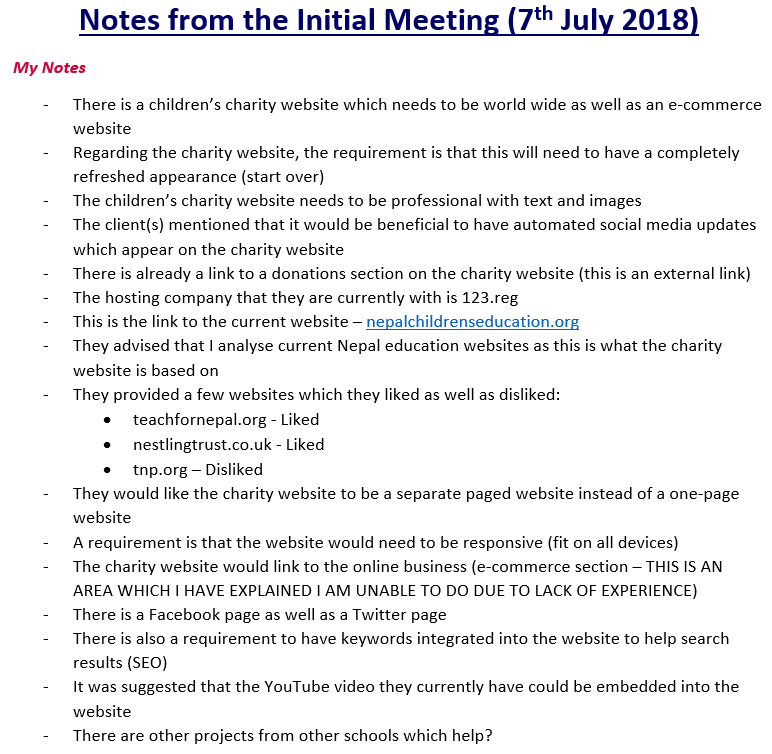
My Meeting Notes
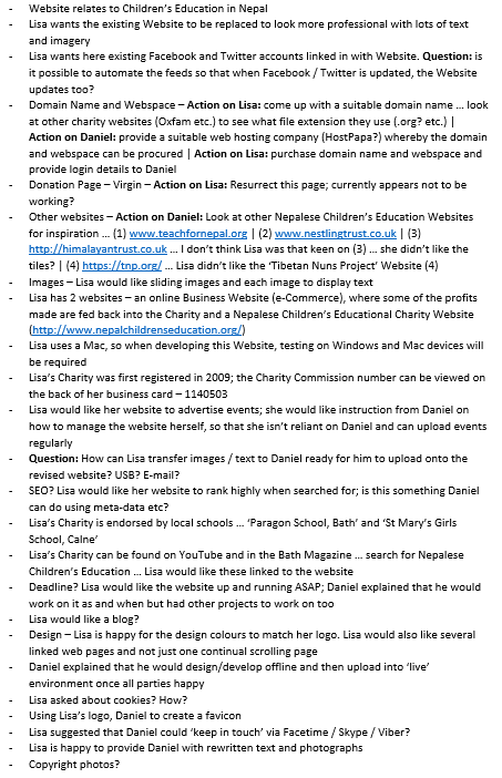
The Other Person's Meeting Notes
Explaining the Areas of the Website I Could Complete
Overview
As was agreed during the initial meeting, I was required to send an e-mail to the clients explaining the areas which I would have been able to complete as well as those that I wouldn’t have been able to do. Within this e-mail, I stated that I could redesign and build/code the charity website and that I would have needed to undertake research regarding automated social media updates and the ‘keywords’ aspect relating to Search Engine Optimisation (SEO). The element which I mentioned that I wouldn’t have been able to complete was the e-commerce section as I explained that I was inexperienced in this area and wouldn’t want to cause any unnecessary security risks to users of the website.
In response to this e-mail, the clients asked some further questions relating to the social media and 'keywords' elements as well as purchasing a domain name.
After receiving the previous e-mail from the client, I replied explaining that I would have been able to produce a brand-new website for them and suggested a hosting service called 'HostPapa'. I also explained that with regards to the social media and 'keywords' aspects, that I would have tried to attempt these areas once researched. Evidence of these e-mails in order can be viewed below.
The E-mails
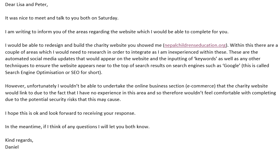
Explaining Areas I Could Complete in the Initial E-mail
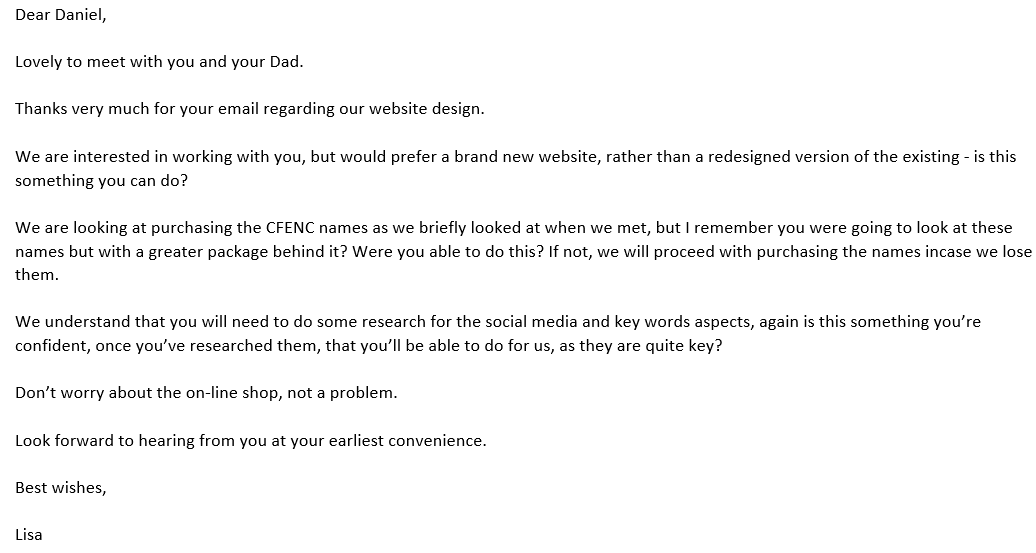
The Clients' Response
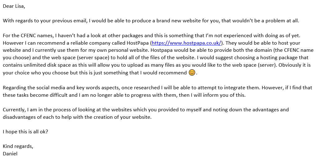
My Response to the Clients' Response
Planning Methods of the Project
Overview
After confirming the requirements with the clients, I then created several methods of planning to help myself with the project. Although these may have been started whilst continuing with the project, these helped myself to understand the tasks and milestones of different stages. These methods took the form of a task table, Gantt chart, technological and platform requirements table and a contact log. Please note that the Gantt chart was improved to accommodate university requirements after beginning the first semester of my third year.
As will be evident, I continuously contacted the client regarding different aspects. Although not all e-mails have been displayed, the images below of the contact log show a document that I created to keep a log of when I had either contacted the clients myself or had been contacted by the clients. This can also be viewed through a provided link below.
The Task Table
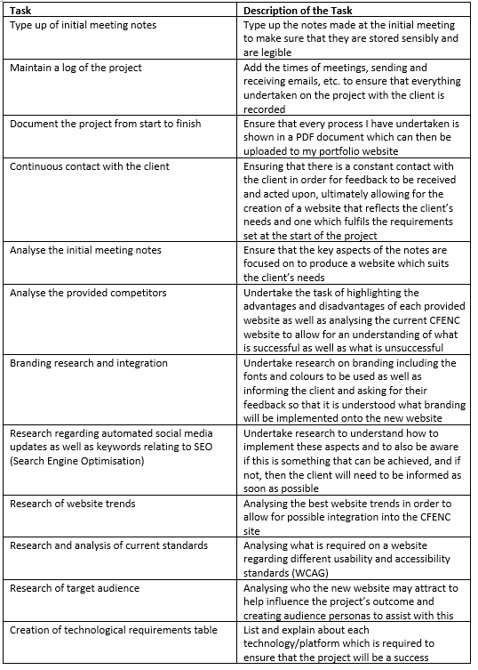
The Task Table - Part 1
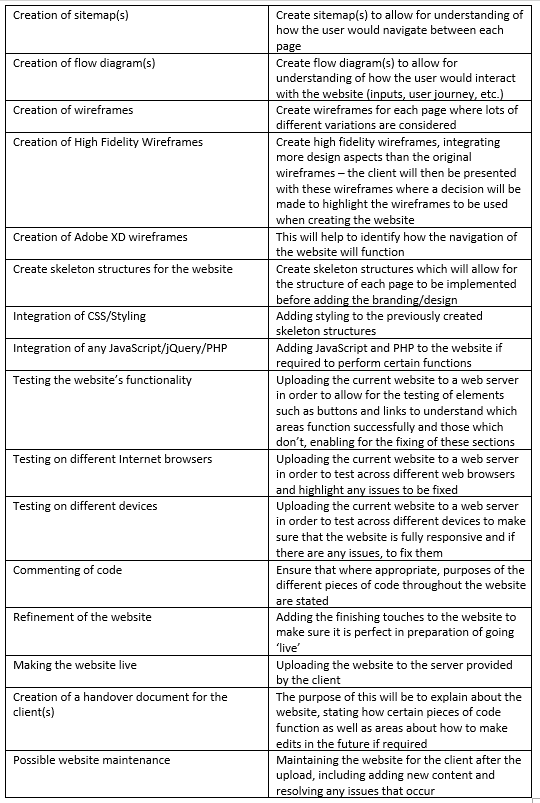
The Task Table - Part 2
The Gantt Chart Versions (Original and Improved)
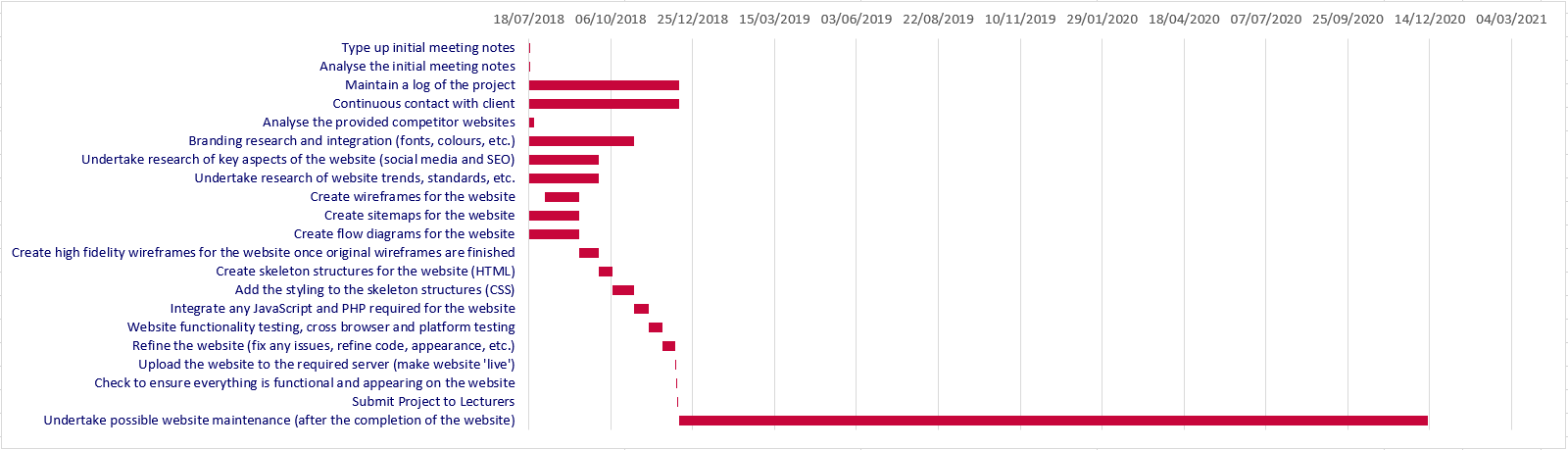
The Originally Created Gantt Chart
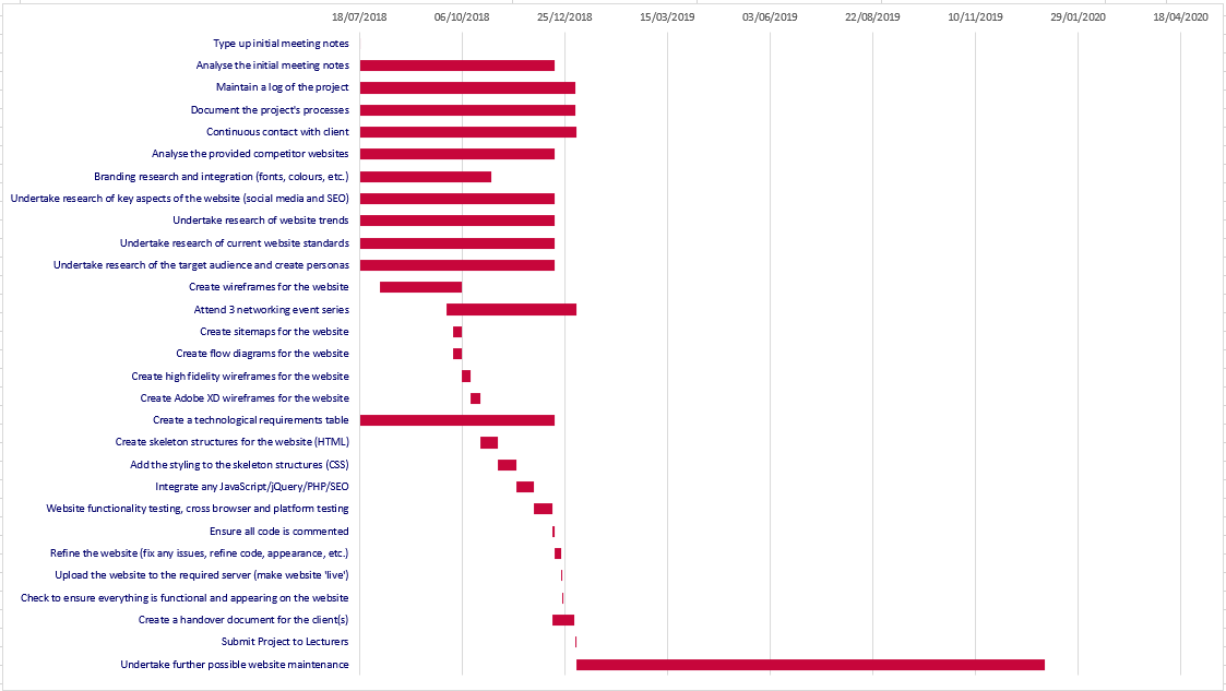
The Improved Gantt Chart
The Technological and Platform Requirements Table
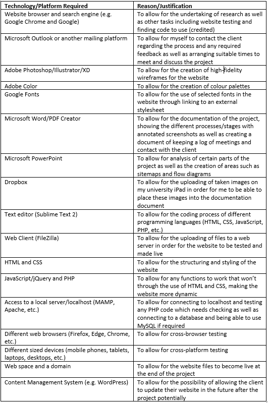
The Technological and Platform Requirements Table
The Contact Log
View through the link below or by viewing the images below.
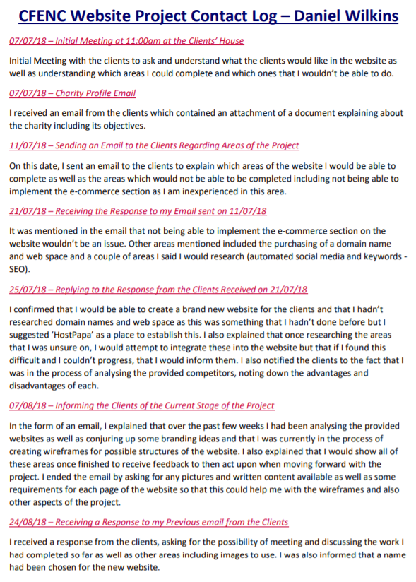
The Contact Log - Part 1
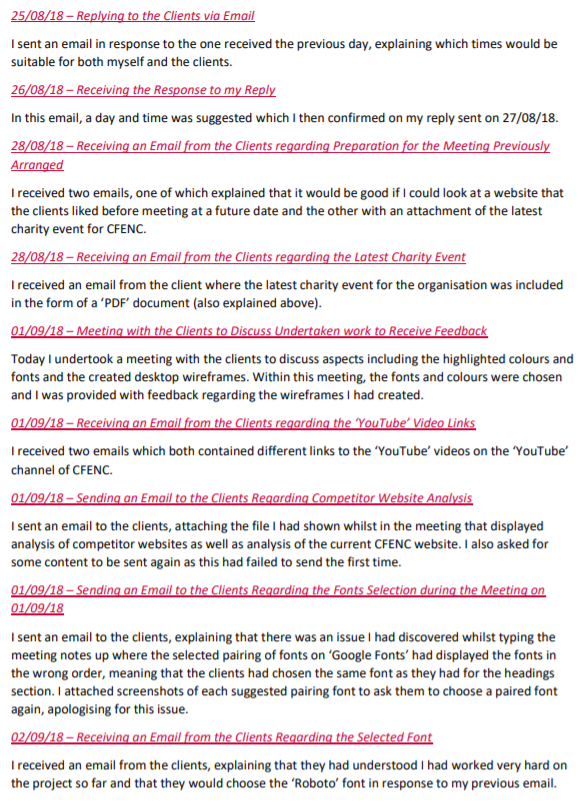
The Contact Log - Part 2
The Contact Log - Part 3
The Contact Log - Part 4
Analysing the Competitor Websites
Overview
After confirming the requirements with the clients, I then decided to begin with analysing the advantages and disadvantages of the websites provided by the clients, both those that they liked and disliked. I also did the same for the current 'CFENC' website. The purpose of this was to try and influence the project I would have been undertaking. All of this analysis can be viewed either below or through the provided link.
The Competitor Analysis
Branding Research
Overview
Following on from analysing the websites shown previously, I then decided to think about the fonts and colours for the new website. Firstly, I noted down the colours used in the logo and fonts currently used in the 'CFENC' website that I didn’t know of to help identify each aspect. Throughout this task, I utilised the colour picker tool in 'Adobe After Effects' to identify the colours and the 'inspector tool' to identify each font. This process is viewable below.
Identifying the Utilised Colours in the Logo
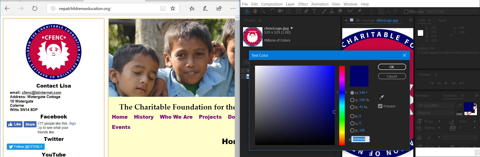
Identifying the Colours on the Logo with 'Adobe After Effects' - Example 1
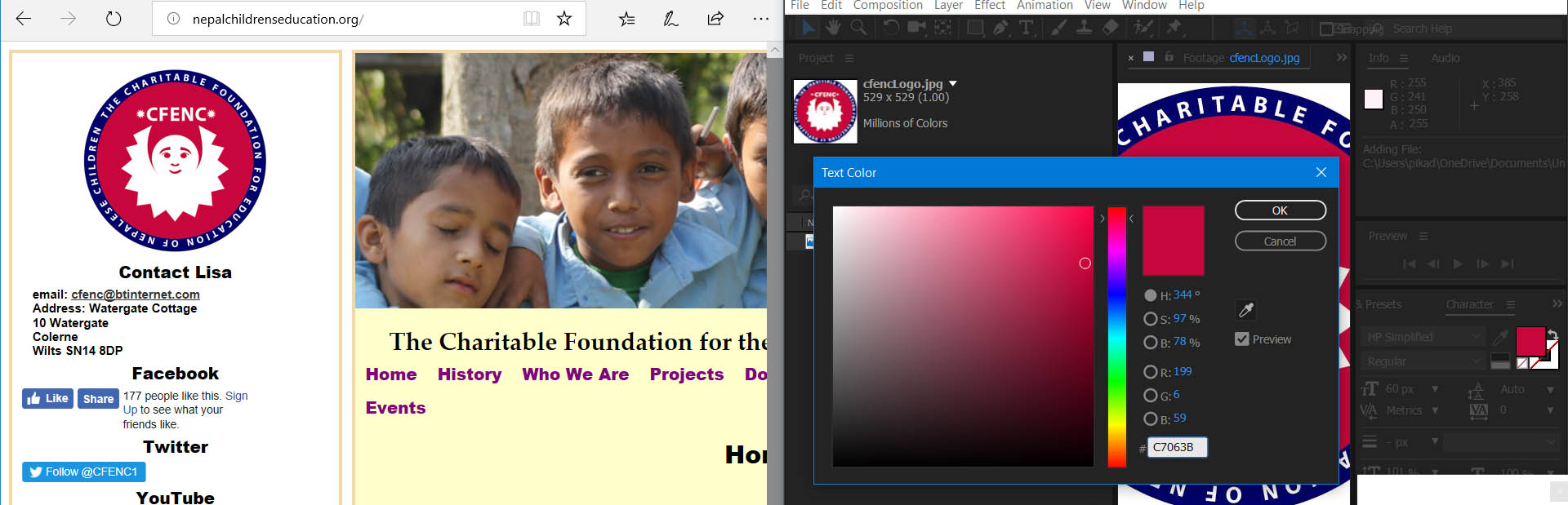
Identifying the Colours on the Logo with 'Adobe After Effects' - Example 2
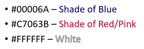
Listing the Colours Utilised
Identifying the Utilised Fonts on the Website
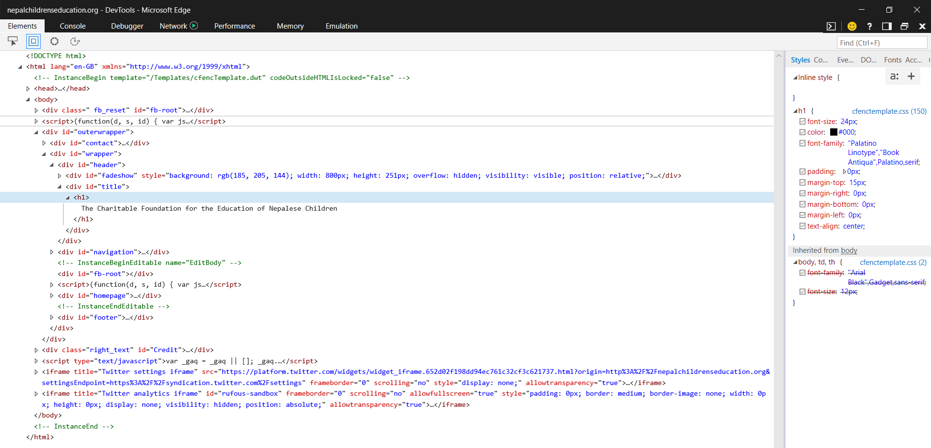
Utilising the 'Inspector Tool' to Identify Fonts - An Example
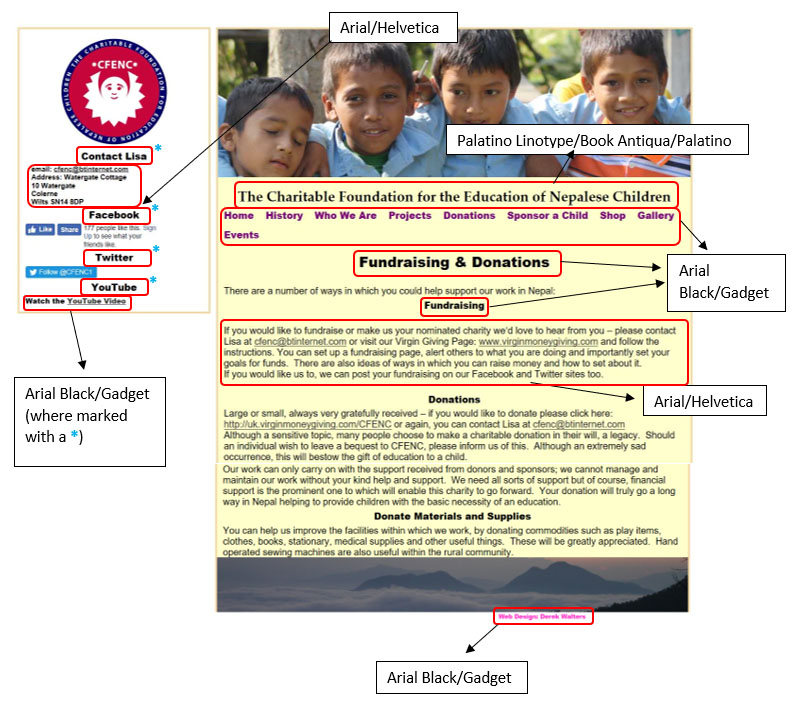
Undertaking in-depth Analysis of a Page on the Current 'CFENC' Website
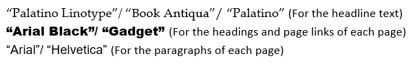
Listing the Main Fonts Utilised (Some Fonts Couldn't be Found by the Software I was Using at the Time)
Undertaking Further Colours Research
Overview
After I had finished analysing the current fonts and colours for the 'CFENC' website, I then undertook research regarding colour meanings/connotations to help myself create a few colour palettes for the new website. Within a couple of colour wheels I had discovered, I highlighted the aspects which I believed to relate to 'CFENC' as a charity. This would have allowed for the values of the charity to be displayed in the created colour palettes later on. This is highlighted below.
Highlighting Aspects of the Colour Wheels to Relate to 'CFENC'
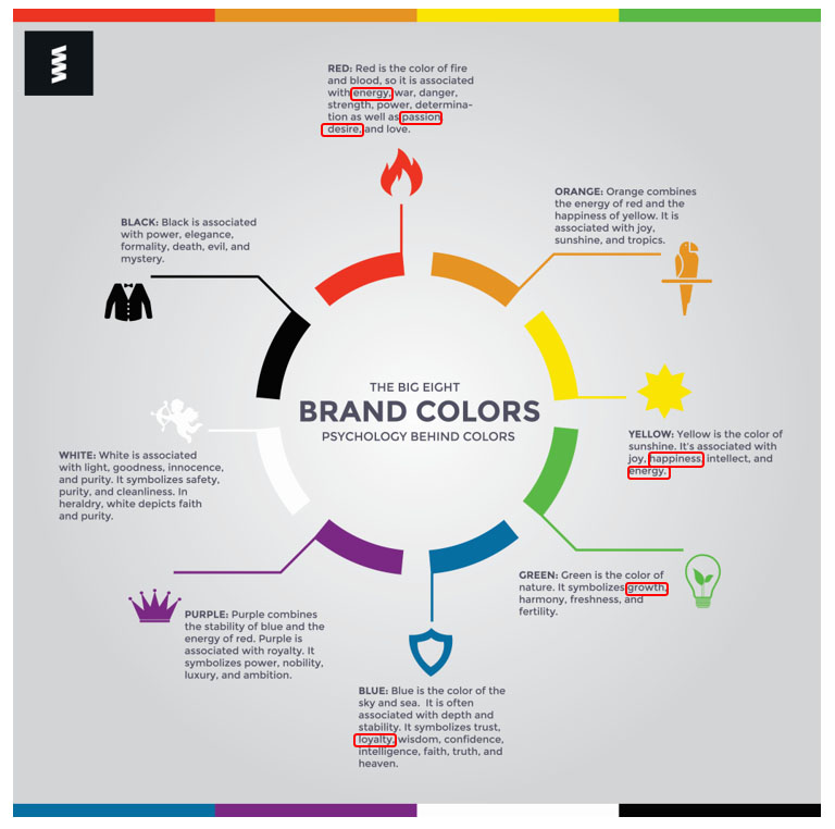
Highlighting the First Colour Wheel
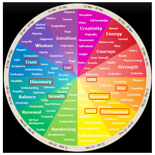
Highlighting the Second Colour Wheel
Colour Palette Creations
Overview
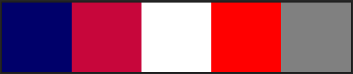
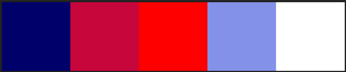
After viewing the colour wheels, I then decided to create a few colour palettes to try and incorporate some of the colours shown above as well as the colours of the current logo and those that I thought would have been professional. As will be seen below, a mixture of vibrant and paler colours had been integrated into the colour palettes to try and add variety to both specific palettes as well as the palettes as a whole. Red was utilised in some of the colour palettes as this related to the business card the client had given to me and therefore, I thought this would have been beneficial to include.
The Created Colour Palettes

Colour Palette Creation 1

Colour Palette Creation 2
Colour Palette Creation 3
Colour Palette Creation 4
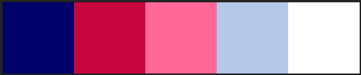
Colour Palette Creation 5

Colour Palette Creation 6

Colour Palette Creation 7

Colour Palette Creation 8

Colour Palette Creation 9
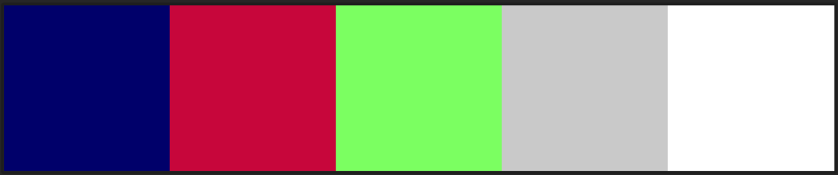
Colour Palette Creation 10
Undertaking Font Analysis of the Competitor Websites
Overview
After the colour palettes had been created and ready to show to the client at the next meeting, I therefore also began to analyse the types of fonts used on the provided competitor websites. This allowed for an understanding of aspects such as font-weights and alignment which would have ultimately helped myself when creating the new website. This analysis is evident below.
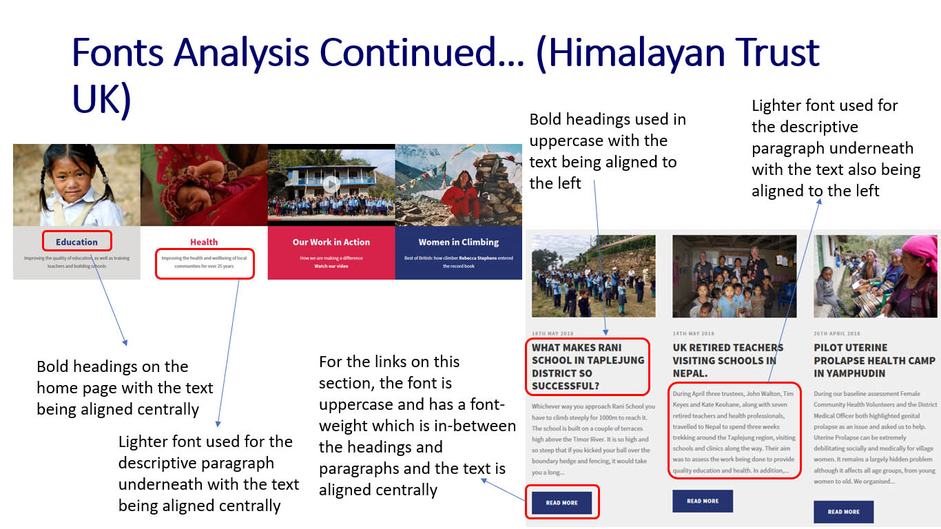
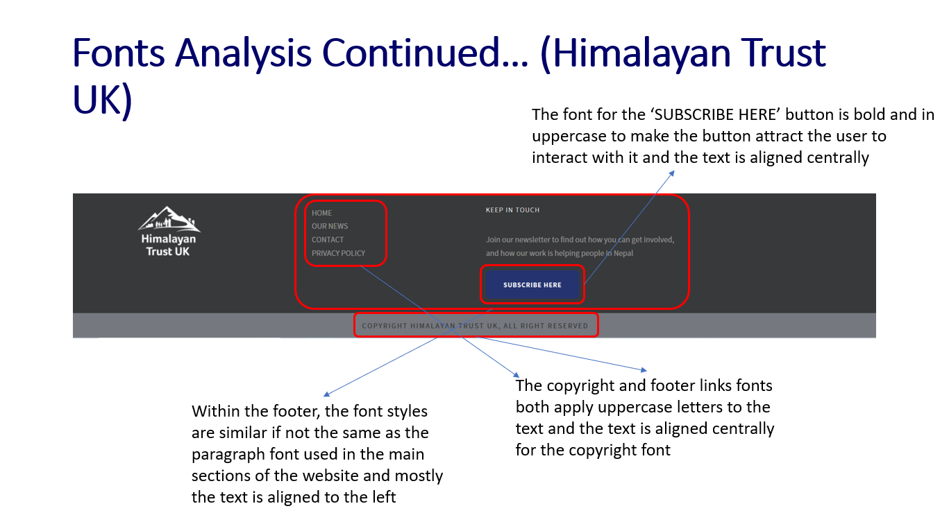
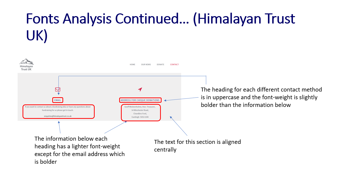
Font Analysis of the 'Himalayan Trust UK' Website
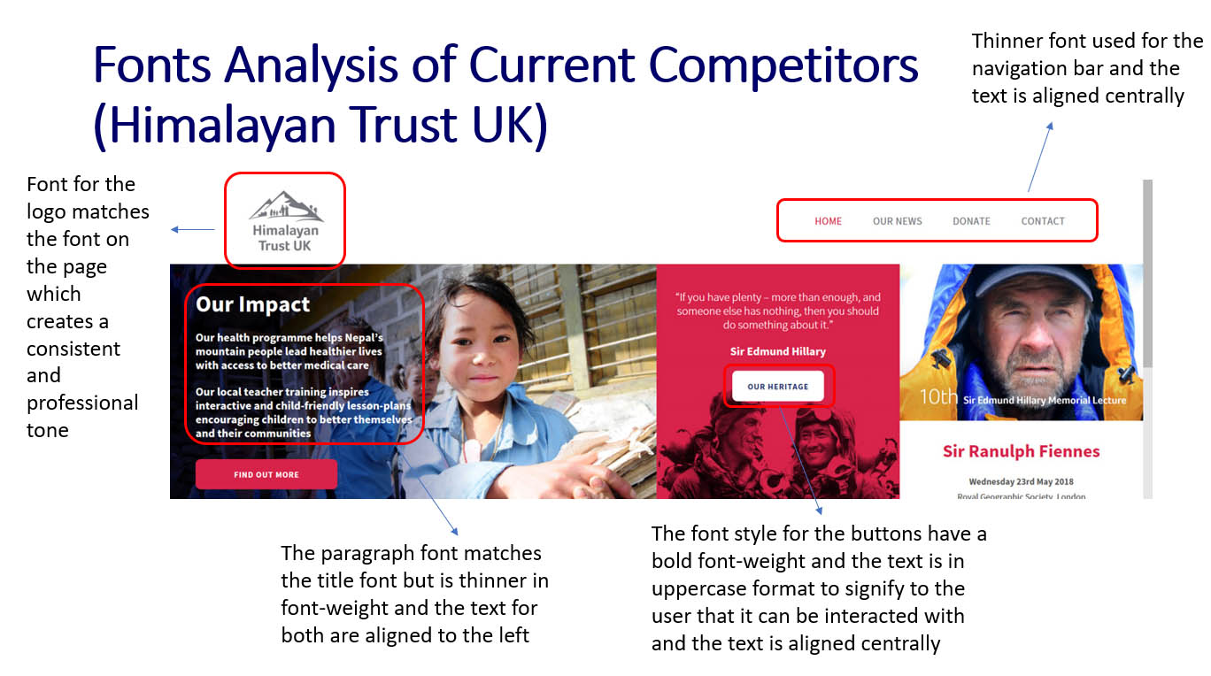
'Himalayan Trust UK' Website Font Analysis - Part 1
'Himalayan Trust UK' Website Font Analysis - Part 2
'Himalayan Trust UK' Website Font Analysis - Part 3
'Himalayan Trust UK' Website Font Analysis - Part 4
Font Analysis of the 'Teach for Nepal' Website
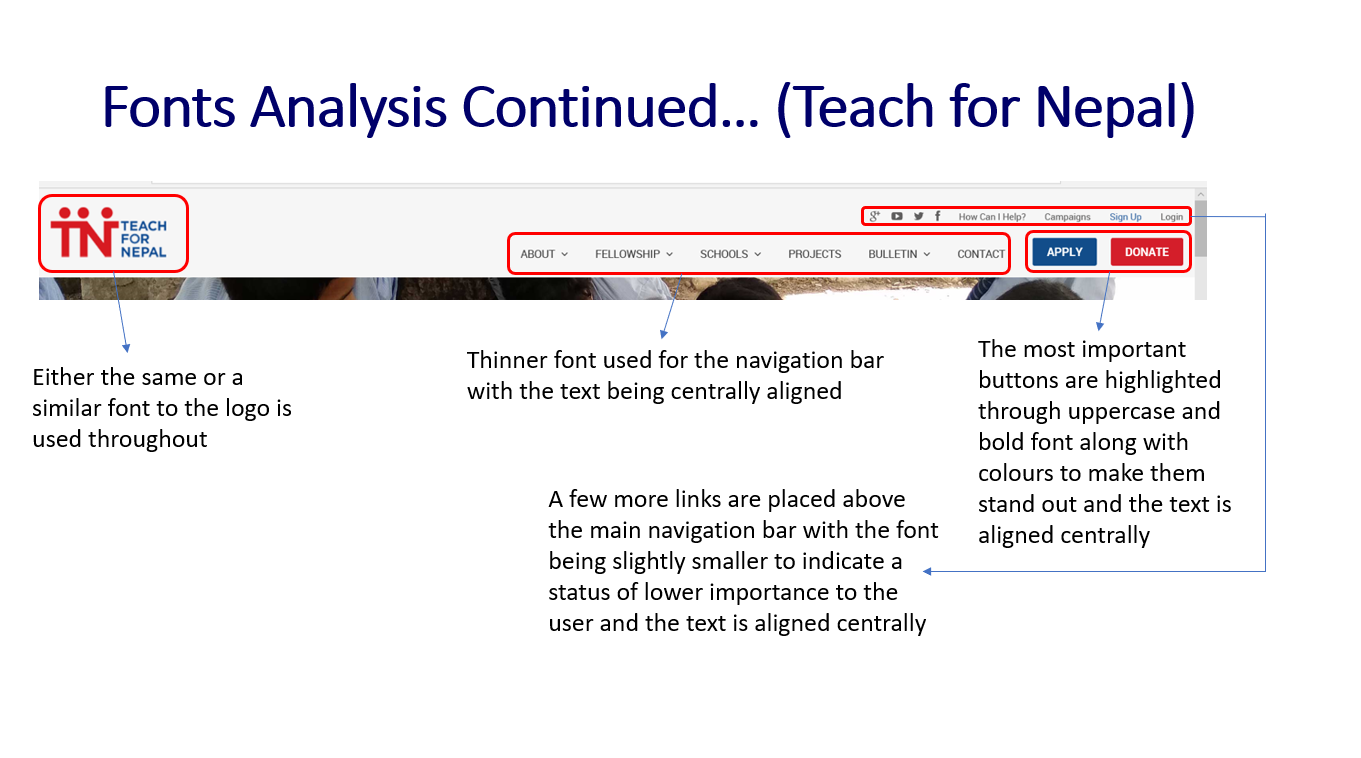
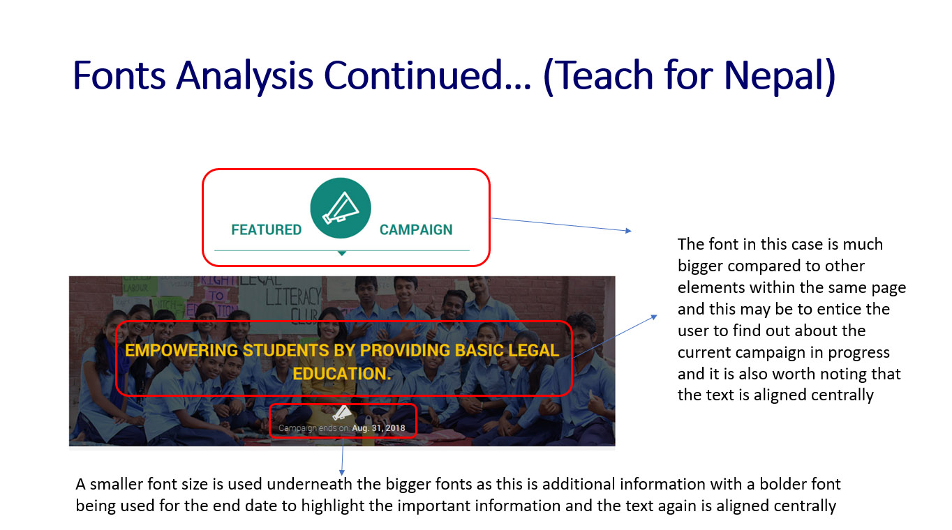
'Teach for Nepal' Website Font Analysis - Part 1
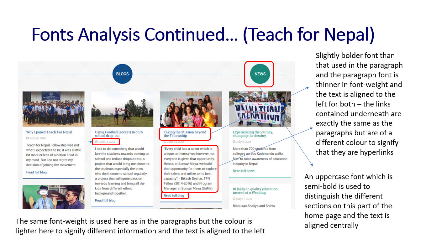
'Teach for Nepal' Website Font Analysis - Part 2
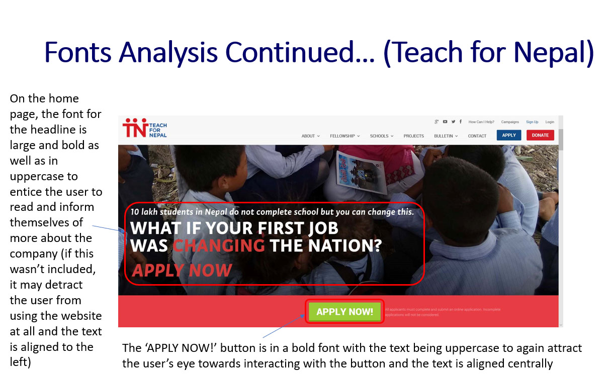
'Teach for Nepal' Website Font Analysis - Part 3
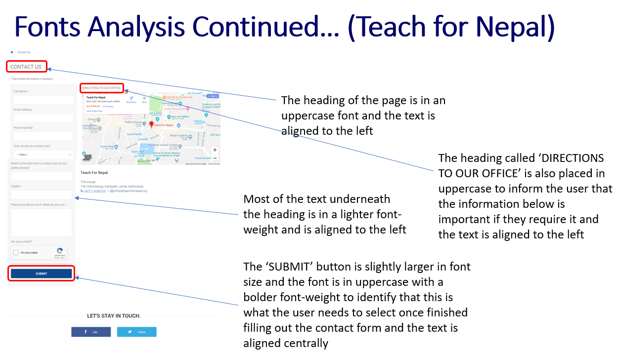
'Teach for Nepal' Website Font Analysis - Part 4
'Teach for Nepal' Website Font Analysis - Part 5
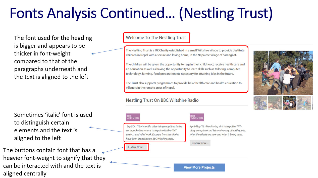
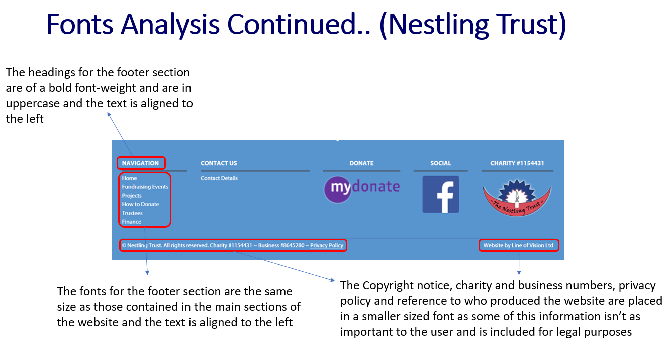
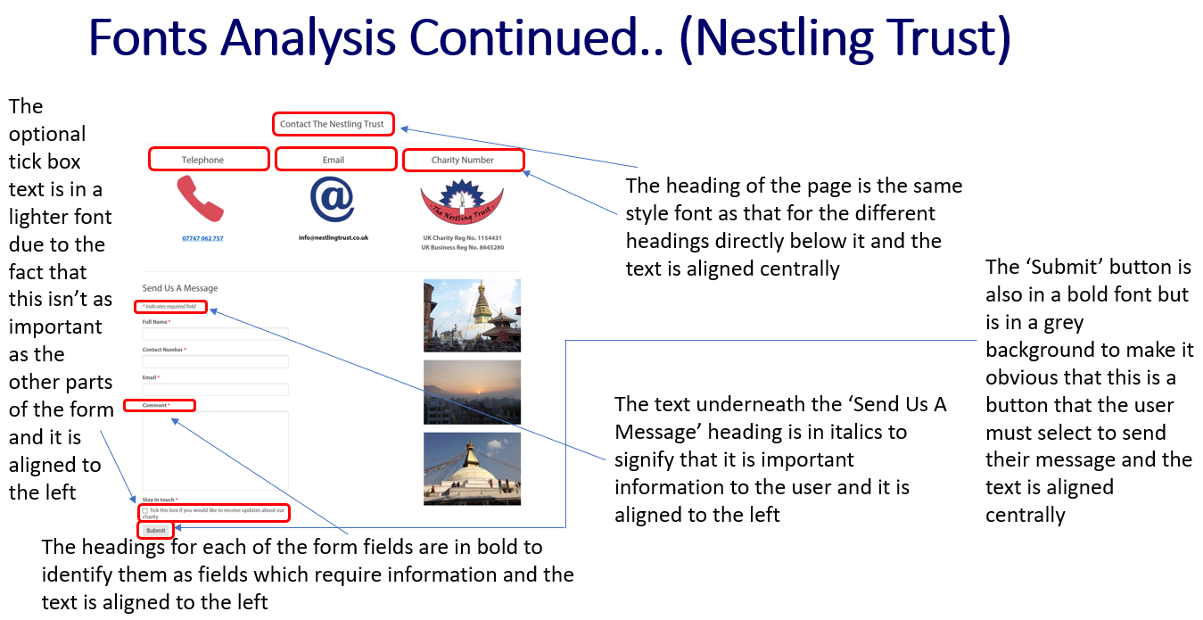
Font Analysis of the 'Nestling Trust' Website
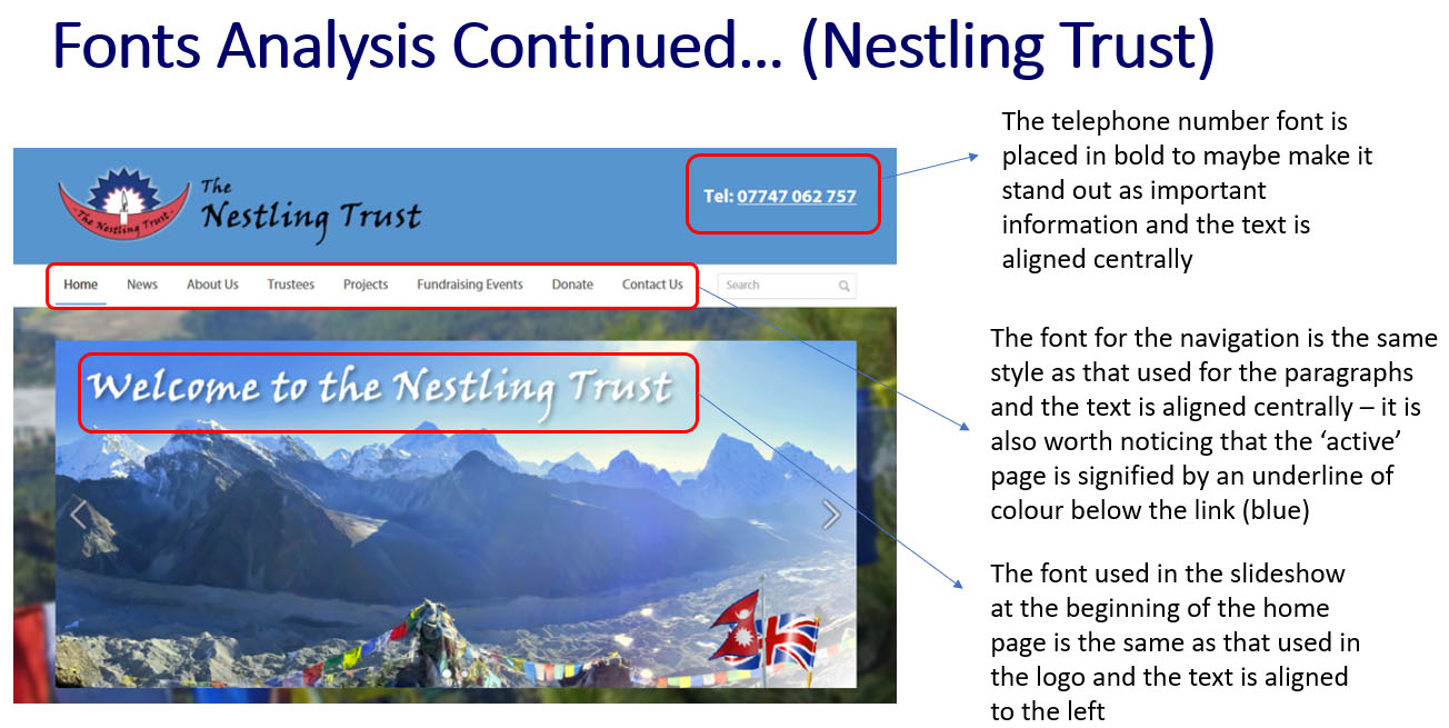
'Nestling Trust' Website Font Analysis - Part 1
'Nestling Trust' Website Font Analysis - Part 2
'Nestling Trust' Website Font Analysis - Part 3
'Nestling Trust' Website Font Analysis - Part 4
Font Analysis of the 'TNP' Website
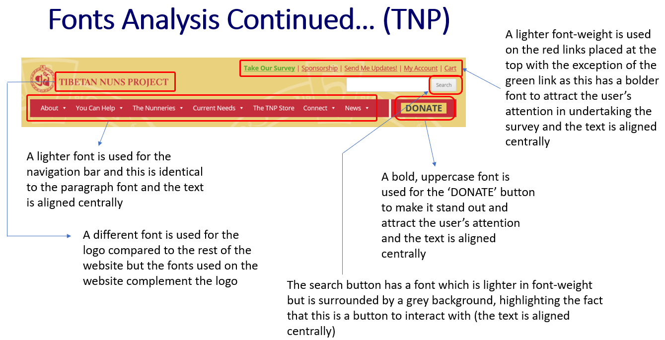
'TNP' Website Font Analysis - Part 1
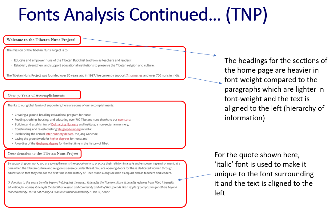
'TNP' Website Font Analysis - Part 2
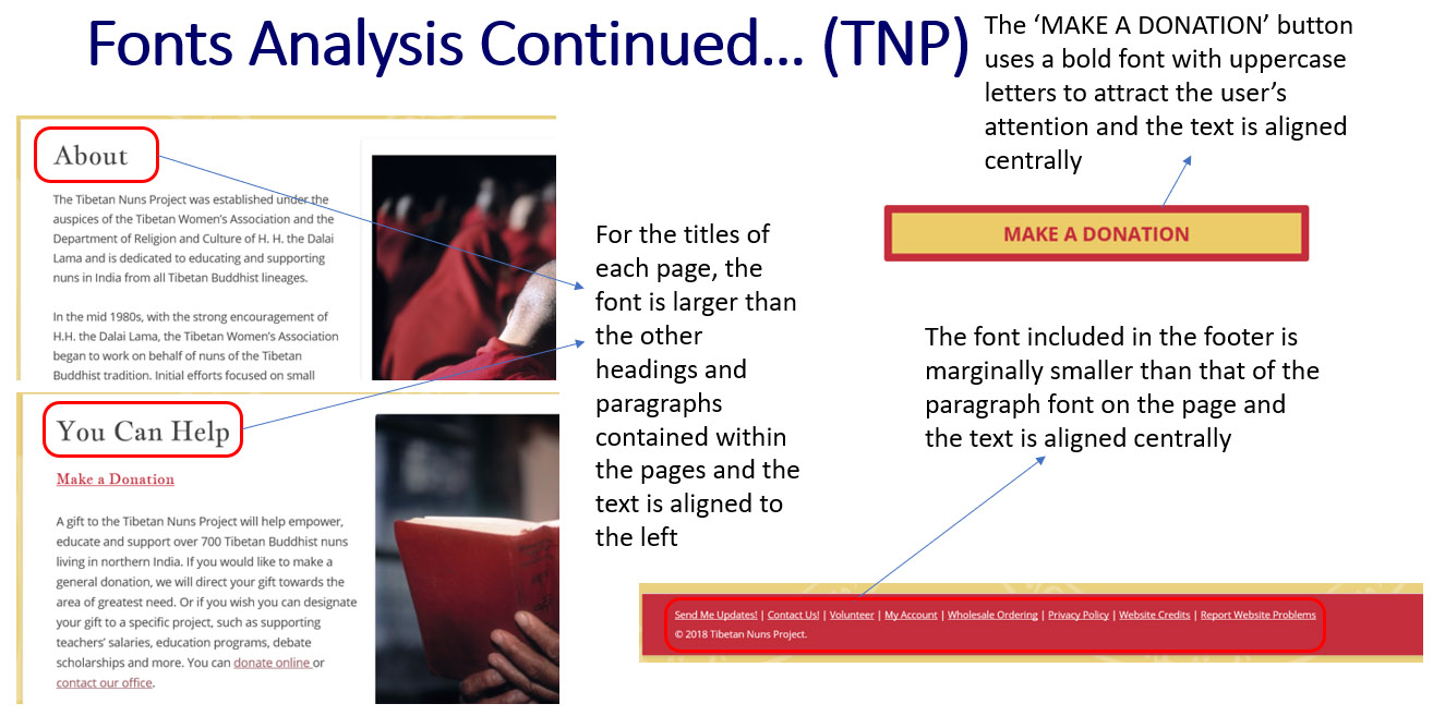
'TNP' Website Font Analysis - Part 3
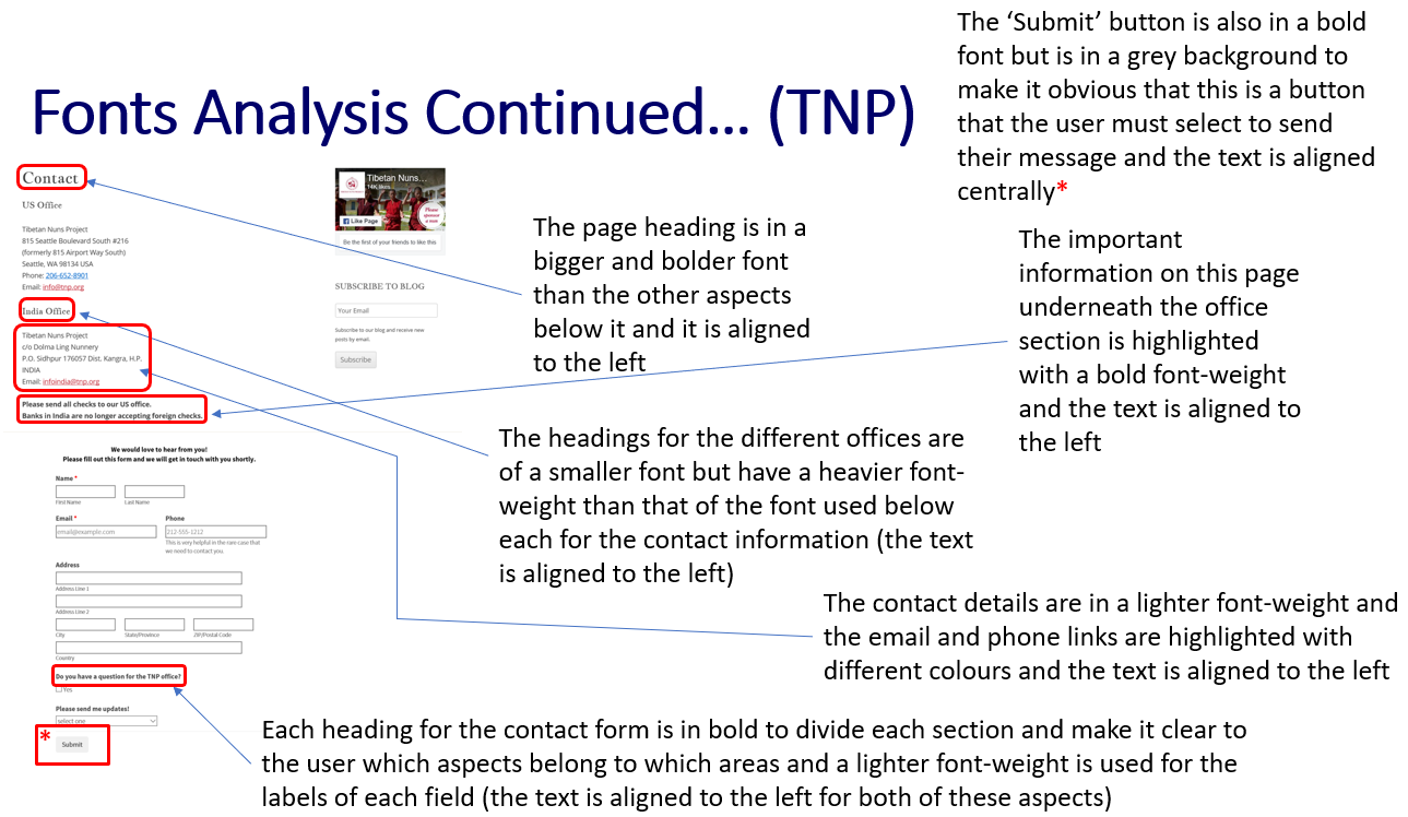
'TNP' Website Font Analysis - Part 4
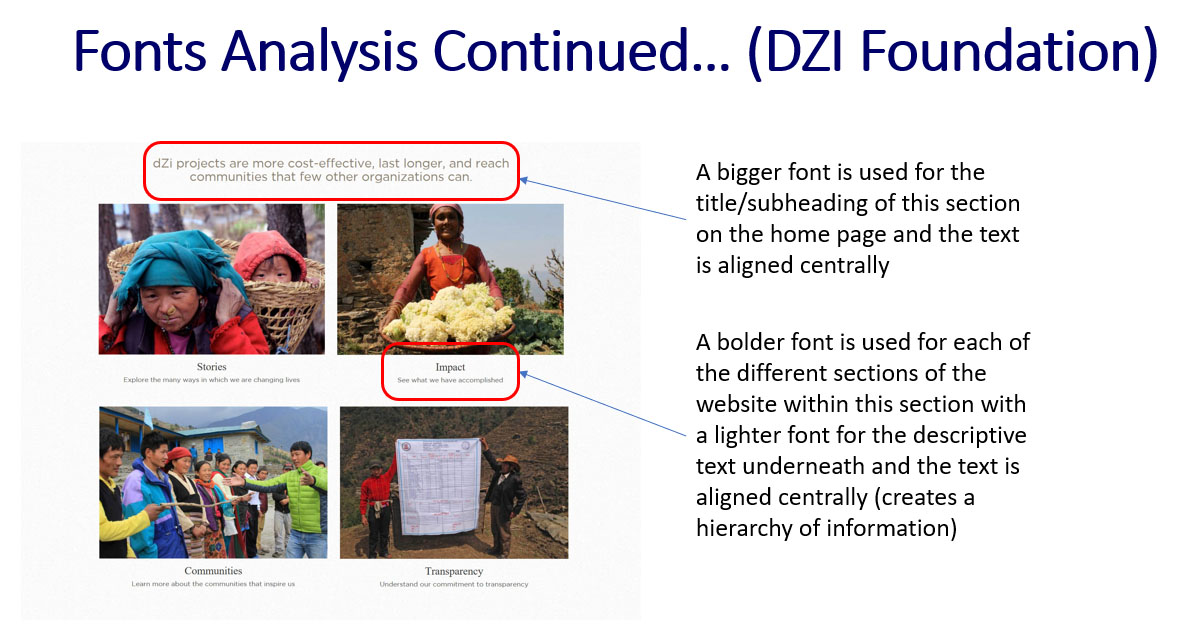
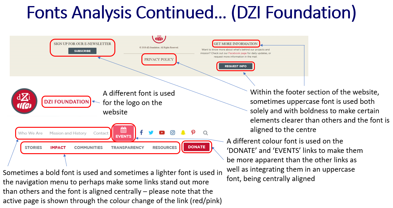
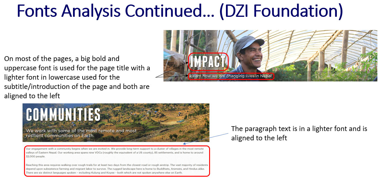
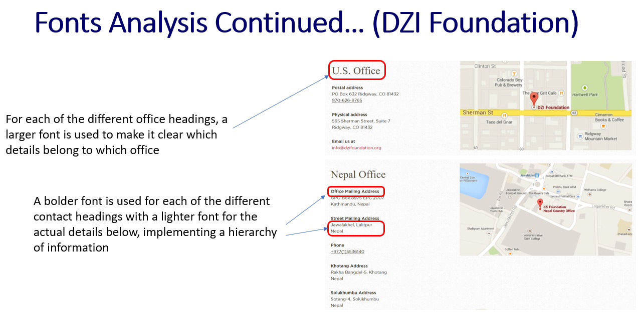
Font Analysis of the 'DZI Foundation' Website
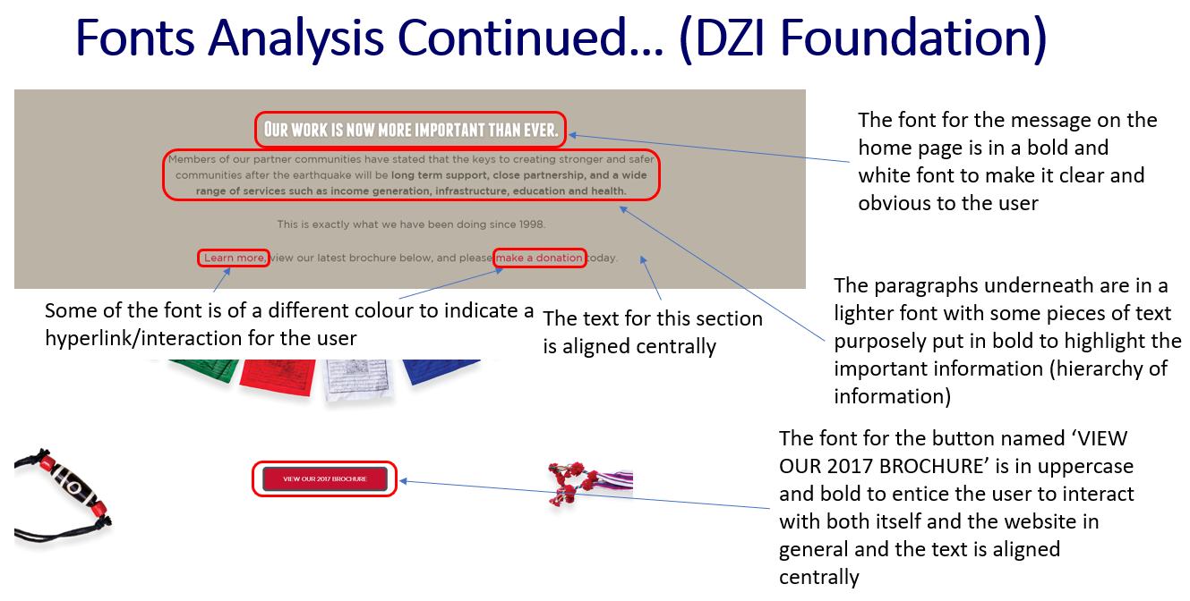
'DZI Foundation' Website Font Analysis - Part 1
'DZI Foundation' Website Font Analysis - Part 2
'DZI Foundation' Website Font Analysis - Part 3
'DZI Foundation' Website Font Analysis - Part 4
'DZI Foundation' Website Font Analysis - Part 5
Creating a List of 'Google Fonts'
Overview
After analysing the fonts for each of the websites above, I then decided to view the fonts supplied by ‘Google Fonts’ as I thought these would have been more professional than standard fonts including ‘Calibri’ and ‘Arial’. The fonts I shortlisted were the ones that I thought would have benefitted the charity best with professional but friendly and appealing fonts being selected as is seen below. Some fonts contained curved edges with others in the style of almost handwriting which could have related to the children's nature.
The Listed 'Google Fonts'
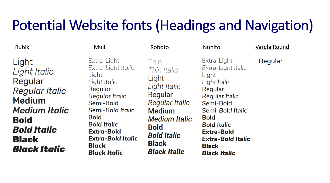
The Listed 'Google Fonts'
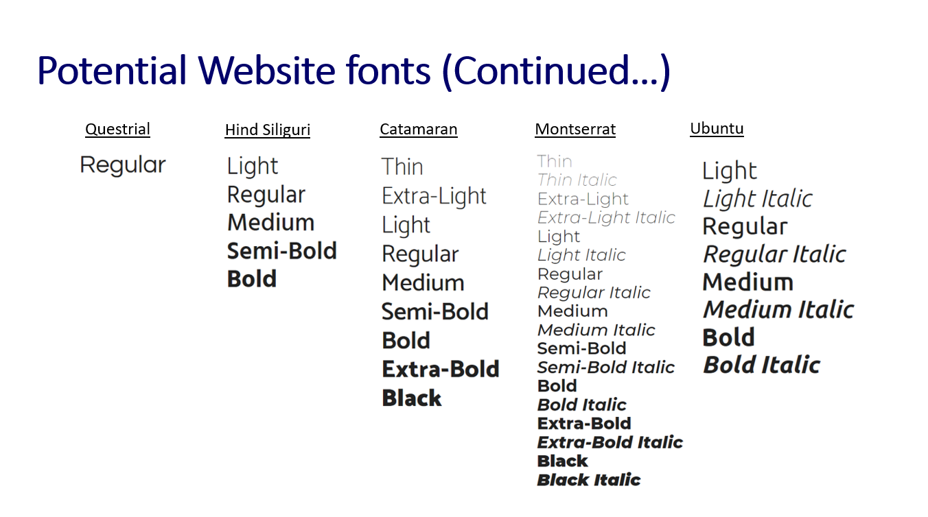
The Listed 'Google Fonts' Continued
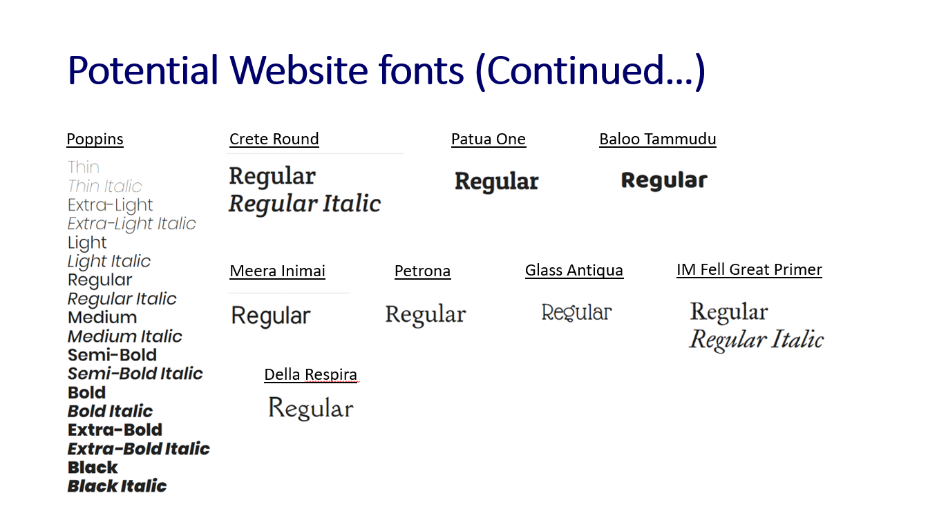
The Listed 'Google Fonts' Continued
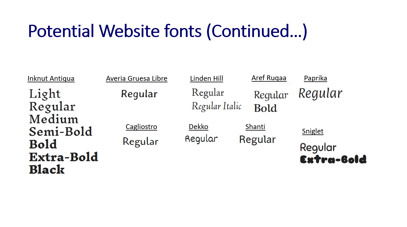
The Listed 'Google Fonts' Continued
The Decision of the Final Colours and Fonts
Overview
During a meeting with the clients undertaken on 1st September 2018, I explained the work I had completed for the project thus far, receiving feedback for this. A variety of topics were discussed, of which some will be shown later and one of these topics related to the colour palettes and fonts I had highlighted as well as the research I had undertaken to inspire this.
From this, the following colour palette was chosen due to the fact that this represented the branding of the company of which the clients didn't want to change.
The Chosen Colour Palette
The Chosen Colour Palette
The Chosen Fonts
Overview
After the colour palette had been chosen, the font called 'Poppins' was chosen by the clients as this was the one they preferred. I had explained that this would have been for the headings of the web pages with another font needing to be selected through suggested pairings by 'Google Fonts'. This process can be seen below with the 'Poppins' font first and then the suggested pairings options.
The font the clients chose to pair with 'Poppins' was 'Playfair Display' as this, again, was the font that appealed to them the most. After the meeting, I had noticed that the heading and paragraph fonts had been swapped for the font that the clients had chosen, which meant that the actual font that they had chosen was the ‘Poppins’ font. To resolve this issue, I therefore contacted the clients by e-mail to explain this, asking them to select one of the fonts again. The clients then replied, stating that the font they wanted to choose was 'Roboto'. Evidence of this process can be viewed below.
The Suggested Fonts to Pair with 'Poppins'
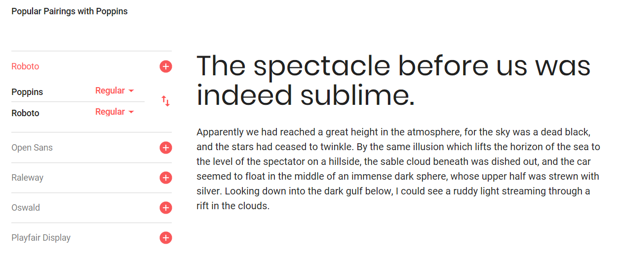
Suggested Paired Font 1 - 'Roboto'
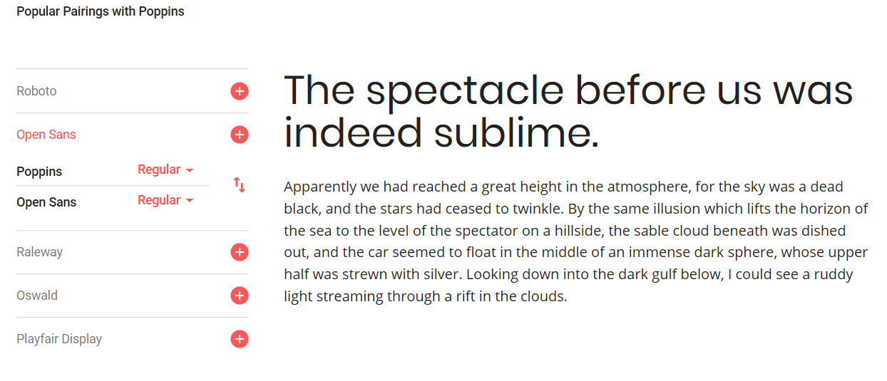
Suggested Paired Font 2 - 'Open Sans'
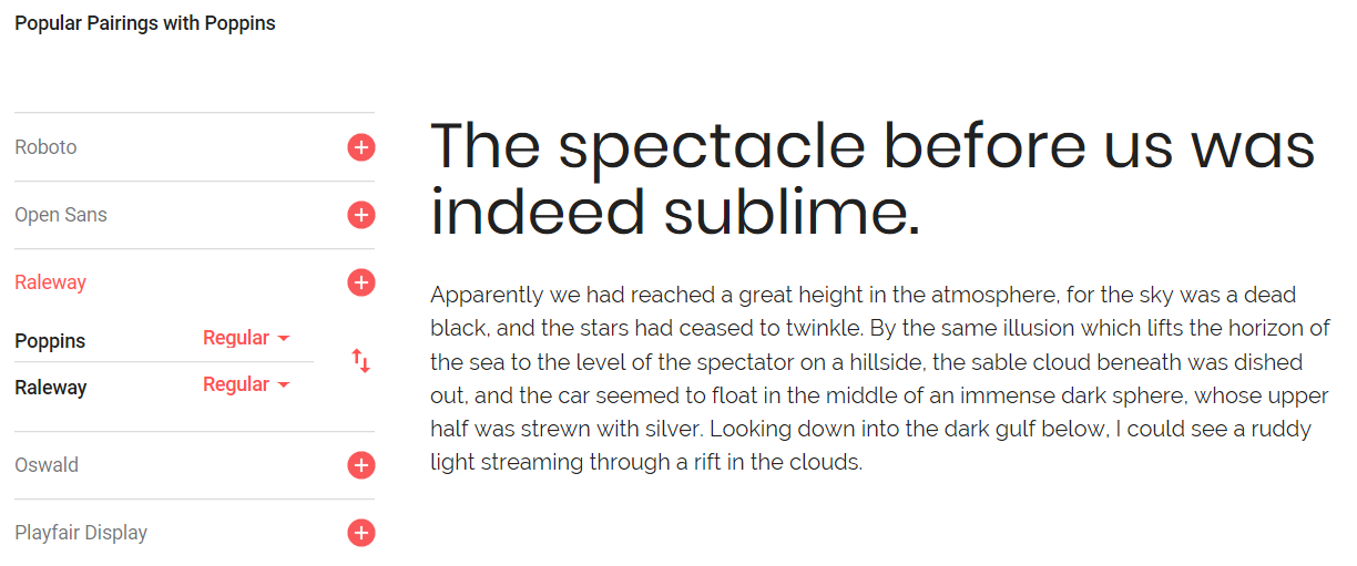
Suggested Paired Font 3 - 'Raleway'
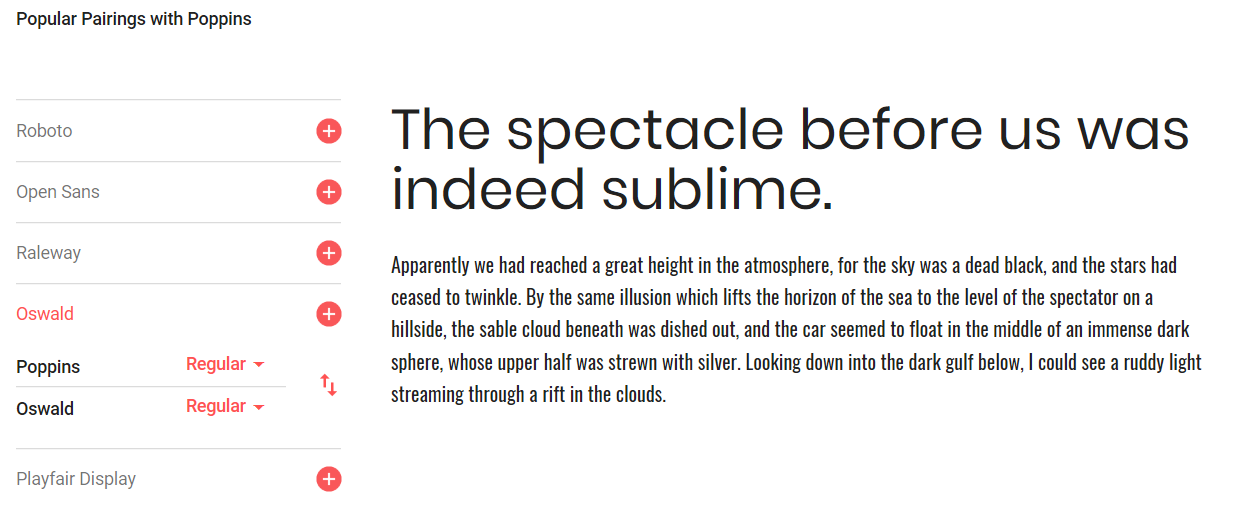
Suggested Paired Font 4 - 'Oswald'
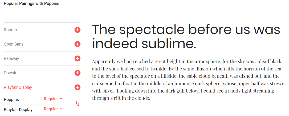
Suggested Paired Font 5 - 'Playfair Display' (Where the Fonts Automatically Switched Positions)
Contacting the Clients and the Response
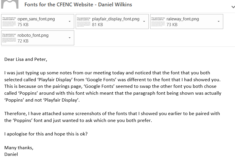
Explaining the Issue and Attaching the Fonts
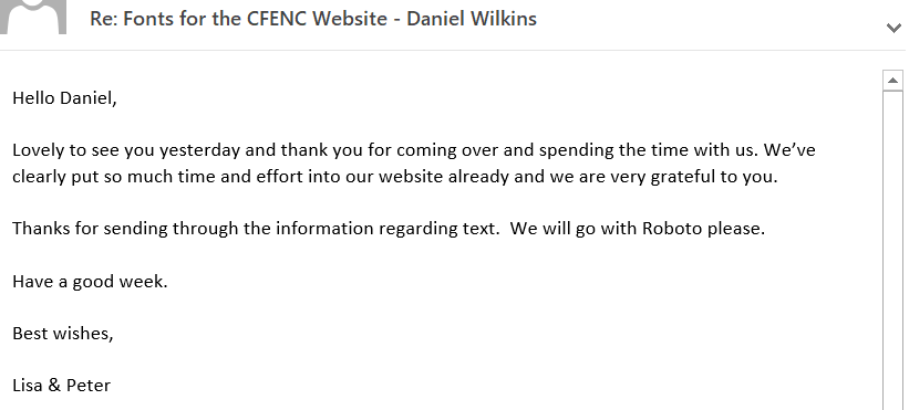
The Clients' Response to my E-mail
Final Stages of the Branding Stage
Overview
As the colours and fonts had now been chosen for the website, I thought it would have been beneficial to analyse how colours were used throughout the websites provided by the clients. This would have then allowed myself to use knowledge gained from this to integrate similar aspects into the new 'CFENC' website with the key aspects discovered being displayed through the images of the analysis below.
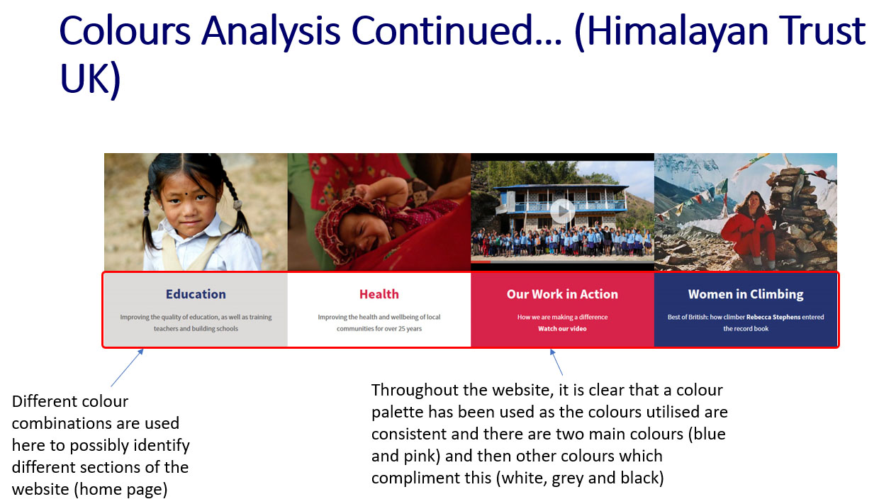
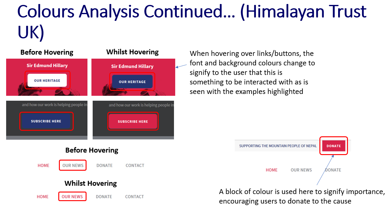
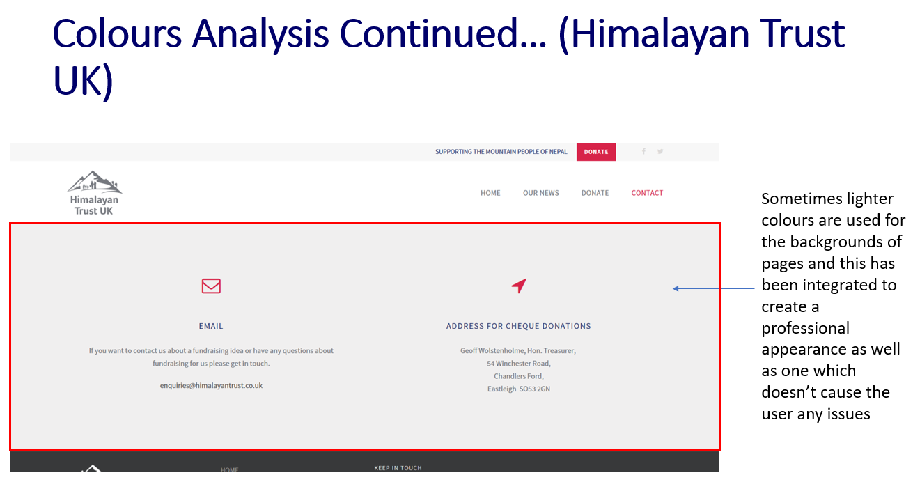
Colours Analysis of the 'Himalayan Trust UK' Website
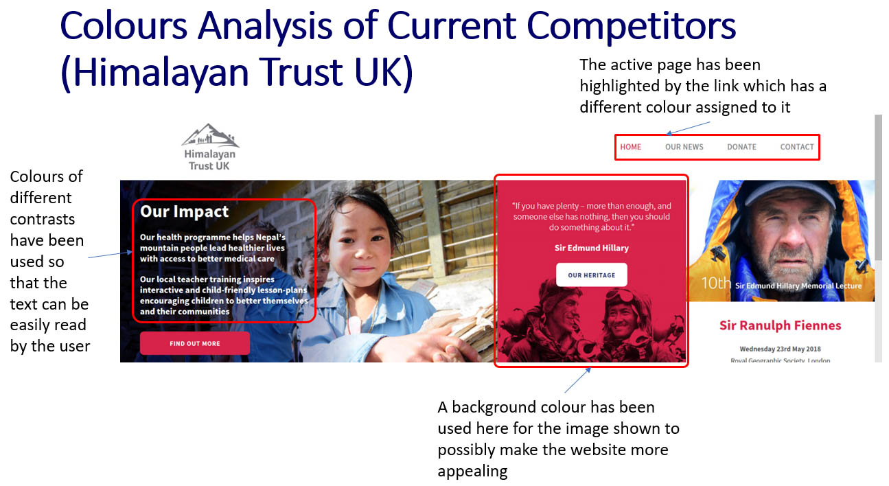
'Himalayan Trust UK' Website Colours Analysis - Part 1
'Himalayan Trust UK' Website Colours Analysis - Part 2
'Himalayan Trust UK' Website Colours Analysis - Part 3
'Himalayan Trust UK' Website Colours Analysis - Part 4
Colours Analysis of the 'Teach for Nepal' Website
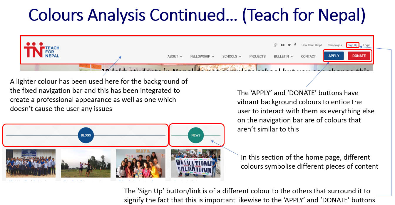
'Teach for Nepal' Website Colours Analysis - Part 1
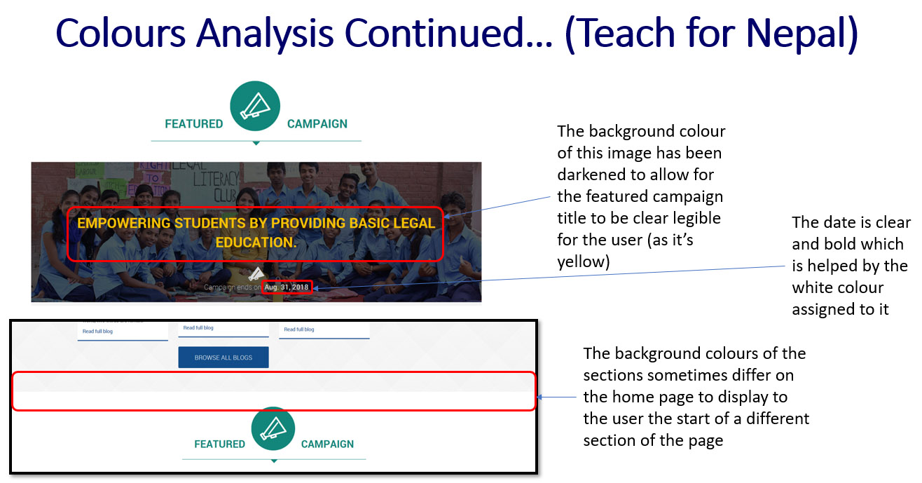
'Teach for Nepal' Website Colours Analysis - Part 2
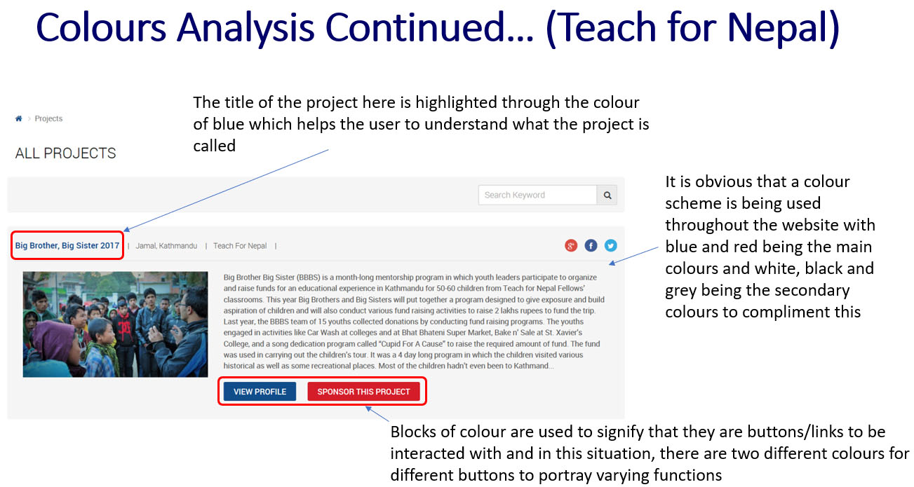
'Teach for Nepal' Website Colours Analysis - Part 3
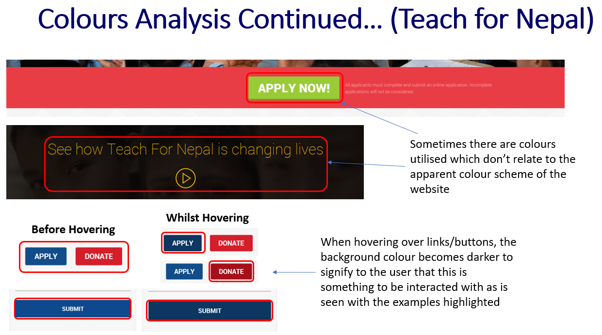
'Teach for Nepal' Website Colours Analysis - Part 4
Colours Analysis of the 'Nestling Trust' Website
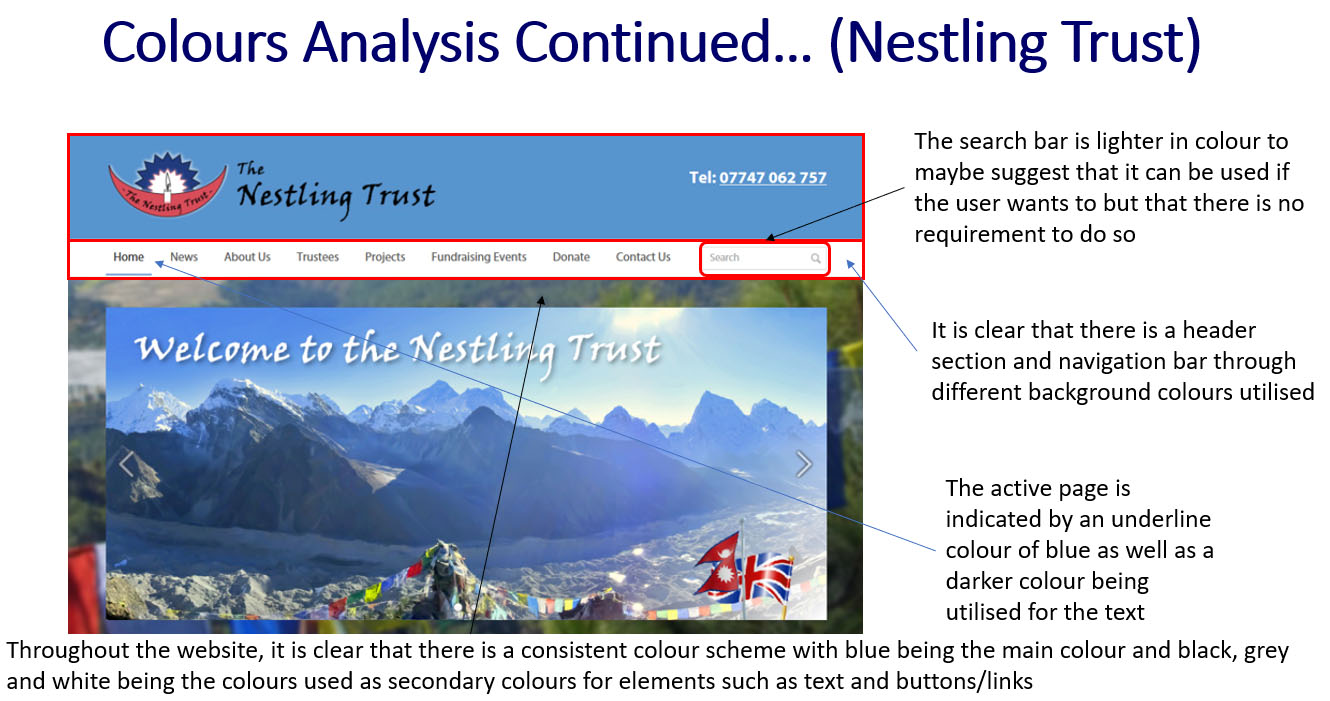
'Nestling Trust' Website Colours Analysis - Part 1
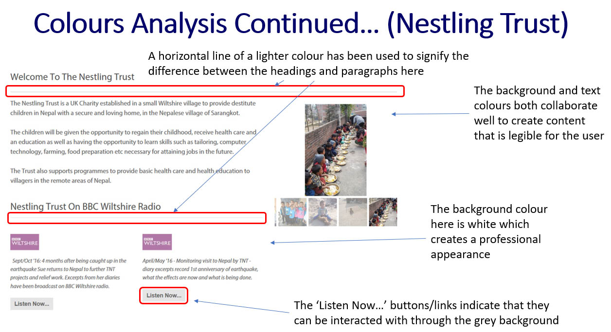
'Nestling Trust' Website Colours Analysis - Part 2
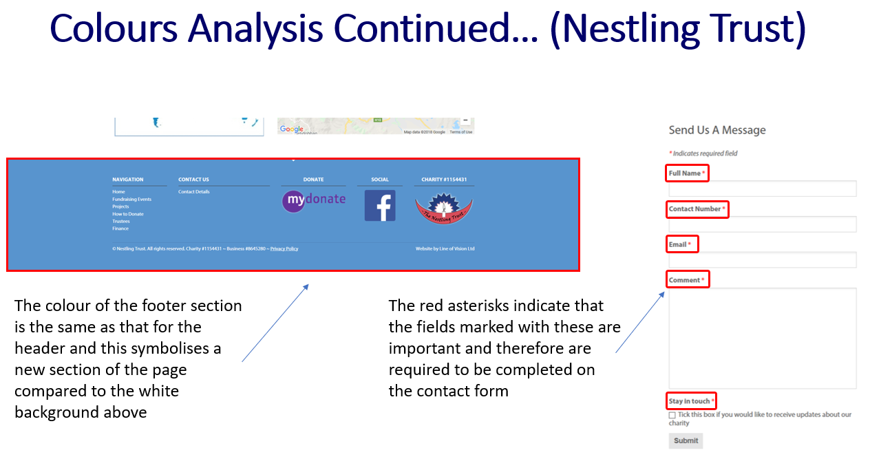
'Nestling Trust' Website Colours Analysis - Part 3
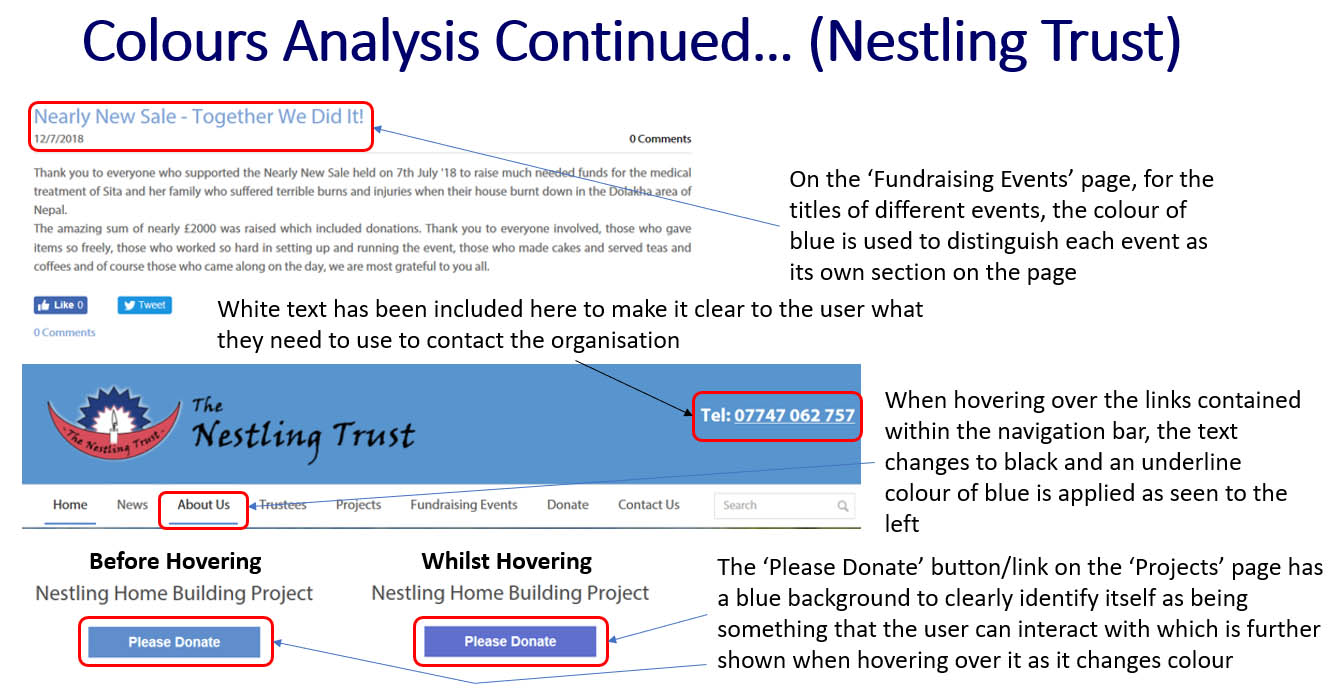
'Nestling Trust' Website Colours Analysis - Part 4
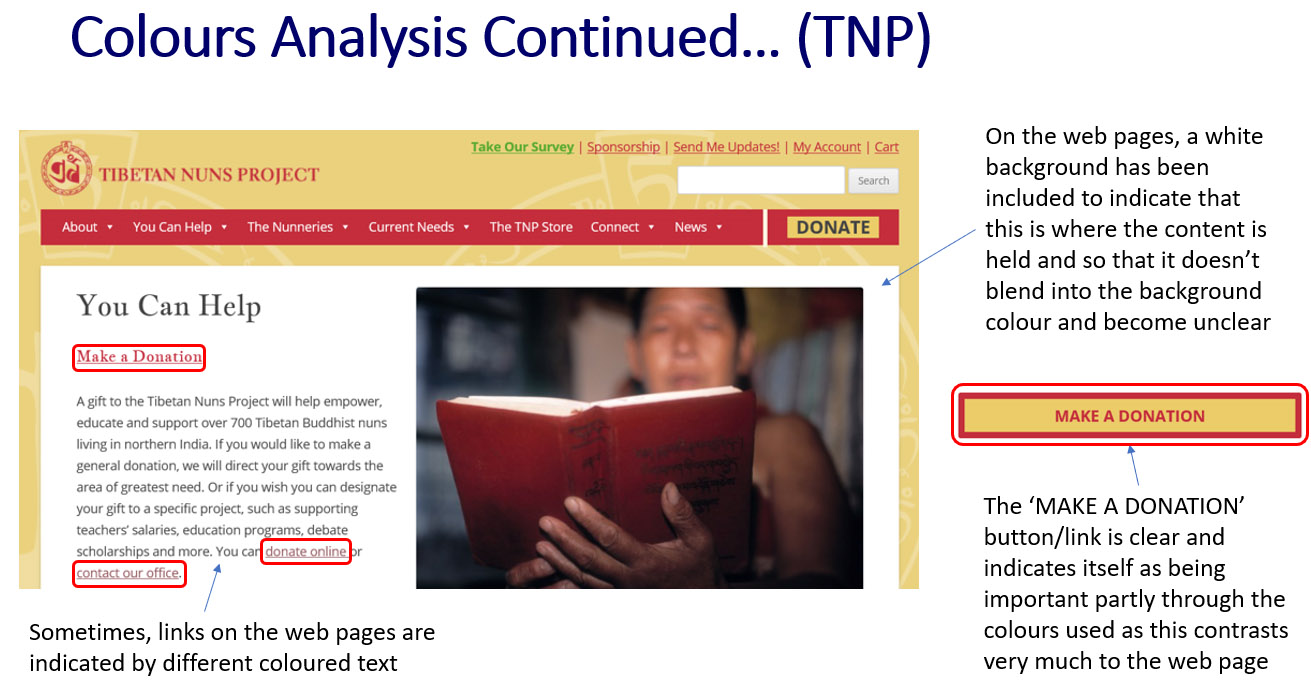
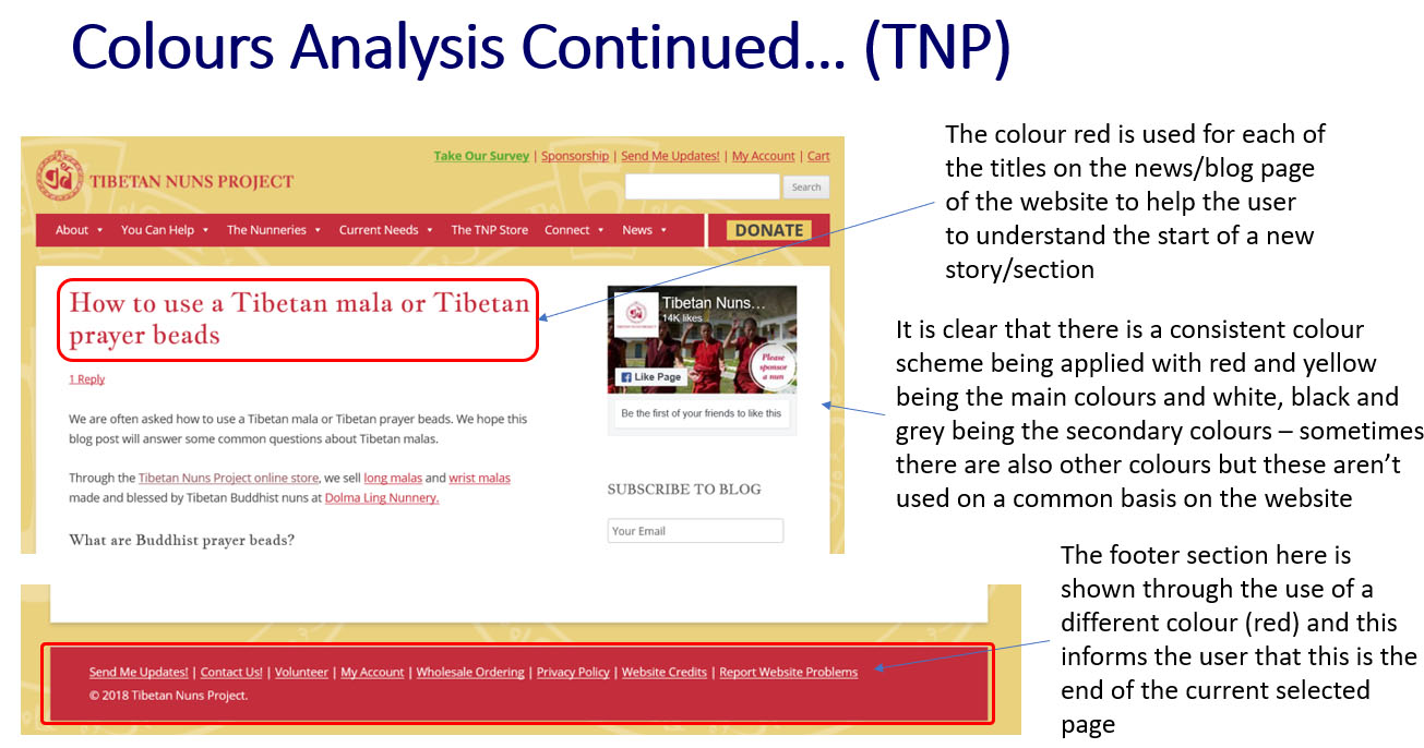
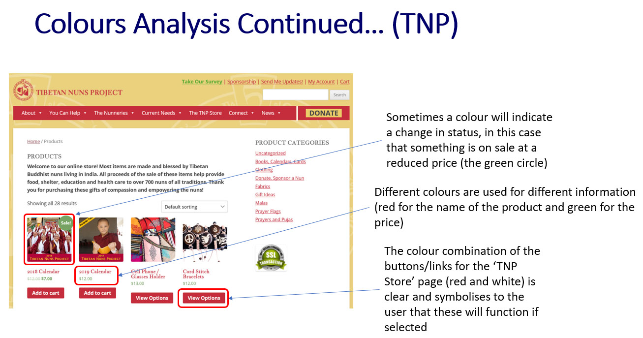
Colours Analysis of the 'TNP' Website
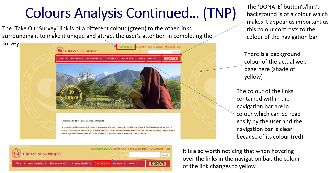
'TNP' Website Colours Analysis - Part 1
'TNP' Website Colours Analysis - Part 2
'TNP' Website Colours Analysis - Part 3
'TNP' Website Colours Analysis - Part 4
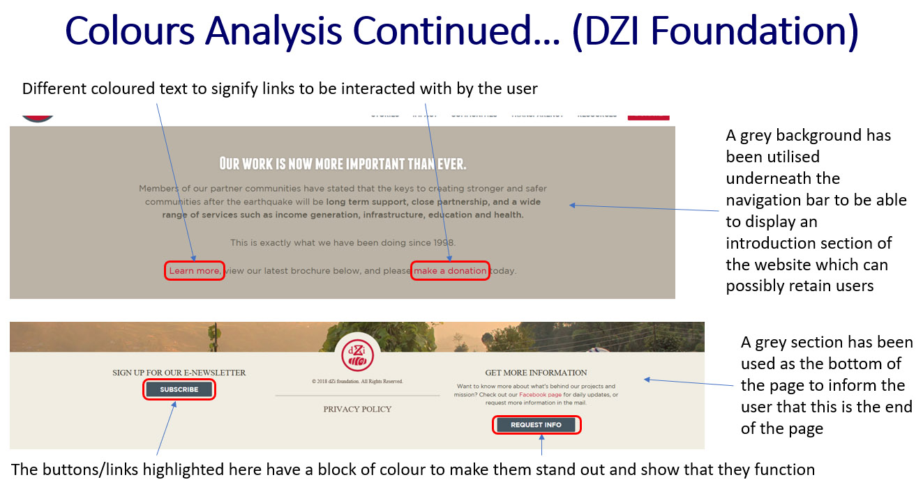
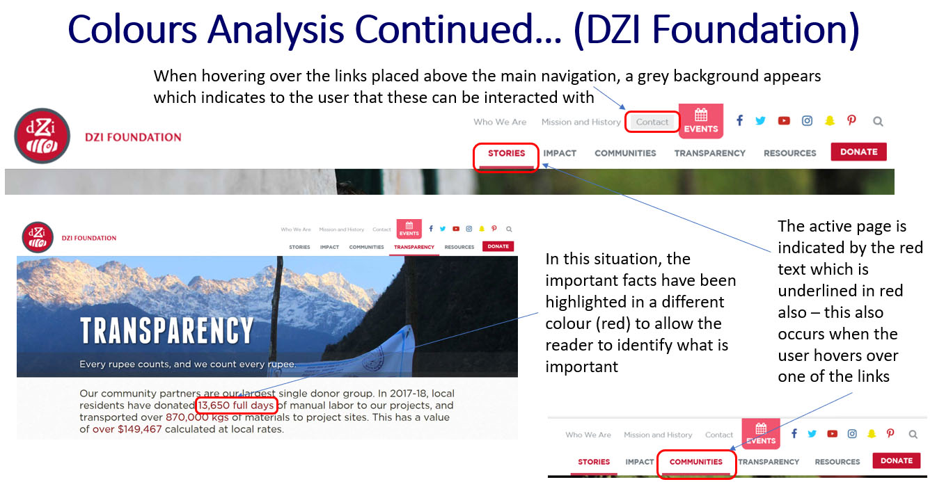
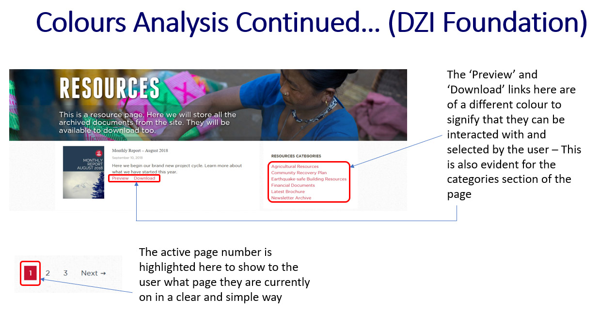
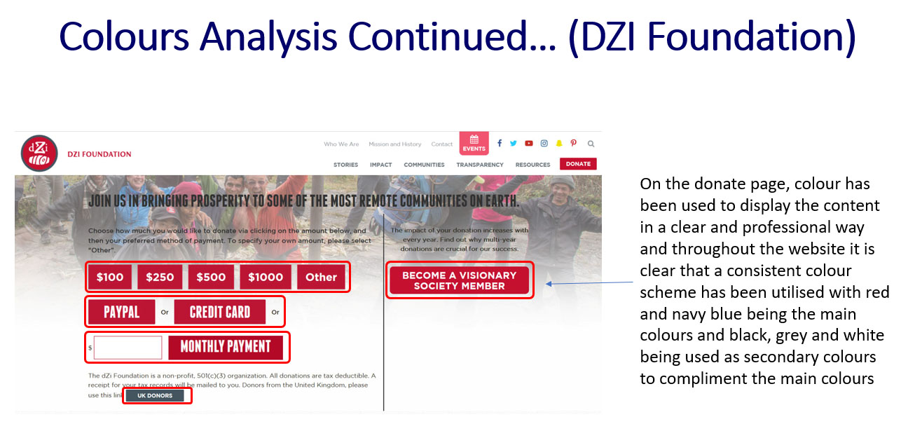
Colours Analysis of the 'DZI Foundation' Website
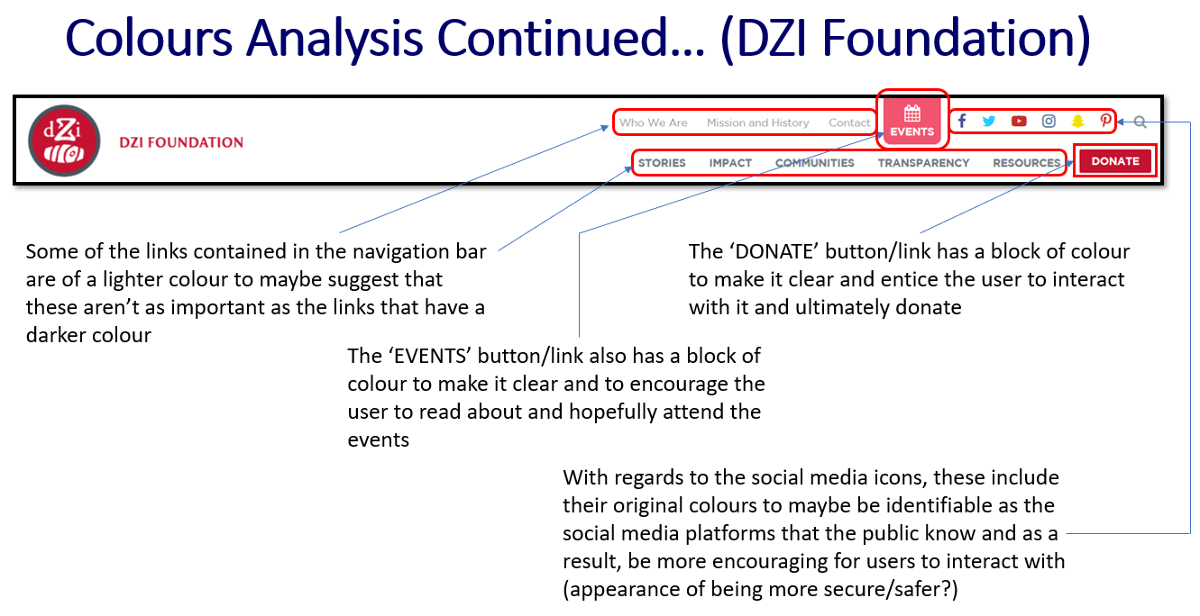
'DZI Foundation' Website Colours Analysis - Part 1
'DZI Foundation' Website Colours Analysis - Part 2
'DZI Foundation' Website Colours Analysis - Part 3
'DZI Foundation' Website Colours Analysis - Part 4
'DZI Foundation' Website Colours Analysis - Part 5
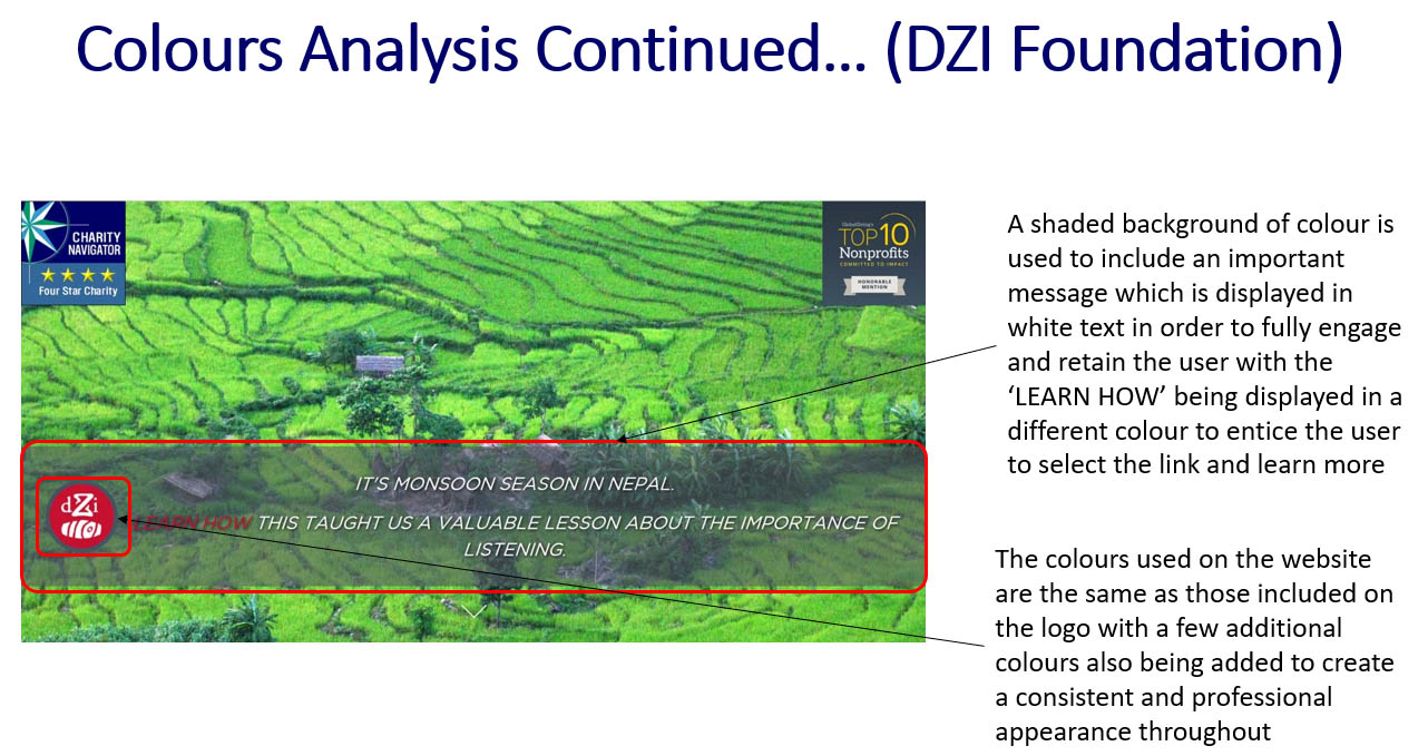
'DZI Foundation' Website Colours Analysis - Part 6
Target Audience Research
Overview
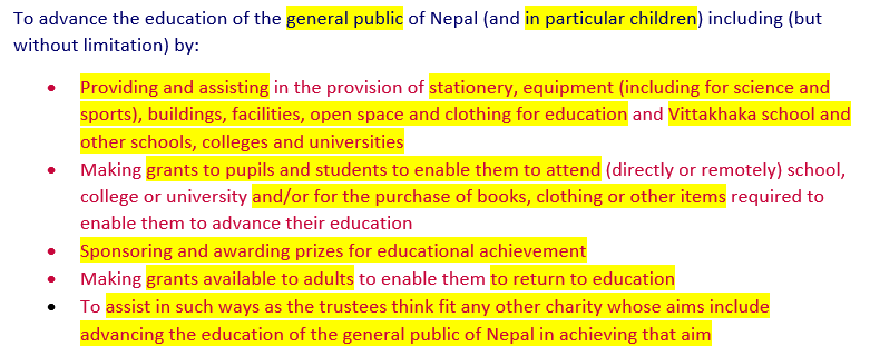
Following on from the branding stage, I then decided to undertake target audience research to allow for the creation of a website that would have suited the correct type of visitor. To begin this process, I analysed the charity's values/objectives.
As a result of undertaking this task, I made several conclusions including the fact that this would have attracted those who were generous and kind-hearted as well as those between the age of 18 and 70 who were interested in helping.
To view the full analysis, please refer to the document at the end of this semester section which provides more detail of this project in some areas before the development and coding stages.
Analysing the Charity's Values/Objectives
The Analysis Process
Undertaking Several Processes of Research
After making some initial judgements, as shown before, I then decided to undertake a series of research to help better my understanding of the topic area. This involved collecting an overview of charity statistics, research regarding the funding options for charities and also the types of audiences charities attracted. The statistics, as found on the website 'Statista', can be viewed below, providing an example of the research I collected. To view the research in full detail, please refer to the document at the end of this semester section.
After completing the necessary research, both that shown above and in the document at the end of this semester section, I then summarised the main points I thought had appeared several times regarding types of target audience to help myself in preparation for creating the target audience personas later on in the project. These main points were that women were more charitable than men, the younger generation was less likely to be interested and not be charitable at all, people were more likely to be charitable towards a charity if it was something that they could have related to and sometimes people needed to be encouraged and motivated in order to become charitable.
Research Examples
The Quantity of Charities
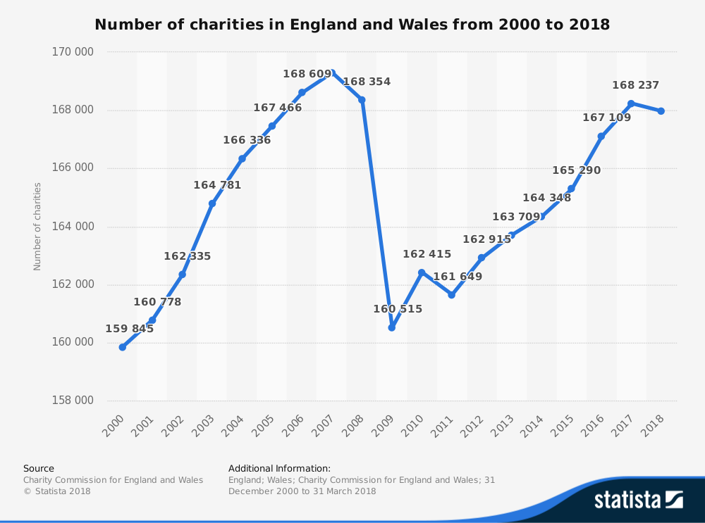
'Statista' Research - Number of Charities in England and Wales from 2000 to 2018
People Giving to Charity - Gender
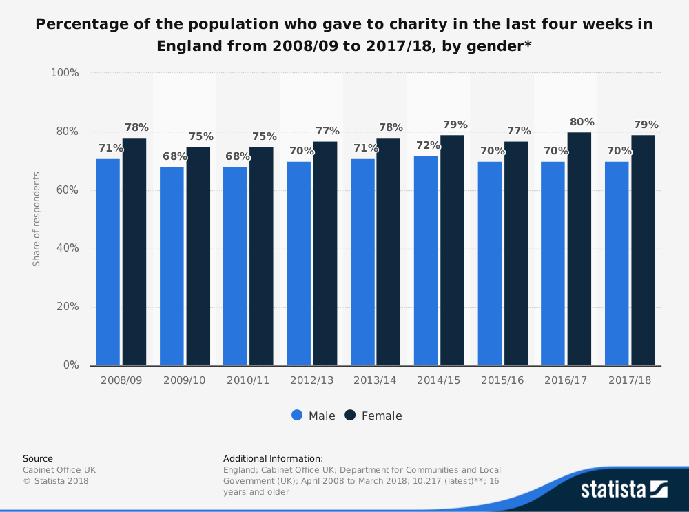
'Statista' Research - Percentage of the Population who Gave to Charity in the Last Four Weeks in England from 2008/09 to 2017/18, by Gender
People Giving to Charity - Age
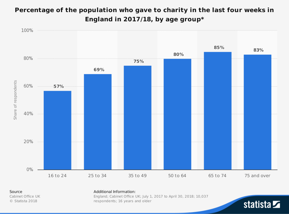
'Statista' Research - Percentage of the Population who Gave to Charity in the Last Four Weeks in England in 2017/18, by Age Group
Creating the Target Audience Personas for the 'CFENC' Website
Overview
Following on from the previous processes, I decided to create three target audience personas to allow for variation in different types of target audience, hence allowing for consideration of more than one type of visitor when producing the website. This is viewable below.
Persona 1
Name: Alice Smith
Age: 55 years
Occupation: Accountant
Income: £70,000 annually
Description: Alice is a very kind natured person who always puts others first, especially her family. She is married and has two children, one boy named George and the other, a girl, called Sophie. When she was younger, she undertook some voluntary work in a 'RSPCA' charity shop as she is a lover of animals, in particular cats of which she has two. One is called Tiger and the other is called Snowflake. She also currently regularly donates to the 'RSPCA' on a monthly basis, giving £15 each time and is looking for a new charity to start donating to. She is specifically looking for a charity which specialises in providing education to those who are less fortunate.
Persona 2
Name: Tony Blake
Age: 67 years
Occupation: Retired plumber
Income/Pension: £45,000 annually
Description: Tony is always very friendly and caring towards others who surround him. He has a good sense of humour and is always telling jokes but also can be very considerate and compassionate when he needs to be. He is married to a beautiful woman called Geraldine and is retired. During his retirement, Tony has met with others and travelled to other countries where he has witnessed those with unfortunate lives and is now, as a result, looking to donate some of his money to help the lives of others.
Persona 3
Name: Michelle Adams
Age: 18 years
Occupation: Full time student at the 'University of Southampton' but works part-time in the shop on the university campus
Income/Pension: £180 on a weekly basis from working in the shop
Description: Michelle has just started studying primary education studies at the 'University of Southampton' and is very enthusiastic to help educate others. She is a very conscientious, patient and kind individual who is always looking to help and make a difference to other people’s lives. At her home in London she has a chihuahua called Cuddles and a tabby cat called Snuggles and enjoys spending time with both, especially Cuddles as this allows her to meet new people whilst walking the dog. Due to her passion to become a teacher after graduating from university, she wants to donate some of her money earnt from working within the university shop to those who are not entitled to the many opportunities within the United Kingdom in the education sector.
Undertaking Website Trends and Standards Research
Overview
Further to the target audience research, I also undertook research relating to website trends (predicted and current regarding 2018 and 2019) and standards as I thought that this could have helped me when completing work later in the project, hopefully being able to implement best practices into the final outcome of the website.
Website Trends Research
Overview
Due to the fact that this aspect was solely written research, this can be fully viewed in the document at the end of this semester section. However, to summarise, the main aspects to consider were one-page websites, static websites, photo content, successful website development for mobile, progressive website applications, e-commerce, 'JavaScript' and typography as well as other aspects.
Website Guidelines and Standards Research
Overview
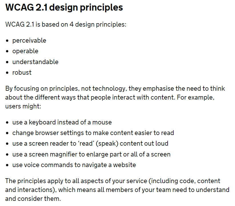
Likewise to the research above, due to the fact that this aspect was solely written research, this can be fully viewed in the document at the end of this semester section. Some of the main aspects to consider were ensuring of fast loading times, the ability to function on mobile devices and following of the 'W3C' standards and of the 'Web Content Accessibility Guidelines' ('WCAG').
As a result of noticing the mention of the 'Web Content Accessibility Guidelines' ('WCAG') and due to the fact that the guidelines had been updated from 'WCAG' 2.0 to 2.1, I therefore decided to undertake detailed analysis which can be fully viewed in the document at the end of this semester section. Although from a different source, 'GOV.UK' summarised the main elements of the 'Web Content Accessibility Guidelines' which can be seen below and these related to the research shown in the document.
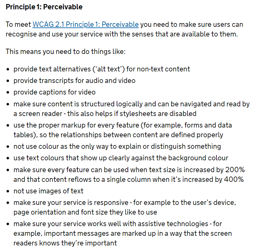
The key aspects to highlight regarding the 'Web Content Accessibility Guidelines' ('WCAG') were the fact that 'alt' text should have been utilised for anything that wasn't text based, ensuring that the background colours and text colours contrasted, ensuring that the user could have used the product easily without any problems and also making the content clear and understandable. Through undertaking the process of viewing the 'Web Content Accessibility Guidelines', this allowed for myself to consider some areas whilst progressing with the project.
'GOV.UK' Summary of 'WCAG' 2.1
'GOV.UK' 'WCAG' 2.1 Summary - Part 1
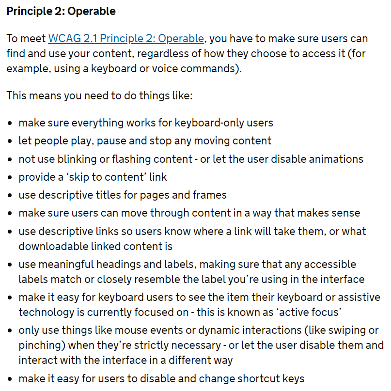
'GOV.UK' 'WCAG' 2.1 Summary - Part 2
'GOV.UK' 'WCAG' 2.1 Summary - Part 3
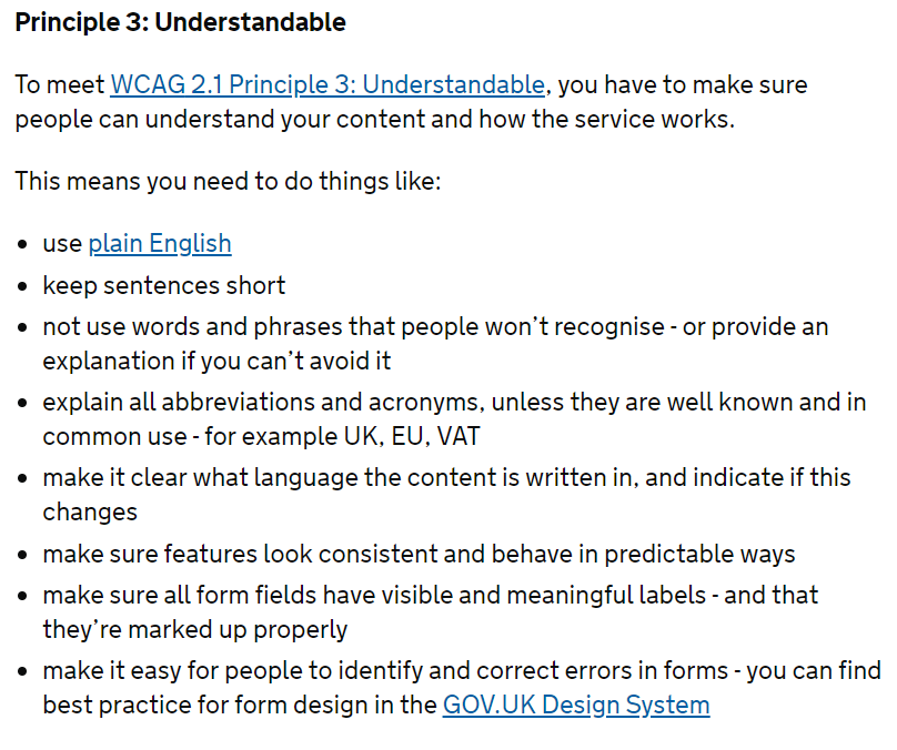
'GOV.UK' 'WCAG' 2.1 Summary - Part 4
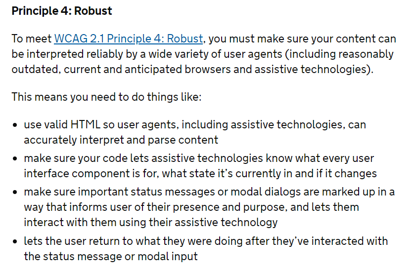
'GOV.UK' 'WCAG' 2.1 Summary - Part 5
Creating Website Wireframes
Overview
Although some of the wireframes were created earlier than some of the other processes of this project, this was an important part that was reviewed and developed over a period of time. The process of this development will be able to be seen below.
Initial Wireframes - Desktop Versions
Desktop Set 1 - Overview
The initial wireframes for the 'CFENC' website were created in the very early stages of the project whilst also undertaking the branding process. At this stage, I created two sets of wireframes for desktop devices. The purpose of creating two for each page at the current time was to try and explore more than one method of how each page could have been structured, acting as a process of ideation. The first set of wireframes created can be seen below. For these, I placed the logo at the top of the page with the title of the website placed next to this, believing it would have been beneficial for the user to remind them of the organisation they would have been either reading about or considering helping as well as being able to navigate to the home page through a link placed around the logo. The navigation bar and footer sections were also in the same place for the first set of wireframes to keep a consistent appearance for the user, allowing them to easily recognise where different elements would have been placed on the page, hence creating a good user experience. Within the navigation bar for the first set of wireframes, the links to the different pages would have been able to have been interacted with and in the footer, items such as contact details and legal policies (e.g. a privacy policy) would have been included for quick reference.
The Home and History Pages
Overview
For the first home page wireframe, I decided to include a slideshow of images underneath the navigation bar as this was something that was currently included on the 'CFENC' website and therefore, I thought this would have been good to keep to help provide an overview of the website through different images. Furthermore, the title of the page was placed underneath the slideshow with either an image or set of images next to the descriptive text underneath, providing an overview of the organisation and what the user could have expected to find on the website.
Regarding the first history page wireframe, I included the same layout with regards to the title of the web page, the introductory text for the page and the image or set of images as that used in the home page. This was due to the fact that again, this would have created a consistent and professional appearance throughout the website and helped the user to familiarise themselves with the structure of each page. For this page, I thought it would have been beneficial to include facts in circles or similar shapes which would have provided short, concise, historical information about the organisation and Nepal in general. I believed the shape of a circle or similar shape could have possibly represented the sun and moon shown in the logo of 'CFENC' and encouraged the user to learn about the history in a fun and interesting way.
The Actual Wireframes
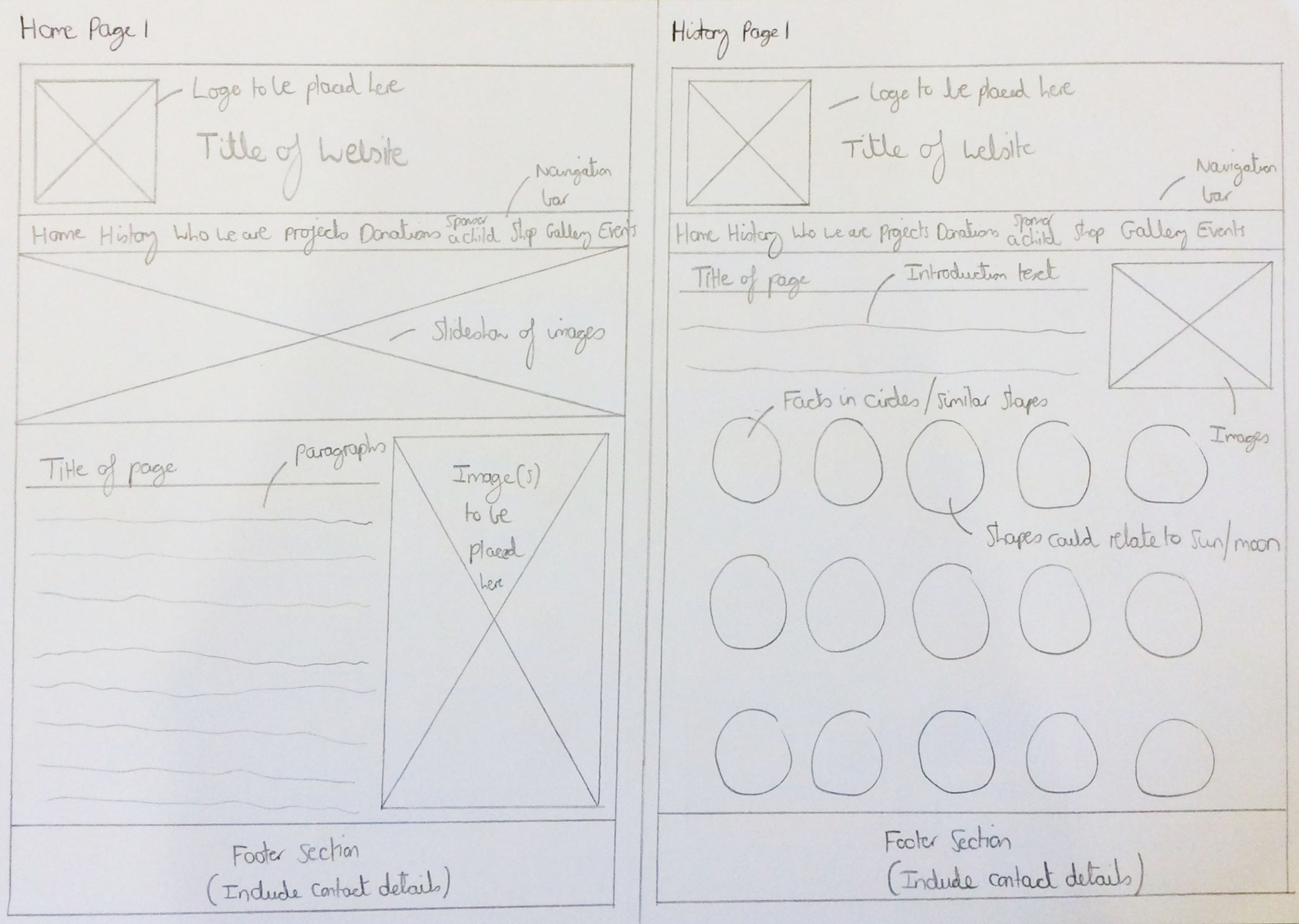
The Sketched Home and History Pages Wireframes
The 'Who We Are' and Projects Pages
Overview
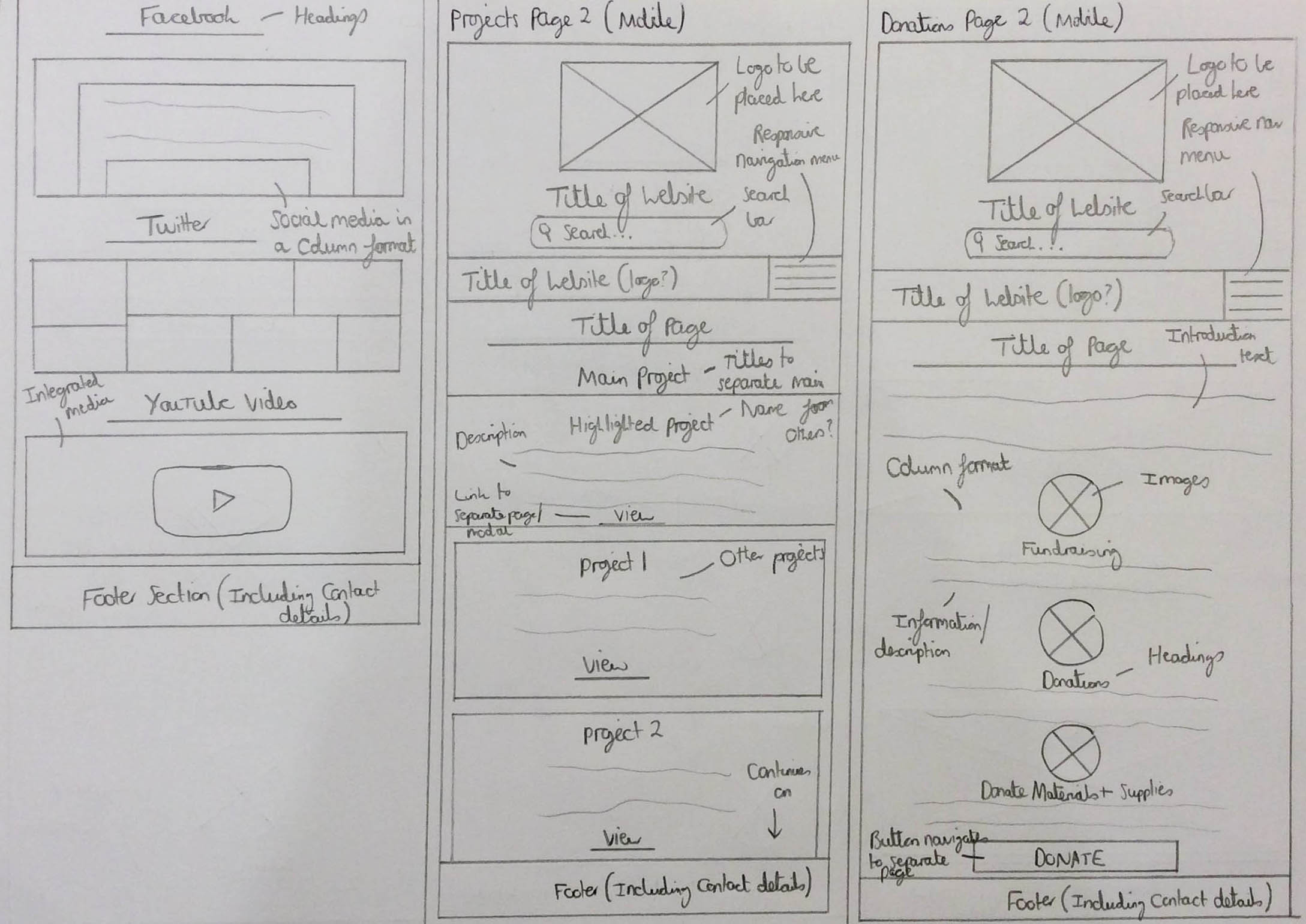
For the first 'Who we are' page wireframe, the title of the web page along with the introductory text and image or set of images was placed in the same place to create a consistent and professional appearance. I included a section which would have related to the people involved with 'CFENC', including only two people relating to the clients. This was due to the fact that, at this stage, I didn’t have any content to understand if there were more people. In this section, I placed the name of each person with their images and a descriptive piece of text underneath each image. As will be evident, I decided to place the name on a line attaching to each image as I thought this would have enhanced the design of the website. This section was also placed centrally due to the fact that if I placed this to the left, it wouldn’t have added variation to the page. Underneath, I believed that it would have been beneficial to include a social media section to encourage users to interact with and help promote the 'CFENC' organisation as well as being able to see what the organisation had been up to.
Regarding the first projects page wireframe, I integrated the same structuring of the introduction section with the title of the page, text and image or set of images as that of the other pages. With regards to the content of the projects, I chose to include each project as their own container and placed all of these in a grid layout as I thought this would have been clear to see for the user. This would have allowed the user to select a project they were interested in and to read about it in more detail through selecting the ‘View’ link underneath each. This grid system would have continued as far down the page as possible, ultimately depending on how many projects had been undertaken by 'CFENC'.
The Actual Wireframes
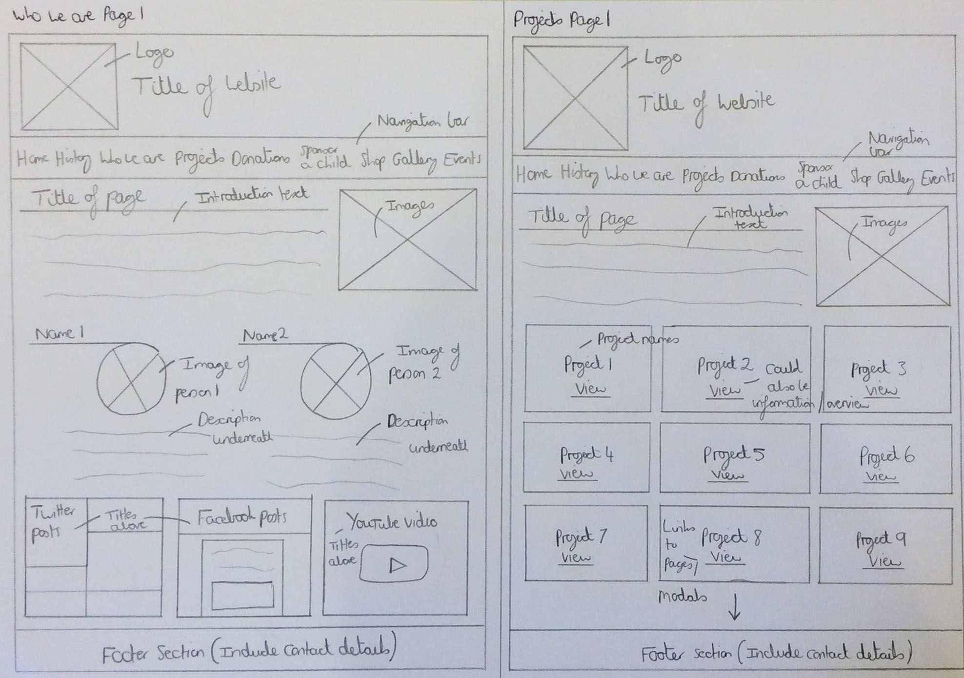
The Sketched 'Who We Are' and Projects Pages Wireframes
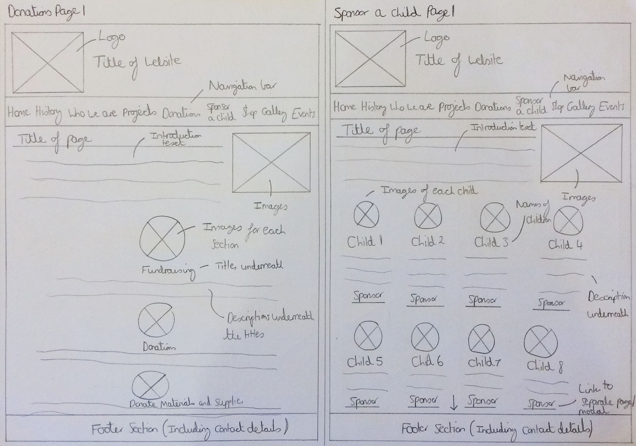
The Donations and Sponsor a Child Pages
Overview
With relation to the first donations page wireframe, I integrated the same structuring of the introduction section with the title of the page, text and image or set of images as that of the other pages. For the content of this page, I decided to integrate the three different sections (fundraising, donations and donate materials and supplies) in a vertical format placed centrally on the page. This was to attempt to add different content flows throughout the page as I thought this might have added variation. The images would have been placed first and then the titles of the different elements along with descriptive text would have been placed below. I believed that placing the titles above their respective images would have created an appearance which wouldn’t have been as aesthetically pleasing which was the reason why the images were placed first, creating a tidy appearance for the user.
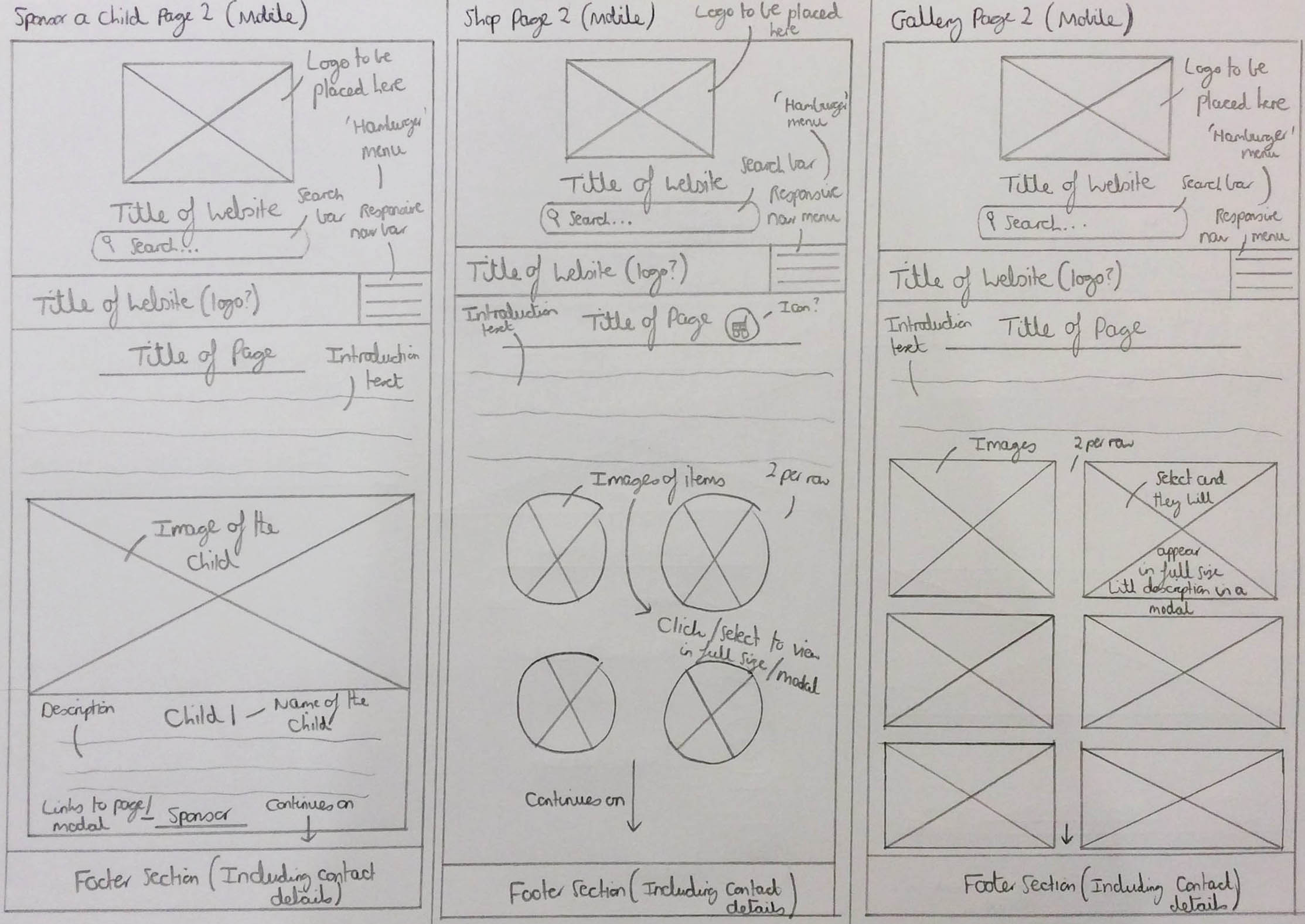
For the first sponsor a child page wireframe, I thought it would have been beneficial to have each child that was available to sponsor in a row format with the same layout for each; the image first and then the name of the child followed by a description of them with a link to sponsor them. This was because I thought that this would have helped maintain a professional and consistent structure to the page. I thought that also having the sponsor links underlined would have indicated to the user that they were to be selected, hence being intuitive. These sponsor links would have taken the user to either a modal or a separate page due to the fact that having too much text on the page would have probably disinterested the user and having the option to do this would have allowed the user to have had the choice of whether to continue with the process or not.
The Actual Wireframes
The Sketched Donations and Sponsor a Child Pages Wireframes
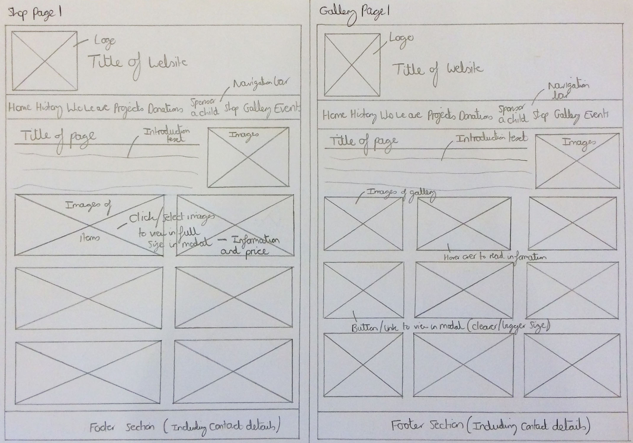
The Shop and Gallery Pages
Overview
For the first wireframe of the shop page, I decided to place the images of each shop item in a block format to create a professional and consistent structure on the web page. Only images would have been displayed on the screen until the user interacted with them by selecting them, causing the products to be displayed either in full size or in a modal with the information and price relating to them. Likewise to the first sponsor a child wireframe shown previously, this would have reduced the amount of text displayed on the page and encouraged users to select each product to read more about each one, giving the user a choice and allowing them to have control.
With regards to the first gallery page wireframe, I decided to structure images in a block format and in a simple way to create a professional and consistent feel to the web page. When hovering over these images, this would have displayed information about each image in the gallery to the user, enhancing the user experience through the form of an animation. As well as displaying information, a button would have also appeared allowing for the user to select this to view the selected image more clearly in the form of a modal.
The Actual Wireframes
The Sketched Shop and Gallery Pages Wireframes
The Events and Contact Us Pages
Overview
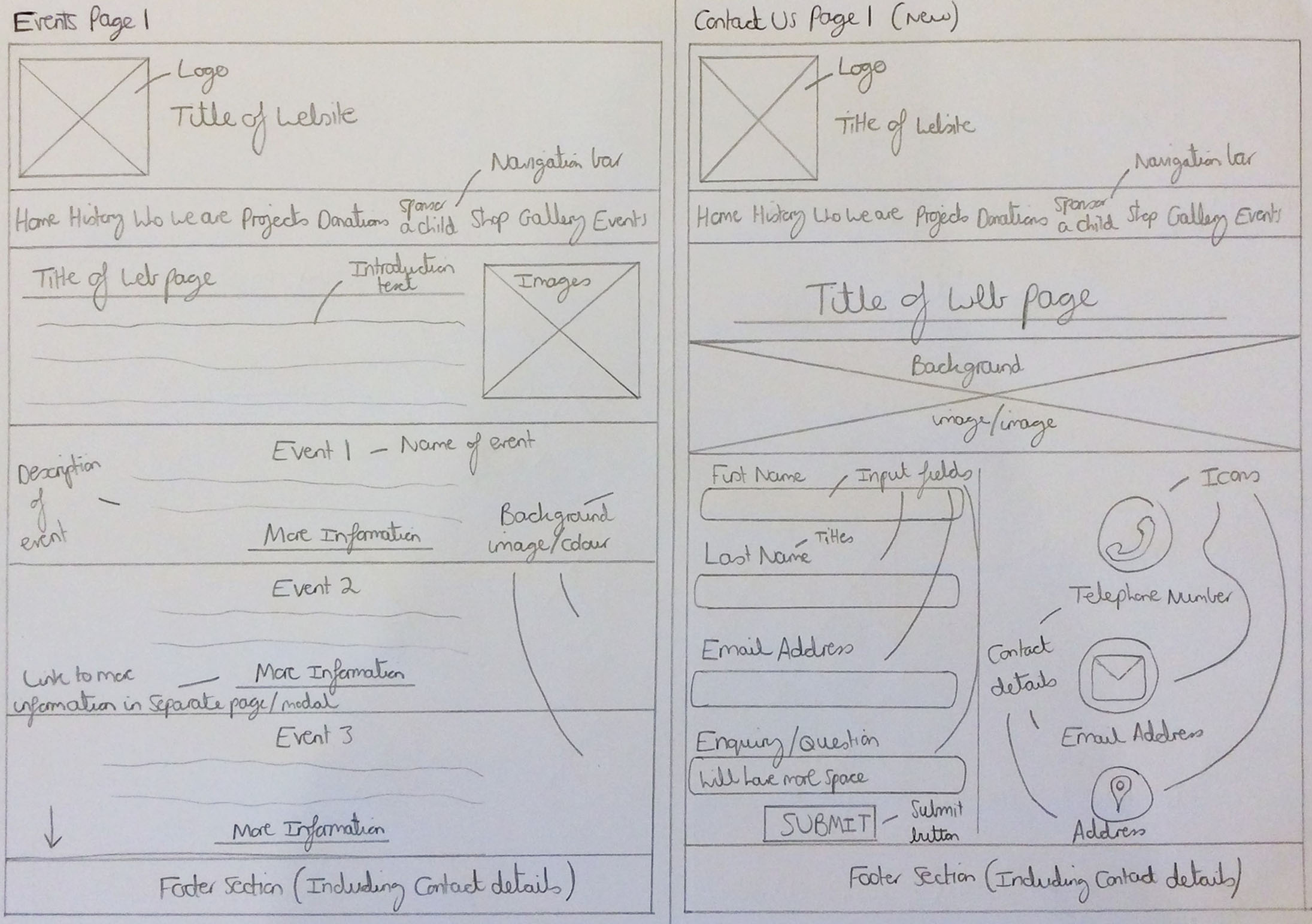
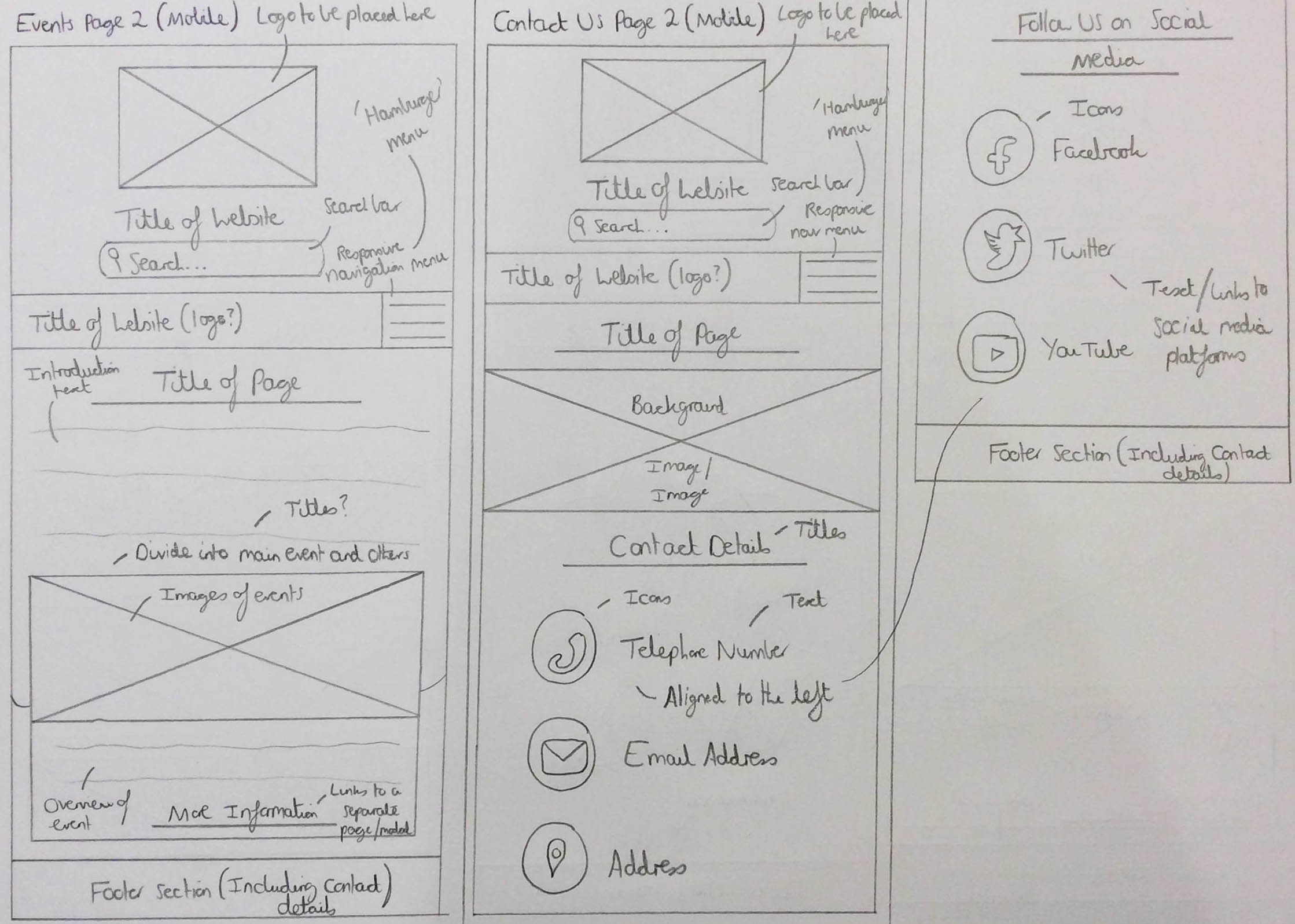
For the first events page wireframe, I thought it would have been beneficial to structure the page with one event for every row with either different background images or colours to distinguish different events. This would have therefore acted as a visual aid to the user in knowing how many events there were available to read about on the page. Similar to some of the other wireframes, the titles of the events would have been placed first with information and links to view more information about the events below, allowing for the user to read more if they wanted to. This information would have either been placed in a modal or on a separate page to attempt to reduce the amount of information on the page and keep visitors to the page engaged and interested. It is also worth noting that the latest event would have been placed at the top of the web page with the older events being placed further down the page, hence encouraging visitors to read about the upcoming events and hopefully encouraging them to become involved.
For the first contact us page wireframe, the structure of this page was different to the other pages as this wouldn't have included an introduction section and the title would have been placed centrally. There would have also been a background image placed at the top of the page as this was something that the client had mentioned they liked about one of the current competitors. To view where this was inspired from, please view the document at the end of this semester section. I also decided to place the content for this page in a column format as I thought this would have created a more pleasing appearance than if I were to place the content in a row format. I also thought including icons would have enhanced the design of the page and been more beneficial than titles, adding more variation than if I were to place everything in the form of text for the contact details section. With regards to the ‘SUBMIT’ button for the contact form, I thought it would have been better for the user if I had placed the font for this in uppercase to indicate it as a button to select once finished with providing details to the form.
The Actual Wireframes
The Sketched Events and Contact Us Pages Wireframes
Desktop Set 2 - Overview
As mentioned previously, I created two sets of initial wireframes and the second set can be viewed below. Likewise to the first set of wireframes, I decided to place the logo at the top of the page with the title of the website placed next to this. However, within this set of wireframes, I decided to also include a search bar as seen in the provided competitor websites to allow for users to perform a quick search and find any information within the website that they wanted to view. For the same reason as the other set of wireframes, these aspects are something that will be seen consistently through these desktop wireframes because, as explained before, I believed it would have been good for the user to remind them of the organisation they were either reading about or considering helping as well as being able to navigate to the home page through a link placed around the logo. As was the same for the other selection of wireframes, the navigation bar and footer sections were also situated in the same place for all of the wireframes seen below and this was due to the fact that I wanted to maintain a consistent appearance throughout the website for the user, enabling them to easily recognise where different elements would have been placed, hence creating a good user experience through an intuitive interface. Within the navigation bar, the links to the different pages would have been able to have been interacted with and in the footer, items such as contact details and legal policies (e.g. a privacy policy) would have been included for quick reference and legal purposes.
The Home and History Pages
Overview
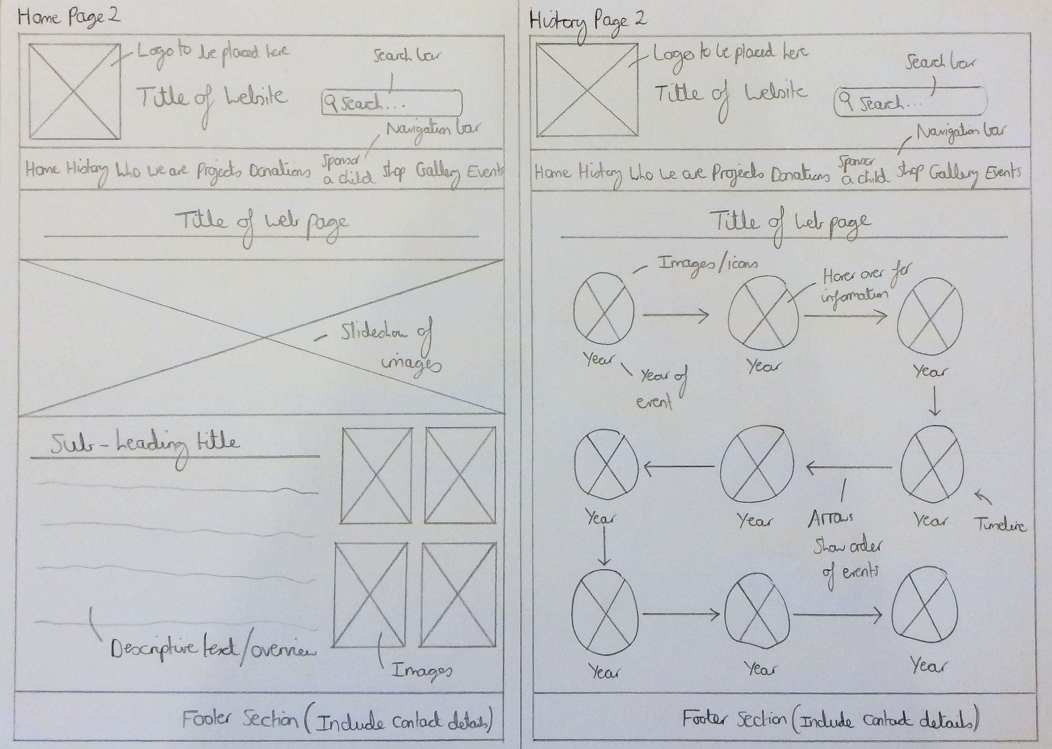
For the second home page wireframe, I decided to include a slideshow of images underneath the navigation bar as this was something that was currently included on the 'CFENC' website and therefore, I thought this would have been good to keep to help provide an overview of the website through different images. However, on this wireframe, the title of the page would have been placed above the slideshow centrally with a sub-heading, descriptive text and a selection of images placed in the same format as that seen on the first home page wireframe. Again, the purpose of this was to help provide an overview of the organisation such as their values and work and also direct users to other aspects of the website.
Regarding the second history page wireframe, the title of this page was placed in the same place as the other pages to create a professional and consistent appearance throughout the website. Regarding the content of this page, this time I decided to place the images on the page instead of facts which would have related to the piece of information supplied when hovering over each image. This would have therefore created a more visual page and increased interest from the visitor. The year of each event was placed under each image to display to the user the time in which the event occurred and arrows were placed between each image to display to the user the order in which these events happened, symbolising a timeline of history.
The Actual Wireframes
The Sketched Home and History Pages Wireframes
The 'Who We Are' and Projects Pages
Overview
Regarding the second 'Who we are' page wireframe, the title of the web page was placed in the same place for the same reason as stated before but this time there would have been some introductory text to explain to the user about the people at 'CFENC' or about 'CFENC' in general. The images this time wouldn’t have had a line attached to the top of them as I thought this may have been easier to structure with regards to programming. The same format would have been integrated as before for the same reasons stated before regarding the first wireframe. The social media section of this page would have also been the same as the other wireframe created as I thought that this was the best way to structure this at the current time with titles above each social media channel’s content.
For the second projects page wireframe, I thought it would have been beneficial to have a sponsored project placed larger and higher up the page than the other projects to signify to the user that this would have been the project that was the most important and relevant at the current time. This was inspired by one of the provided competitor websites and to view this inspiration, please view the document at the end of this section. Another difference between this wireframe and the first was the fact that an overview of information was included for each project, helping to entice the user and engage them into finding out more about each project which they could have then viewed more information about through selecting the ‘View’ button/link. This would then have displayed more detail in either a modal or on a separate page, allowing the user a choice to either continue reading or to visit another page. The name of the projects would have been placed at the top of each container to display a hierarchy of information, structuring the information in a professional and consistent manner.
The Actual Wireframes
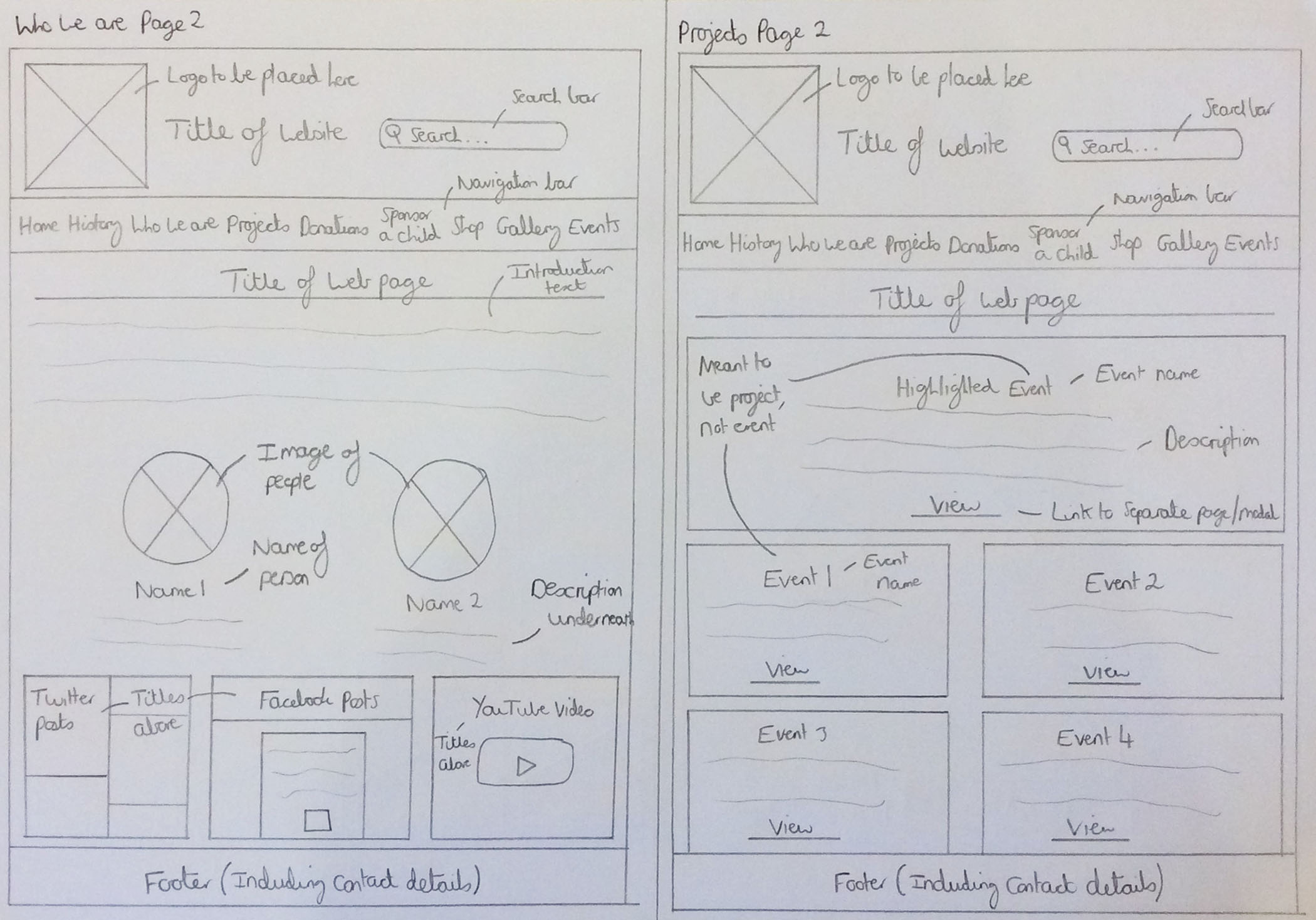
The Sketched 'Who We Are' and Projects Pages Wireframes
The Donations and Sponsor a Child Pages
Overview
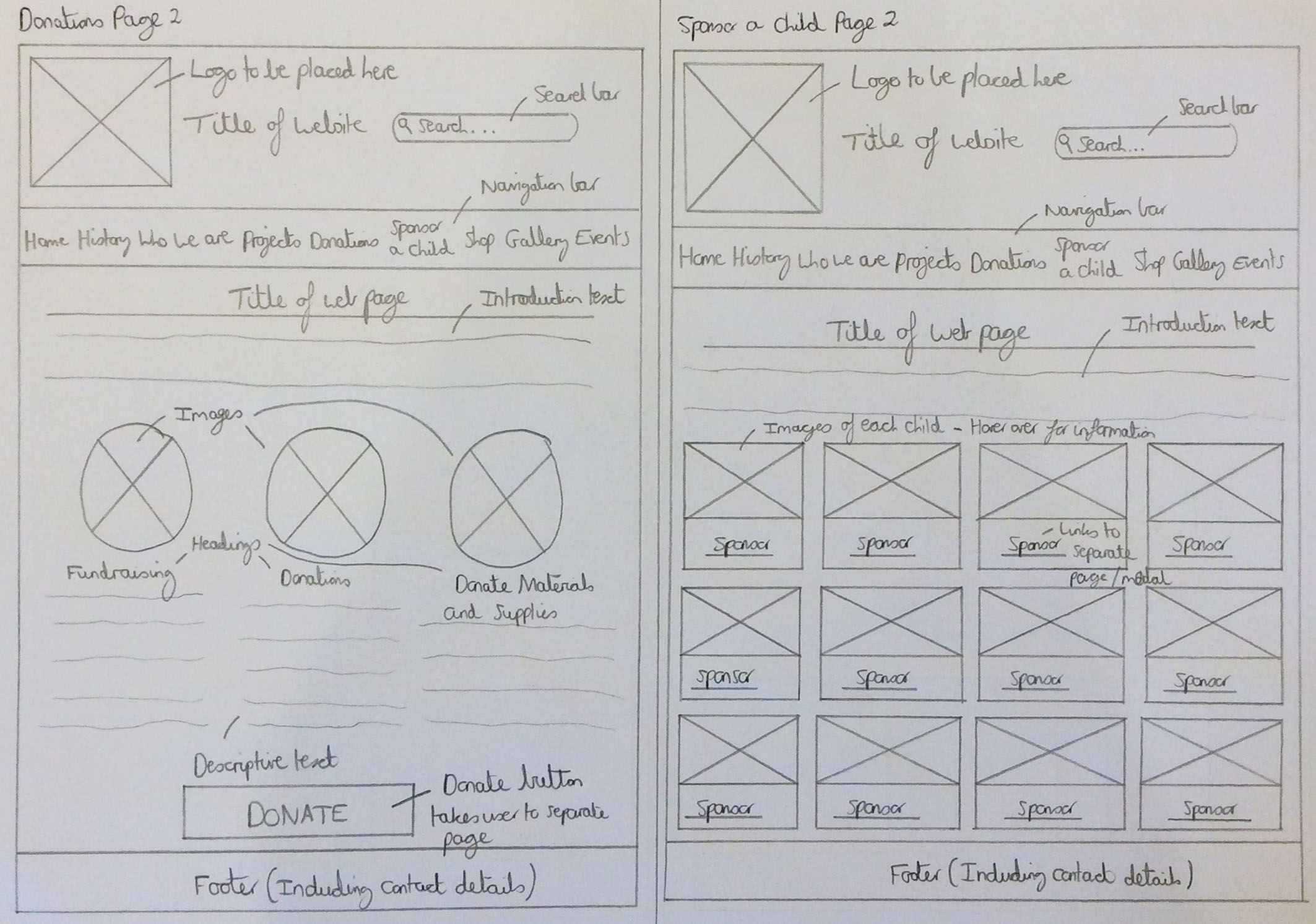
With regards to the second donations page wireframe, this time I decided to place the three sections in a row as I thought that this would have helped reduce any unnecessary white space as would have been the case on the other wireframe. The same format for these sections would have been used as before as this, in my opinion, was the best way to structure this with regards to the visual appearance. On this page, I decided to include introductory text to be able to introduce the user to the purpose of this page as well as providing an overview. The other main difference for this wireframe compared to the other wireframe was the fact that I thought including the ‘DONATE’ button would have been beneficial to try and encourage visitors to donate to a good cause, hence helping the organisation and most importantly those in Nepal.
The second sponsor a child page wireframe also demonstrated the fact that there was to be an introductory section which would have welcomed users to the page, explaining what they could have expected to find. The difference with this wireframe and the first was that in this one, the children would have been displayed within a card format as seen with the framework ‘Bootstrap’. To view this inspiration, please view the document at the end of this semester section. Furthermore, information would have been displayed about each child when hovering over each image, providing an enhanced user experience with a link that would have enabled the user to sponsor the child of their choice. The ‘Sponsor’ buttons/links were of the same concept of the previous wireframe and the explanation of this can be viewed previously.
The Actual Wireframes
The Sketched Donations and Sponsor a Child Pages Wireframes
The Shop and Gallery Pages
Overview
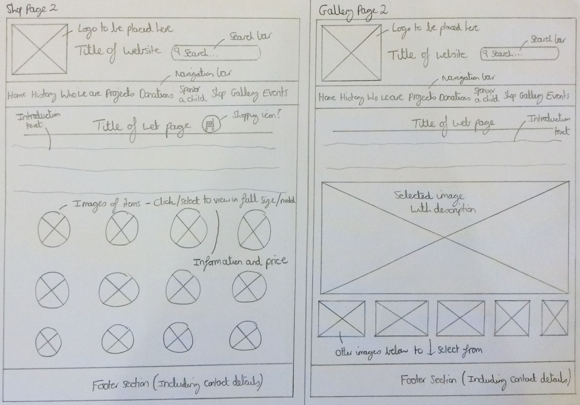
For the second shop page wireframe, I explored a different approach by having the images of the shop items in circles and in a block format as I thought this could have possibly been integrated as well. The introductory text section had also been included to introduce users to the page and again provided an overview of the content on the page as well as instructions. The same concept would have been incorporated as before, displaying each product in full size either in a modal or on a separate page along with information about the product and its price if the user were to select an image. As is also evident, I thought it would have been beneficial to integrate a shopping icon at the top of the page to signify that this was an e-commerce section of the website.
Regarding the second gallery page wireframe, I decided to structure the gallery images differently for this wireframe, gaining inspiration from a couple of football galleries found through research on the Internet. These were galleries of both the 'rangers.co.uk' and 'www.chelseafc.com' websites. To view this inspiration, please view the document at the end of this semester section. I thought that displaying the gallery similar to the 'Rangers' football gallery would have been beneficial as this was both professional and tidy and highlighted the selected image in an obvious and clear way. I thought I would have also included a description of each image as this would have helped the user to understand the context of each image, also inspired by the 'Rangers' football gallery. The 'Chelsea' gallery was one which I used less to help as this didn't include a description of each image. Elsewhere on the page, an introductory section would have been included to explain about the gallery page as well as providing instructions on how to operate the gallery.
The Actual Wireframes
The Sketched Shop and Gallery Pages Wireframes
The Events and Contact Us Pages
Overview
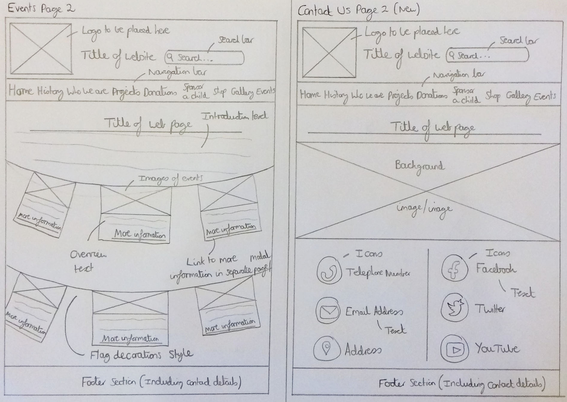
With relation to the second events page wireframe, there was introductory text to again introduce the user to the page, providing an overview of what they would have expected to find. With this wireframe, I thought it would have been beneficial to have a few events positioned on bunting to symbolise the fact that these were events. There would have been images of events and information with buttons/links placed beneath for the user to select to read more information about each event. This would have either appeared in a separate page or within a modal to reduce the quantity of text on the page. I thought that this might have helped to produce a friendly appearance whilst also trying to maintain a professional and consistent appearance throughout to try and encourage users to view more aspects of the website and ultimately help 'CFENC'.
For the second contact page wireframe, I decided to keep the same layout as before as I thought this was aesthetically pleasing. However, this time I decided to remove the contact form as on some websites I had viewed, either for this project or during another instance, occasionally contact forms weren't included. I wanted to explore this approach as well. Instead of including a contact form, I replaced this with social media contact details, encouraging users to visit the social media platforms provided by 'CFENC'. The final element to notice is the fact that I decided to keep the icons as I thought this was visually pleasing and had noticed this had been included on a few websites as well. To view the inspiration for this wireframe version, please view the document at the end of this semester section.
The Actual Wireframes
The Sketched Events and Contact Us Pages Wireframes
Initial Wireframes - Mobile Versions
Overview
As well as creating the desktop wireframes shown above, I also decided to create two sets of mobile wireframes to reflect the desktop wireframes structure but on mobile devices instead. The main aspect to mention is the fact that most of the content would have been displayed in column format to suit the size of mobile devices. Another key aspect to note is that the title of the website was included with the logo on the responsive navigation bar as well as at the top of each page to remind the user of the organisation they would have been viewing. As well as these elements, a 'hamburger menu' was included to allow for the user to select and navigate to different pages on the website with the search bar being placed at the top of the page regarding the second set of wireframes. This would have made it easier for the user to identify how to search for content when first visiting the website on a mobile device. These wireframes can be viewed below.
Mobile Wireframes Set 1
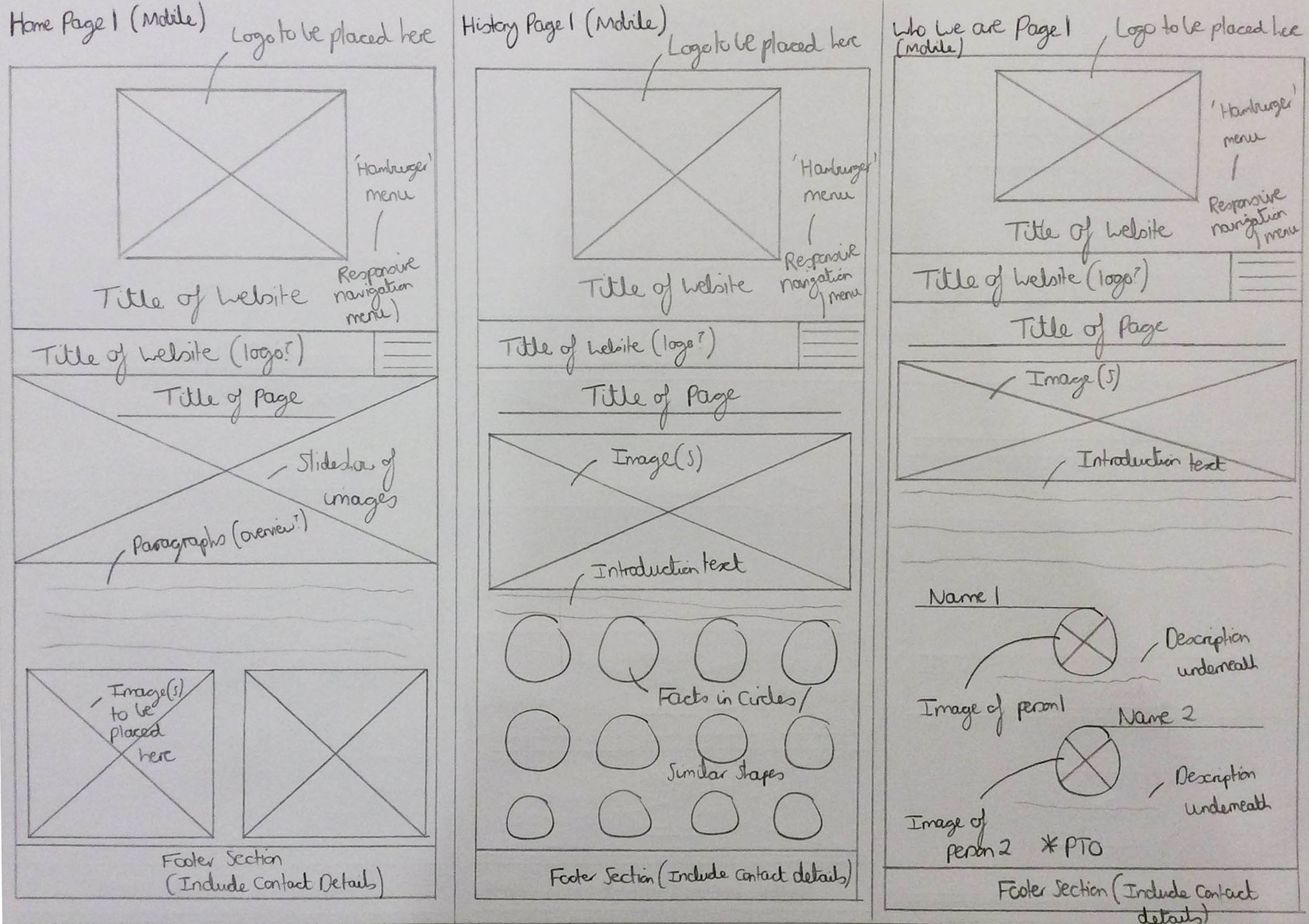
The Sketched Home, History and 'Who We Are' (Part 1) Pages Wireframes
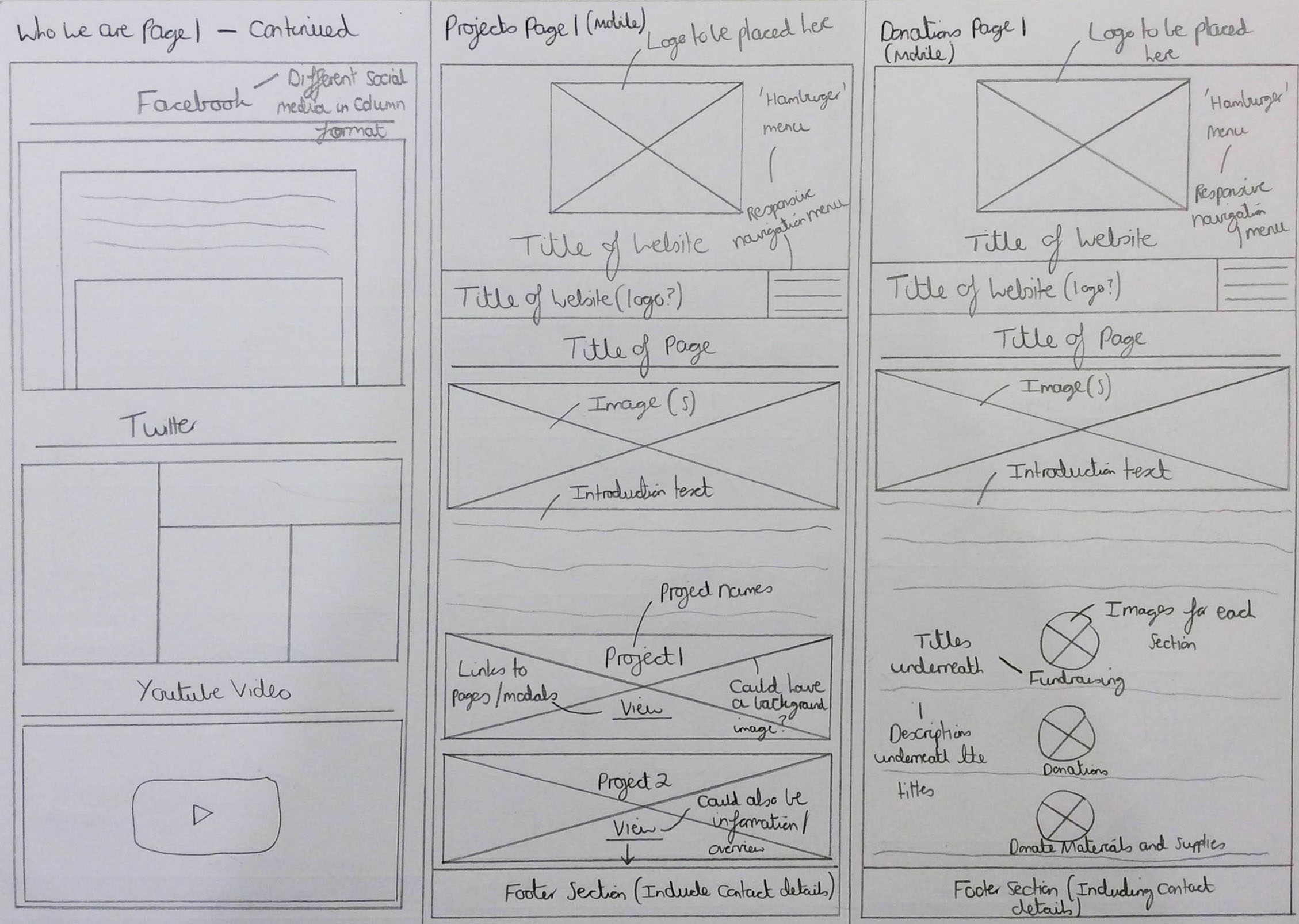
The Sketched 'Who We Are' (Part 2), Projects and Donations Pages Wireframes
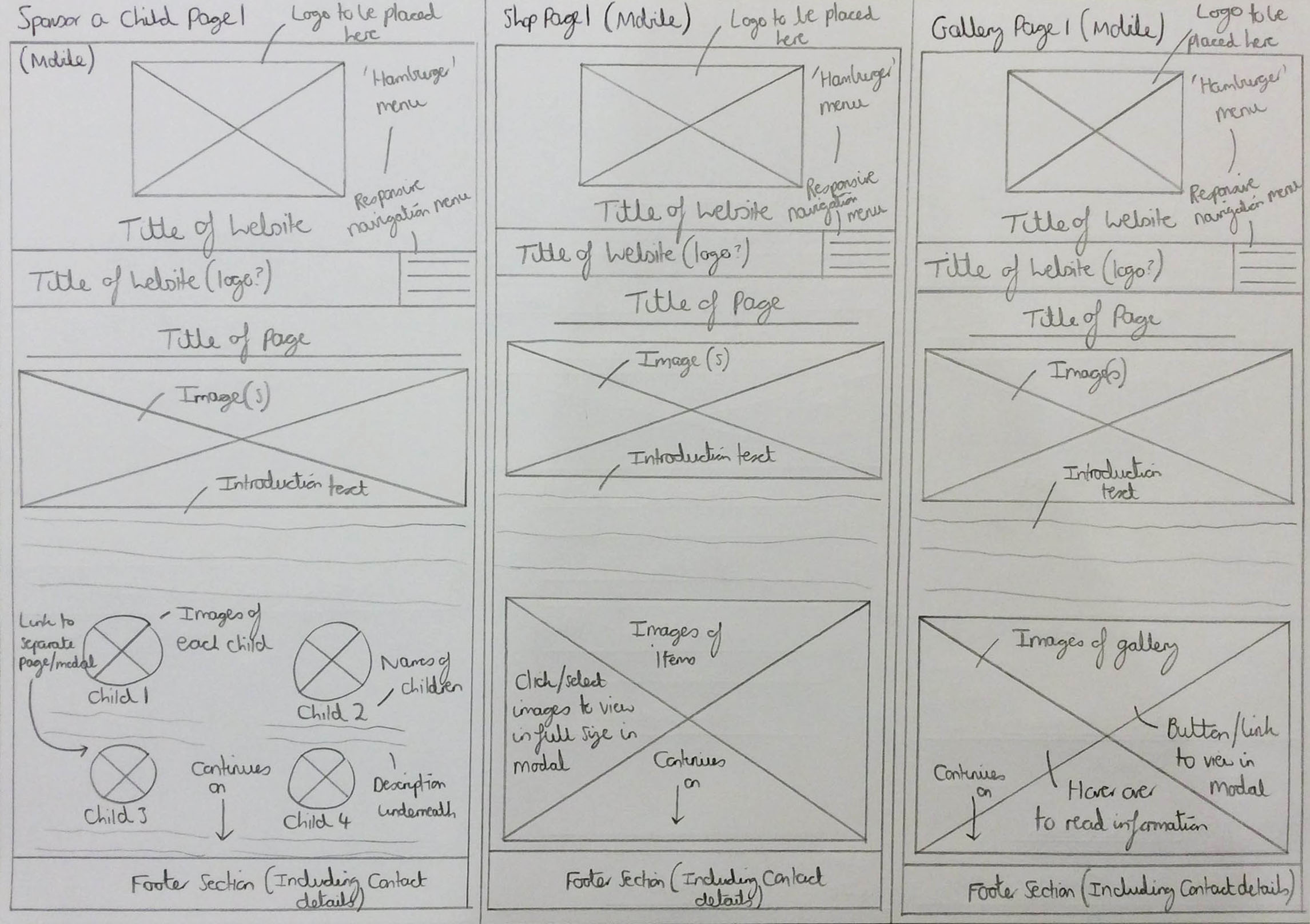
The Sketched Sponsor a Child, Shop and Gallery Pages Wireframes
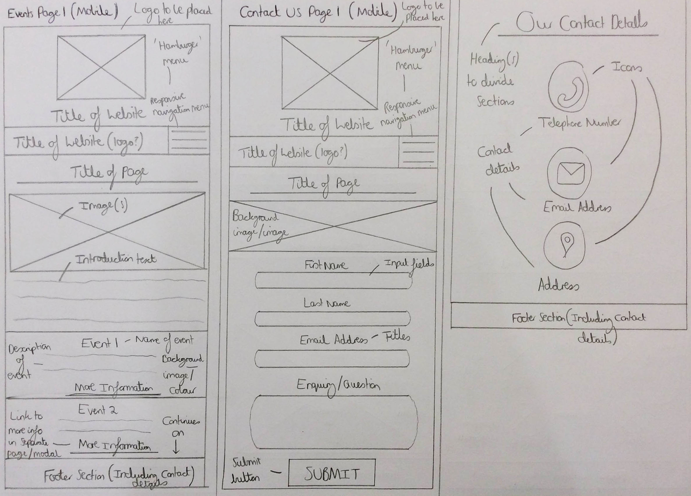
The Sketched Events and Contact Us (Parts 1 and 2) Pages Wireframes
Mobile Wireframes Set 2

The Sketched Home, History and 'Who We Are' (Part 1) Pages Wireframes
The Sketched 'Who We Are' (Part 2), Projects and Donations Pages Wireframes
The Sketched Sponsor a Child, Shop and Gallery Pages Wireframes
The Sketched Events and Contact Us (Parts 1 and 2) Pages Wireframes
Wireframes Created from Feedback
Overview
In the meeting between myself and the clients on 1st September 2018, as well as showing the clients the colours and fonts, I also decided to show both the desktop wireframe sets I had created as shown previously. This was to demonstrate different types of structures for each web page. From doing this, I received feedback for various pages which were the home, sponsor a child, history, shop and contact pages. Key aspects were to explain how visitors could have helped regarding the sponsor a child page rather than being specific, to structure the contact page in a block format, as seen on a company website shown to the client and to also contain the history facts in prayer flags rather than circles. Another major aspect mentioned was to create a partners page to show who 'CFENC' were currently collaborating with. To view the full feedback, please view the document at the end of this semester section.
After receiving this feedback, I decided to create a few more wireframes to include some, if not all of this feedback. These can be viewed below.
The Our Partners Page Wireframes
Overview
For the first partners page wireframe, I decided to include the introduction structure as seen on the second set of wireframes displayed previously to help introduce the user to the page and with regards to the partners, I thought it would have been beneficial to have these displayed in a row in a card format as seen with 'Bootstrap'. The image of each partner was placed first with the partner’s name, description and link/button to their website to view placed underneath, creating a hierarchy of information, inspired by some of the competitor websites. Please note that the same structure with regards to the heading and footer sections was used as that shown in the first set of wireframes shown previously. To view all inspiration, please view the document at the end of this semester section.
Regarding the second partners page wireframe, this had the same concept to the previous example with relation to the content placed on the page but the introductory section included an image to add more visuals to the page and the partners were placed in a column format. These would have alternated with regards to positioning of content to add variation to the page and the images would have been circular. Likewise to the first wireframe, a hierarchy of information was included but in a horizontal manner instead to maintain a professional feeling to the website. Please note that the same structure with regards to the heading and footer sections was used as that shown in the second set of wireframes shown previously.
The Actual Wireframes
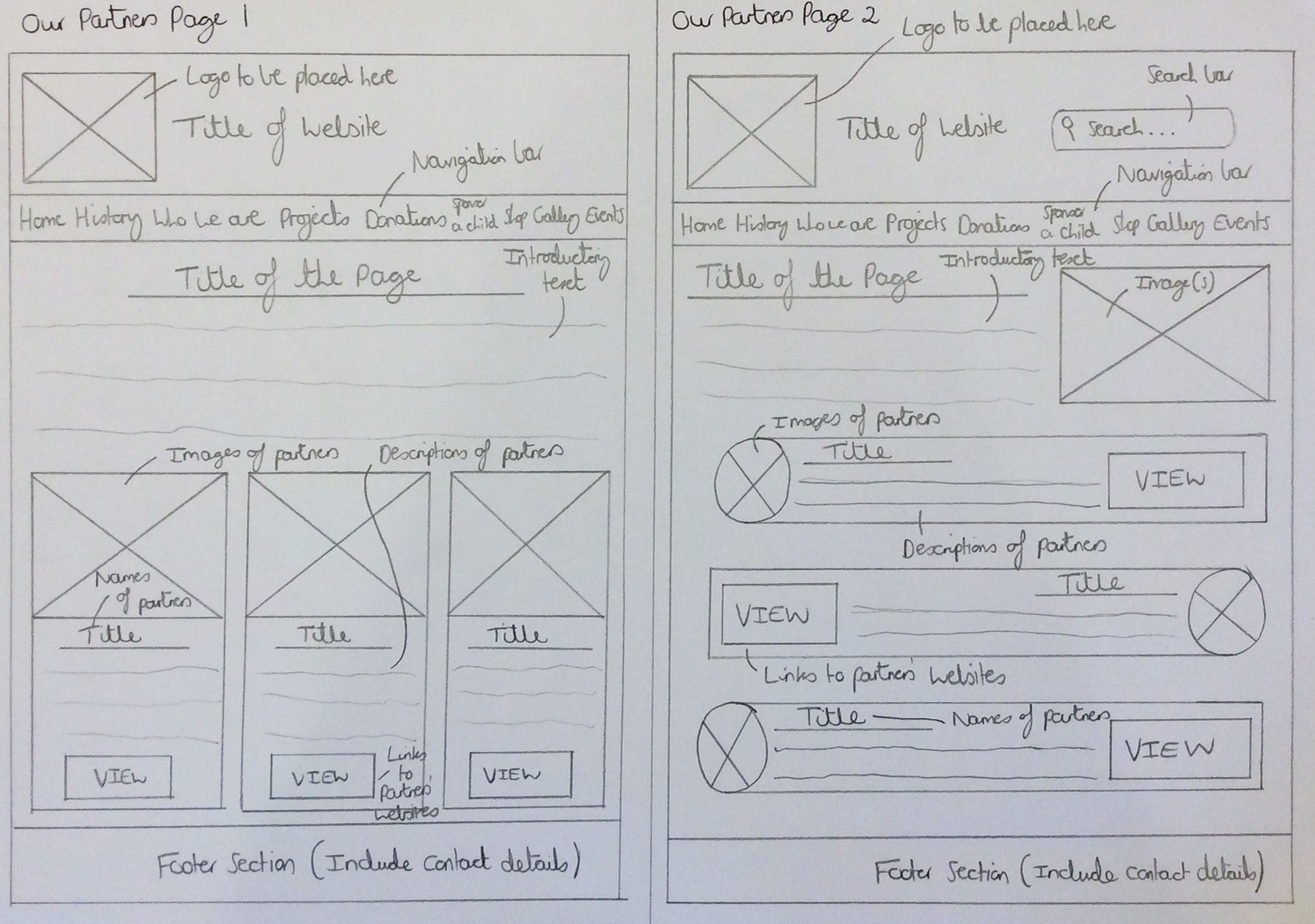
The Sketched Our Partners Page Wireframes 1 and 2
The Improved Contact Us and Sponsor a Child Pages Wireframes
Overview
Regarding the contact page wireframe displayed below, I decided to integrate the ‘DONATE’ link/button into both the banner section of the page and further down as well, as requested. The ‘DONATE’ button was placed centrally further down the page as I thought this would have helped it to be more obvious to the visitor, helping to encourage them to interact with it. I decided to keep the structure of the introductory section of the page as the same as shown in the previous set of wireframes for the contact page. This was because I thought this would have been more structurally appealing than if I were to align this to the left or right of the page but also due to the fact that it would have complemented the image shown underneath. As is also noticeable, I integrated a block format as this was an area the clients mentioned that they liked, taking inspiration from the ‘Edit.’ website. Within these blocks I thought it would have been beneficial to contain a map locator, links to social media platforms, contact details and a contact form as this would have allowed visitors to choose their preferred method of contacting 'CFENC'.
For the new sponsor a child page wireframe, I believed it would have been beneficial to include an introductory section with text to provide an overview of the information on the page or to relate to the purpose of the page. I also believed adding simple instructions would have been good to inform visitors of how they could have helped to sponsor a child in a clear way. Underneath this, I included examples of children this had helped already to show how this method was helping. An image of each child was placed first with their names and a short description underneath to again create a hierarchy of information and structure this in a professional and clear way. This was all based on the feedback provided by the clients, stating that they didn’t want this page to be specific to sponsoring a child but instead to how people could have helped in general.
The Actual Wireframes
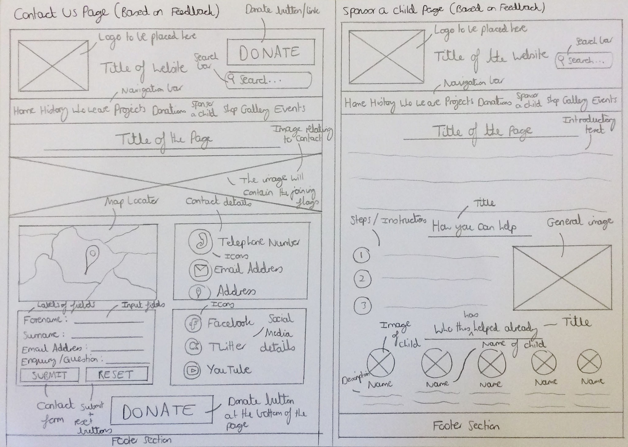
The Sketched Contact Us and Sponsor a Child Pages Wireframes
Desktop High-fidelity Wireframes
Initial High-fidelity Desktop Wireframes
Overview
After creating the wireframes shown previously, I then decided to create high-fidelity wireframes, using ‘Adobe XD’, where I attempted to integrate both the feedback received as well as viewing all of the wireframes I had already created. This then allowed myself to create the first set of high-fidelity wireframes which can be viewed via the link provided below. Please note that due to not having received any content at this stage, this therefore meant that I utilised the images available on the current website. Some of the aspects from previously undertaken research with regards to colour schemes and fonts were taken into consideration whilst creating the high-fidelity wireframes.
Please note that there are interactive links included within the wireframes which allow for navigating between different pages.
The Actual Initial High-fidelity Desktop Wireframes
Refined/Developed High-fidelity Desktop Wireframes
Overview
After creating the first set of high-fidelity wireframes and progressing with the coding of the website, of which the process will be shown in multiple documents within this semester section, I then decided to refine the previous wireframes in a new file. I changed the footer section to allow for understanding of how this could have been built through programming as well as adding new elements to attempt to enhance aspects of the design including the flags of the United Kingdom and Nepal. Please note that some of the icons/images were integrated from other websites of which will be referenced in the document at the end of this semester section.
Please note that there are interactive links included within the wireframes which allow for navigating between different pages.
The Actual Refined/Developed High-fidelity Desktop Wireframes
Mobile High-fidelity Wireframes
Overview
After creating the high-fidelity wireframes for desktop devices, I then decided to also create one for each page for mobile devices to reflect the content on a mobile screen resolution. The main aspects to note here were including the content in a column format as well as including both a search bar to allow users to search the website and a ‘hamburger menu’ to allow the users to navigate the different web pages on the website through a drop-down list. To view each high-fidelity wireframe, please select the link provided below.
The Actual High-fidelity Mobile Wireframes
Creating the Sitemap and Flow Diagram
Overview
Due to the fact that the sitemap was an aspect that I could have only completed during the latter stages of building the website, this therefore represented a high amount of detail with regards to the different proposed links on the final 'CFENC' website. With regards to the flowchart, the purpose of creating this was to demonstrate the user journey as they navigated through the website. Please note that I created one flowchart after completing the majority of the website as this was the stage when I had a full understanding of the structure of the website.
The Sitemap
Inspiration
Overview
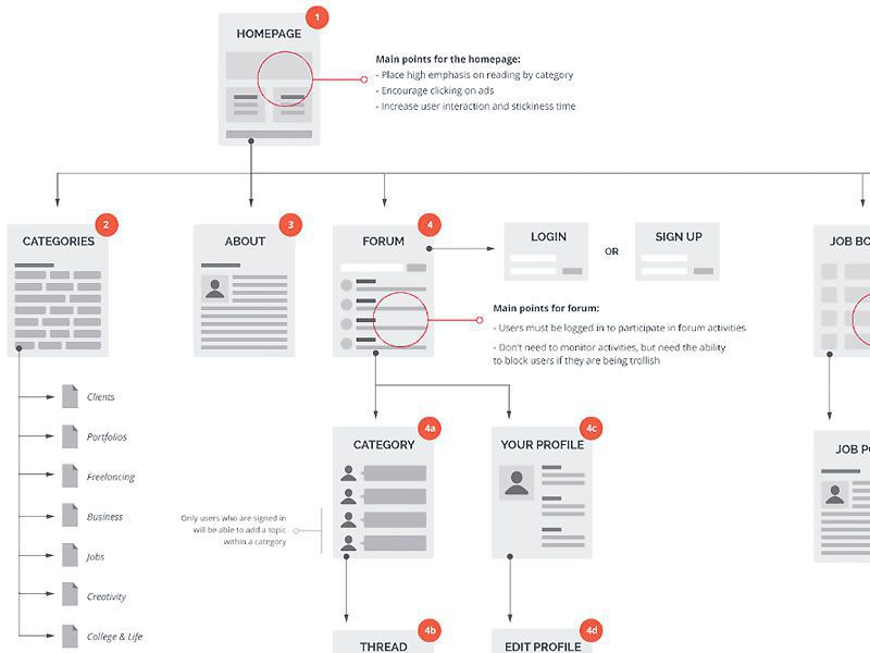
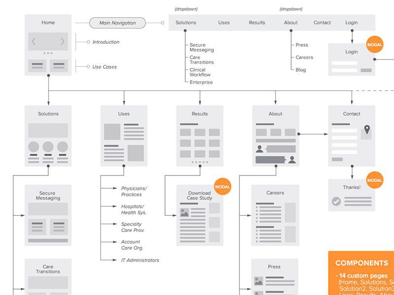
In order to gain inspiration for the sitemap, I viewed a few examples through Internet research to help myself understand how I could have structured my sitemap. This can be viewed below.
From this research, I understood that there was a hierarchy involved where the main aspects would have been placed at the top with the other aspects being placed in order of importance. I also understood that a brief overview was included to state what each section related to and that arrows were utilised to direct the flow of navigation.
The Collected Inspiration
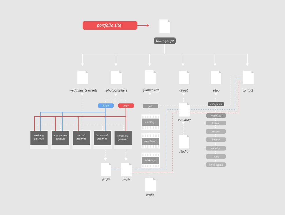
Inspiration Piece 1
Inspiration Piece 2
Inspiration Piece 3
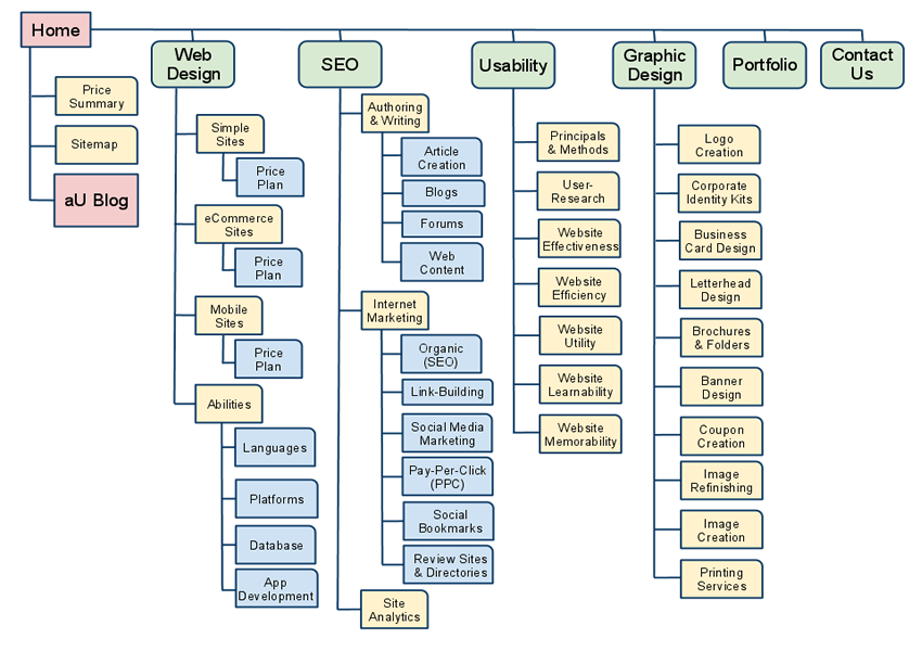
Inspiration Piece 4
The Final Created Sitemap
Overview
After viewing the examples shown previously, I then created the final sitemap for the website and this can be seen below.
The banner and footer sections applied to all pages which was therefore why these were linking to each page with the logo being able to link to the home page in the banner and the footer providing social media links as well as legal links (e.g. a privacy policy). I included the links that were situated on each page, including links to aspects such as social media and external websites. The text in red related to each page heading and for the shop and gallery pages, as the aim was to have filtering of images/shop items, this therefore meant that the blue text related to the outcomes of selecting a filter. The ‘Read More’ and ‘Buy’ buttons related to the options to select on each shop item and the ‘Images’ for the gallery page allowed users to select an image to view more information about it.
The Actual Sitemap
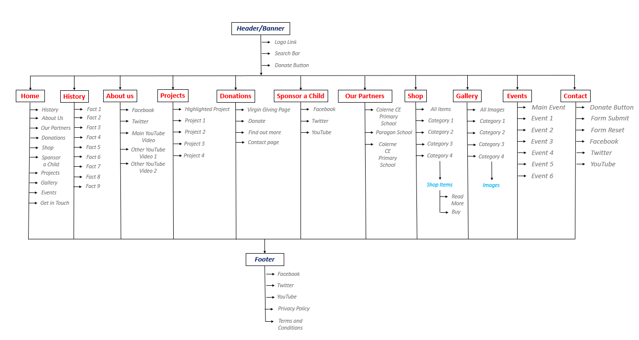
The Final Created Sitemap
The Flow Diagram
Inspiration
Overview
I utilised one of the aids I used in my second year for the ‘Whitchurch Silk Mill’ project as I believed this to be very helpful. I also viewed an example as well as viewing the flowcharts I created in my second year to help inspire myself, integrating some previously used aspects where relevant.
From this research, I realised that different shapes signified different actions within a flowchart and that arrows were utilised to display the journey of the process. Also, I understood that brief pieces of information were used to state each process clearly.
The Collected Inspiration
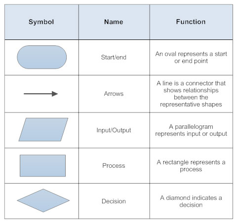
Inspiration Piece 1
Inspiration Piece 2
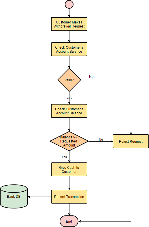
The Final Created Flow Diagram
Overview
After viewing the examples shown previously, I then created the final flowchart for the website and this can be seen below. Please note that the flowchart was basic due to time constraints, however, this still demonstrated a user journey throughout the website.
I included some initial actions with the user connecting to the Internet and opening a website browser to navigate to the home page of the website. A decision would have then been made because if the user had tapped or clicked a page link on the website, then questions would have been asked until the page selected was identified. Once the page had been identified, another decision was made to stop the process if the user didn't interact with or read the content on the page as this meant that they would have exited the website. This same process was undertaken if the user decided not to tap or click a page link. After the user would have read or interacted with the content on a page, a process of deciding if a user navigated to another page would have been undertaken, identifying the page again. The decision was then again made to stop the process if the user didn't interact with or read the content on that page. If the user did interactive with or read the content on that page, the process would have then repeated until the user had stopped these actions.
The Actual Flow Diagram
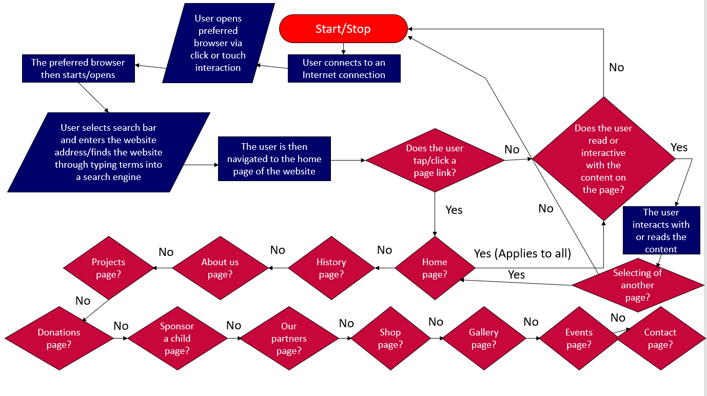
The Final Created Flow Diagram
Review of the Work Completed at this Stage
Overview
I believe that throughout undertaking the processes shown above, I had managed to understand different aspects of an individual website project and as stated previously, I had documented this in the form of a 'Word' document which had then been converted to 'PDF' format. The information in this document mostly represents that of the content above but also includes other areas which haven't been included on this web page. Some, if not all of these aspects have been mentioned above. To view this document, simply select the link provided below.
More Detailed DocumentThe Development and Programming Processes
The Different Stages Before Full Testing
Overview
Although some of the work shown above was either completed during or after the programming process of the website, the next stage after the majority of the tasks shown above had been completed was to begin developing the website through the use of programming languages. To view this process, please view the ‘PDF’ documents provided below.
The Documents to View
Development Document (Part 1)Development Document (Part 2)
Development Document (Part 3)
Development Document (Part 4)
The Testing Process
Overview
After progressing the website to its latter stages, I then decided to undertake testing, resolving some experienced issues and to show this process, I have included a document below which documents this. This has been included separately to the development document above but still acts as part of the development and programming process.
The Document to View
'CFENC' Website Testing DocumentThe Result of the Semester
Overview
As would have been seen above for this project, I undertook many different processes to help myself produce the best possible outcome. The final outcome of the website at the end of my first semester of my third year can be viewed below, either on this page or alternatively through an external link. Please note that I was currently waiting to receive content to place onto the website but I decided that this was to be completed at a later date when having received the content from the clients. Overall, I was pleased with the outcome and when undertaking the building process of the website, I received some feedback from the clients who were also very pleased. This feedback can also be seen below. Please note that due to the fact that the contact form on the website wasn't high in security, I therefore decided to disable this for the final outcome. However, to compensate for this, I have included a video also below to show this functioning. To conclude, I believe this project had been successful at this stage and I was proud of the outcome.
The Feedback from the Clients
WOW!!! Thanks so much for sending through the website to date. It's fabulous, we are so impressed with what you have done for us and very much like it. It's also very useful for me now, to have the pages to associate the photos with. Please bear with us as the next couple of weeks are really busy, but we will get back to you as soon as we can. Again, a massive thank you to you - amazing.
- Lisa & Peter
Refining the Website and Adding Content
Overview
During the summer, I continued to refine the website in preparation for inserting content that was to be provided to myself.
Unfortunately, at this stage I haven't received the content which means the improvements/refinements can't be viewed below. However, the final outcome from the semester is displayed in the final outcome section of this page.
Once the content is supplied and the website is finished with the content, this will be displayed on this page.