Brief
"To produce a website application utilising new technologies that allows fans of 'Manchester United' to view 'Manchester United' players with their statistics and to be able to compare these statistics with either other players or by matchday (relating to the 'Premier League')"
Overview
The main purpose of this project was to help myself explore new technologies through a selected topic area. This was to accompany the website that I was creating for 'Home Sweet Home Front' and to help show different projects for my second semester of my third and final year at the 'University of Winchester'. Before choosing the final brief idea shown above, I considered multiple different project types to help myself understand which type of project would have benefitted myself the best. Due to the fact that this project’s sole purpose was to explore new technologies, this therefore meant that I focused less on other aspects, such as design, in order to help myself explore these technologies as best as I could have. I undertook two main roles, one being a designer in thinking of how the project could have appeared aesthetically and the other being a developer, allowing for the application to function fully.
All of the processes for this project will be viewable on this page.
For a document version of processes not relating to the development and programming stage, I have included a link to a document situated at the bottom of this page.
Brainstorming Initial Project Ideas
Overview
As explained before, I first of all brainstormed initial ideas to help myself understand which project would have been the best in terms of outcome and scope. Before doing this, I first of all viewed current technologies/programming languages on ‘Indeed’ in the area of ‘front-end’ website development, brainstorming these into a mind map. This was because this was something suggested by the lecturer and something that would have helped myself in understanding which areas to explore. The reason why ‘front-end’ was viewed was because this was an area of industry that I wanted to enter after finishing university.
After brainstorming the current technologies, I then brainstormed project ideas relating to different topic areas. As will be evident below, I brainstormed various areas such as a single page application and a game on a web page or miniature website. Whilst brainstorming these ideas, I viewed inspiration on 'CodePen', something also suggested by the lecturer, which would have helped to inspire myself. The ideas which appealed to myself the most were indicated with a blue star/asterisk. These were the ideas that I thought might have been the most feasible/achievable in the time scale as well as the ones which I thought were the most interesting.
Both mind maps are viewable below.
The Mind Maps
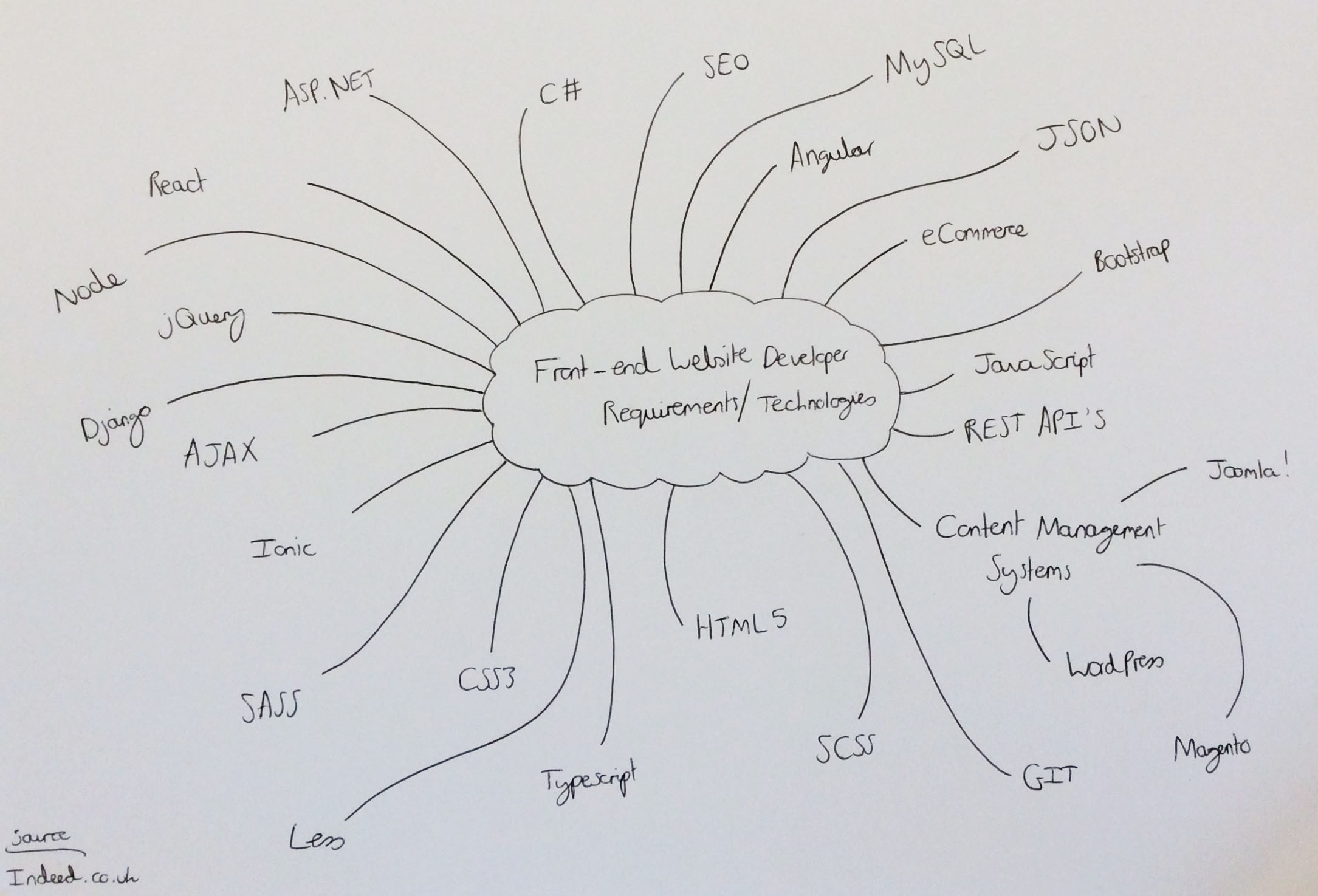
Brainstorming Required Technologies
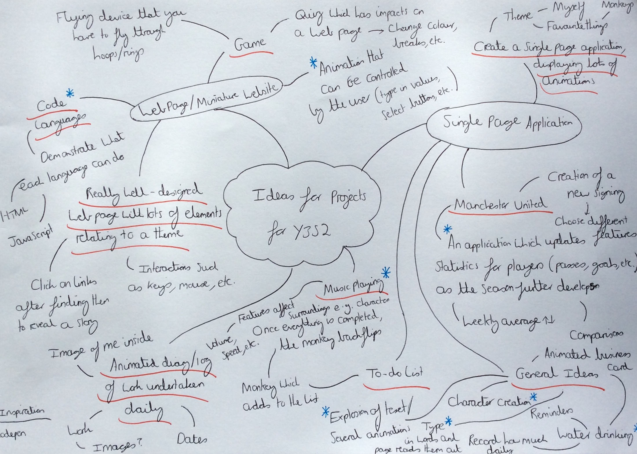
Brainstorming Project Ideas
Specifying Project Ideas Further
Overview
After specifying the ideas to those with the blue stars/asterisks, I then undertook this process again, specifying the ideas to four. The first was the 'Manchester United' football season website application idea. The second was the water drinking website application which would have reminded users to drink water and have allowed them to record how much they would have drunk daily. The third was the creation of a character website application which would have allowed users to change certain aspects such as hair colour and eye colour. Finally, the fourth was the animations of typed text into a website application/web page.
The reasons for specifying the ideas to the four explained above was because of the fact that I supported 'Manchester United' and would have been able to fully understand which content to place into the application as well as something I would have had more passion for. With regards to the second idea, this was listed due to the fact that this would have been an area I would have found useful as I didn’t drink a sufficient amount of water daily and making this application would have helped to remind myself to drink water as well as anyone else that didn’t drink sufficient water. The last two were listed due to the fact that these were areas I knew had been achieved by other people in the past as well as areas which I thought were interactive and interesting. The inspiration for the last two ideas on 'CodePen' can be viewed below.
Inspiration for the Last Two Ideas Explained Above
The Inspiration for the Third Idea
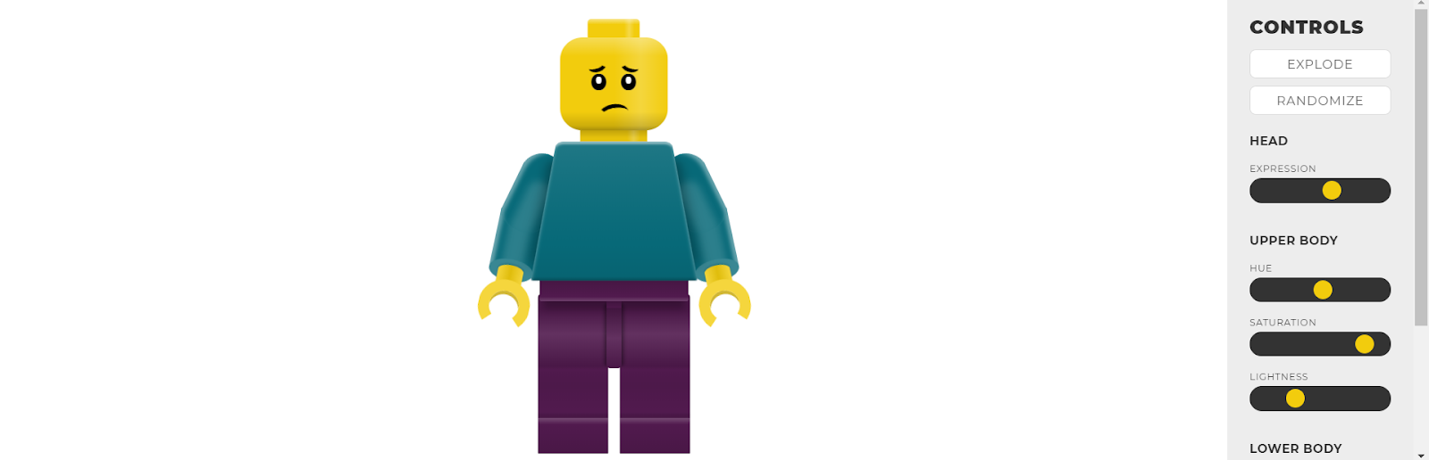
Before Changing the Options of the Character
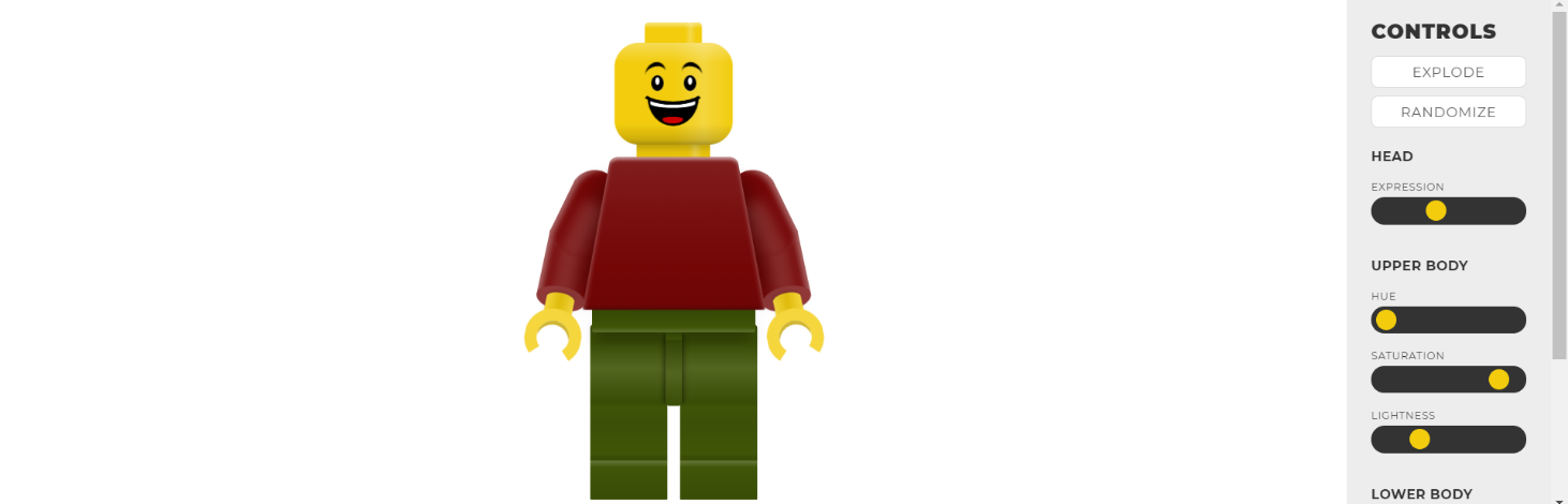
After Changing the Options of the Character
The Inspiration for the Fourth Idea

Before Interacting with the Mouse on the Web Page
After Interacting with the Mouse on the Web Page
Choosing the Final Project Idea
Overview
After having listed the four options displayed previously, I then decided to choose the final idea of the 'Manchester' United player statistics website application. The reason for choosing this was because I believed this area to have the most potential compared to the other ideas as well as an area which could have implemented ‘back-end’ functionality, an area I wasn’t as confident with and wanted to improve.
The original purpose of this idea was to allow fans of 'Manchester United' to view player statistics either for the whole football season or based on weekly matches with both green and red arrows displaying whether players would have performed better in one week than another week, for example. The original idea involved allowing the user to be able to compare one player with another player and to be able to search for players either through an entered search or a search created by selecting certain filters. As the idea had now been chosen, this allowed for continuous progress to be made.
Planning Methods of the Project
Overview
One key area to undertake regarded creating documents to help myself organise the project and assist with time management. Two documents were created, one being a task table and the other being a Gantt chart. Both are viewable below.
The Task Table
Overview
A task table was created to help allocate specific hours to tasks as well as to help myself understand whether a particular task had been completed, either through the 'Progress of the Task' or 'Has the Task been Completed?' columns. Furthermore, consequences of not completing tasks as well as identified risks and how to overcome these were included to also help myself counteract against any issues which would have occurred during the project. The tasks listed related to various areas such as target audience and creating wireframes but ultimately this would have acted as a tool for analysing progress of the project.
The Actual Task Table
The Gantt Chart
Overview
A Gantt chart helped to display a more visual timeline of the project, allocating weeks instead of specific hours to understand what aspects to progress with in certain weeks. As will be evident below, there were continuous processes planned such as documentation and maintenance of a work log. This was because these would have been added to throughout the semester and could have not been completed within a specific allocated period.
Furthermore, regarding the development process, this was divided into further tasks not displayed on the task table. This was regarding the 'front-end' and 'back-end' development with the 'front-end' planning to have been completed first to have then allowed for further focus on the 'back-end', an aspect I had little knowledge of and therefore needed to invest more time within.
The majority of the main processes were planned to be completed approximately at least a week before the submission deadline to allow for refinements and enough time to submit the final project. One final aspect to note is that the processes suited more to design were planned to have been completed first to then have allowed for more understanding of how the final website application would have appeared, creating a professional and user-friendly outcome.
The Actual Gantt Chart
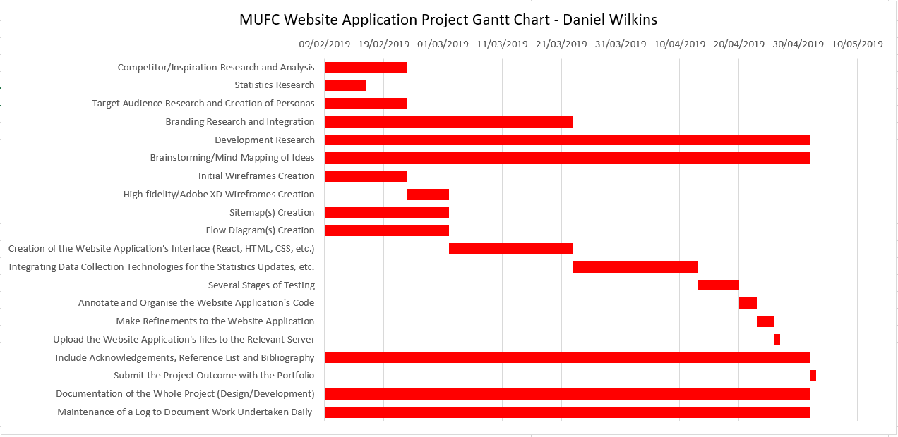
The Created Gantt Chart for the Project
Branding Research
Overview
The purpose of this process was to help myself fully understand which fonts and colours to utilise in the 'Manchester United' website application to make it personalised to the team and fans.
Colours
Analysing the Current Utilised Colours by 'Manchester United'
Overview
In order to understand the colours utilised for 'Manchester United', I therefore analysed different areas, utilising a colour picker tool in 'Adobe After Effects' as well as 'DevTools' on 'Google Chrome' to highlight the 'HEX' values of each. After this, I then noted down all the collected 'HEX' values in preparation for creating colour palettes. This process can be viewed below.
Utilising the Colour Picker Tool in 'Adobe After Effects'
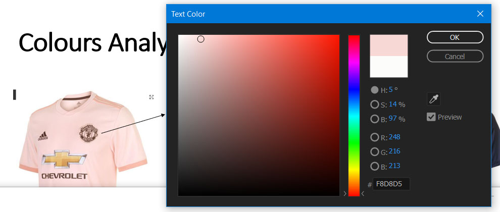
Identifying the Colours with 'Adobe After Effects' - Example 1
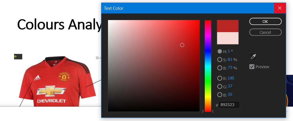
Identifying the Colours with 'Adobe After Effects' - Example 2
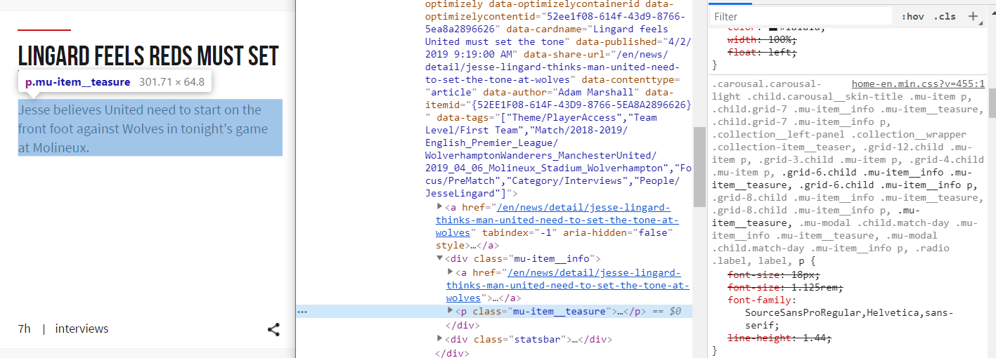
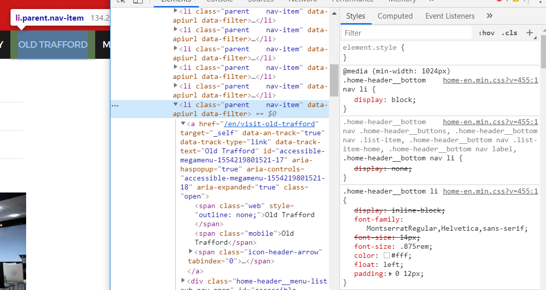
Utilising the 'DevTools' in 'Google Chrome'
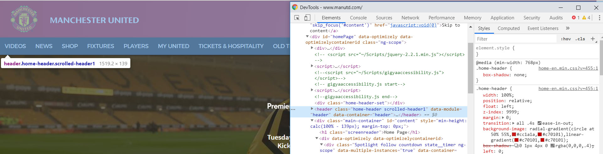
Identifying the Colours with 'DevTools' - Example 1
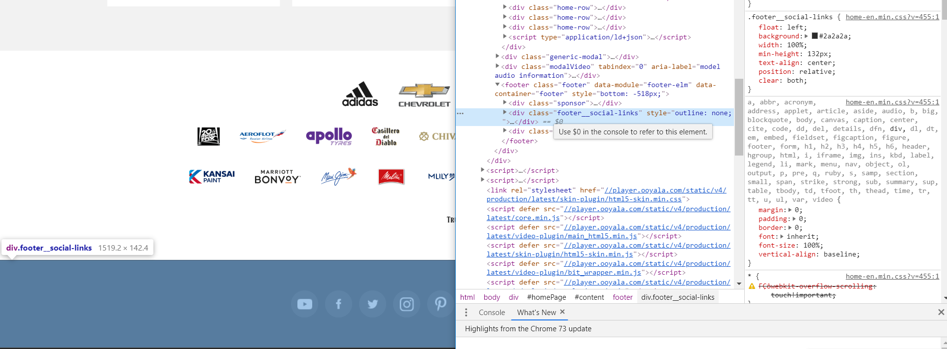
Identifying the Colours with 'DevTools' - Example 2
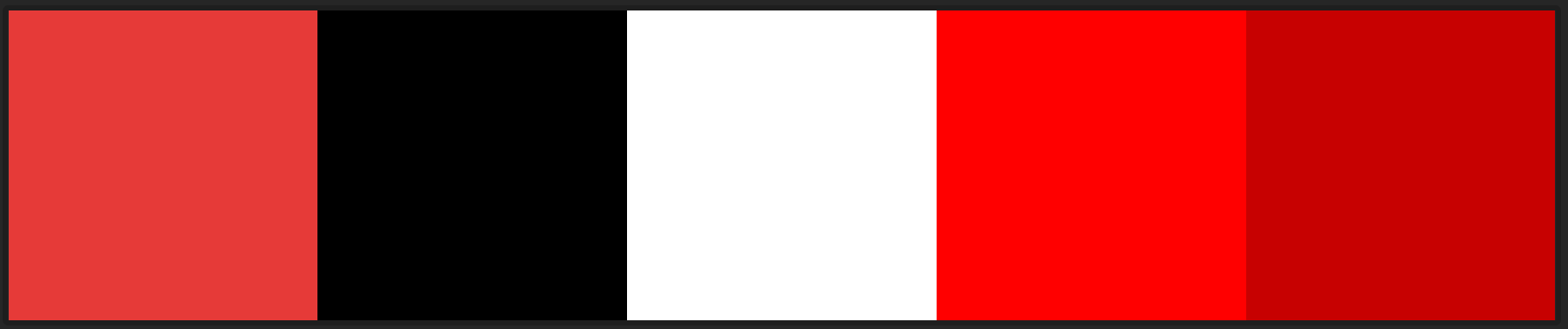
Listing the Colours Utilised
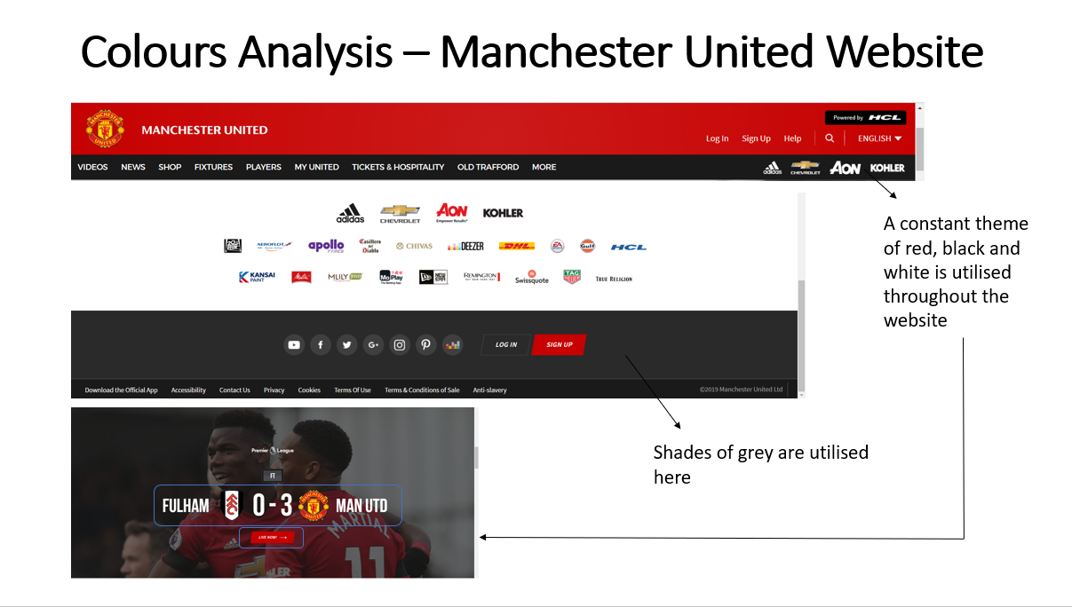
Listing the Colours Utilised on the Website
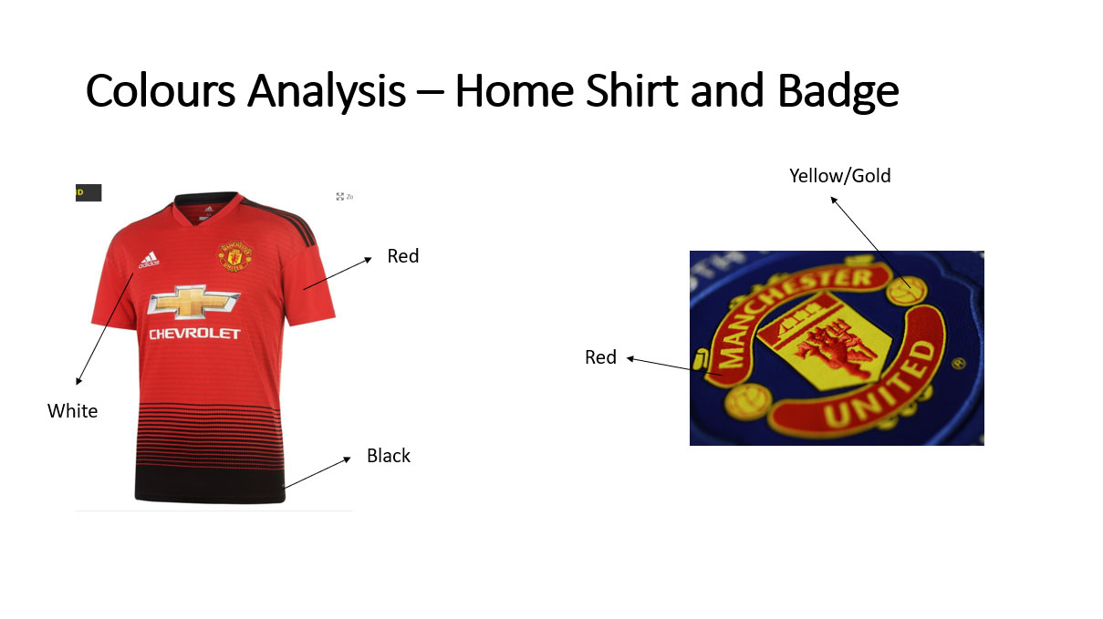
Listing the Colours Utilised on the Home Shirt and Badge
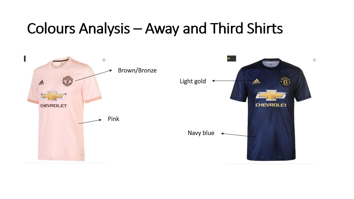
Listing the Colours Utilised on the Away and Third Shirts
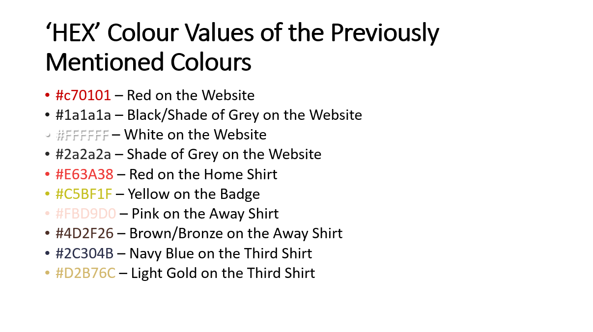
Listing the 'HEX' Values of the Colours Utilised
Creating the Final Colour Palettes
Overview
After having undertaken the previous processes, I then decided to produce seven colour palettes to help explore different approaches and to provide more choice when selecting the colours to use in the website application. These colour palettes included colours highlighted before as well as more vibrant colours of those highlighted before. This was because I thought that some colours were potentially uninteresting/unenthusiastic and that integrating vibrant colours would have helped to create more energy. These colour palettes can be viewed below.
The Actual Colour Palettes
Colour Palette 1

Colour Palette 2

Colour Palette 3
Colour Palette 4

Colour Palette 5

Colour Palette 6
Colour Palette 7
The colour palette chosen by myself was the first as this was the most vibrant and would have caused for an exciting final outcome. However, I did decide that I would have considered using some colours from other colour palettes as some of these would have helped to reflect 'Manchester United' better. This related to the darker reds.
Fonts
Analysing the Current Utilised Fonts by 'Manchester United'
Overview
Similar to the colours, I also analysed the fonts utilised by 'Manchester United', viewing their website to complete this task. This was achieved through using the 'DevTools' on 'Google Chrome' and after I had finished, I listed the fonts as I did with the colours shown before. This process can be viewed below.
From viewing the fonts on the official website of 'Manchester United', I understood that different font-weights and fonts were utilised to signify different elements of the website. This was evident with the title 'SHAW IS YOUR PLAYER OF THE MONTH' and the paired paragraph font, with the title being bolder and capitalised and the paragraph font being lighter, displaying a hierarchy of information.
Utilising 'DevTools' to Identify Fonts
Identifying the Fonts Utilised with 'DevTools' - Example 1
Identifying the Fonts Utilised with 'DevTools' - Example 2
Listing the Fonts Utilised
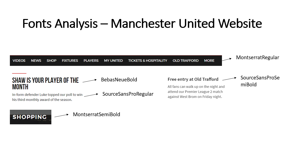
Listing the Fonts Utilised on the Website
Undertaking Fonts Research
Overview
In addition to the previous task, I also viewed a website regarding fonts utilised in sports, helping myself to understand and identify key features of these fonts. This can be viewed below.
From undertaking this research, I fully understood that mostly ‘Serif’ fonts were utilised with also boldness/thickness being applied. Furthermore, it was also understood that modern appearing fonts were utilised. These were therefore areas to consider when specifying some fonts to utilise in the website application at a later stage.
The Collected Research
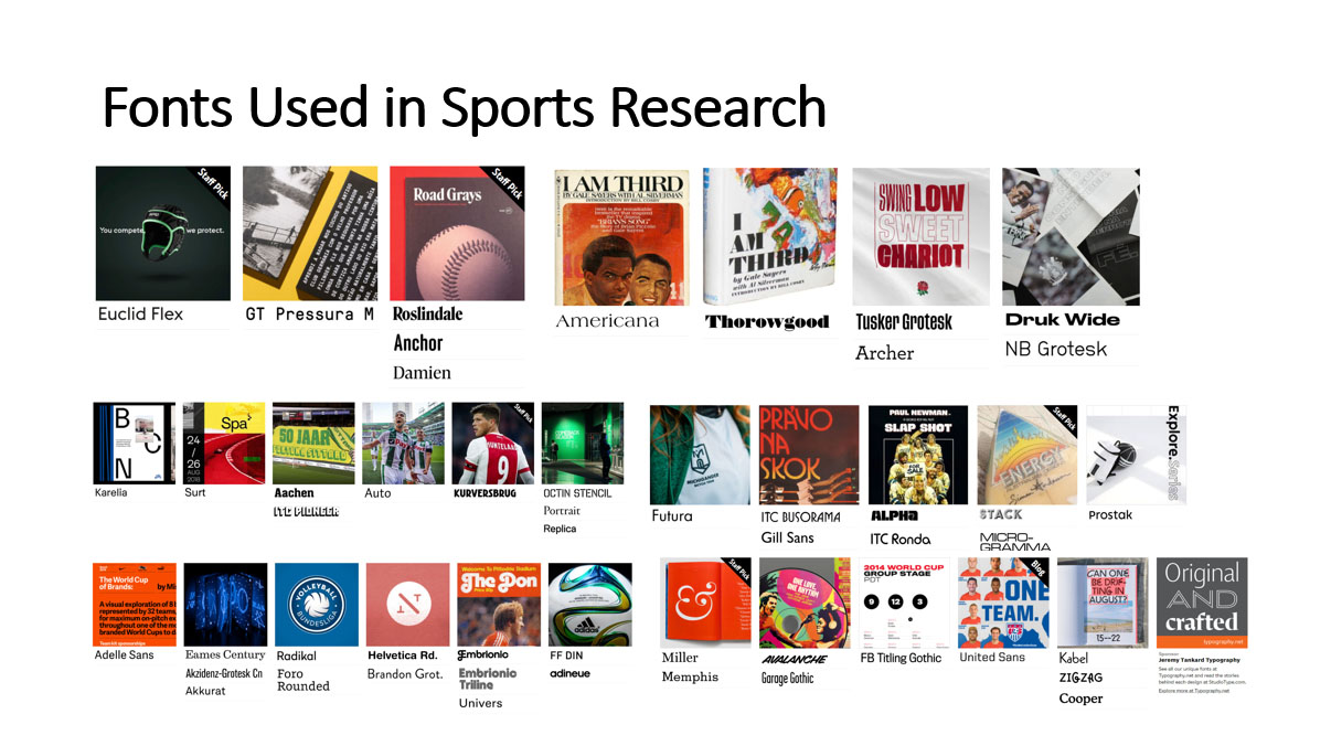
Fonts Research Collected
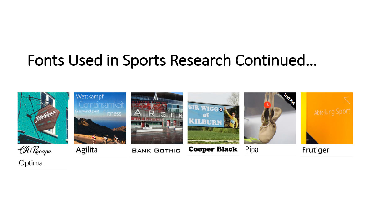
Fonts Research Collected Continued
Highlighting Fonts to Utilise
Listing the Heading Fonts to Potentially Utilise
Overview
After gaining a full understanding of the types of fonts used in sport, I then decided to shortlist fonts both within 'PowerPoint' and within 'Google Fonts' that appeared similar to the previously discovered research. These were fonts that were bold and that were 'Serif' fonts. This was relating to heading fonts to be used with paragraph fonts to be chosen at a later date. This process can be viewed below.
The Actual Listed Heading Fonts
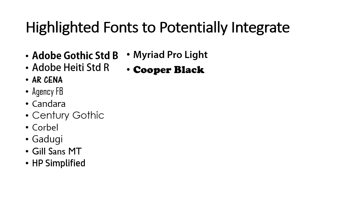
Highlighted Heading Fonts to Potentially Utilise
Highlighted Heading Fonts to Potentially Utilise Continued
Listing Paired Fonts to Potentially Utilise
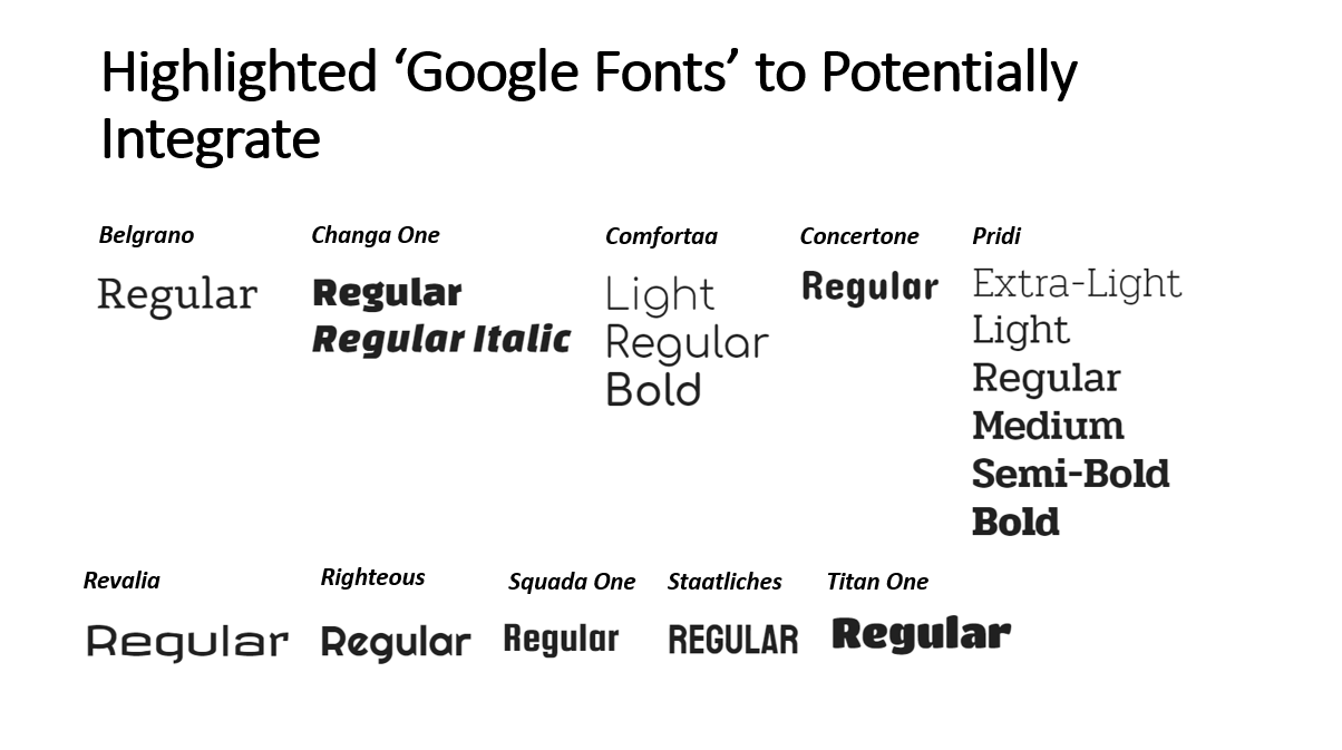
Overview
After completing the previous process, I then utilised 'Google Fonts' to list the suggested pairings to be paired with each of the highlighted 'Google Fonts'. This was because I would have been selecting 'Google Fonts' to be placed within the final outcome due to the fact that I would have been able to select a suggested pairing, providing better fonts than if I were to choose these myself. I also believed the fonts on 'Google Fonts' to be more unique which would have therefore helped to distinguish the website application from other similar products. This process can be viewed below.
The Actual Listed Paired Fonts
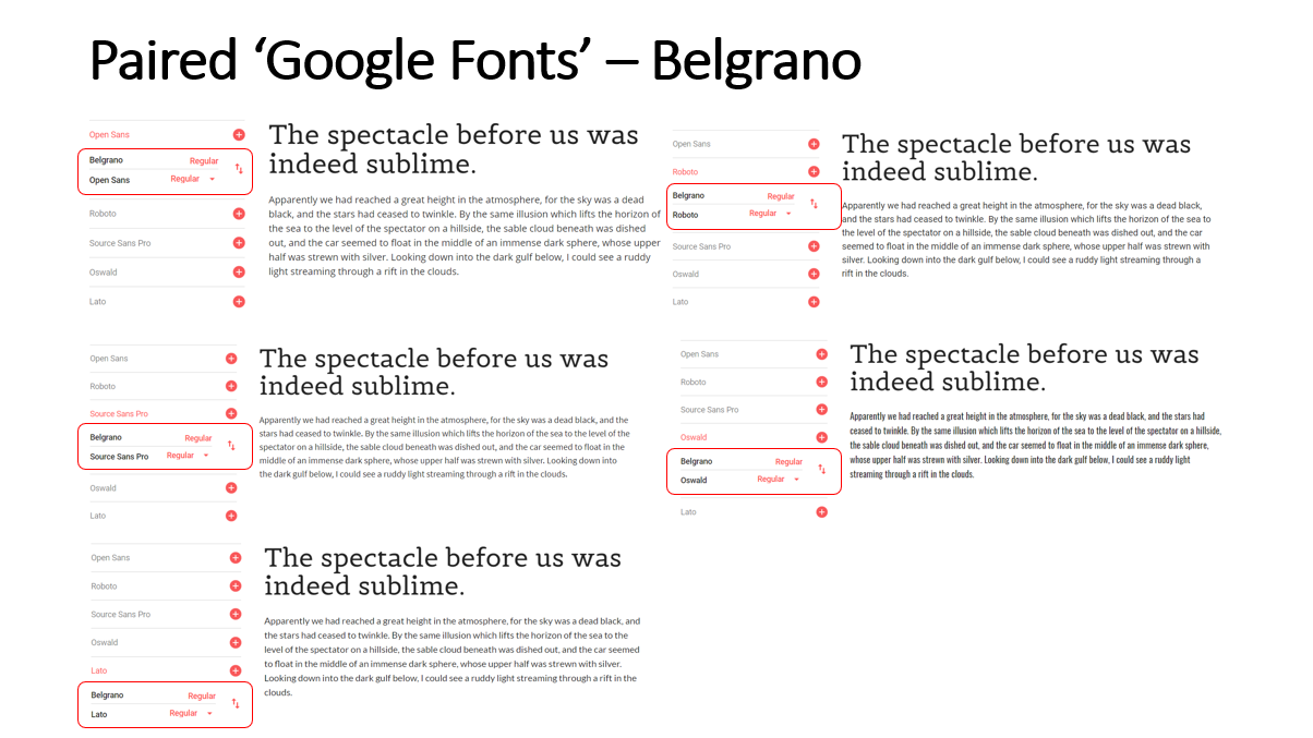
Highlighted Paired Fonts for the 'Belgrano' Font
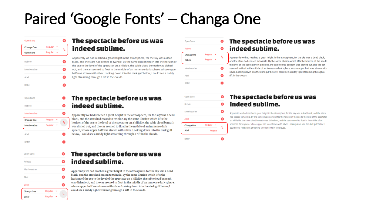
Highlighted Paired Fonts for the 'Changa One' Font
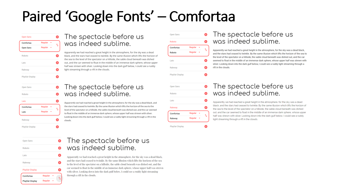
Highlighted Paired Fonts for the 'Comfortaa' Font
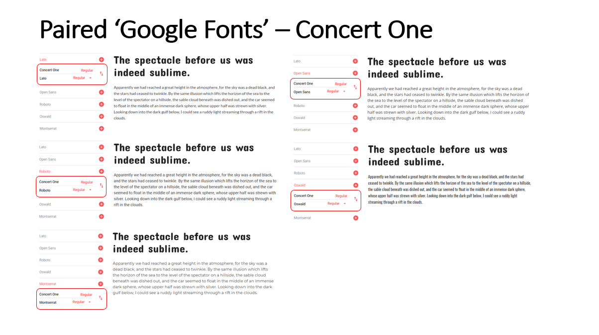
Highlighted Paired Fonts for the 'Concert One' Font
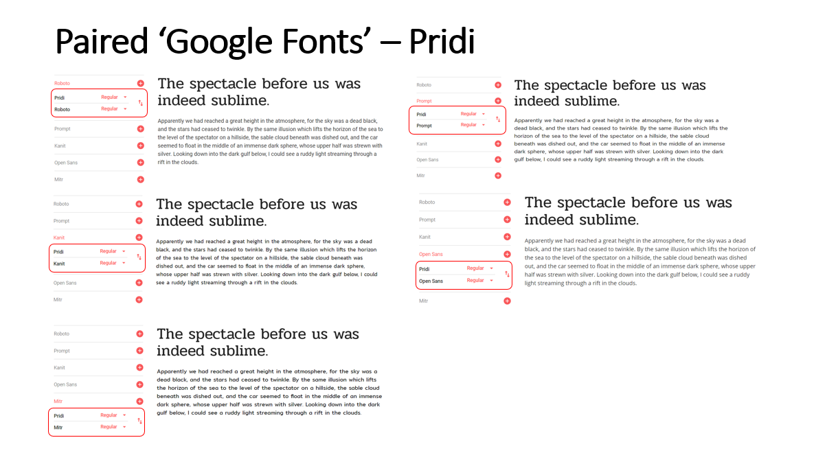
Highlighted Paired Fonts for the 'Pridi' Font
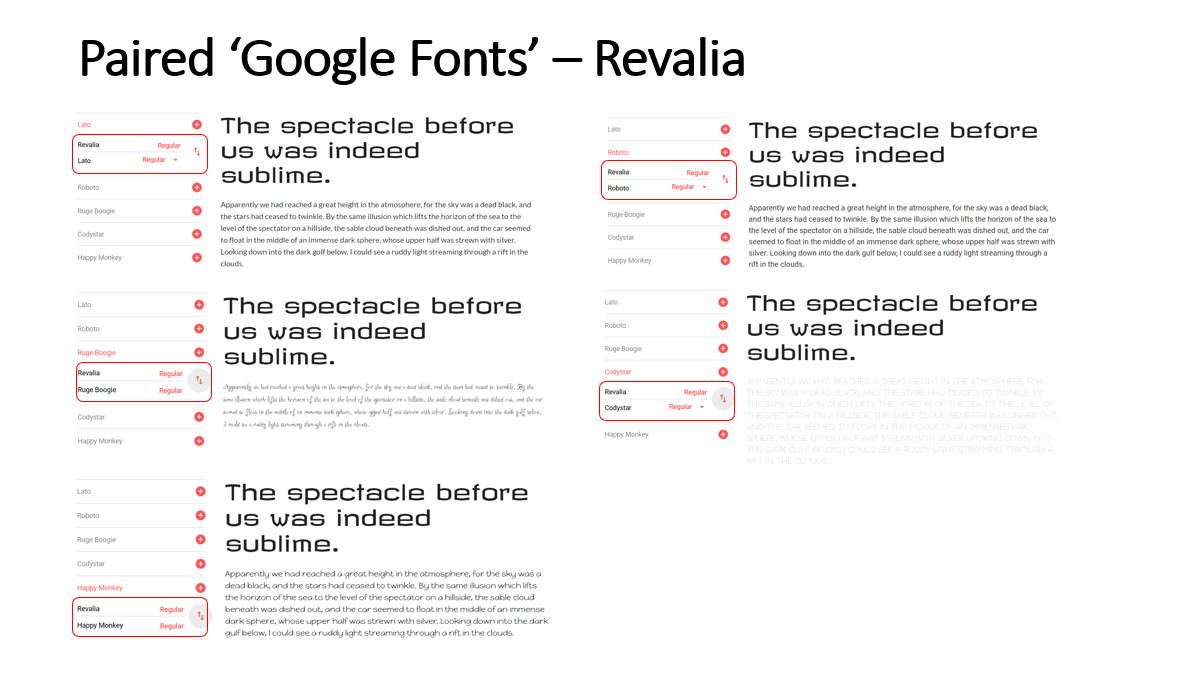
Highlighted Paired Fonts for the 'Revalia' Font
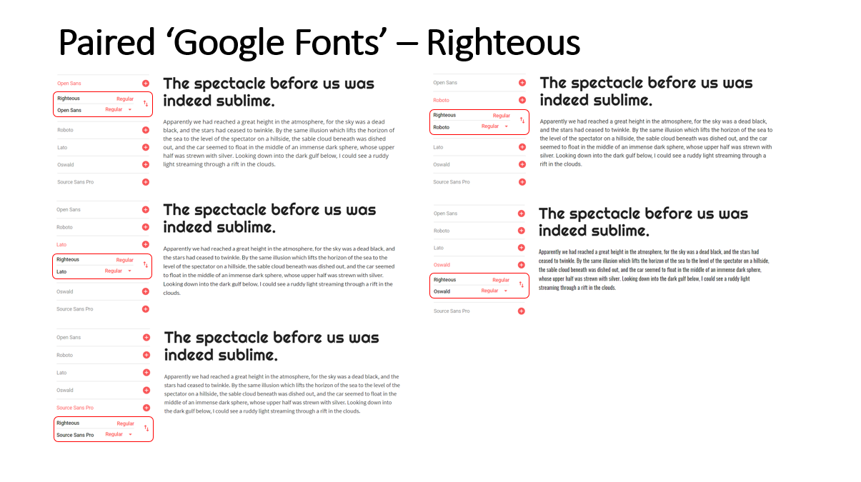
Highlighted Paired Fonts for the 'Righteous' Font
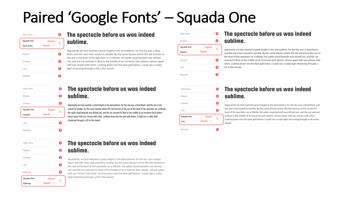
Highlighted Paired Fonts for the 'Squada One' Font
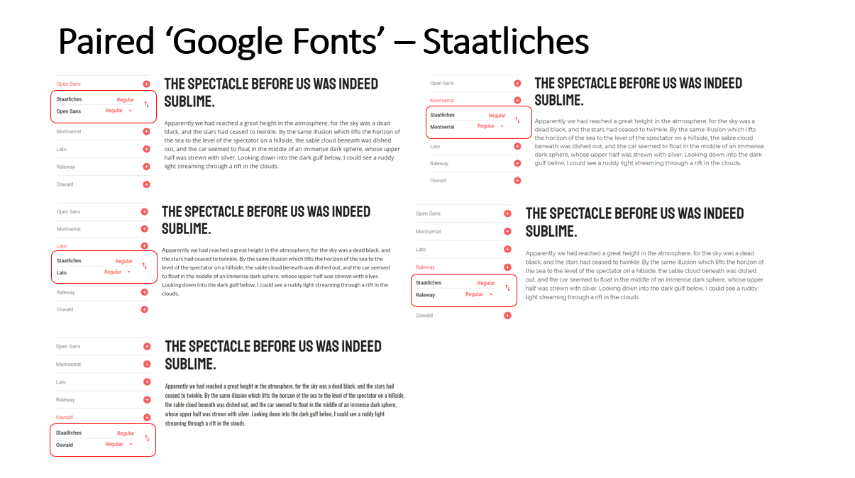
Highlighted Paired Fonts for the 'Staatliches' Font
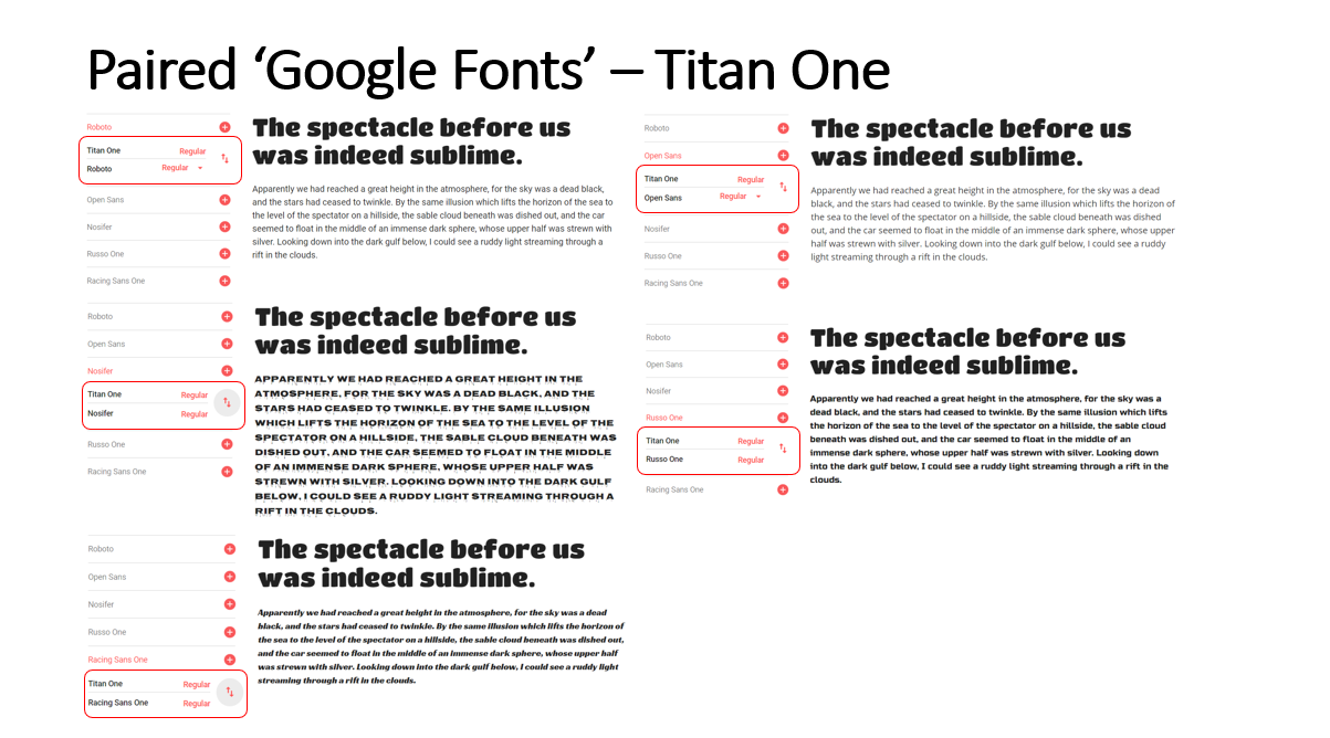
Highlighted Paired Fonts for the 'Titan One' Font
After having completed the previous task, I then decided to choose the 'Google Font' called 'Comfortaa' for the headings font due to the fact that this was the font that appeared to be the most modern as well as the one which appeared to be the most professional. With regards to choosing the paired font to be used for the paragraphs/areas not requiring headings, I decided to choose 'Roboto' as this was the font that appeared to be the boldest, relating to the research discovered of sports fonts being bold in font-weight.
Inspiration Research
Overview
In order to understand the statistics to include within my project, I therefore needed to view existing products that were similar to my project idea. Whilst undertaking this task, I also listed the advantages and disadvantages of each existing product. This would have helped myself to understand which features would have been beneficial to integrate as well as those that would have needed to have been discounted. This process can be viewed either below or through the provided link.
From this inspiration research, I understood that detailed statistics were included with the ability to allow the user to select filters to categorise the provided information. This would have allowed the user to find the information they required more easily. Furthermore, I also understood that player profiles were included to help provide a context to certain players. With regards to player comparisons, I knew that utilising colours to highlight those performing the best in certain areas would have acted as a visual aid to users.
With regards to the application I would have been building, I therefore understood that I needed to integrate these aspects to make it interesting and informative to users. One final aspect to note is that I obtained knowledge that including interactive elements as well as an exciting appearance would have helped to make the application more interesting also.
The Inspiration Document
Target Audience Research
Initial Stages
Overview
Another key area to undertake before creating aspects such as wireframes was to understand the target audience for the 'Manchester United' website application. To begin, I listed a few target audience examples from my judgement. These were 'Manchester United' fans, football fans in general as the website application could have been extended to include other teams and players, and those interested in sport.
The main target audience area would have been 'Manchester United' fans as the website application would have revolved around the topic of 'Manchester United'. Furthermore, if having been able to expand the application to include other teams, this would therefore have influenced the audience as supporters of the included teams would have needed to have been considered also. The final area I considered was those interested in sport due to the fact that football was a type of sport and could have therefore attracted anyone who had an enthusiasm for any type of sport or anyone who was interested to learn more about a particular sport.
Collecting Research
Overview
After listing my initial ideas for target audiences, I then undertook target audience research regarding different areas relating to that shown previously including demographic research regarding supporters for different teams. This was to understand the scope of those that the application could have been marketed to. This can be viewed below.
Collecting Supporter/Attendance Statistics
Overview
The key aspect to note with the first chart below is that the attendance would have been affected by the capacity of the football stadiums of which 'Manchester United' had one of the highest capacities. However, this demonstrated that 'Manchester United' were the most popular supported club in the 'Premier League'. This also demonstrated that the other best performing clubs such as 'Arsenal' and 'Liverpool' were also highly supported with these being placed in the top 8. One final aspect to note is that this demonstrated that there was a high support for football teams in the 'Premier League'.
Likewise, the second chart below demonstrated that 'Manchester United' was the most supported 'Premier League' club but this time through social media. Furthermore, this also demonstrated that the other most supported clubs were those that were the other most successful clubs in the 'Premier League' such as 'Liverpool'. This demonstrated that particular clubs had a very large following on social media.
Regarding the charts relating to the following on different social media platforms, it was understood that again, 'Manchester United' were the most popular but that also some smaller teams were also well supported such as 'Newcastle United' and that sometimes the smaller teams would have had a higher following on a certain platform than the bigger teams. This was evident with 'Newcastle United' having a higher 'Instagram' following than 'Manchester City'.
The Actual Charts
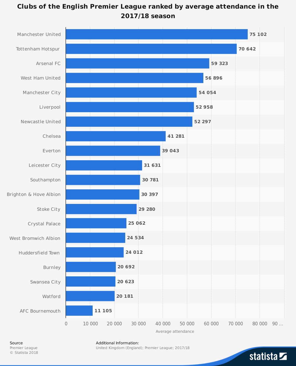
'Statista' Research - Clubs of the English 'Premier League' Ranked by Average Attendance in the 2017/18 Season
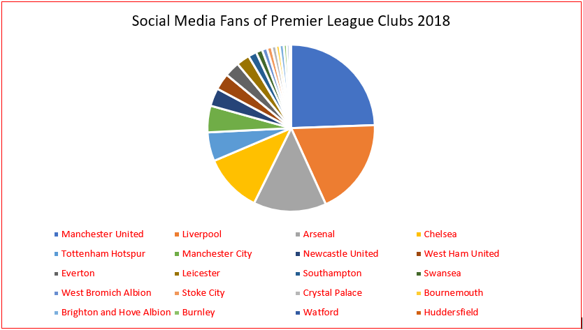
Social Media Fans of each 'Premier League' Club in 2018
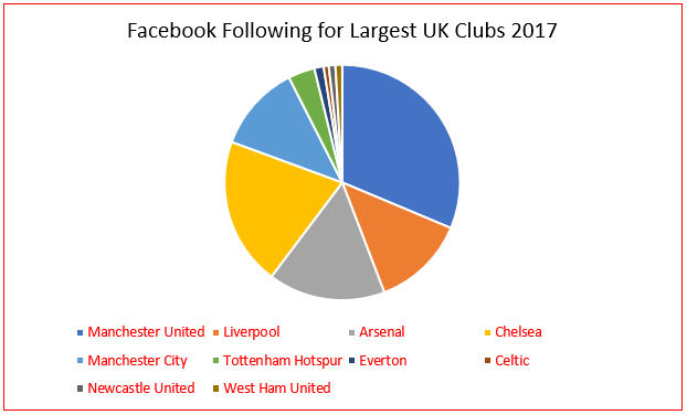
Followers on 'Facebook' for the Largest UK Clubs in 2017
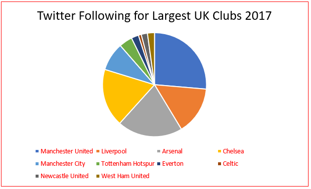
Followers on 'Twitter' for the Largest UK Clubs in 2017
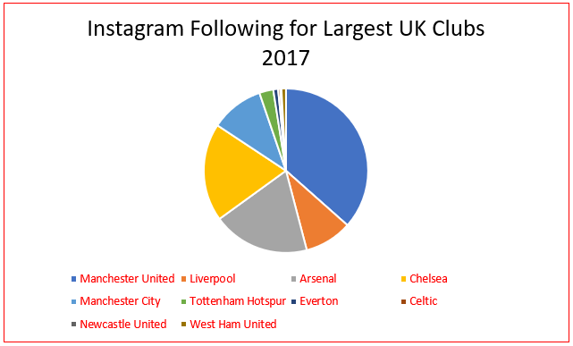
Followers on 'Instagram' for the Largest UK Clubs in 2017
Collecting 'Manchester United' Supporter Demographics
Overview
I discovered that the age demographic for 'Manchester United' supporters had potentially changed from those much older being the majority to those that were younger. It was also discovered that a range of different ages were included for 'Manchester United' supporters, indicating that the target audience would therefore have had to relate to anyone of any age who supported 'Manchester United', emphasising the need for an easy to use website application.
With regards to the gender for 'Manchester United' supporters, I was able to discover that this was very equal with 31% being women and 30% being men. This therefore suggested that, again, there was more than one key area to focus on with regards to the target audience for the 'Manchester United' website application.
The Actual Charts
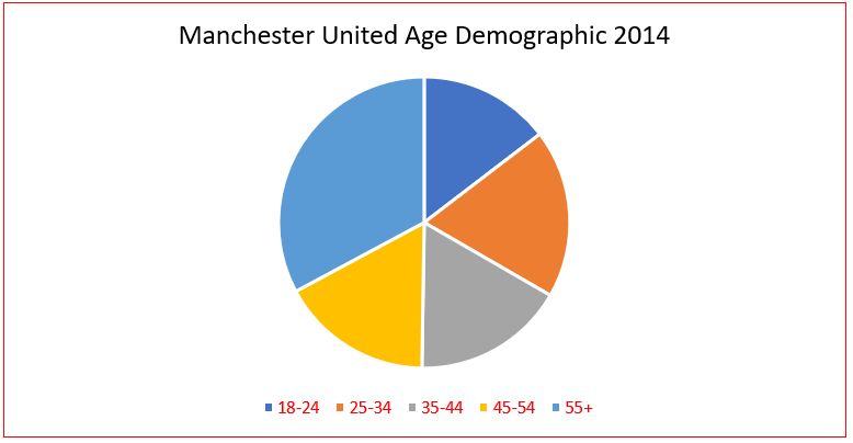
'Manchester United' Age Demographic 2014
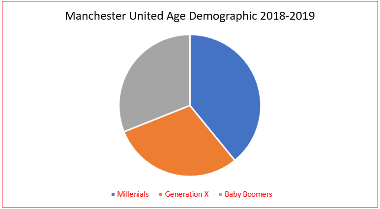
'Manchester United' Age Demographic 2018-19
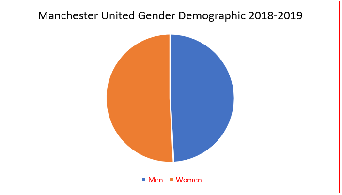
'Manchester United' Gender Demographic 2018-19
Collecting General Supporter Demographics
Overview
From collecting the graph displayed below, I understood that there were more male supporters than female supporters of football in the United Kingdom, emphasising that therefore the website application would have needed to cater more for those that were male. This also contradicted the research found for the gender of 'Manchester United' supporters. However, this also emphasised the need to be able to create a website application which would have appealed to multiple audiences in order to gain the most users.
Although the research relating to age below related to the 2014/15 season, this helped myself to understand that the quantity of younger supporters was increasing, emphasising the need for a simple and exciting website application to engage younger audiences as well as making this highly interactive to increase interest amongst those that were slightly older (18-34 years).
The Actual Research
Age Demographic Research 2014/15
- There was an increase from 57,370 to 58,168 season ticket sales for children
- During the last 10 years, there has been an increase of 26% regarding junior season ticket sales
- Those attending of the ages between 18 and 34 years increased by 40%
- The average age of a fan attending games has decreased to 41 years
- 25% of the adult population supported a team in the 'Premier League' and 31% followed the league
Distribution of Football Fans Chart
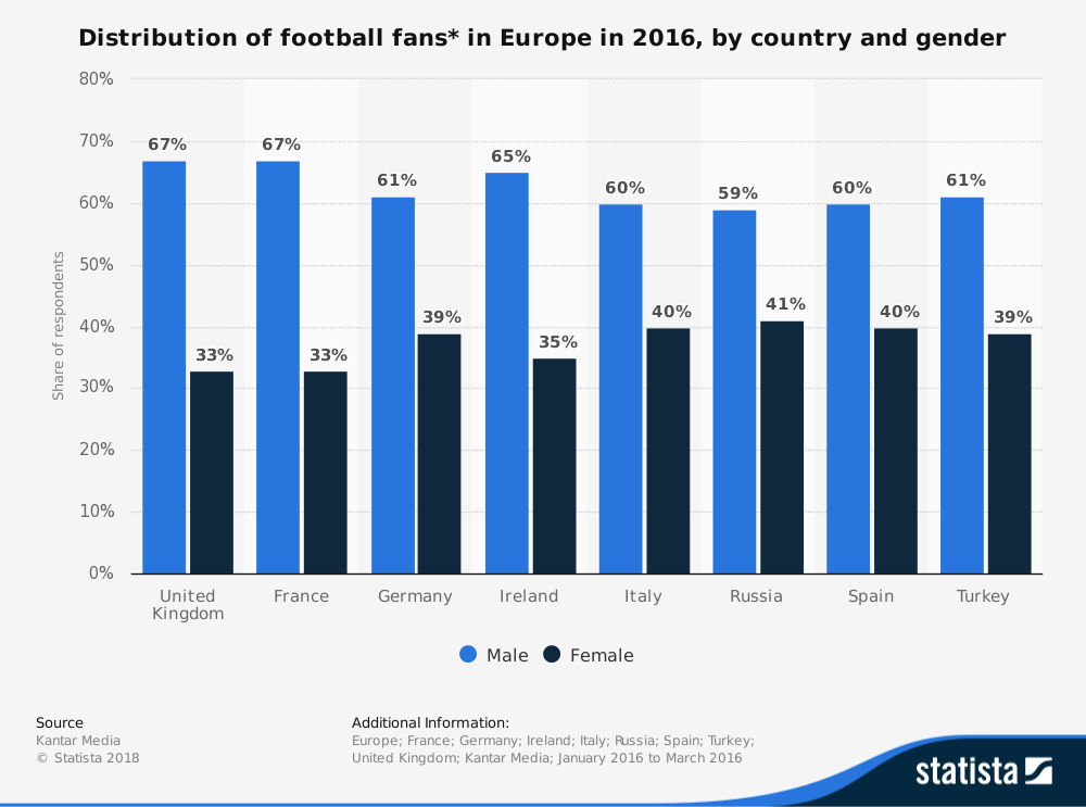
'Statista' Research - Distribution of Football Fans in Europe in 2016, by Country and Gender
Demographics Relating to those Interested Sport
Overview
The first graph below helped myself to understand that sport was an area of interest to people, emphasised through the various types of sporting activities undertaken. Most of this related to fitness and due to the fact that participation was of a high level, this therefore indicated that there may have been a high level of interest in sport, especially football, within England.
Likewise, the second graph also displayed a high interest in sport through the high percentage of those that met the aerobic guidelines, with a fairly equal divide between those male and female. This again suggested that there may have been a high interest in sport in general with a higher chance of becoming interested in football.
The final graph related to participation by age group. This helped myself to obtain a knowledge that as age increased, the higher the percentage would have been of those participating in sport less than once a week. Also, as the age decreased, the participation in sport three times or more a week would have increased. This demonstrated that the target audience would have been of a younger age. This helped to emphasise again that the demographic of the website application I would have been creating would have been one that needed to suit all ages.
The Actual Charts
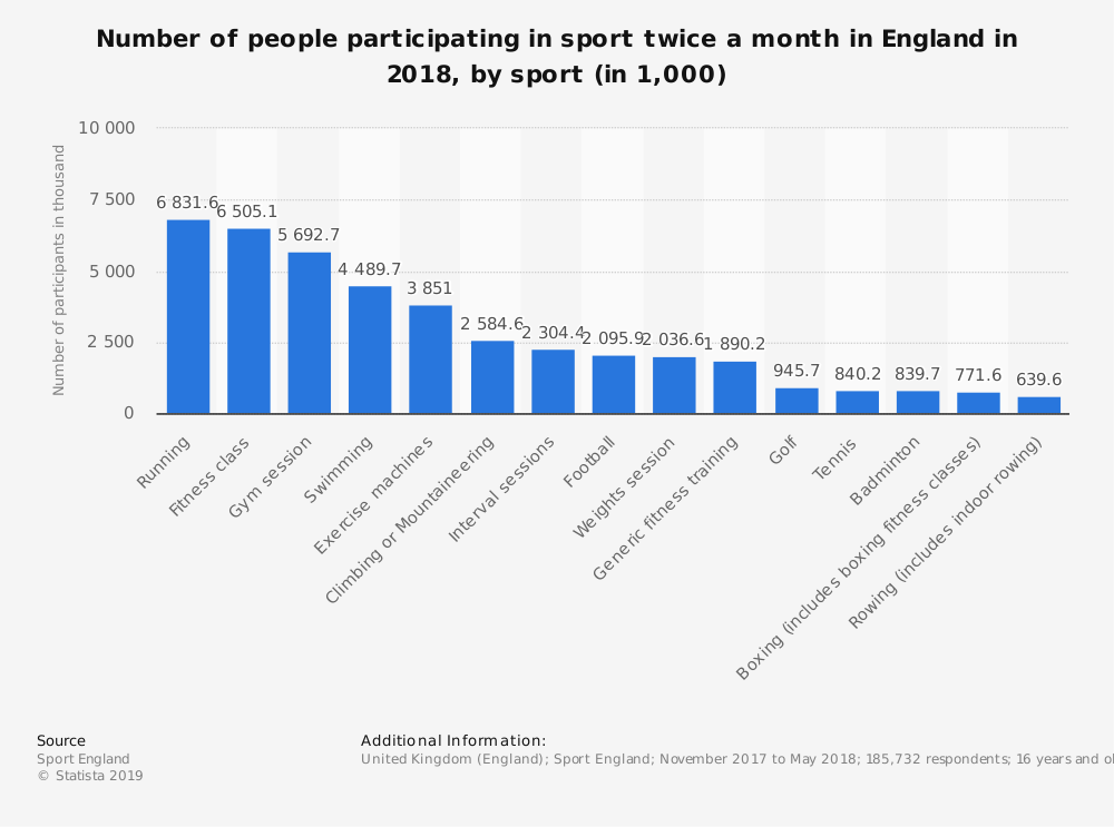
'Statista' Research - Number of People Participating in Sport Twice a Month in England in 2018, by Sport (1000)
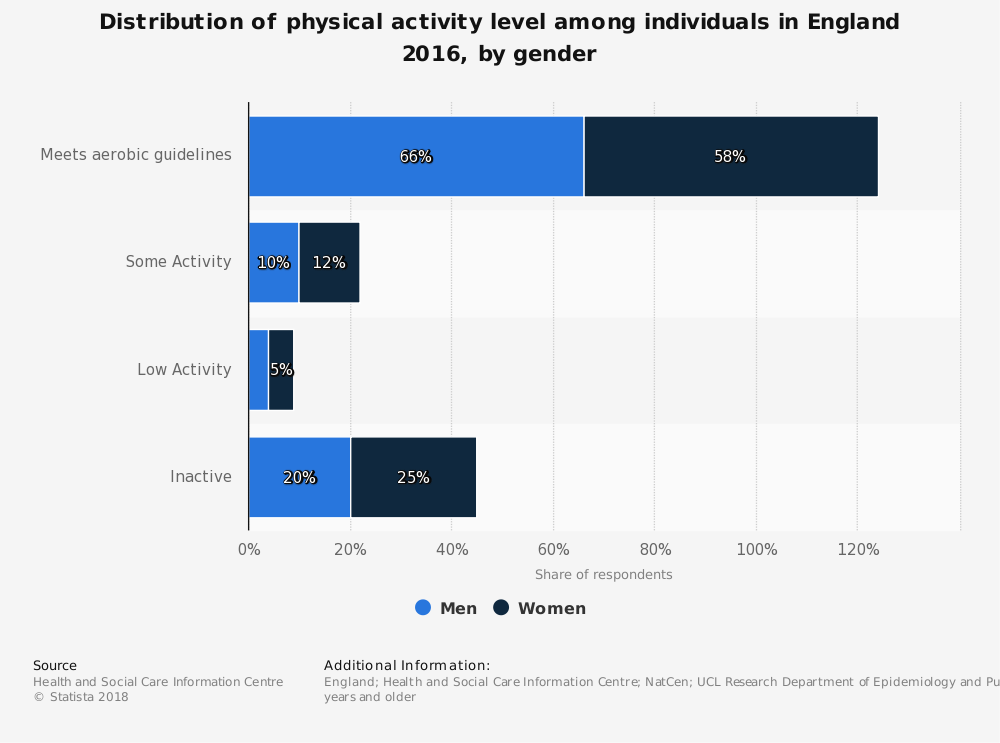
'Statista' Research - Distribution of Physical Activity Level Among Individuals in England 2016, by Gender
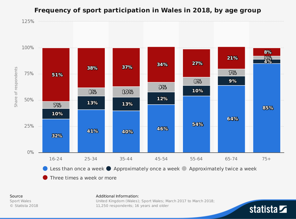
'Statista' Research - Frequency of Sport Participation in Wales in 2018, by Age Group
Conclusions from Collected Research
Overview
From undertaking the target audience research, I understood that due to the high quantity of supporters for different teams as well as the varying age and gender groups, that the target audience wouldn’t have been specific. Instead, the target audience would have been those of a variety of ages and genders. This would have emphasised the need to create a website application that would have been user-friendly and not overcomplicated in order to appeal to both those of very young and old ages but also to include interactive and interesting features to engage all audiences. The information that I would have needed to provide on the website application would have also needed to be clear and understandable by anyone as well as creating a consistent and professional interface to reduce confusion caused to users.
Created Target Audience Personas
Overview
After now having completed the previous task of highlighting the target audience, I then decided to create three personas to reflect different types of users. This would have therefore helped myself to understand how to design and build the website application from the view point of users as opposed to my own view point. These personas can be viewed below.
The Created Personas
Persona 1
Name: Calvin Fryer
Age: 42 years
Occupation: Front-end website developer
Income: £32,000 annually
Description: Calvin has been a 'Manchester United' supporter since the age of 5 and thoroughly enjoys attending matches each week. He has a wife called Lucy with two children called Ben and Sam. He enjoys taking his family to watch 'Manchester United'. When not watching 'Manchester United', Calvin enjoys spending time with his family watching films as well as enhancing his skillset as a front-end website developer. Recently, Calvin has been wanting to be able to find a new service to allow him to find players and view their statistics, dedicated solely to 'Manchester United'. He wants to be able to maintain his knowledge of the latest statistics each week and understand how players are performing compared to other weeks of the football season.
Persona 2
Name: Stacey Brown
Age: 70 years
Occupation: Retired athlete
Income: £24,000 annually
Description: Stacey is a retired athlete but also enjoys becoming interested in other types of sport as this is an area she has a sincere passion for. She is married to her husband called Simon and has a dog called Tommy and a cat called Ruby. Stacey enjoys exercising when she can to remain healthy and enjoys playing with her pets. Her husband is a big fan of football, supporting 'Manchester United'. As Stacey knows little about football, she therefore wants to impress her husband by obtaining knowledge of the players and their statistics. However, she wants to find a service that is easy to understand and that is solely dedicated to 'Manchester United' to be able to find what she is searching for more easily.
Persona 3
Name: Timmy White
Age: 7 years
Occupation: Primary school student
Income: None
Description: Timmy is a very enthusiastic student who loves to learn of new areas to expand his knowledge. During his time in school, he also plays for the school football team, playing as a striker. During his free time, Timmy also spends time outside with his friends playing football as this is something that he has a high passion for. He aspires to become as successful as Wayne Rooney, a former 'Manchester United' player, as 'Manchester United' is the team he supports. He watches 'Manchester United' play each week, attending matches with his Mum and Dad. Whilst playing football with his friends, who are also 'Manchester United' supporters, Timmy feels slightly intimidated as his friends know all the player statistics for the football season so far and he doesn’t. Therefore, Timmy needs to find a service that can allow him to find information about players and their statistics in an easy to understand and interesting way. This will allow for Timmy to fully remember these statistics when playing football with his friends next.
Wireframes
Initial Wireframes
Overview
After now having undertaken initial research and being able to understand which areas to include in my website application as well as how to implement these to suit the target audience, I now began by creating initial wireframes. These related to the pages that would have been included on the website application. In order to provide more options for myself, I created various wireframes, creating more than one for each page. This was using 'Adobe XD', helping to create highly professional appearing wireframes as opposed to using sketches.
These can be viewed either below or through the provided links.
Desktop Wireframes
'Home/Introduction' Page Wireframes
Overview
With regards to the first wireframe below and other wireframes throughout, I believed it to have been beneficial to include the title of the website application. At this stage, this was 'Manchester United Player Statistics 2018/19'. Please note that the statistics utilised at a later date were those from a previous season as I realised that this would have provided a more complete set of statistics for a season than the current one. Regarding the title section, I believed this to have been beneficial to include because it would have helped to remind the user of the application's purpose. Within this title/header section, links would have been included to allow users to easily navigate between pages on the website application. For this wireframe as well as other wireframes, I decided to place these in boxes, easily identifying these as aspects to interact with for the user. Furthermore, for this wireframe, I included two sections in two different containers signifying the tasks the users would have been able to undertake on the website application. Within this, an overview would have been included, providing a clear explanation of what the user needed to undertake, enhancing the user experience. Also included would have been links to the separate pages placed underneath the explanations to help the user identify what to select in order to navigate to the required page. One final aspect to note related to the footer where a logo of 'Manchester United' would have been included to relate to the theme of the website application. Furthermore, a link to view sources utilised to create the website application would have been included to provide reference to others. The other main aspect of the footer was the fact that I decided to include the links to the pages. This would have allowed for quick reference for the user, allowing them to easily navigate to other pages. This was applied to all other pages also with some variation in design. For this footer design, I decided to separate the different aspects by placing these further apart, helping to cause less confusion for the user.
Regarding the second wireframe below, this was of a similar structure to the first. However, to make the page more interesting, I decided to include footballs for each of the different titles of the website application’s pages. This would have also helped to reiterate the theme of the website application to users. Furthermore, the header section was different, placing all navigation links in a bar format to differentiate these aspects from the title placed above, helping the user to identify that this was a form of navigation. Regarding the footer, I decided to place the page links in horizontal format underneath a heading to allow the user to identify the purpose of these links, placing a line in-between this aspect and the other aspect of the footer. This would have helped to create a clear and professional structure. Both the header and footer sections were also applied to some other wireframes, demonstrating ideation.
The aspect that I changed for the third option shown below related to the positioning of the content. Instead of placing both sections next to each other, I placed these underneath each other with the content alternating. This helped to cover more space on the page whilst also allowing the user to read one aspect before reading the next, providing a better user experience through reducing the feeling of being overwhelmed by the content on the page. I decided to keep the footballs on this wireframe to make the page more interesting and relatable to the project’s theme, as stated before.
The fourth and final wireframe below was of a similar concept to the previous wireframe with regards to placing content underneath each other to allow for a better user experience as well as covering the page. However, instead of including the titles in footballs next to text, I decided to include placeholder images instead. This was because I believed this would have helped the page to be more visual as well as visually being able to inform users of each section of the website application. Furthermore, I decided to include a welcome message as I believed this would have helped to welcome the users to the website application, allowing them to fully understand the purpose of the application.
The Created Wireframes
'Player Comparison' Page Wireframes
Overview
As will be evident below, the first wireframe would have allowed users to compare players of 'Manchester United' where they would have been able to select different filters to specify players or search by player name. This is shown within the first wireframe where the players would have appeared. After selecting on the desired players, this would then have displayed the players next to each other as shown in the second wireframe with their statistics placed underneath. The reason for displaying the players and their information in a horizontal format was because I believed this would have been easier for users to compare statistics of each player as opposed to placing the players underneath each other. Furthermore, lines were included to allow users to identify which statistics belonged to certain categories such as ‘Goals’. One final aspect to note was that the title of the page would have been placed at the top to remind the user of which page they would have been situated on. This description relates to the first two shown wireframes below as this would have been before and after selecting the players to compare.
The third and fourth wireframes below were of a similar concept to the previous wireframes with regards to displaying the players horizontally and allowing users to filter or search for players. However, I decided to include a title of 'Search Preferences' to allow the user to understand the purpose of the filters and custom search. Furthermore, horizontal lines were included to divide the search filters from the results/players, creating a clear and professional structure. Another aspect to note is that all content was positioned centrally to produce a tidier appearance as well as one that was more aesthetically pleasing. With regards to the players, these were displayed in a circular format to produce variation between the players and content below, signifying different pieces of information. One final aspect to note was that with regards to the statistics for the players, these were placed within boxes in a centred format with the categories signified by bolder font. This was to allow for a professional and aesthetically pleasing appearance on the web page as well as easily differentiating between different statistic types.
The Created Wireframes
'Individual Players' Page Wireframes
Overview
As will be evident below, this page would have related to viewing each individual player’s statistics. First of all, the user would have been presented with a page with all available players whilst also allowing them the option to either enter a name through a custom search or select filters to specify a certain player. This would have helped them save time.
On the first wireframe regarding the first part of this page, the filters/search preferences would have been placed above the player results to create a hierarchy on the page with each player being displayed beneath with the option to select the desired player through their name. Once selecting a player through their name, the user would have then been navigated to the selected player where they could have viewed general information and statistics for different matchdays as well as the full season, as displayed with the second and third wireframes below. This would have been achieved through selecting one of the links situated to the right of the player. The statistics would have then been displayed, showing either a higher or lower performance compared to a previous matchday through different colours assigned to arrows. This would have related to the individual matchdays as opposed to the full season statistics. This would have helped to create a visual understanding for the user through the familiar colours of green and red. The reason for placing the player information above the statistics was because this would have helped the user to be introduced to the player first before viewing their performance, providing context to why some statistics may have been low/high (e.g. position of the player). This description relates to the first three wireframes shown below.
As is evident with the second set of wireframes (the fourth, fifth and sixth wireframes below), there was a similar concept of being able to search for players through a custom search or filters. However, the search preferences with the title of the web page would have been placed next to the player results, exploring another option of how to structure this page. This would have allowed users to view players whilst specifying filters, saving them from needing to navigate further down the page. With regards to viewing individual players, the players would have been situated at the top of the page next to the image of 'Manchester United’s' logo, helping to reiterate the theme of 'Manchester United'. Furthermore, all information would have been displayed below, allowing for users to view the image of the player before exploring further. One final aspect to note was all aspects relating to general information and statistics would have been grouped together to help separate different areas into different sections.
The Created Wireframes
Mobile Wireframes
Overview
Regarding the mobile wireframes, these demonstrated how each of the previously shown desktop wireframes would have appeared on mobile devices, demonstrating responsiveness. The main aspect to note was that all content remained but was displayed in a vertical format to suit mobile devices as well as including a responsive navigation menu to hide the navigation links, presenting a more professional appearance. These are viewable either below or via the provided links.
The Created Wireframes
'Home/Introduction' Page Wireframes
'Player Comparison' Page Wireframes
'Individual Players' Page Wireframes
The Chosen Wireframes
Overview
Due to the fact that the sole purpose of this project was to explore new technologies, I therefore decided to not create high-fidelity wireframes as I could have used the currently created initial wireframes and have applied the relevant chosen colours and fonts shown before. This would have allowed for more investment in developing the outcome. The chosen wireframes can be viewed below.
The Chosen 'Home/Introduction' Wireframe
Overview
Regarding the chosen wireframe for the 'Home/Introduction' page, I thought this was the most interesting to users as well as the fact that footballs were included. This would have helped to relate to the theme of the website application. Furthermore, I believed this to be the most aesthetically pleasing wireframe due to the way in which the content was structured. When developing/building the website application, I also decided to add a welcome section, as seen on another wireframe, to help introduce the user to the website application. With regards to the footer sections for all of the pages, I chose the alternative design to the one displayed below as this helped to divide the different sections better, enhancing the user experience. With relation to the header sections for all the pages, I decided to integrate that shown in the wireframe below as I thought this would have helped to separate each navigation link better by including them in boxes rather than within one bar with lines underneath.
The Chosen Wireframe
The Chosen 'Player Comparison' Wireframes
Overview
Regarding the 'Player Comparison' page, I decided to not choose a specific wireframe set but to combine different elements of each. This was because I thought doing this would have helped to create the best appearance as there were elements to each wireframe set degrading the appearance. I decided to include the title of 'Search Preferences' as well as a further title called 'Player Results' to help differentiate between the search and players sections. Furthermore, I chose to include the different containers for each statistic type as this was more attractive, in my opinion, than displaying with horizontal lines.
The Chosen Wireframes
The Chosen 'Individual Players' Page Wireframes
Overview
One of the main reasons for choosing the wireframe set below for the 'Individual Players' page was because when searching for players, I thought it would have been better for the appearance if the players were displayed underneath the search aspect rather than inline. This was because this would have caused unnecessary white space to occur with the players section being longer in height than the search section. Also, I believed having the player's information placed next to their image, after selecting a player, would have also helped to create a more professional appearance whilst also allowing for an introduction to the page. Otherwise, the user could have become overwhelmed with the information all situated in one area.
The Chosen Wireframes
Review of the Work Completed at this Stage
Overview
Despite having developed the 'Manchester United' website application whilst undertaking some of the processes displayed above, this still helped myself to plan and undertake a process to then create a professional outcome. With regards to the development processes, these can be viewed in a separate supplied document beneath this section. Within the whole development process, I attempted to include all planned features shown above but due to the fact that I was new to the framework I was using called ‘Laravel’, as will be explained later, I was unable to achieve everything. However, I still managed to create a professional and working prototype of the concepts displayed above, introducing myself to new technologies throughout.
Although displayed on the web page, the document created to help with these processes with references can be viewed below.
Other Processes DocumentThe Development and Programming Processes
The Different Stages
Overview
As mentioned above, in this section you will be able to view the development processes undertaken for this project with challenges encountered as well as those overcome. This document also shows the final code for the most relevant files of the website application, demonstrating organisation and commenting of code to be readable and maintainable. To view these processes, please view the document supplied below.
The Document to View
Development DocumentConclusion and Reflection
Throughout this project, I was able to learn of new areas within website development regarding modern frameworks relating to both 'front-end' and 'back-end' website development. I was especially able to enhance my 'back-end' website development skillset, utilising data within the final outcome as well as using the 'PHP' framework called 'Laravel' to build the final outcome.
If I were to approach this project again, I would attempt to utilise 'React' with a 'back-end' website development framework to challenge myself even further. This is because I wanted to use 'React' in this project but due to difficulties experienced regarding discovering a 'back-end' website development framework to use, this caused myself to utilise 'Laravel' instead. Furthermore, I would attempt to integrate even more complex functionality into the website application to allow for a more interactive user experience.
Overall, I believe I managed to create a professional and functional website application to allow for fans to view statistics regarding different players for the 2017/18 'Premier League' season. Despite not achieving all aspects I wanted to implement, I believe this project was a success, especially because I was using 'Laravel' which was a framework not used before.
The final outcome for this project can be viewed below.