Brief
"To produce a user-friendly re-designed website of the 'Home Sweet Home Front' website that is both cross-browser and cross-device compatible, retaining all of the previously included content where appropriate."
Overview
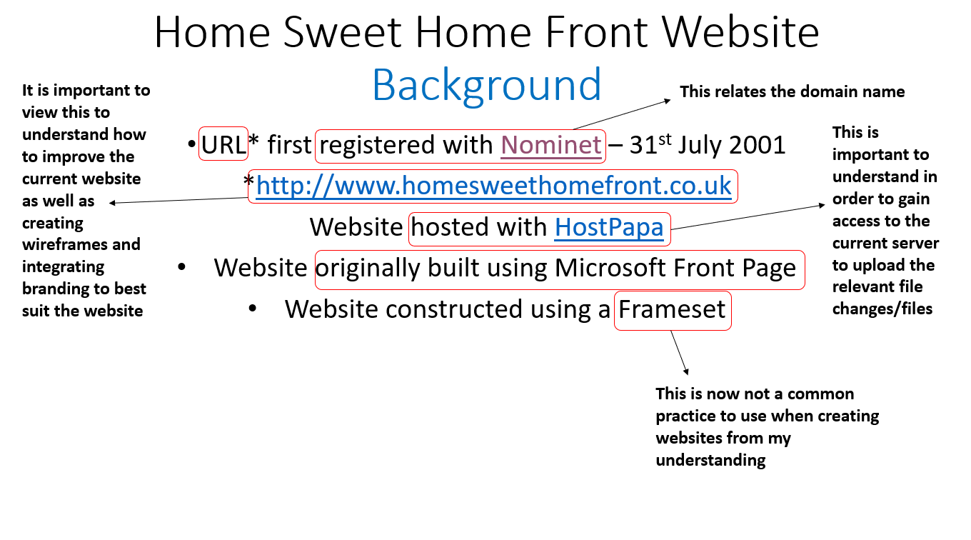
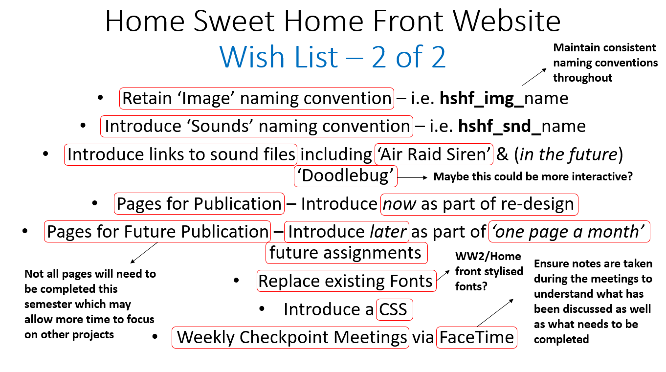
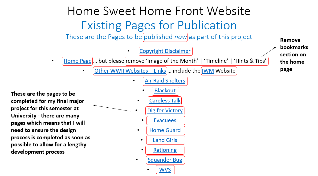
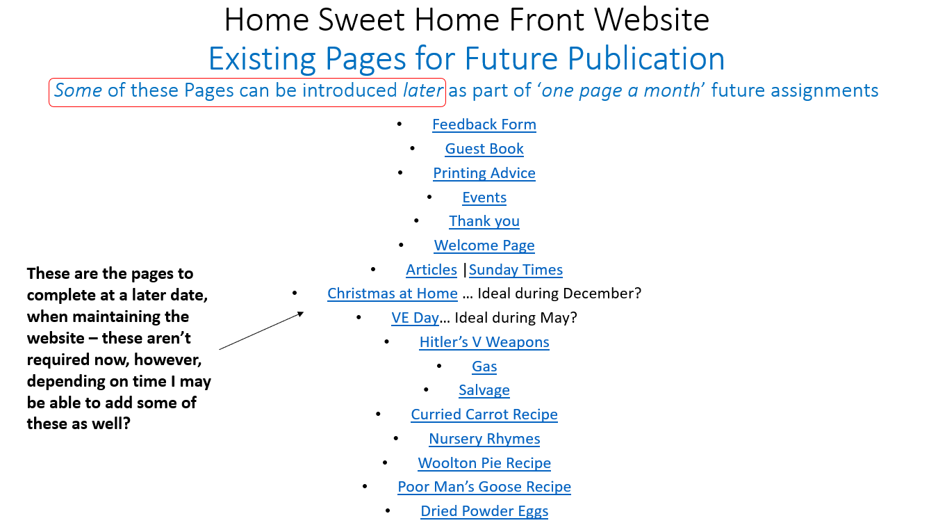
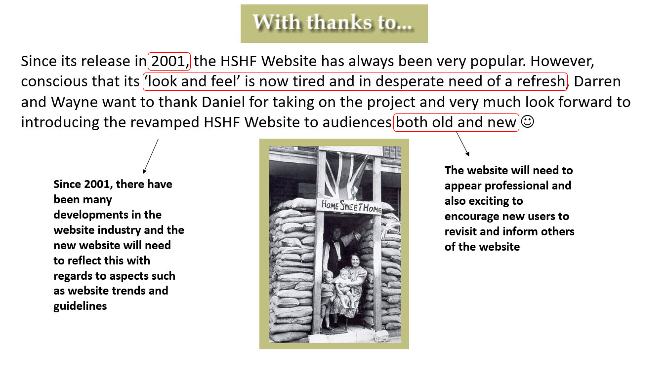
The 'Home Sweet Home Front' website was a website that had been created by both my father and uncle using 'Microsoft Front Page' in 2001, basing the topic around the Home Front during World War 2. Due to the fact that the appearance was outdated and some aspects weren’t accessible or user-friendly and due to the fact that I needed to find a project to undertake during my second semester of my third and final year at university, it was therefore agreed that I could have completed a re-designed website for them both. Please note that the whole website was not re-designed and rebuilt during the second semester of my third year as the clients stated that other pages were for future publication. However, I still undertook this process for 12 pages during the second semester of my third year.
The website was then continued and finished during the summer period of 2019, adding new pages and elements and making refinements.
Throughout this project, I undertook two major roles. One was acting as the designer, including suggesting fonts and colours as well as creating several wireframes for the required pages, and the other was as the developer, building the design using different programming languages to ensure that the website functioned properly throughout different devices and browsers.
All of the processes for this project will be viewable on this page.
For a document version of processes not relating to the development and programming stage in the second semester of my third year, I have included a link to a document situated at the bottom of the 'Y3S2 PROCESSES' section.
Analysing the Provided Brief
Overview
Although this was undertaken after having started the project, as the clients were kindly placing a brief together, this was a process undertaken throughout in order to help myself understand which areas would have needed to have been addressed as the main priority. Constant reviewing of the brief helped myself to understand what was still required to be completed as well as understanding what had already been achieved. The process of analysing the brief can be viewed below.
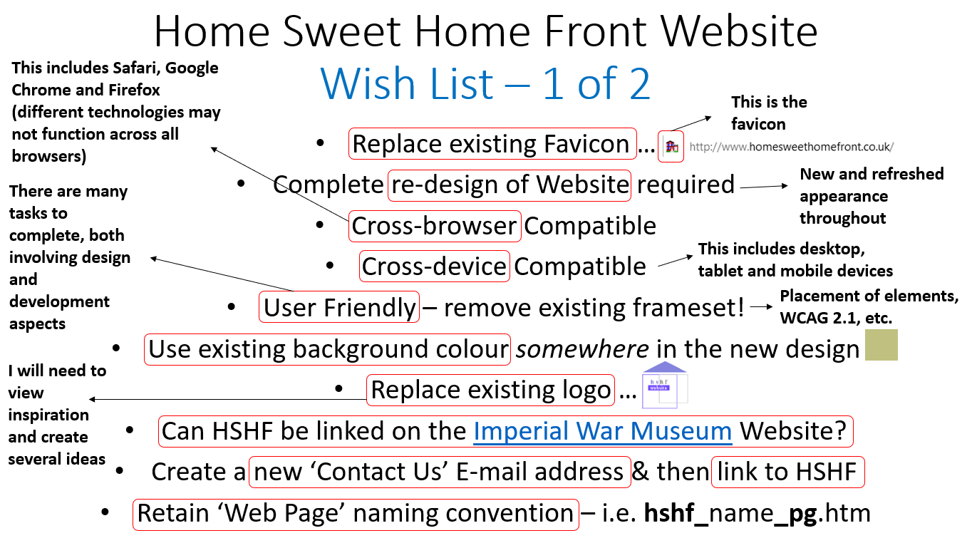
With regards to the image for the 'Existing Pages for Publication', where I annotated with the text 'Remove bookmarks section on the home page', I clarified this with the clients as I wasn’t sure if this related to the bookmarks section or the actual sections themselves as well. I was informed that they wanted the sections relating to 'Image of the Month', 'Timeline' and 'Hints & Tips' to all be removed but after discussing with them that this would have removed most of the content of the home page, it was agreed that not all aspects would have been removed.
The Brief Analysis
Brief Analysis - Part 1

Brief Analysis - Part 2
Brief Analysis - Part 3
Brief Analysis - Part 4
Brief Analysis - Part 5
Brief Analysis - Part 6
Brief Analysis - Part 7
Brief Analysis - Part 8
Planning Methods of the Project
Overview
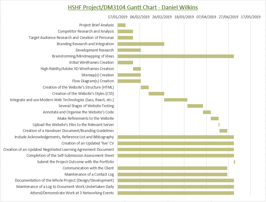
One of the first aspects I completed was a task table to be able to analyse the required tasks, allocating specific time periods to each and also explaining the consequences if not completed and the risks with the tasks. Although throughout there may have been additional tasks, this related to the main tasks required to complete. The listed tasks related to various processes including development research (e.g. website trends) and creating wireframes. Furthermore, the progress of each task was indicated by either 'Not Started', 'In Progress' or 'Completed', each with different colours and also by the tick or cross in the last column.
Please note that before creating the task table for the project, I created a table that related to the information about the module such as the due dates for the assignments as well as tasks to complete for the module, including those not relating to this project. This helped myself to understand then how much time to allocate to different aspects. Regarding some of the listed tasks, this then helped myself explain these in more detail as will be seen in the created task table. Both the time map for the module and task table relating to the project can be viewed below.
At a later date, I then created a Gantt chart to reflect the task table in a more visual way. However, whilst completing this, I also divided the development process into several sections to allow myself to understand how much time I would have needed to allocate to progress through different phases such as completing the 'HTML' code and 'CSS' code. With regards to the programming and coding process, I allocated a longer amount of time to the languages which I believed would have required a longer process such as 'CSS' and the new frameworks and languages that I wanted to explore. This was because I knew that 'CSS' would have entailed not only styling the website on desktop devices but also integrating aspects such as 'media queries' to change styles on different screen resolutions or devices. With regards to the new frameworks and languages, I allocated even more time to these as I knew I would have needed to learn how to use them whilst progressing with the project, requiring thorough research and seeking of advice from relevant lecturers. Please note that at a later stage, I decided not to explore new frameworks due to the fact that I was undertaking this in another project during the semester and because I wanted to have a fully completed project regarding this project.
With regards to the other processes before the programming and coding stage in the Gantt chart, I ensured that the majority of these would have been completed before starting the programming and coding stage as this would have helped myself progress better with this. This was especially relevant to the wireframes as these would have helped myself visualise the structure and styling of the website better, being more efficient and quicker in the programming and coding process. Areas such as target audience and development research would have helped myself identify how to design each web page so that it would have been both modern and usable and accessible.
With regards to the continuous processes such as the documentation of the project in the Gantt chart, these were allocated these time periods due to the fact that these would have been areas that wouldn’t have been able to have been completed immediately and would have needed to have been either added to throughout or completed near to the end of the semester to reflect the work undertaken. This was especially relevant to both the 'Self Submission Assessment Sheet' and 'Negotiated Learning Agreement Document' which would have demonstrated what had been completed throughout the semester.
Finally, with regards to the Gantt chart, the majority of the tasks had been organised to be completed by 26th April 2019. This was to allow enough time to ensure that I would have been happy with the completed work and to also allow enough time to successfully submit my portfolio to the lecturers. The Gantt chart is viewable below.
The Module Time Map
Analysing the Current Website
Overview
In order to fully understand the current website, I undertook the task of analysing the positives and negatives of each relevant page. This would have then helped myself to understand which areas would have been beneficial to keep and which areas that would have needed to have been removed as well as improved. This analysis can be viewed through the 'PDF' file provided below.
'HSHF' Current Website AnalysisBranding Research
Overview
The purpose of this stage was to have been able to determine the appearance of the website through gaining inspiration from both the current website and from online resources, being able to produce an outcome which fully demonstrated the website's values. The different processes of this can be viewed within this section of this project.
Colours
Analysing the Current Utilised Colours
Overview
I decided to begin the branding process by analysing the current colours used on the current website in order to influence the final produced colour palettes at a later stage. This was due to the fact that the clients wanted to keep the colours and also because I thought these reflected the theme of the website successfully. I decided to list the colours used on the current logo and website with their 'HEX' values to allow for creating colour palettes with some of these 'HEX' values.
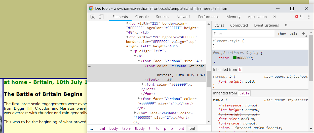
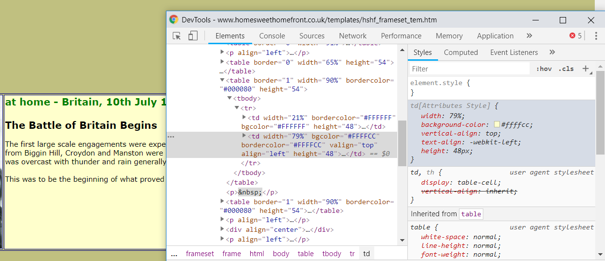
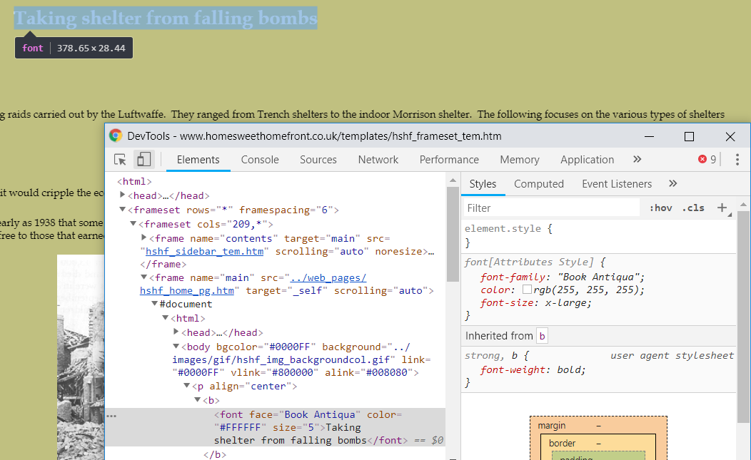
This was undertaken through various methods. The first was utilising 'Adobe After Effects' through using the colour picker tool. Another method of collecting some of the colour values was by using the tools provided by 'Google Chrome'. These were the 'DevTools' and examples of these methods can be viewed below as well as the listed colours as a result.
Utilising the Colour Picker Tool in 'Adobe After Effects'
Identifying the Colours with 'Adobe After Effects' - Example 1
Identifying the Colours with 'Adobe After Effects' - Example 2
Utilising the 'DevTools' in 'Google Chrome'
Identifying the Colours with 'DevTools' - Example 1
Identifying the Colours with 'DevTools' - Example 2
Listing the Colours Utilised
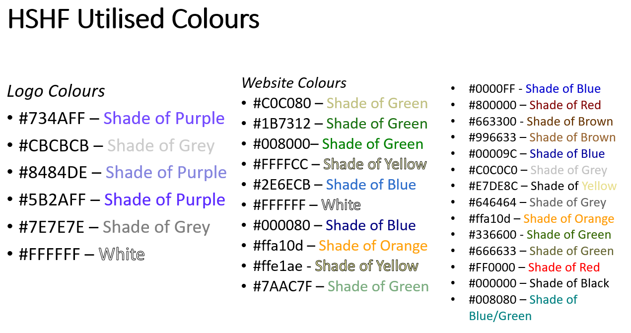
Listing the Colours Utilised
Undertaking Colour Connotations Research
Overview
After completing the previous task, I then decided to analyse a couple of colour palettes which I had used in previous projects before as I believed these to be very thorough and helpful. I highlighted certain words included in each colour segment that I believed to relate to either World War 2, the Home Front or the website in general. This analysis can be viewed below.
Analysing the Colour Connotations for this Project
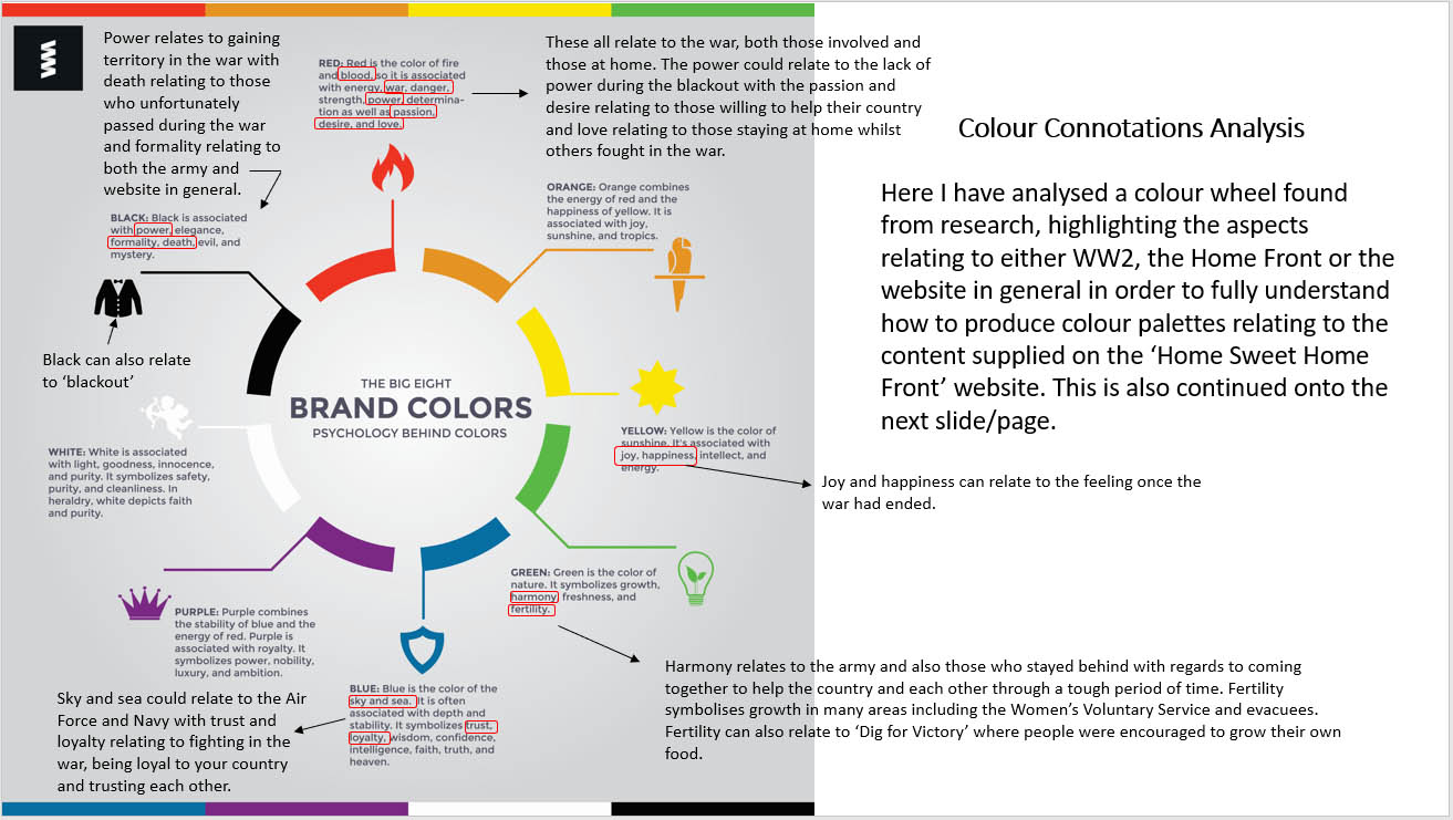
Highlighting the First Colour Wheel
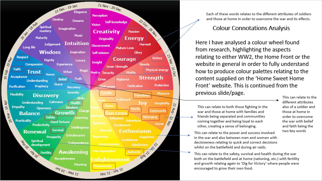
Highlighting the Second Colour Wheel
Creating the Final Colour Palettes
Overview
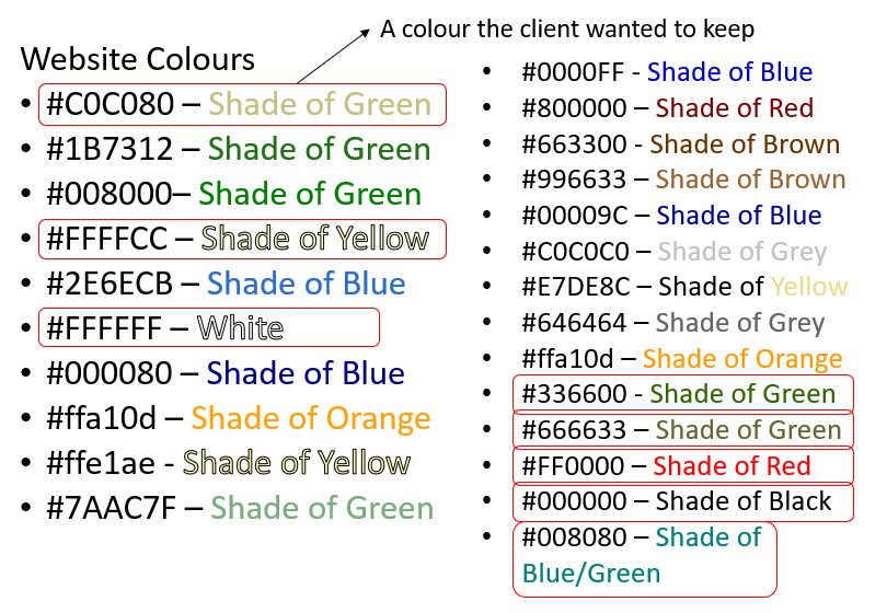
After undertaking the necessary research, I then decided to specify colours to keep from the originally created list that would have then allowed myself to create colour palettes based on the highlighted colours. I decided not to include new colours at the later stage of creating the colour palettes due to the fact that I believed the current colours were representative of the topic and helped to create a nostalgic appearance.
During this process, I decided to eliminate the colours from the logo. This was because the clients wanted to have a new logo created and therefore, I thought that the colours of the logo would have changed, making the previous colours redundant. I also didn’t include these because I was relating to the website in general and these related to the logo. One of the colours was kept due to the fact that the clients had stated in the brief that they wanted this to be used in some aspect of the new website. The other colours I chose to keep were because I thought these related to World War 2 and the Home Front the most with the different shades of green representing the army. Black and white were kept due to the fact that these were colours which would have been a standard to use for paragraphs to allow for easier reading by users of the website. The red was chosen because I thought this could have been utilised as an accent colour and also because this related to passion, indicating key elements of the website. One final aspect to note is that I decided to choose the colours below to provide a variety of colours, hence creating an outcome that was varied and exciting.
Following on from this, I then decided to create the final colour palettes which can be viewed below as well as the previously mentioned aspect. As will be evident, I decided to alternate between colours in different colour palettes to explore multiple options and to be able to provide the clients with multiple options to choose from.
Specifying Colours to Utilise in the Colour Palettes
Specifying the Colours from the List
The Created Colour Palettes
Colour Palette 1
Colour Palette 2

Colour Palette 3
Colour Palette 4

Colour Palette 5
Colour Palette 6
Colour Palette 7
Colour Palette 8
Colour Palette 9

Colour Palette 10
Fonts
Analysing the Current Utilised Fonts
Overview
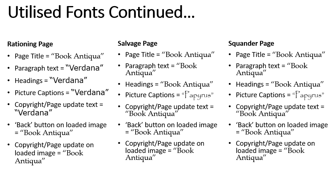
As well as producing the colour palettes for the new website, I also decided to shortlist 'Google Fonts' and fonts within 'Microsoft PowerPoint' that I believed could have related to the theme of the Home Front and World War 2. However, before undertaking this task, I navigated through each page of the current website, utilising 'Google Chrome' 'DevTools' to help identify the fonts used for several aspects including headings and paragraphs. This was to understand the style of fonts utilised throughout which was something that could have then been considered whilst progressing with highlighting particular fonts to be used in the new website. After identifying each font on each page, I then documented this to help myself remember which fonts had been utilised on certain pages. This process can be viewed below.
Utilising 'DevTools' to Identify Fonts
Identifying the Fonts Utilised with 'DevTools' - Example 1
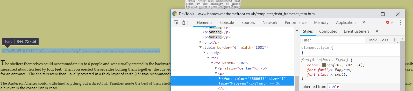
Identifying the Fonts Utilised with 'DevTools' - Example 2
Listing the Fonts Utilised for all Pages
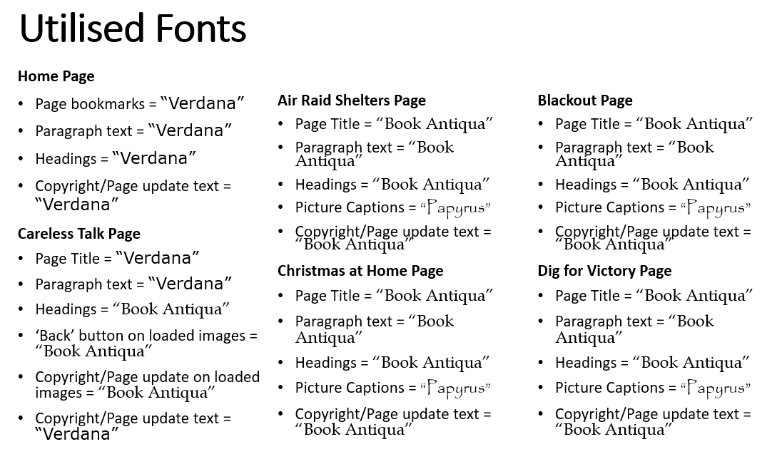
Listing the Fonts Utilised - Part 1
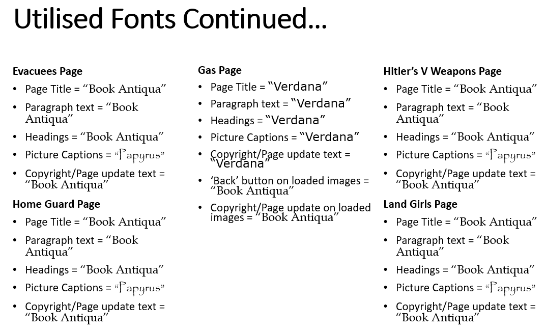
Listing the Fonts Utilised - Part 2
Listing the Fonts Utilised - Part 3
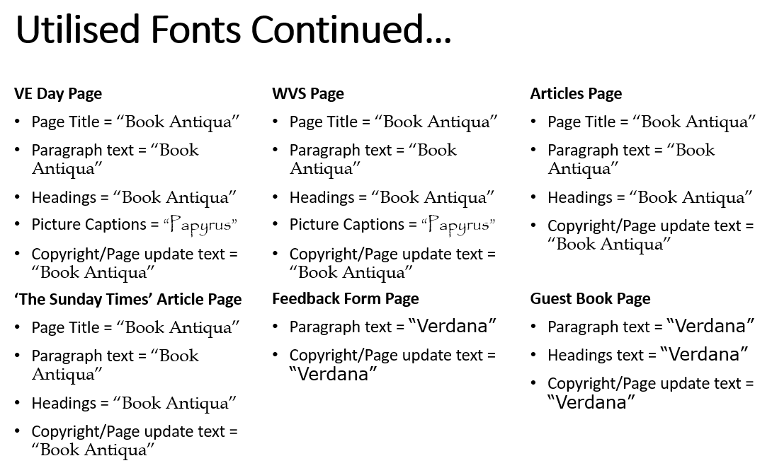
Listing the Fonts Utilised - Part 4
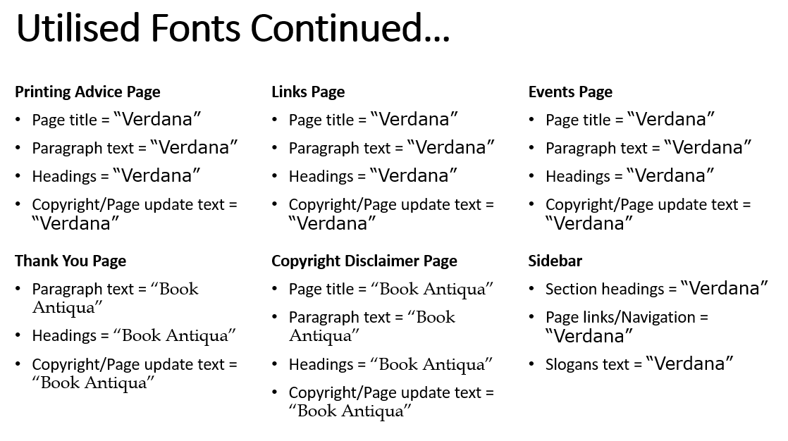
Listing the Fonts Utilised - Part 5
Undertaking Fonts Research
Overview
After analysing the fonts currently utilised on the 'Home Sweet Home Front' website, I then undertook research on the Internet, attempting to discover fonts that related to war or World War 2. This would then have allowed myself to understand the characteristics of these fonts to then highlight possible fonts that could have been utilised on the new website. The research discovered can be viewed below.
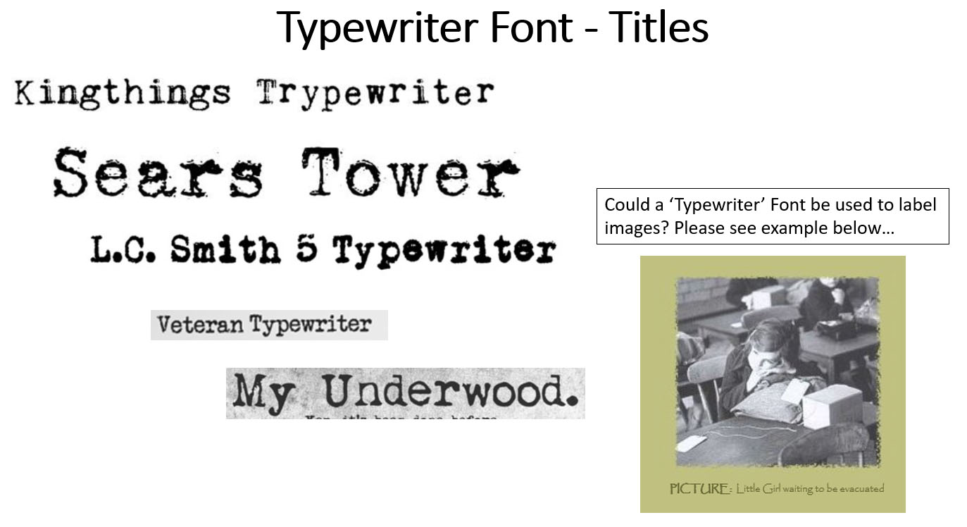
From undertaking this research on the Internet, I understood that the best fonts were those that were in bold and in italics. I also understood that fonts based around the theme of war or World War 2 were 'Serif' fonts (as seen with the font called ‘Futura’), as inspired by an online source, and that character spacing was an element used to create an old-fashioned appearance. Finally, I also understood that a typewriter effect was integrated which helped to create a nostalgic appearance and especially relate to World War 2 letters.
The Collected Research
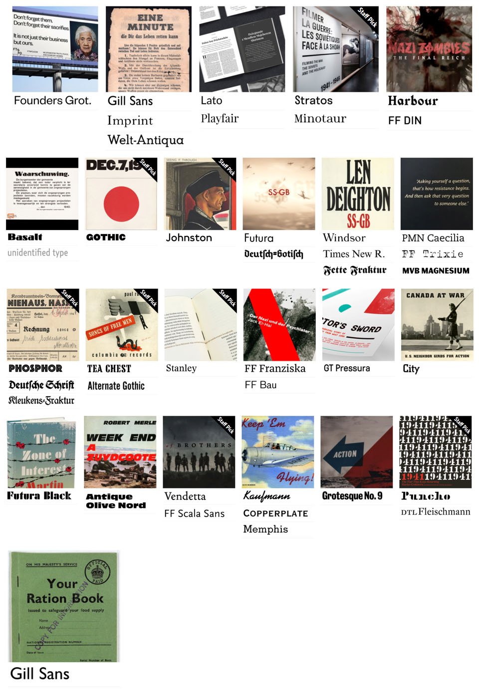
Fonts Research Collected from One Source
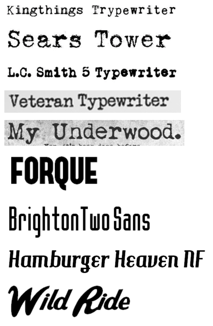
Fonts Research Collected from Another Source
Highlighting Fonts to Utilise
Overview
After having undertaken the previous processes, I was now at a stage where I was able to highlight potential fonts to be utilised for the new website. This was to have allowed for sending of the file to the clients to have allowed them to decide which fonts they would have preferred as this was their website and therefore the website would have needed to have reflected their preferences.
I highlighted the most relevant fonts both available through 'Microsoft PowerPoint' as well as viewing the 'Google Fonts' available under the setting of 'Serif' fonts. When selecting the fonts, I ensured that I considered the previous research and the characteristics utilised to reflect the topic of the website in the best possible way. This process can be viewed below.
Listing the Fonts to Potentially Utilise
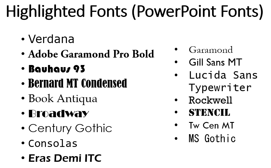
Highlighted Fonts to Potentially Utilise in the new Website
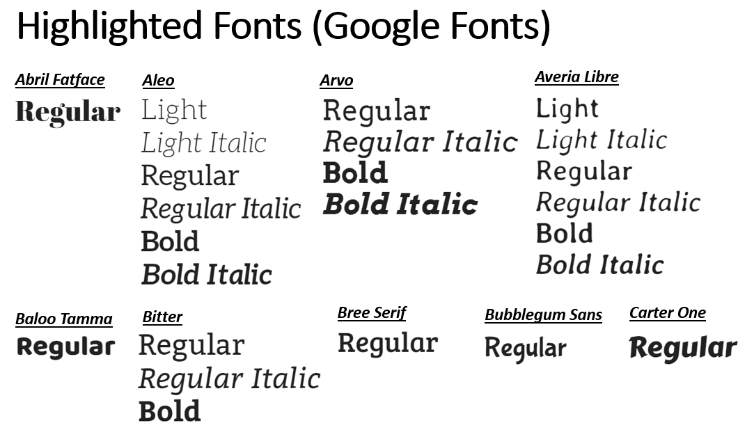
Highlighted Fonts to Potentially Utilise in the new Website Continued
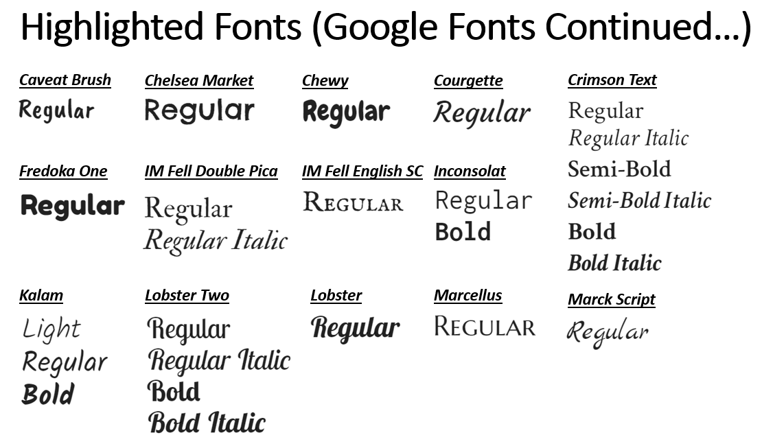
Highlighted Fonts to Potentially Utilise in the new Website Continued
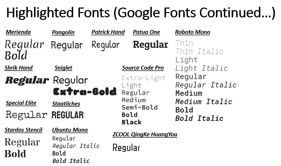
Highlighted Fonts to Potentially Utilise in the new Website Continued
Contacting the Clients
Overview
After having produced colour palettes and highlighting the possible fonts to have been utilised, I then contacted the clients, attaching the branding document I had been progressing with. The purpose of this was to ask for their feedback regarding which colour palette and font relating to the headings of the website that they would have liked to have integrated into the new website. Following on from this, the clients then replied to me mentioning that they had decided on the colour palette and fonts that they preferred. This is viewable below.
Sending the E-mail and the Response
Sending the E-mail with the Required Actions
The Response from the Clients
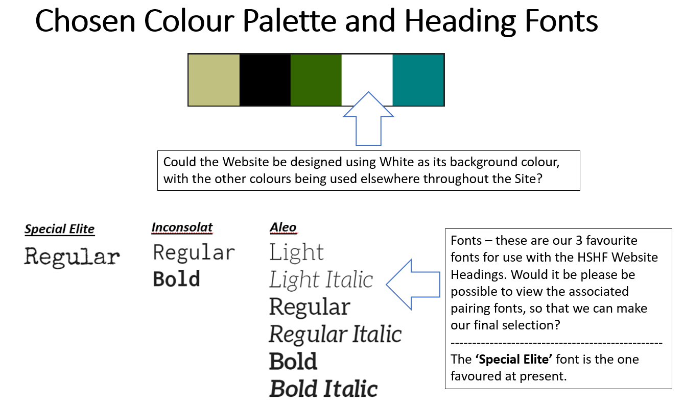
The Chosen Colour Palette and Preferred Fonts
The Preferred Fonts Continued
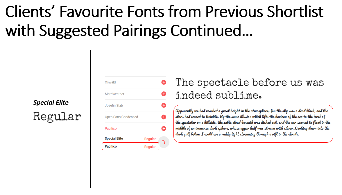
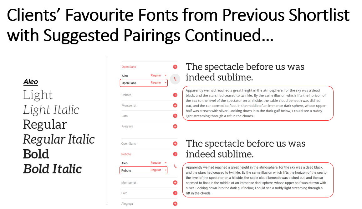
Supplying Paired Fonts from 'Google' and the Final Chosen Fonts
Overview
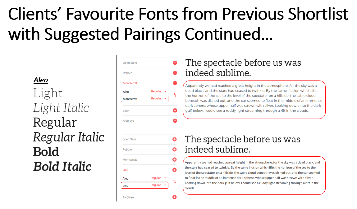
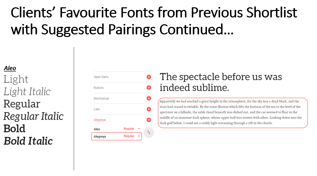
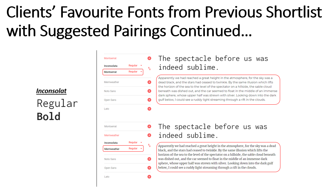
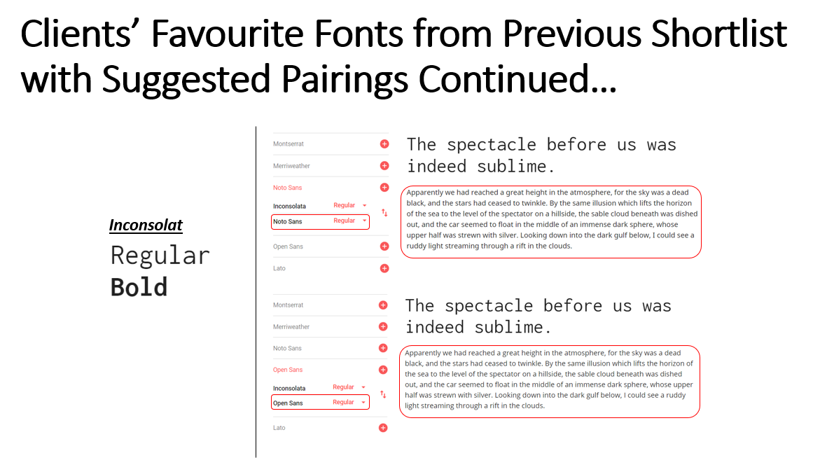
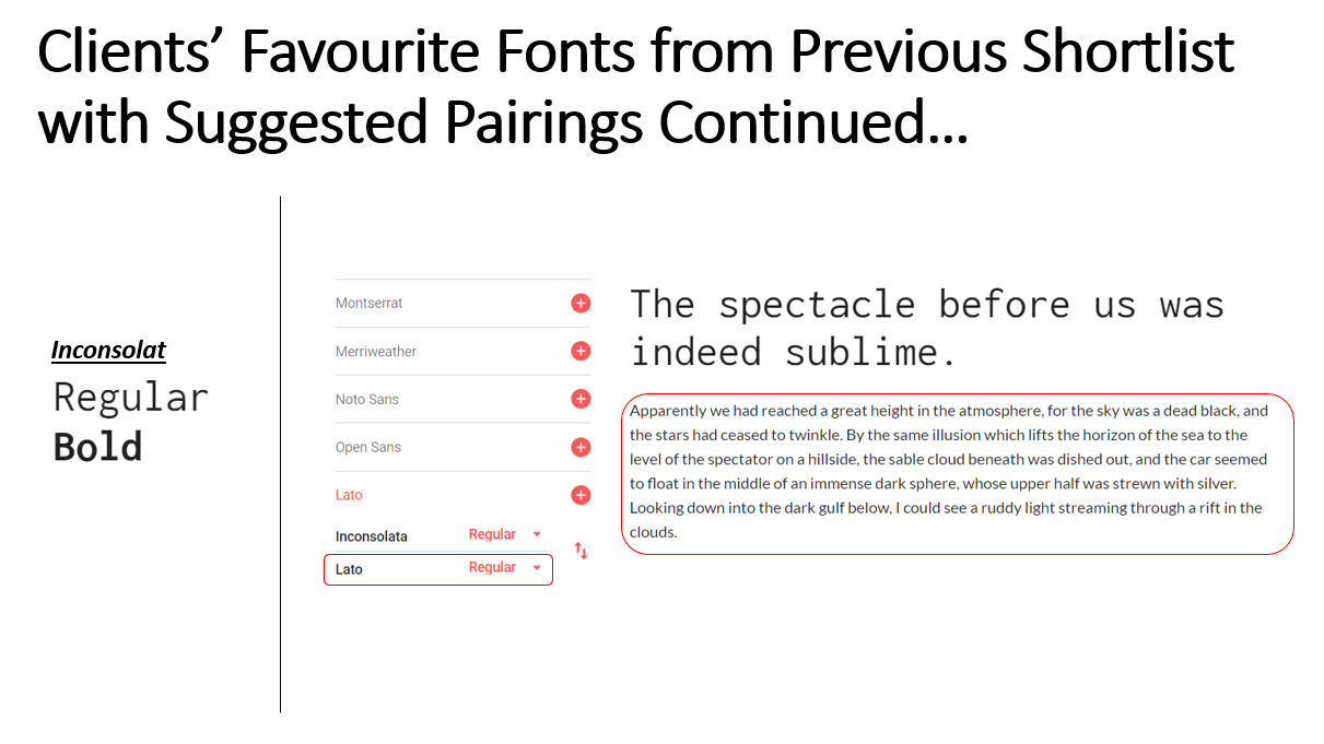
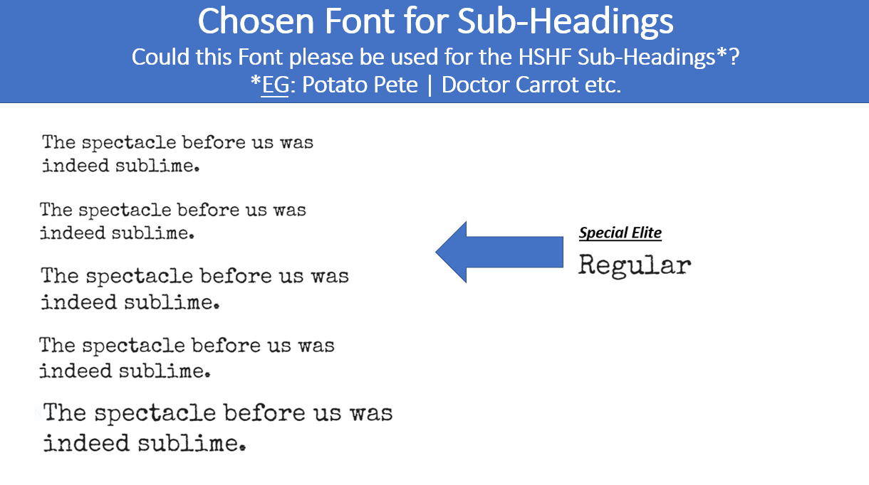
As will be evident above, the clients had then mentioned that they would have liked to have seen the paired fonts for the 'Special Elite', 'Inconsolat' and 'Aleo' fonts. This was therefore an action that I then completed as will be seen below.
Listing the Suggested Font Pairings
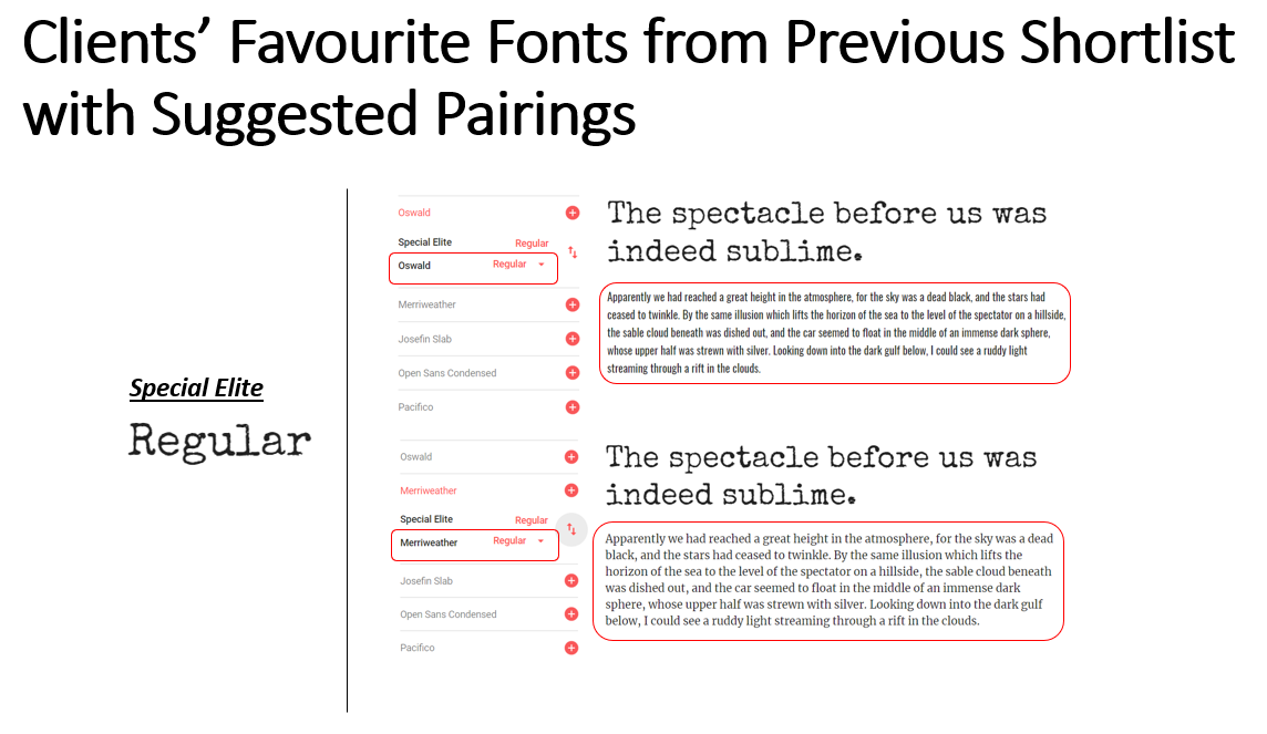
Listing the Suggested Font Pairings
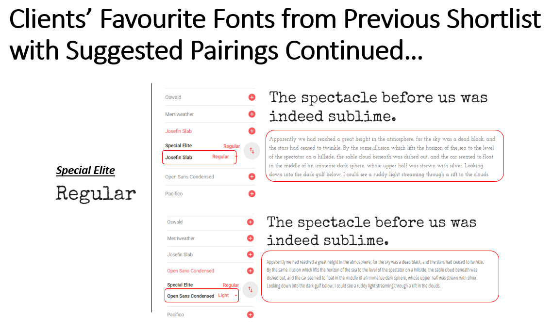
Listing the Suggested Font Pairings Continued
Listing the Suggested Font Pairings Continued
Listing the Suggested Font Pairings Continued
Listing the Suggested Font Pairings Continued
Listing the Suggested Font Pairings Continued
Listing the Suggested Font Pairings Continued
Listing the Suggested Font Pairings Continued
Listing the Suggested Font Pairings Continued
Contacting the Clients and the Final Decisions
Overview
After listing each of the paired fonts for each selected heading font, I then decided to contact the clients again at a later date once I had finished the initial desktop and mobile wireframes, as will be seen further down this page. This was to allow them to choose the paired font which they wanted to integrate as the paragraph font for the new website. I then received a response from the clients which also stated in the attached file which fonts were preferred to be utilised. This therefore signified the end of this stage and also the branding stage altogether, allowing for progression onto other aspects. Images of this can be viewed below.
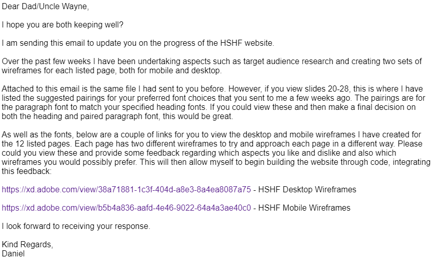
Sending the E-mail to the Clients
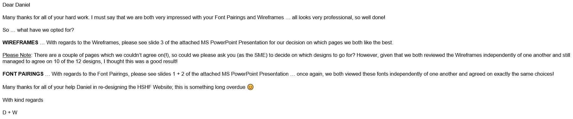
The Response from the Clients
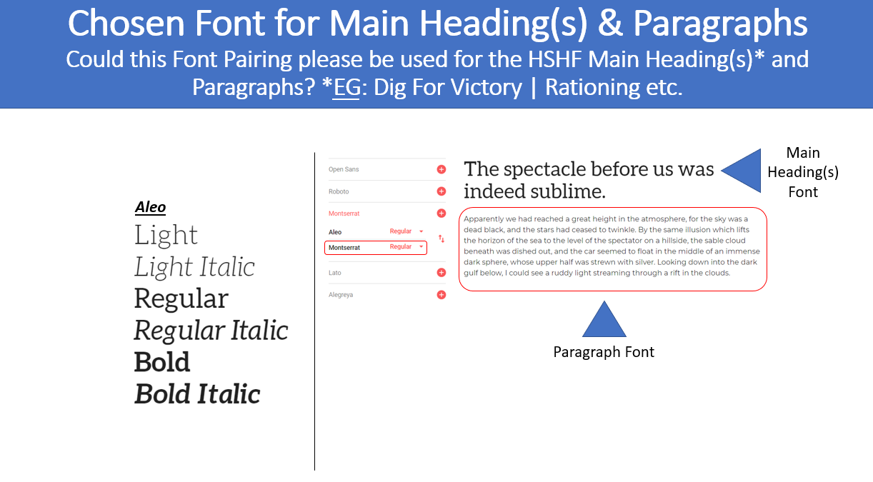
The Chosen Fonts
The Chosen Fonts Continued
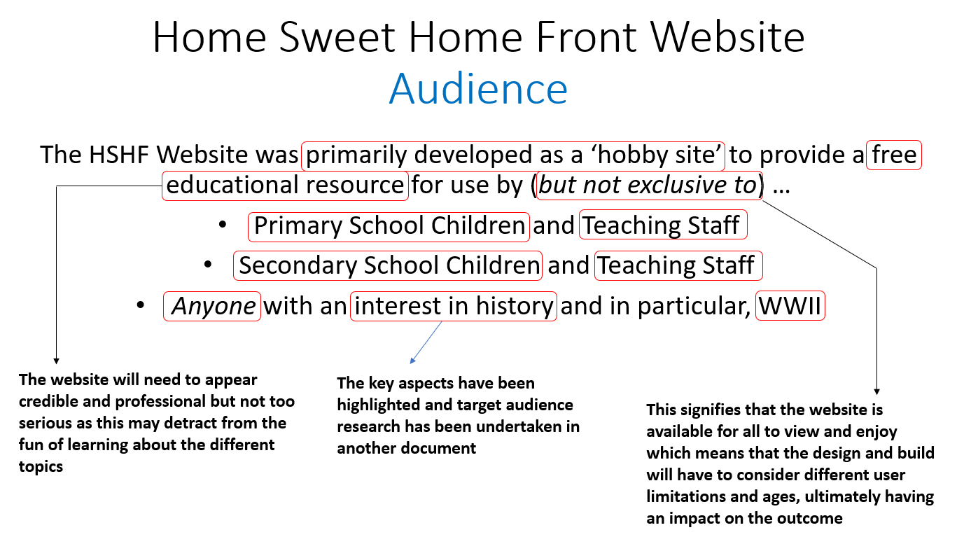
Target Audience Research
Overview
Another key aspect undertaken before creating the wireframes and progressing onto the building stage of the website included undertaking target audience research based on the target audiences provided by the clients within the brief supplied to myself. This target audience research was undertaken within a separate document whereby I added some initial thoughts of my own as well as discovered research.
Highlighting Key Points
Overview
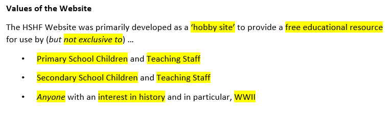
Firstly, I began by highlighting the key aspects of the overview provided by the client, helping myself to fully understand the types of people to undertake research regarding in order to produce the best possible conclusion from this research. The provided target audiences and highlighting key aspects can be viewed below.
The Analysis
Analysing the Provided Overview
Analysing the Provided Overview Continued
Separating Initial Ideas and Collected Research
Overview
I then separated the initial ideas and discovered research into three categories based on the three target audience areas. Some of these ideas and research overlapped but still provided a good overview and understanding on how to make the new website suitable for these target audiences. I found it difficult to find sufficient research online for some areas which limited the research included. However, I was still able to gain an understanding of aspects to consider for the new website from the research discovered.
With regards to those interested in history and those, in particular, interested in World War 2, the first thought that occurred to myself was the fact to undertake research regarding historians. This was because I knew this audience was fascinated by history and would have helped to provide an overview of what other people interested in history would have preferred to see on the new website. This therefore contributed to most of this particular target audience research with some mention of other areas also. Every aspect of this process can be viewed below.
The Separated Initial Ideas and Collected Research
Category 1 – Primary School Children and Teaching Staff
- The website will need to be easy to understand and interesting*
- The website will need to include many visuals in order to maintain the interest of the children*
- Children and teenagers learn through areas including experimenting and exploring
- Children learn through many different ways
- Children learn through playing
- The website will need to be reputable through its appearance to encourage teaching staff to utilise this*
- The website will need to contain enough information for teaching staff to utilise the website as a teaching resource*
- Use visualisation*
- Ask questions to consolidate learning (potentially include question and answer reveals)
- Use a variety of content to add variation to the website*
- Integrate a type of game into the website
- The content provided must enthuse teaching staff to allow for effective teaching to their pupils, meaning that the website must present its content in an interesting way with multiple elements such as interactivity*
- Each child is different with regards to their learning preferences and styles
- There are seven key learning styles which are visual, auditory, verbal, physical, logical, social and solitary
- The website will need to include content which is enthusiastic about the subject matter because if a child or student notices that someone is enthusiastic, this will make them enthusiastic
- Game-based learning motivates children to be involved in the learning process and this will make them want to learn even more
- Ensure to recognise and celebrate a child’s achievements, potentially including positive feedback after an element of the new website such as a game
- Primary school children are aged from 5-11
Category 2 - Secondary School Children and Teaching Staff
- Ensure that the learning process is fun
- Use a variety of content to add variation to the website, making it more interesting*
- Integrate a type of game into the website
- Some children can be disengaged which will mean the information will need to be concise and structured in a format that is professional and interesting with appropriately used fonts and colours to make the topic more exciting -> There could also be constant interactivity throughout the website to help engage these children*
- Due to the fact that there are different students with different abilities, the website will need to be easy to understand and presented in a format that is memorable, ultimately creating a useful learning resource*
- The content provided must enthuse teaching staff to allow for effective teaching to their pupils, meaning that the website must present its content in an interesting way with multiple elements such as interactivity -> There must also be elements which help to depict the time period such as colours and fonts to help create a nostalgic appearance as well as lots of visuals to help the users visualise multiple aspects*
- Ensure to give students a choice to increase engagement -> This can apply to the website, meaning that the user isn’t forced into choosing something to interact with or read, as a result, feeling more inclined to stay on the website and increase user retention
- Ensure to provide incentives to help motivate and interest students -> This can relate to the new website, meaning that some rewards will need to be provided digitally to retain engagement and increase user recommendations and retention as a result
- Secondary school children are aged from 11-16 years
Category 3 - Those Interested in History
- Historians are interested in creating ideas and descriptions of facts regarding past events and circumstances -> This will mean that there will need to be many facts and information that are presented in a clear way on the new website that can help them to create their ideas and descriptions of facts*
- Historians need to be able to discover and understand information about an event or time in the past* -> This will mean that the information or content will need to be structured in an easy to read and clear format so that the user is able to gain a full understanding about a particular topic on the website
- Historians need to understand about certain elements of an image in order to interpret the event which means that on the new website, image captions will be key to helping them to understand about a particular image to make these interpretations*
- Historians conceptualise, describe, contextualise, explain and interpret past events and circumstances* -> This means that the website will need to include enough content for historians to undertake these tasks but also present this in the most aesthetically pleasing way as possible to make it interesting to other audiences
- It has been stated that historians like to answer ‘why’ questions* -> This will mean that the information or content will need to be provided in both an easy to read and informative way with lots of detail
- Historians interact with the public via educational programs or presentations* -> The information will need to be easy to understand and clear on the website so they can utilise this within the presentations and other aspects they create
- Historians write reports, articles and books on the findings and theories they have collected* -> This will mean that, again, the information will need to be easy to read and clear but also the website will need to be able to highlight key information through various structuring and styling of certain aspects to help them differentiate themselves from other sections -> This will allow historians to highlight the key information to place into their reports, articles and books
- Historians are interested in the ‘thinking’ interest area which relates to researching, investigating and improving knowledge of natural laws -> This may suggest that historians may be less interested in the way a website appears and more interested in the content provided, suggesting content will be key to the new website
- Historians should also be analytical, able to communicate, able to solve problems and be able to have good research skills and writing skills
- As well as historians, there are also those that will study history at the level of higher education as a degree* -> This will mean that the website must present itself in a professional and highly credible way to attract the attention of these students and gain their trust, causing them to utilise the provided resources and information within aspects such as their essay writing
- A museum or gallery curator is an example of an occupation to undertake with a history degree and this has responsibilities including producing materials and articles for the website and writing articles for publications inside and outside of the organisation* -> This emphasises the need for clear, concise and easy to find information on the new website if relating to undertaking research for these articles
- Examples of other occupations relating to history include being a librarian, an archivist and a researcher, all of which have a serious passion for history -> This therefore means that the website will need to be very informative through lots of information and perhaps through different methods such as interactivity
- Due to the fact that the brief stated that the website relates to anyone with an interest in history, this indicates several different age ranges including younger children and older adults* -> This emphasises the need for the website to be easy to use and accessible, allowing any visitor to be able to find what they are looking for easily and without any issues
Collecting Demographics Research
Overview
After separating the relevant research and ideas into the different target audiences, I then decided to undertake some demographics research to help myself understand the key statistics regarding types of people relating to each audience type. This was placed into one section for all three target audience areas and this can be viewed below. I also collected some statistics from 'Statista' relating to various other aspects including reasons for visiting cultural heritage websites. This research can also be viewed below.
Regarding the first graph below, I understood that the majority of those employed related to both primary and secondary education which therefore signified to myself that the website would have needed to accommodate these audiences the most.
As will be evident below, I also understood that primary and secondary education were the areas most invested in within the United Kingdom, as displayed by the second graph. This again emphasised that those involved in this area such as students and teachers would have been of a large audience, influencing the majority of the website's outcome.
The reason why the third graph was highlighted below was because it occurred to myself that heritage websites could have related to history websites and therefore understanding the reasons why people visited these websites would have been beneficial in influencing the outcome of the new 'Home Sweet Home Front' website. I understood that one of the most popular reasons for visiting these websites related to learning about the history or historic environment. This therefore influenced myself to think that the website would have needed to have been easy to understand and informative to help visitors to the new 'Home Sweet Home Front' website learn the most from the information provided.
The reason why the final graph was highlighted below was to understand the age demographics of those visiting history related websites, as in my opinion, museums and galleries could have related to history. From viewing this graph, I believed that it demonstrated the most popular ages on average were between 25 and 34 years and 35 and 54 years. This again demonstrated to myself that the website would have needed to have been accessible and usable by any age due to the variety of visitors that the website would have obtained. This emphasised that despite there being set target audiences, various ages would have still visited the website.
The Demographics Research
Demographics Research
- Within teaching in the United Kingdom, there are more women than men teaching
- Approximately 3 out of 4 school teachers were female in 2017, equivalating to 376,300 teachers
- There were approximately 248,900 nursery and primary school teachers in 2017
- There were approximately 219,700 secondary school teachers in 2017
- As of January 2018, 4,716,245 students were in state funded primary schools
- As of January 2018, 3,258,451 students were in state funded secondary schools
- As of January 2018, in state funded primary schools there are a total of 2,292,888 boys full time and 2,205,260 girls full time
- As of January 2018, in state funded secondary schools there are a total of 1,633,792 boys full time and 1,621,529 girls full time
- In 2016, the number of historian occupations was placed at 3300 in the USA -> This indicates a small target audience for this area
- According to HESA, those enrolled on historical and philosophical studies for 2017/18 were 84,115, indicating a smaller target audience again
- There were more female (46,055) than male (37,910) enrolled onto historical and philosophical studies for 2017/18
- From April to June in 2018, a total of 37 librarians and related professionals were in employment, indicating a very small target audience (this included archivists and curators)
The 'Statista' Graphs
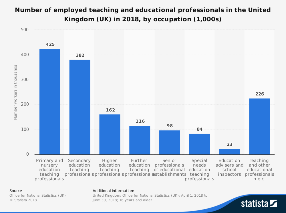
'Statista' Research - Number of Employed Teaching and Educational Professionals in the United Kingdom (UK) in 2018, by Occupation (1000s)
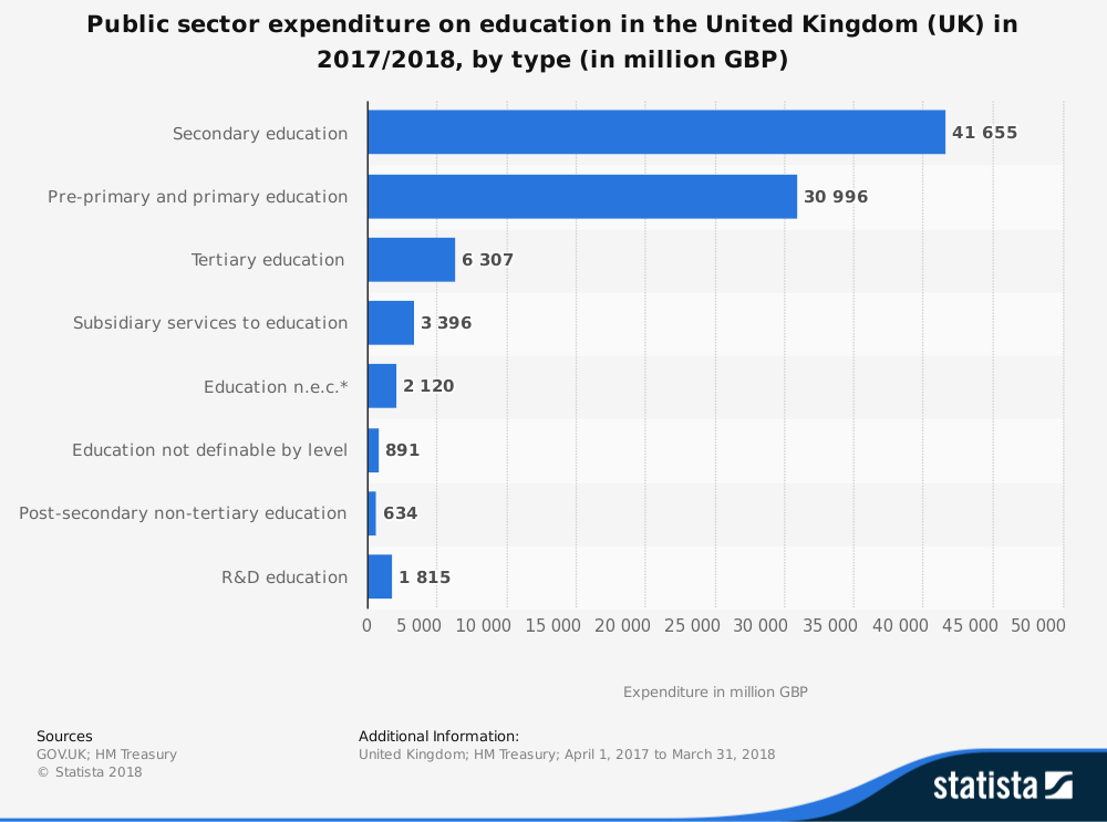
'Statista' Research - Public Sector Expenditure on Education in the United Kingdom (UK) in 2017/18, by Type (in Million GBP)
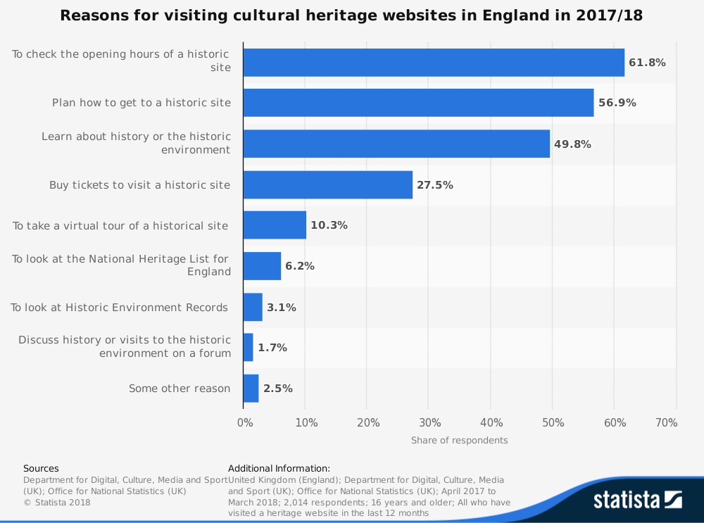
'Statista' Research - Reasons for Visiting Cultural Heritage Websites in England in 2017/18
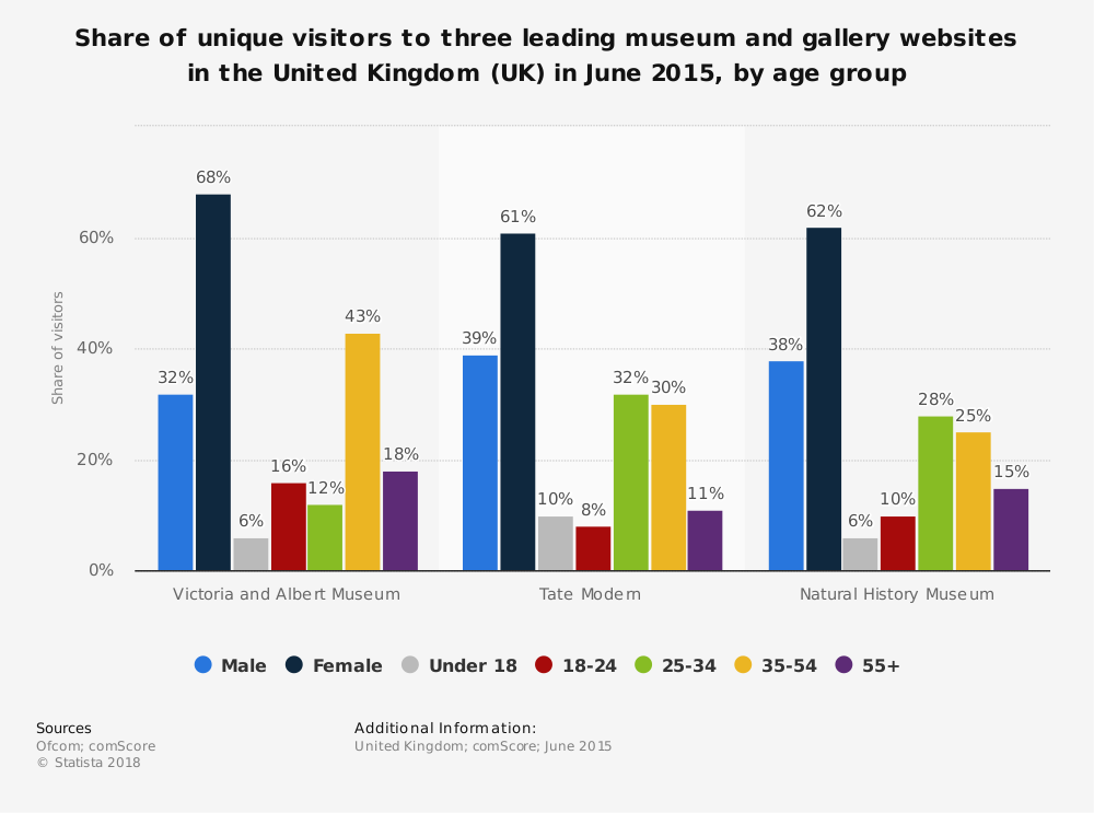
'Statista' Research - Share of Unique Visitors to Three Leading Museum and Gallery Websites in the United Kingdom (UK) in June 2015, by Age Group
Conclusions and Created Target Audience Personas
Overview
After collecting several pieces of research, I then decided to place a red asterisk next to the most relevant points to help myself create conclusions from the research. This will have been evident in the previously provided images. This would then have allowed myself to create target audience personas. As will be evident below, there were numerous aspects to consider whilst progressing with the project in order to satisfy and provide a high-quality user experience to the relevant target audiences.
After creating the conclusions from the research, I then decided to create four target audience personas to help myself fully understand how to produce a website that would have suited the main target audiences. These personas related to different age ranges and personalities, helping to address various different target audiences. This whole process can be viewed below.
Creating Conclusions
Key Aspects to take from the Target Audience Research
- The website will need to be easy to use and understand, especially for those of a very young age
- The website will need to be accessible on multiple devices as different users will use different devices to access the website
- The content on the website must be able to be found easily
- The content must be structured in a clear and easy to follow way
- The website will need to be interesting to accommodate different users with a need to include a variety of content, professional structure and interesting colours and fonts
- The website will need to appear credible in order to engage and retain visitors to the website
- There will need to be positive feedback if implementing a game onto the website
- The information must be credible in order for students and teachers to be able to use it effectively
- The website’s appearance will need to be enthusiastic to encourage more visitors to remain engaged
- Inclusion of page suggestions would be beneficial in helping and guiding the user through the website but not in excessive quantities
- There are more primary school children than secondary school children which means the language will have to accommodate these students more or be suitable for any audience
- Historians and those interested in history are a smaller target audience for the website which means there will be more focus on accommodating the other audiences, however, there will still be consideration for historians and those interested in history
- The website must have an appearance that relates to the topic, creating a nostalgic appearance that excites and enthuses all audiences
The Created Personas
Persona 1
Name: Johnny Green
Age: 8 years
Occupation: Full-time primary school student at 'Winnall Primary School'
Income: No income as Johnny is not currently working
Description: Johnny lives in Winchester and likes to spend his free time playing games and playing football with his friends but he is also a hard-working individual, ensuring that he finishes his homework first before having fun. Johnny has a pet cat called Whiskers and enjoys spending time with Whiskers. One subject Johnny struggles with at school is history, in particular World War 2, and at this current moment in time he has one piece of homework which relates to the Home Front during World War 2. He needs to find a website where he can find information to complete his homework and he needs to find a website which is fun and easy to understand to help himself understand this subject better. Johnny utilises his tablet device to access websites and hopes to find a website that suits his needs.
Persona 2
Name: Dianne Herald
Age: 32 years
Occupation: Full-time secondary school history teacher at 'Kings’ School' in Winchester
Income: £35,008 annually
Description: Dianne is a very enthusiastic individual and loves teaching to different students. She graduated from the 'University of Winchester' studying history, obtaining both undergraduate and postgraduate titles. She is married to her husband Brian with two children called Kate and Thomas and a dog called Max and they all live in Winchester. In her spare time, Dianne loves to read about different aspects of history and improve her knowledge as well as spending time with her family. Recently, she has been wanting to teach her students about the Home Front during World War 2 and needs to find a website which is both exciting and interesting in order to encourage more of her students to participate in the next lesson as some of her students are disengaged usually. She also wants to find out more herself and therefore needs to find a website which is easy to understand and also one which is highly credible and accurate with regards to the information provided.
Persona 3
Name: Andrew Tavern
Age: 19 years
Occupation: Full-time student at the 'University of Southampton' but works at 'Sainsbury’s' in Southampton in a part-time position as a Shop Assistant
Income: £7,731.36 annually
Description: Andrew has just begun studying History at the 'University of Southampton' and he is enjoying the course very much. During his free time, he likes to participate in different university societies including the history club and playing in the pop band as the main guitarist. Andrew is living in Southampton whilst he studies with his home being situated in Liverpool. At home, he has two cats called Maggie and Tommy and enjoys spending time with them both when visiting home from university. Most recently, Andrew has been assigned an essay task regarding the Home Front during World War 2. Due to the fact that he knows that lowly reputable resources will reduce his final grade on the essay, he therefore needs to find a website which is highly credible that provides accurate and clear information in order to understand and use in the essay. Most of the websites he has viewed so far haven’t been useful to the essay and he is still currently searching for a better website.
Persona 4
Name: Kirsty Brown
Age: 43 years
Occupation: Full-time Historian
Income: £45,427.83 annually
Description: Kirsty is very enthusiastic about history and loves to expand her knowledge frequently by exploring various different topics. She is married to her husband David White and lives in Manchester with no pets and no children. In her spare time, Kirsty loves to visit historical places and creates an album of these different places by capturing photographs. Most recently, Kirsty has been wanting to explore more about the Home Front during World War 2 so that she is able to share this with others when presenting to the public. As she wants to collect as much information as possible, she therefore needs to find a website which captures this information in the best way to highlight the key facts easily. She also wants to be able to trust the website she finds, ensuring that the information is of high quality and is credible, otherwise this could damage her reputation as a historian if the facts are incorrect.
This now signified the end of this key task, allowing myself to progress further with other aspects of the project.
Competitor Analysis Research
Overview
Another key aspect undertaken before creating the wireframes and building the website included analysing each identified competitor to understand what was successful and what needed improving. This would have helped myself understand which areas to implement successfully in the new website and those to avoid. This analysis included both general advantages and disadvantages as well as viewing how each website included colours and fonts. To begin, I analysed the general advantages and disadvantages of each highlighted competitor website which can be viewed below.
General Advantages and Disadvantages of Competitor Websites
Advantages and What was Successful
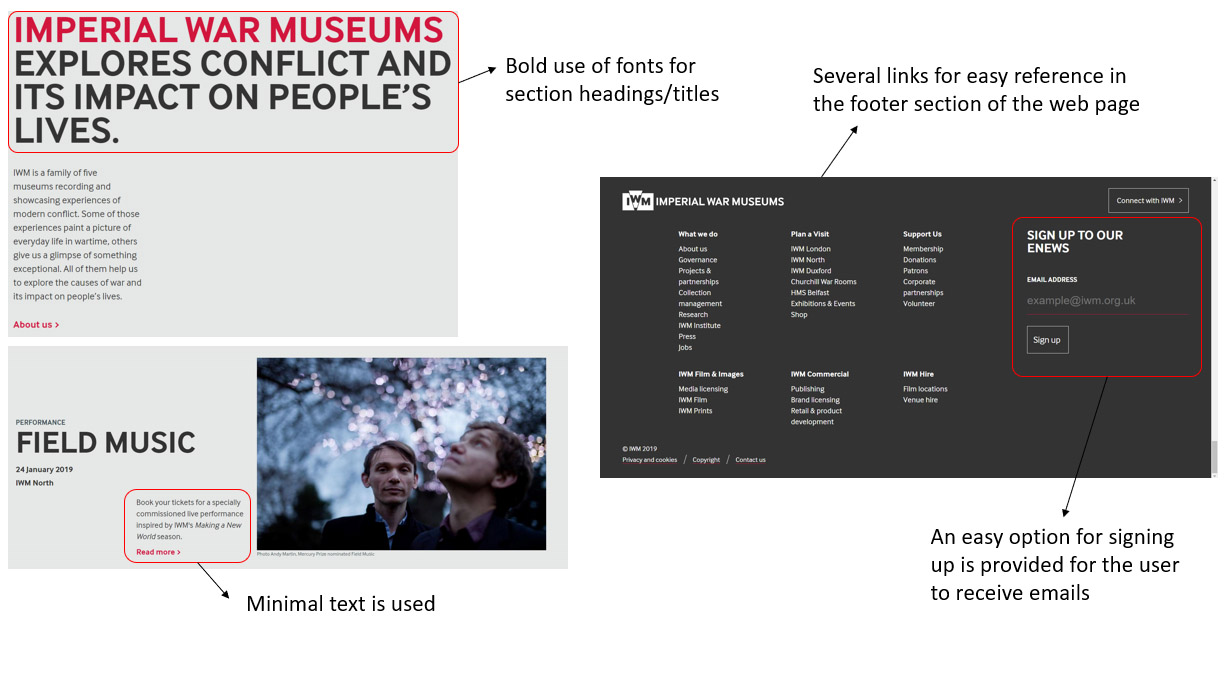
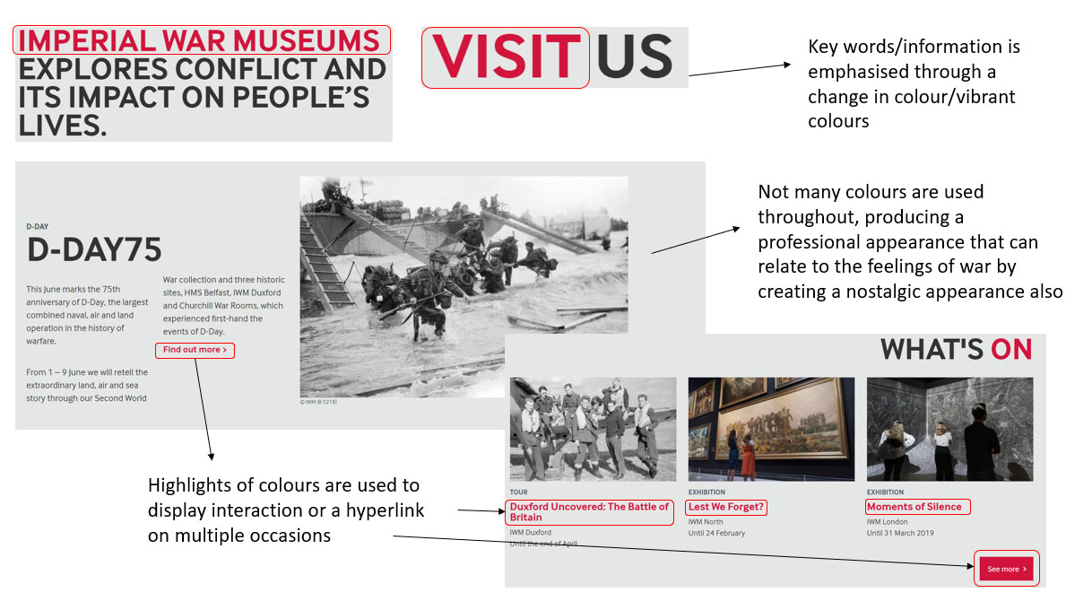
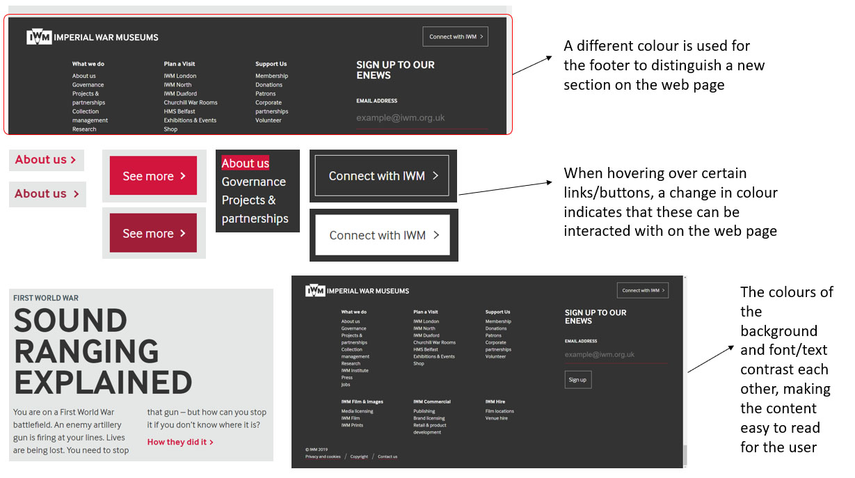
'Imperial War Museums'
Advantages and What was Successful Analysis - Part 1
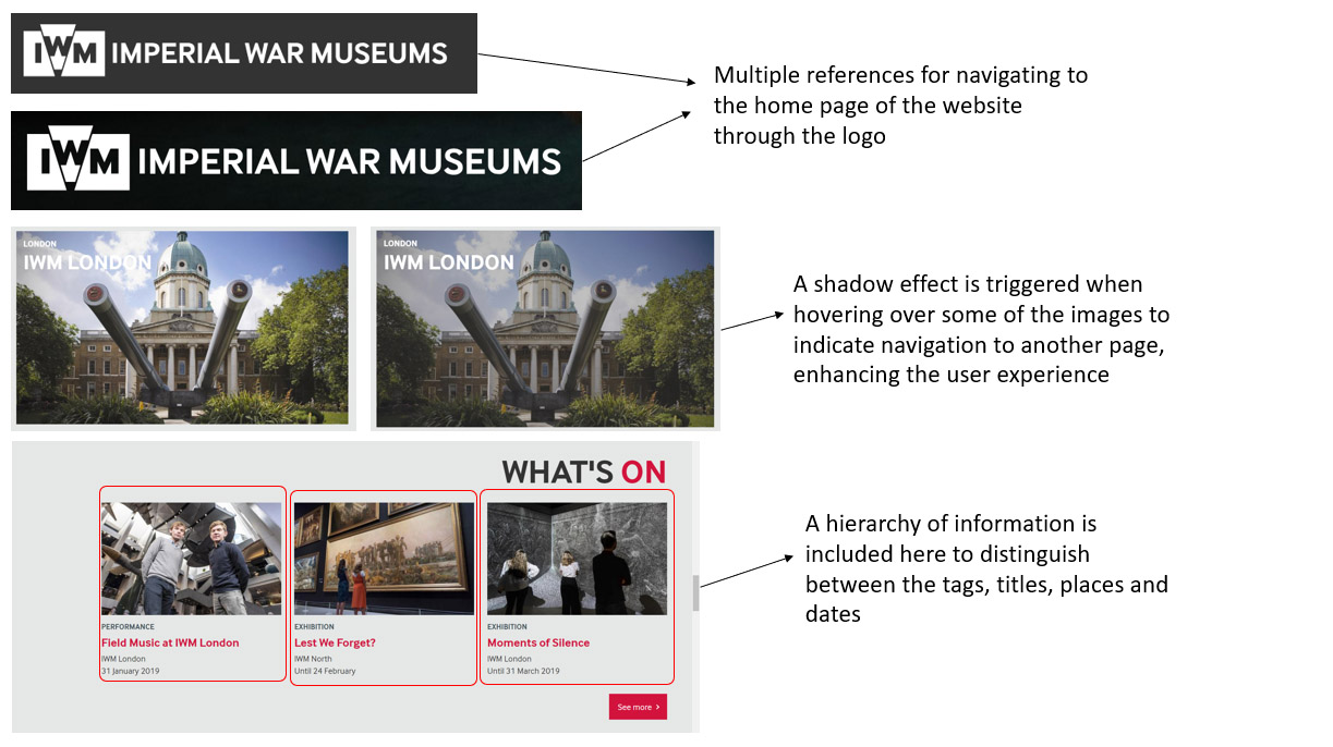
Advantages and What was Successful Analysis - Part 2
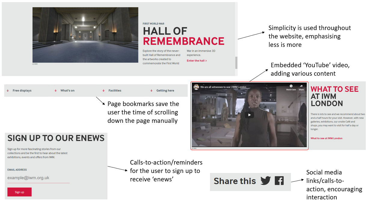
Advantages and What was Successful Analysis - Part 3
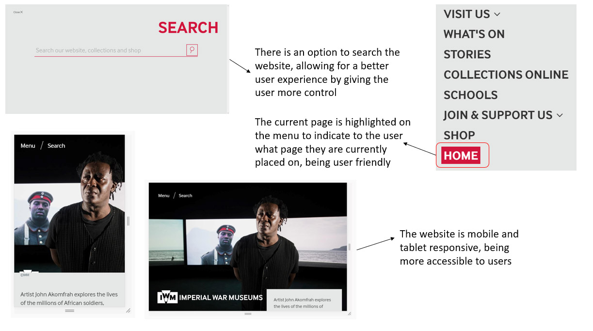
Advantages and What was Successful Analysis - Part 4
'HISTORY'
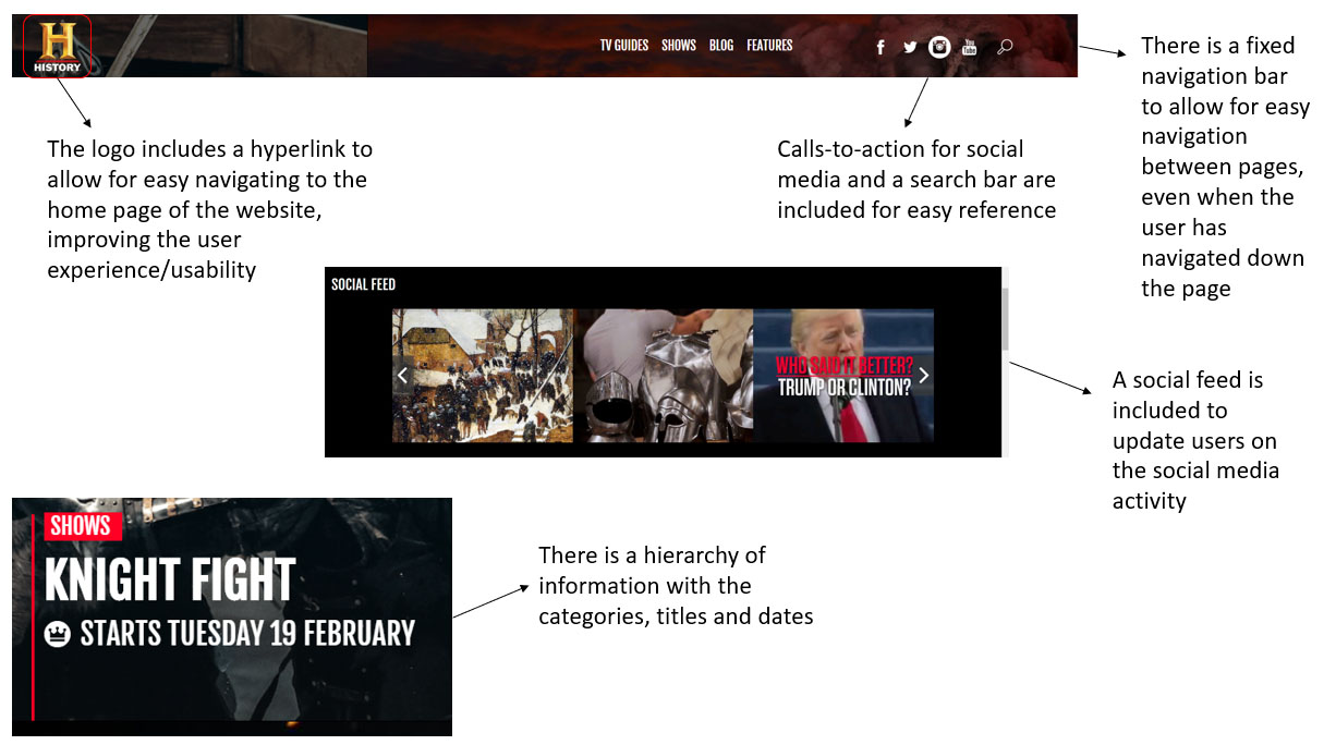
Advantages and What was Successful Analysis - Part 1
Advantages and What was Successful Analysis - Part 2
Advantages and What was Successful Analysis - Part 3
'BBC History'
Advantages and What was Successful Analysis - Part 1
Advantages and What was Successful Analysis - Part 2
Advantages and What was Successful Analysis - Part 3
Advantages and What was Successful Analysis - Part 4
Advantages and What was Successful Analysis - Part 5
Disadvantages and What was Unsuccessful
'Imperial War Museums'
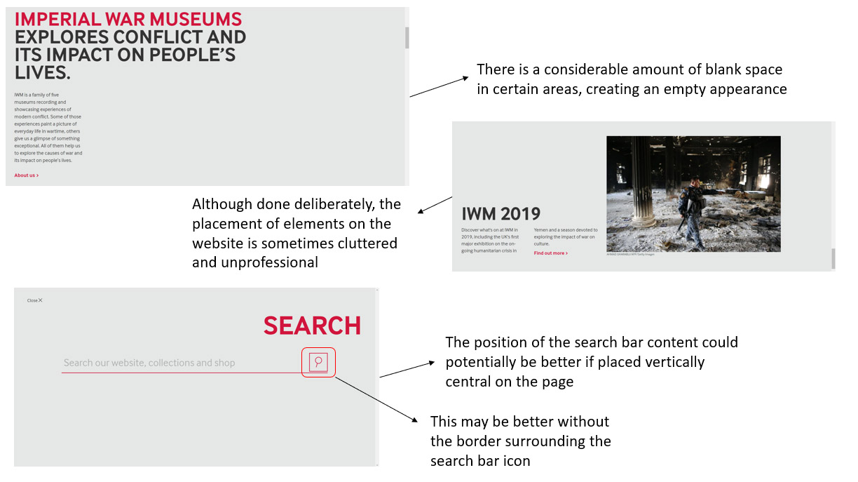
Disadvantages and What was Unsuccessful Analysis - Part 1
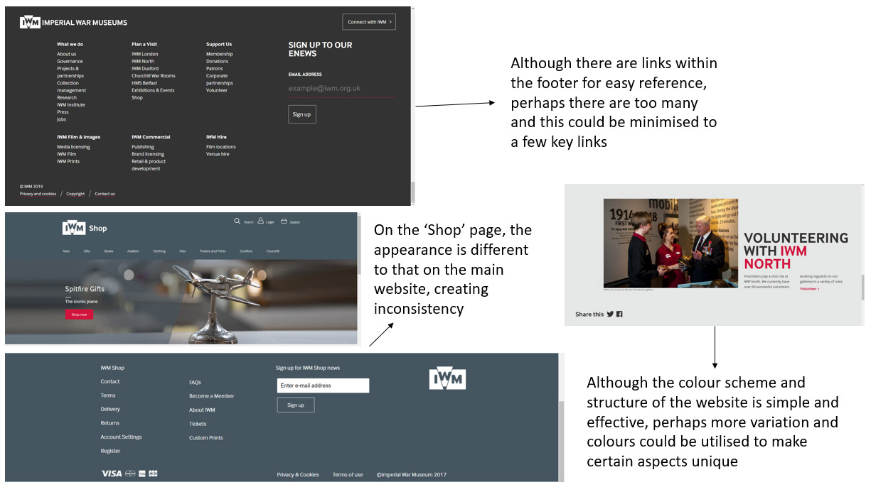
Disadvantages and What was Unsuccessful Analysis - Part 2
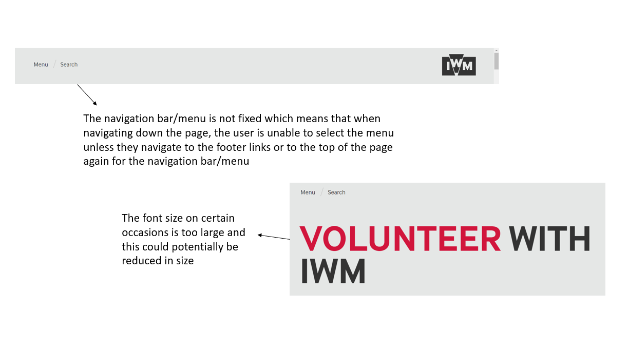
Disadvantages and What was Unsuccessful Analysis - Part 3
'HISTORY'
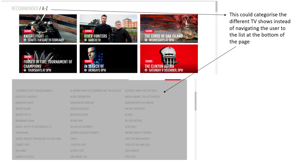
Disadvantages and What was Unsuccessful Analysis - Part 1
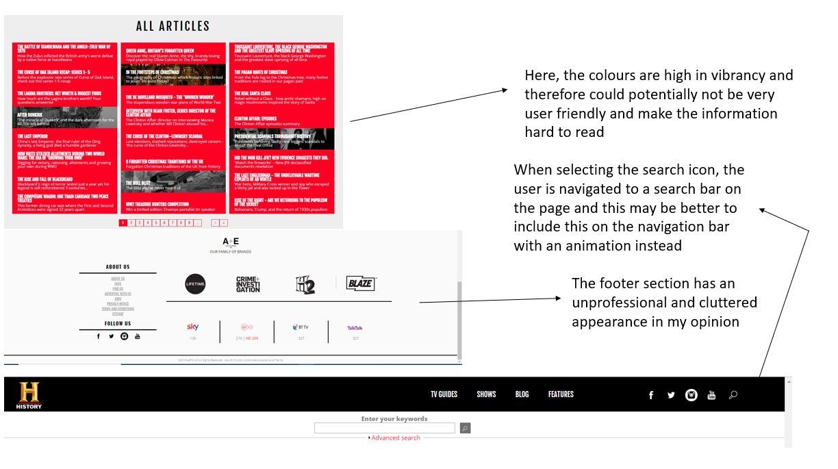
Disadvantages and What was Unsuccessful Analysis - Part 2
Disadvantages and What was Unsuccessful Analysis - Part 3
'BBC History'
Disadvantages and What was Unsuccessful Analysis
Colours and Fonts Analysis of Competitor Websites
Overview
As previously mentioned, after completing the general analysis of the competitor websites, I also undertook analysis regarding how they utilised fonts and colours on their websites. The purpose of this was to influence and inspire the project I was undertaking, helping myself to understand how to integrate colours and fonts effectively and professionally. This analysis for each website can be seen below.
'Imperial War Museums'
Colours Analysis
Colours Analysis - Part 1
Colours Analysis - Part 2
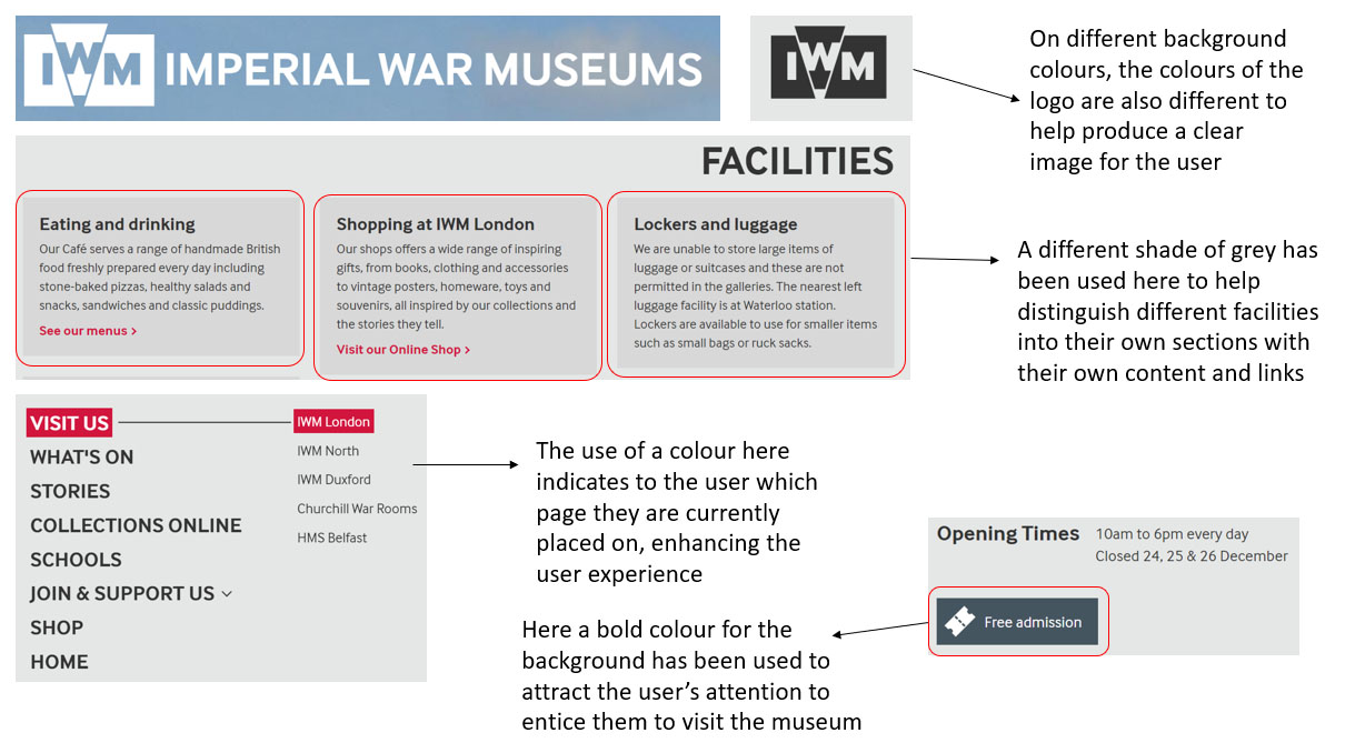
Colours Analysis - Part 3
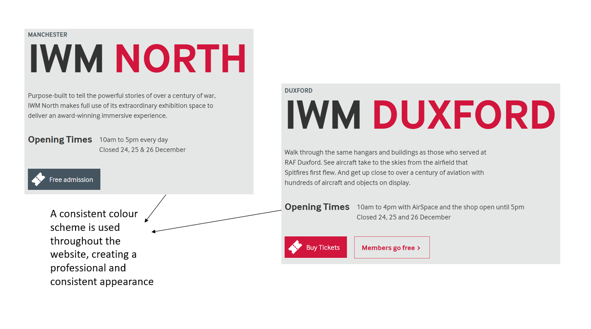
Colours Analysis - Part 4
Fonts Analysis
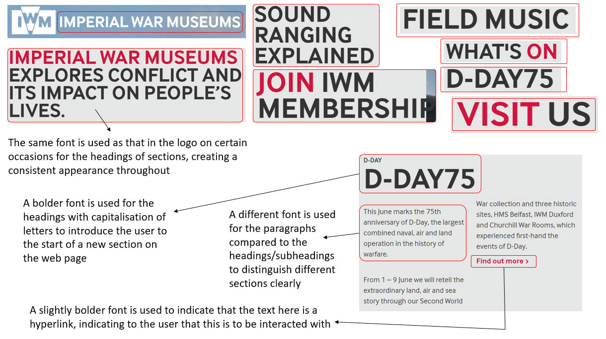
Fonts Analysis - Part 1
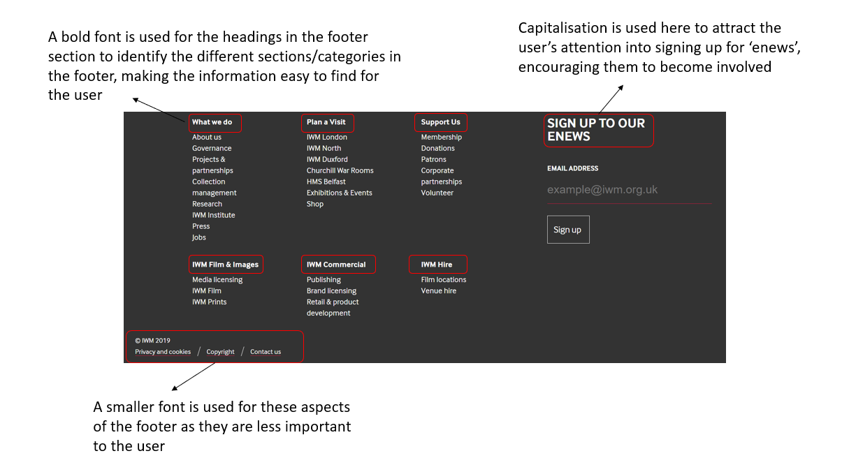
Fonts Analysis - Part 2
Fonts Analysis - Part 3
Fonts Analysis - Part 4
Fonts Analysis - Part 5
'HISTORY'
Colours Analysis
Colours Analysis - Part 1
Colours Analysis - Part 2
Colours Analysis - Part 3
Colours Analysis - Part 4
Fonts Analysis
Fonts Analysis - Part 1
Fonts Analysis - Part 2
Fonts Analysis - Part 3
'BBC History'
Colours Analysis
Colours Analysis - Part 1
Colours Analysis - Part 2
Colours Analysis - Part 3
Colours Analysis - Part 4
Fonts Analysis
Fonts Analysis - Part 1
Fonts Analysis - Part 2
Fonts Analysis - Part 3
Conclusions from this Research
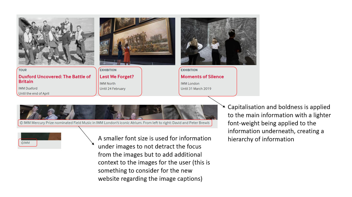
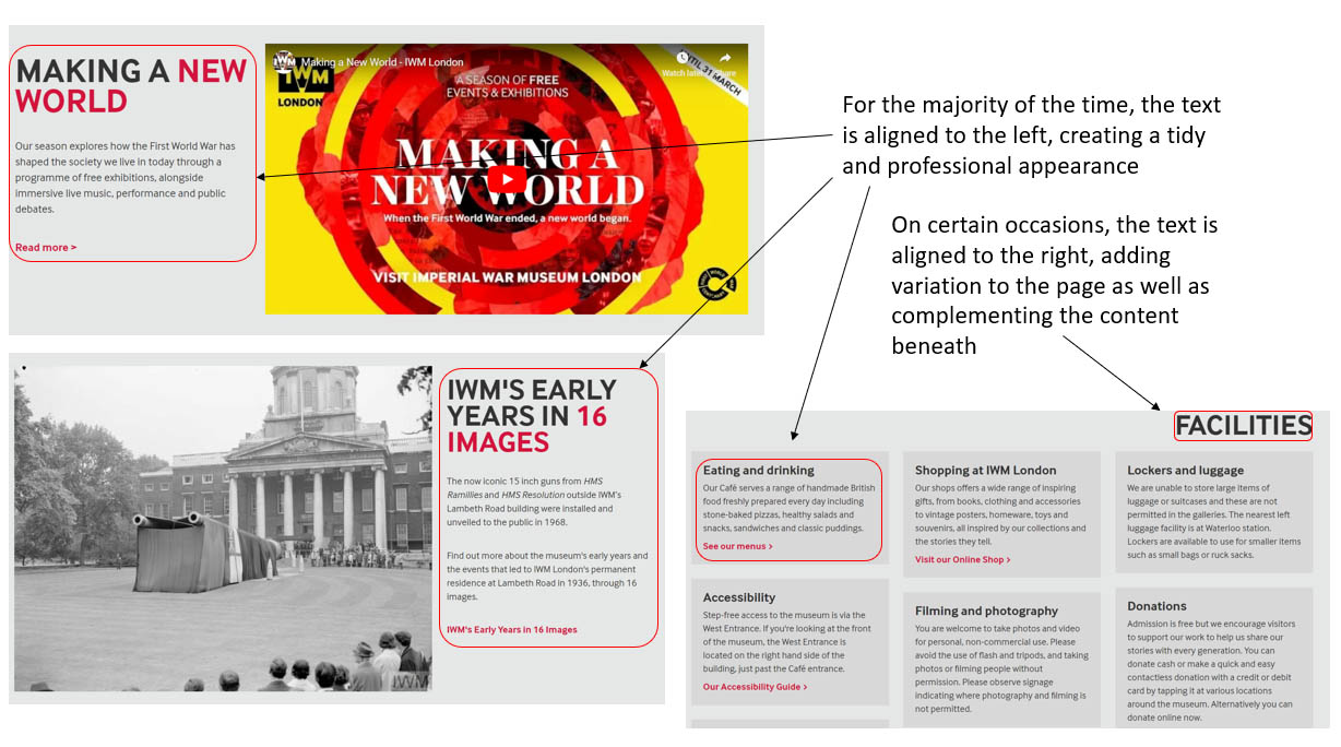
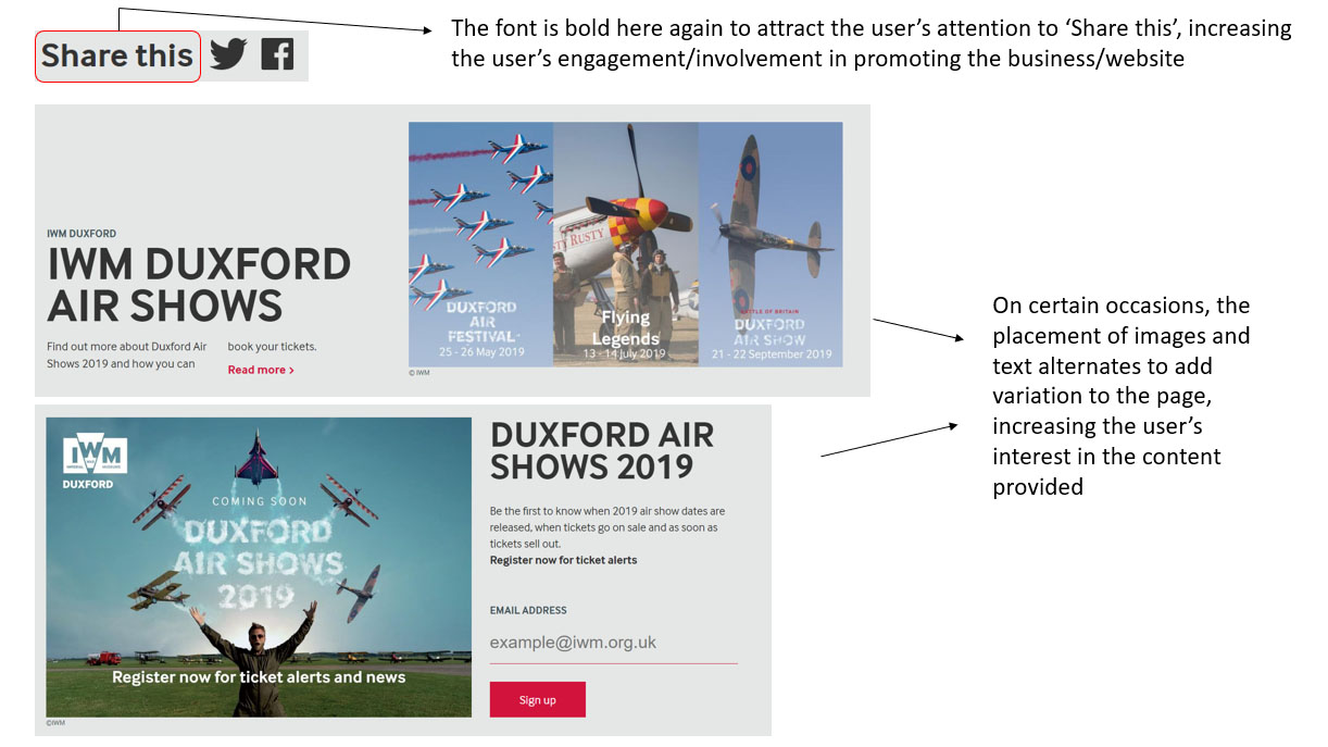
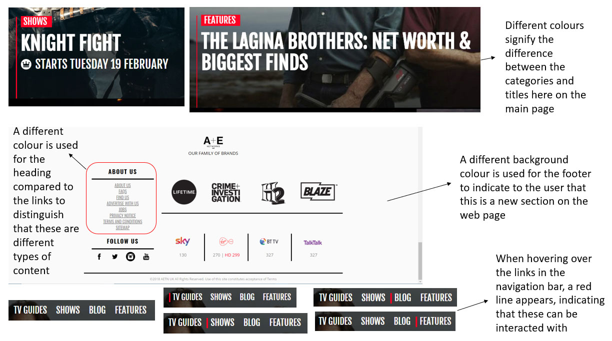
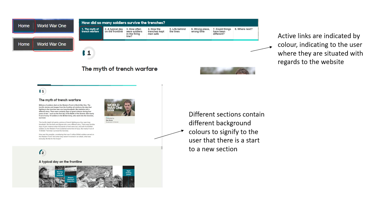
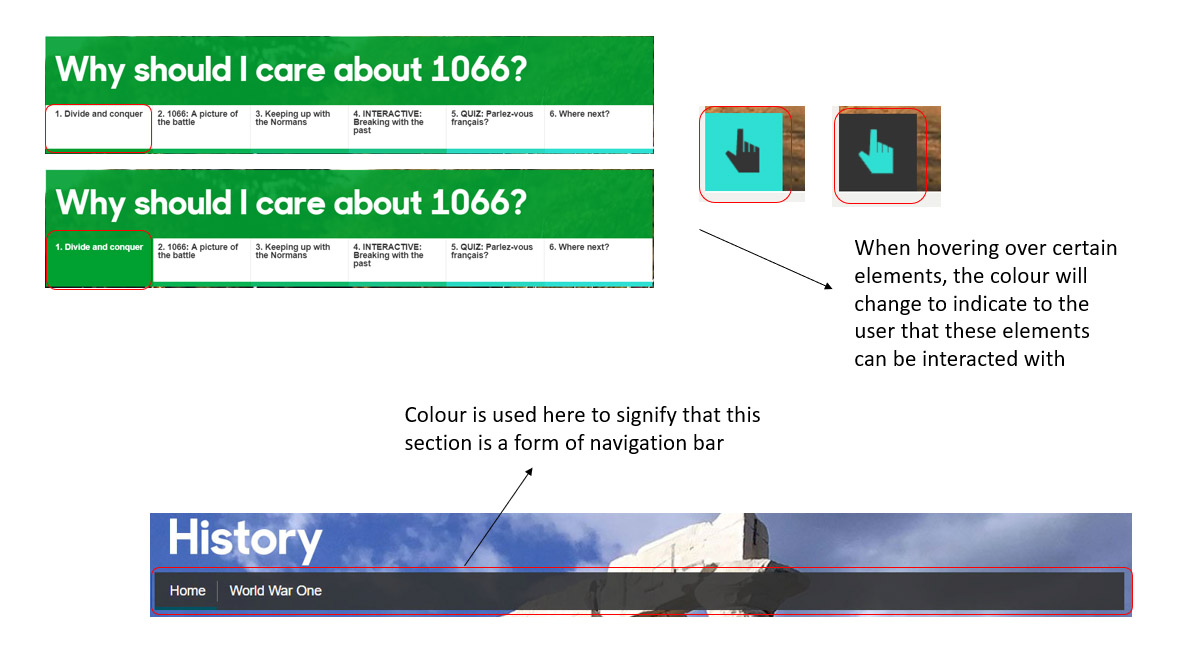
From undertaking all of the analysis above, I understood that colour wasn't overused and that colour could have been utilised to symbolise importance and hierarchy as well as different types of fonts. I also understood different characteristics of fonts as well as colour could be used to indicate interactivity, acting as a visual aid for the user. One final key aspect to note is that I understood that information or content was provided in a clear and professional format to help users find what they wanted faster. These aspects as well as others were considered when progressing further with the project. This now signified the end of this task.
Undertaking Development Research
Overview
As well as undertaking research regarding areas such as competitors, I also believed it would have been beneficial to undertake research regarding website design and development trends and guidelines. This was because this would have allowed myself to understand what worked successfully and what to consider when building the 'Home Sweet Home Front' website to have helped it to appear modern in the industry. This can be viewed within this section.
Website Design and Development Trends for 2019
Overview
To begin, I undertook some research regarding trends to help myself understand aspects I could have possibly integrated into the 'Home Sweet Home Front' website to make it modern and so that it would have followed the latest trends. From doing this, I then listed the key points with some examples to help visualise some key points. Although some listed didn’t relate to the website itself, this still helped myself to understand as a developer what was current within the industry. This can be viewed either below or through the provided link.
The Actual Website Design and Development Trends for 2019 Research
Best Website Practices
Overview
Following on from the previous research, I thought it would have also been beneficial to understand the best practices for websites as this would have helped myself when creating the new 'Home Sweet Home Front' website. This would have helped myself to understand what to include and what to avoid in order to create a fully professional and sophisticated outcome. The key points from this research can be viewed below.
From this research, I understood that the user needed to be considered before other aspects were implemented as well as making sure that the website would have needed to have been clear and easy to use for the user.
The Actual Best Website Practices Research
- Ensure that the branding is consistent throughout the website otherwise this can become stressful and confusing for the user
- Ensure that strong calls-to-action are included as these are very important in converting website visitors into leads
- Also ensure that strong calls-to-action are placed in the correct places, for example 'Learn More' buttons could be situated higher on the page with a contact form being situated at the bottom of the page
- The website must be quick to load
- The website must be suitable for all devices (it must be responsive)
- The navigation on the website must be easy and simple
- Horizontal top navigation is a website design standard
- Search bars are important, allowing users to search through lots of content
- Contact information should be included in the right corner of the navigation bar
- Sticky 'back-to-top' buttons are good to include to allow the user to be able to navigate back to the top of a page when having scrolled down a page
- The photographs included must be of high quality
- The colour scheme of the website must represent the brand
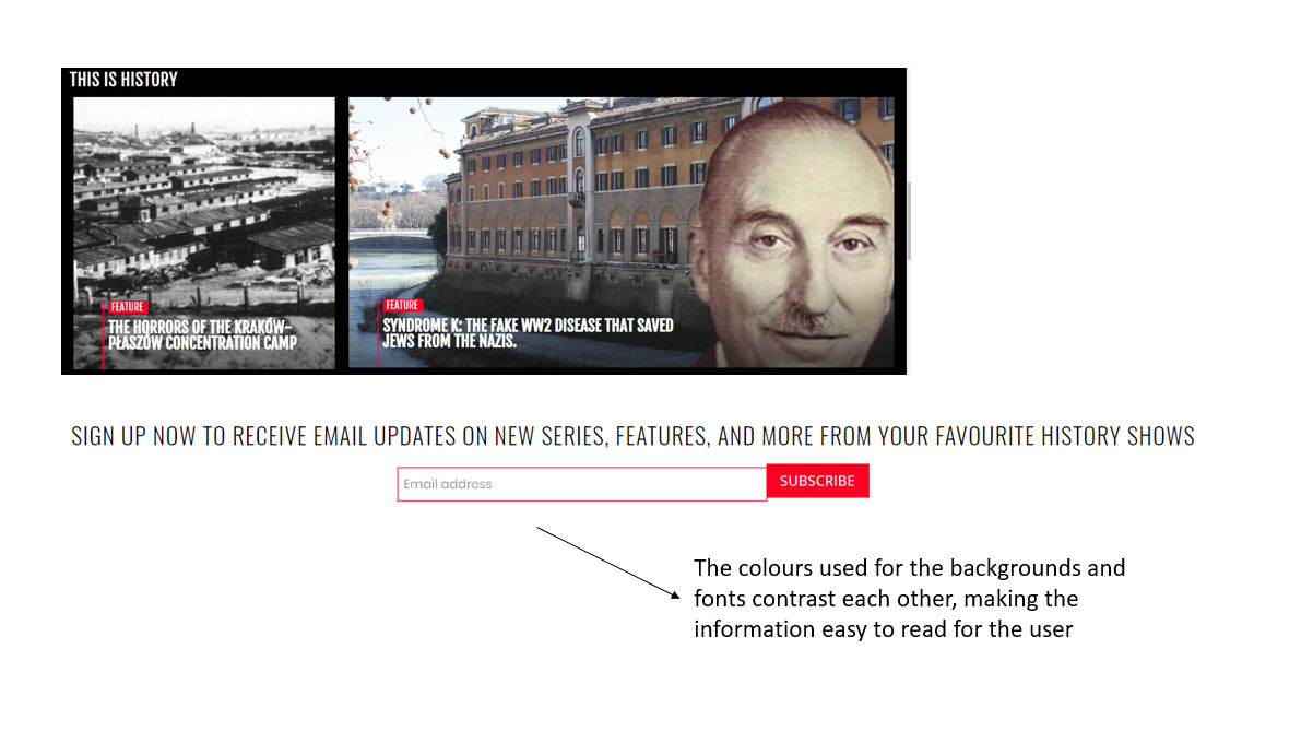
- The colours of the background and text must contrast each other
- Ensure that the design focuses on the user experience
- Ensure that the website can be scanned as people don't read websites
- Make it easy to find interactive buttons and links for the user
- Ensure the website is usable
- Ensure there is a clear and consistent design for the users as this helps users to become familiar with the website
- Make sure that URL, button and navigation placement is solely focused on the usability before integrating the design aspect
- Ensure you know who the target audience is to create the best outcome
- Highlight the most important aspects on the website to create a visual hierarchy
Website Guidelines
Overview
Another aspect of research I undertook related to website guidelines similar to that of the best website practices. This would have also helped myself understand which areas to implement into the new 'Home Sweet Home Front' as well as those which I shouldn’t have considered including to improve the user experience and produce the best possible outcome.
Viewing an Article Online
Overview
Firstly, I began this process by viewing an article online and listing the key points from this research which can be viewed below. As will be evident below, some elements were repeated from the previous research, however this highlighted that some elements were very important to consider when producing a website. The main aspect was understanding the user and to create a website which best suited their needs and not the needs of the person creating the website. Another key aspect understood was that the new website would not have needed to have been overcomplicated but simple to both keep users interested and to not cause confusion or frustration.
The Key Research Points
Simplicity
- Don't utilise too many colours (no more than 5 colours)
- Ensure that the fonts or typography can be read by the user and that there aren't several colours used (no more than 3 fonts with 3 different font sizes)
- When including graphics, ensure they aren't included unless they are important in helping users to complete actions
Visual Hierarchy
- This involves arranging a website's features to encourage users to move towards the more important aspects before viewing the others
- Change the position, colour or size of aspects to make them more visually important
- The majority of website visitors view a website from left to right
Navigation
- Ensure that there is intuitive navigation
- Make sure the structure of the primary navigation is simple and placed in a place near the top of the web page
- Make sure that navigation is also included in the footer section
- Breadcrumbs are useful to show the user the path they have travelled through to be situated on the page they are on
- Ensure there is a search box in a place near to the top of the web page
- Don't provide excessive navigation options
- Ensure that the navigation isn't higher than three levels deep
- Keep the navigation the same on each page
Consistency
- The appearance must be consistent throughout all web pages including aspects such as colours, fonts and writing tone
- Create different structures for certain pages
Accessibility
- The website must be compatible with different devices, operating systems and website browsers
- Add 'alt-text' to all images and other methods to improve accessibility
Conventionality
- Users have become familiar with main navigation being placed either at the top or on the left of a web page
- Users have become familiar with logos being placed either at the top left or centre of a web page
- Users have become familiar with the logo being able to navigate them back to the home page if selected
- Users have become familiar with links changing either their colour or appearance when hovering over them on a web page
- Use icons to distinguish different aspects e.g. a shopping cart icon relates to an ecommerce website
- Ensure that when creating a website that the conventions are abided by otherwise this can cause confusion for the user
Credibility
- Website design conventions help improve a website's credibility which means that these are beneficial to include
- Be honest about the product or service provided on the website to help build credibility
User-Centricity
- Undertake user testing to collect and integrate user feedback
- Ensure that when creating a website, you are thinking about the user and not yourself to create the best user experience possible
Viewing the 'Website Content Accessibility Guidelines'
Overview
After viewing the initial article shown above, I then decided to revisit the 'Website Content Accessibility Guidelines' with the summary provided on the 'GOV.UK' website. This was because I had utilised this in projects before to gain an understanding of how to make a website accessible to all users and believed this to be a good resource. This would have also helped solidify the research found previously. From viewing this, I noted down the notes based on the content provided on the 'GOV.UK' website. This can be viewed below.
From this research, I understood that I needed to address several areas in order to make the website fully accessible and professional. This now signified the end of the research regarding aspects such as trends and guidelines.
The Key 'WCAG' 2.1 Research Points
Overview
- These are a recognised set of recommendations for improving web accessibility
- The guidelines explain of how to make content on the web accessible to everyone
- This includes people with vision, hearing, mobility and thinking and understanding impairments
- WCAG 2.1 is based on the design principles of being perceivable, operable, understandable and robust
- These guidelines help understanding of the ways in which different people interact with web content
- Ways of interaction includes using a keyboard instead of a mouse, changing browser settings to be able to read content, using a screen reader, using a screen magnifier and using voice commands
- This applies to every part of a project including the code and content
Perceivable
- Need to ensure that users can recognise and use a service with their available senses
- Use 'alt text' to provide a text alternative for content that doesn't include text such as images
- Produce audio and video transcripts
- Video captions
- Logical content structure that can be navigated and read by a screen reader
- Ensure a proper markup is used for all aspects such as data tables
- Don't solely use colour to provide an explanation for something
- Ensure that font and background colours contrast each other
- Ensure all features can still be used when increasing the font size
- Don't include images of text
- Ensure responsiveness is included
- Assistive technologies compatibility
Operable
- This means that users must be able to find and use provided content through any method
- Ensure everything functions for people using only keyboards
- Allow people to have control over moving content
- Don't use blinking or flashing content and allow the user to turn off animations
- Include 'skip to content' links
- Descriptive page and frame titles
- Allow for easy navigation through content
- Descriptive links
- Include meaningful headings and labels
- Include 'active focus' for people using keyboards
- Only use mouse events, dynamic interactions and other similar aspects when required
- Allow users to easily turn off and modify shortcut keys
Understandable
- This means that users must be able to understand content and how a product functions
- Use simple language
- Don't use words and phrases that aren't fully known
- Explain abbreviations or acronyms
- Ensure it is stated which language the content is
- Ensure features appear consistently and behave in ways that are understood easily by the user
- Ensure that all fields on forms contain visible and meaningful labels
- Allow users to easily notice and correct form errors
Robust
- This relates to ensuring that several technologies can properly understand the content included on the service
- Utilise valid 'HTML'
- Ensure that the code informs assistive technologies about each interface component's purpose, its current state and if this will change
- Ensure status messages and modal dialogs can inform users of where they are and their purpose as well as being able to allow for interaction via assistive technologies
- Ensure that the user can then return to where they were after the interaction stated above
Identifying Potential Technologies to Utilise
Overview
As well as research regarding aspects such as trends and guidelines, I also decided to undertake some research regarding different technologies to understand if I could have utilised these within the new 'Home Sweet Home Front' website. As the project was based towards front-end website development, this therefore influenced the decision to highlight those technologies based around this area. This research can be viewed below.
Please note that despite undertaking this research, due to the fact that I wanted to create a finished project, I therefore utilised technologies I already had experience of whilst exploring a few new areas.
The Key Research Points
'JavaScript'
- This is beneficial in making a website dynamic
- 'JavaScript' knowledge is needed for both front-end and back-end frameworks
- 'JavaScript' can allow for many various functions
'TypeScript'
- This is an addition to 'JavaScript'
- This is used with 'JavaScript'
- This allows applications to scale
- You can integrate several different 'JavaScript' libraries
- This is open source
'Angular'
- This is used to build client applications in 'HTML' and 'JavaScript' and 'TypeScript'
- 'Angular' is one of the most popular choices regarding frameworks when building single-page website applications
- This is becoming more popular with companies, potentially identifying it as an industry standard technology
- 'Angular' allows for more dynamic website applications
- This allows for quick development
- 'Angular' is compatible with other libraries
- 'Angular' is similar to other 'JavaScript' frameworks
- There is multiple functionality included such as testability and the ability to create components
'React'
- This is used for building interactive user interfaces in an easy way
- This allows for quicker outcomes due to the fact that 'React' renders the components that are only needed
- This is fully component based
- This allows users to produce powerful single-page applications
- This is highly recommended to use
- 'React' allows for collaboration with other libraries and frameworks
'Vue.js'
- This is easy to learn
- This is more suited to smaller projects
- This is used for building website interfaces
- This allows for easier maintenance and testing of a code base
- You can choose which part of an application you place this into
- This allows the user to divide their web page into usable components with their own 'HTML', 'CSS' and 'JavaScript'
- When changing data on a web page, 'Vue.js' updates this where necessary
- There is a command line interface
'SASS'
- Includes variables, nesting and mixins
- This allows for stylesheets to become more readable and 'dry'
- This allows for code that is maintainable
- This is popular within the industry
- This is compatible with any version of 'CSS'
- There are several frameworks built with 'SASS'
'Less'
- This stands for 'Leaner Style Sheets'
- This is a backwards-compatible language extension for 'CSS'
- This includes variables, mixins and nesting like 'SASS'
- This is a similar concept to 'SASS'
'Foundation'
- This is a responsive front-end framework
- This allows for easy designing of responsive websites, applications and e-mails
- This allows for customisations by developers
- This allows for a quicker development process and also page speed
- There is semantic code
- This is widely used by different brands such as 'Amazon' and 'EA'
Wireframes
Initial Wireframes
Overview
To begin the wireframes for the new 'Home Sweet Home Front' website, I utilised the research collected regarding areas including best practices and trends to help influence the outcome of the wireframes, making the web pages appear exciting as well as easy to follow and use.
Desktop Wireframes
Overview
I created two sets of initial desktop wireframes to show variation in approach of how each required web page could have appeared. This would have also allowed the clients to have had more choice when deciding on which wireframes they would have preferred.
I decided to create the wireframes utilising the software ‘Adobe XD’ due to the fact that there were 12 pages with my intention of creating two wireframes for each, totalling to 24 wireframes in total. This would have therefore taken considerably longer by sketching the wireframes and also using ‘Adobe XD’ meant that I could have created professionally structured wireframes to place onto my portfolio for this project.
The two sets of desktop wireframes can be viewed below with descriptions of why certain aspects were integrated.
Desktop Wireframes Set 1
Generic Aspects
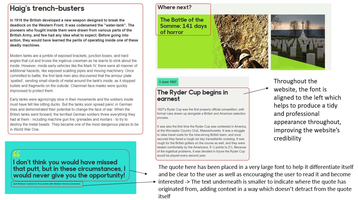
As each set of wireframes attempted to follow a certain format or style, this therefore meant that some aspects remained consistent throughout each page. As will be seen with the first set of wireframes below, I included a navigation bar to be placed across the top of each page with the current viewed page being highlighted through the use of an underline underneath the relevant link. This would have both informed the user of the page that they were currently on and also have helped them to familiarise themselves with the navigation on each page. It is also worth noting that the navigation bar was fixed to prevent the user from needing to navigate to the top of the page to select a certain page link. Also, with regards to navigation, where relevant, page links were provided within the paragraph text when mentioning of other pages or topics. This was due to the fact that this was currently included on the current website and also would have allowed the user to navigate to the relevant page from that aspect in the page as opposed to needing to select a link from the navigation bar.
For the page heading sections, a container was integrated that included space around the page heading, helping to signify that this was the beginning of the page and to add space between this and the first section of the page.
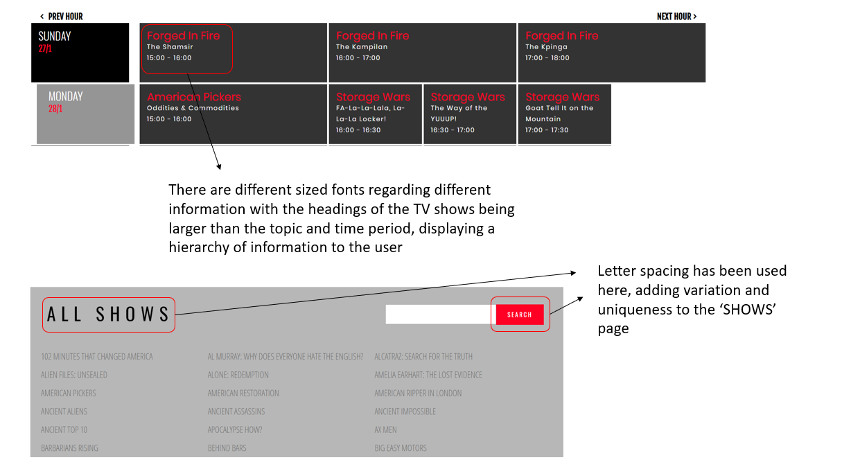
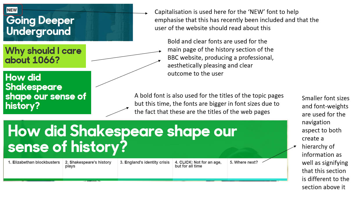
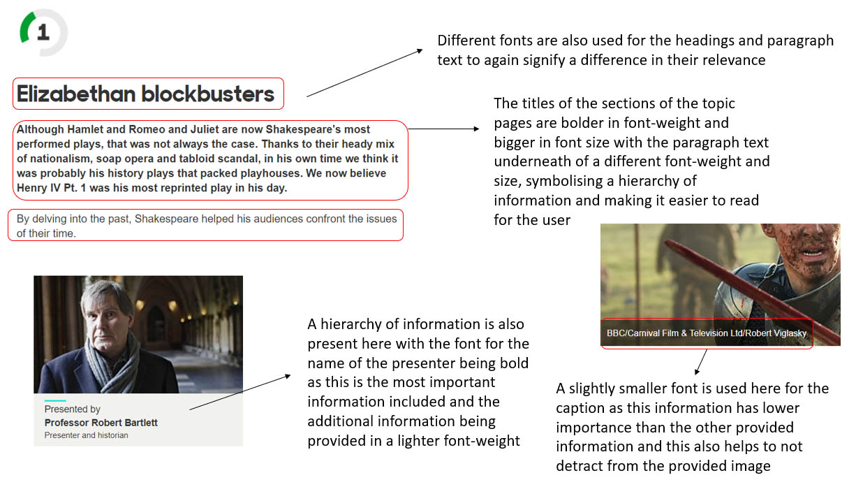
With regards to the fonts, different sized fonts were utilised to identify a hierarchy of information. For example, the page heading was the biggest sized font to help users identify this as the page heading with the headings and subheadings of different sections also being bold but in different font sizes to identify them as different types of headings. A regular font-weight was used for the paragraph text to signify to the user that this information belonged to the bold heading above it. Furthermore, the captions provided, where relevant, were included underneath each image in italics and bold format to help them distinguish themselves as image captions, being a slightly smaller font than that of the paragraphs.
For the footer section of this set of wireframes, the logo would have been positioned to the left with the headings of the different sections being of a bolder font and capitalised to help categorise the links provided within each of the sections. The links were of a lighter font-weight to signify that they were links to be interacted with by the user. The logo was included to help remind the user of the organisation who owned the website as well as creating a consistent brand. A couple of final aspects to note were that a border was included to help divide and separate this from the other sections of the page and that a vertical line was included to divide sections regarding the links in the footer.
Home Page
Regarding the page heading section, I decided to include an image next to the heading, which would have been the logo, to make the page heading more visual and therefore more exciting for the user rather than plain text. I decided to include an introduction section with an introductory image as this was something already included on the current website and I believed that this would have been beneficial in introducing the reader to the website, providing a context. Regarding the ‘Image of the Month’ section, I thought it would have been beneficial to include this in a container that would have differentiated from the rest of the content on the page, attracting the user’s attention to find out more about the image. For the ‘Home Sweet Home Front Timeline’ section, I decided to try and structure this as a timeline to reflect the content’s purpose, including an arrow to show how the events interlinked and followed on from each other. As will be seen throughout the page, I attempted to add variation with different positioning of the content to try and make the web page as interesting as possible rather than having the content in the same format throughout.
Air Raid Shelters Page
As I was still experimenting at this early stage, this is why therefore the title of the page was centred rather than being aligned to the left to try and experiment and understand how the page would have appeared. The introduction section was also positioned more centrally to attempt to signify clearly to the visitor that this was where they should have begun reading on the page. Regarding the ‘Anderson Shelter’ section, this text was positioned to the left with the images to the right to help fill the space of this section as well as to help the reader visualise what they were reading about without needing to scroll to the end of the section. Where possible, alternating text and images were applied. For example, the ‘Anderson Shelter’ positioned the text to the left and the images to the right with the ‘Taking a Chance!’ section being the opposite. This was to add variation to the page and to create a more aesthetically pleasing appearance on the web page. Similar to the ‘Image of the Month’ section on the home page, the ‘Air Raid Sirens – How did they Sound?’ section was placed within a container to separate itself from the rest of the content and indicate an activity for the user, in this case selecting the image to hear an air raid siren in action. As will be evident in a couple of situations on the web page, content was placed centrally for the main reason being again to add variation to the page and to help make the page more interesting, allowing for breaking up of information. Regarding the ‘Other Types of Shelters’ section, this was placed centrally due to the fact that I believed this would have been the best possible method of placing the two images as no text was included.
Blackout Page
The main aspect to note on this page was the ability to switch between the normal colours of the web page, which would have matched that of the chosen colour palette, and the colours of black and white to create a ‘blackout theme’. This was to make the page more interactive and engaging for the user and to help them experience what it would have really been like in complete darkness. The majority of content on the page was positioned to the left to help explore another approach to alternating content, and to help produce a consistent and professional appearance. Content within quotation marks was included in a way that helped it stand out from the other content with a different background colour and the text being placed in bold and in italics as well as including, where relevant, the supplementary information to assist it, providing context. The section placed at the end of the page called ‘Blackout Turns to Dim-Out’ was placed centrally with a different background colour to the container to signify both the end of the page for the user and to also help relate to the fact that the blackout changed to dim-out.
Careless Talk Page
As will be evident with this page, I thought that including an image situated next to the title would have helped to create a more visual page heading section, improving the appearance of the web page. For both the ‘New Slogan for February 1940’ and ‘Keep Mum!’ sections, I decided to include the headings and text included on the current website to allow for a context to be provided for the images situated below each. With regards to the images, I thought it would have been beneficial to include these in a form of carousel to allow for interaction with the user. The user would have been able to select to view different images through the provided previous and next arrow buttons and also have been able to read information about each image, providing an educational experience in an interactive way. The majority of the content on the page was positioned to the left to create both a professional and consistent appearance with the carousel of images being placed in containers that would have been highlighted with colour to make these aspects differentiate themselves from the other aspects of the page, becoming more noticeable to the user.
Dig for Victory Page
As is similar to the previous page, I decided to include an image situated next to the title to help create a more visual page heading section. This was influenced by the provided image at the top of the page on the current website. The content within quotation marks on this page was included through a method to help it stand out from other content on the page with a different background colour and the text being placed in bold and in italics as well as including, where possible, the supplementary information to assist it, providing context to the quotations. Where possible, the content was positioned to the left to help create a consistent and professional appearance throughout the page. This related to the ‘Introduction’, 'Success of the Campaign', ' 'Woolton Pie' ' and ' 'Meat and Poultry' ' sections on the page. There were exceptions to this though with one including the 'Examples of Dig for Victory Posters' section. This was positioned centrally due to the fact that the 'Dig for Victory Anthem' was placed in its own section above, signifying there was no text to be placed with the provided images. Therefore, in my opinion, I believed this to be the best way to structure this whilst also adding variation in structure to the page. Another exception was the section which contained both 'Doctor Carrot' and 'Potato Pete' where the content was structured in a column format with a line to separate both aspects. The column format allowed for the content to be placed without creating the appearance of being compact. The reason why these aspects were included within the same section was because that they were related from my understanding of having viewed the current 'Home Sweet Home Front' website.
Evacuees Page
For this page, no image was included within the heading section of the page due to the fact that there wasn’t one to utilise on the current website. The majority of the content was positioned on the left to again create a consistent and professional appearance throughout the website. One key aspect to note on this page was the fact that for the subheadings of some of the sections, these were of a smaller font with the information below being indented to signify to the user that these belonged to the same section and that these weren’t the start of new sections.
Although the 'Clothing Required as part of the Government Evacuation Scheme' was a section within the main section 'Saying Goodbye to Loved Ones', this was included within a container with the content being centred. This would have been styled to make this aspect stand out as this was a section on the current website that was structured differently and therefore unique. The images were to be placed first as these images currently acted as headings on the current website, with bullet points beneath to provide clear information for the user. Headings would have been used, where appropriate, to distinguish which bullet points belonged to certain categories.
Similar to the 'Clothing Required as part of the Government Evacuation Scheme' section, the 'Those Leaving the Major Cities to Safer Heavens' section was to also be included within a container that would have helped to make it stand out. This was because, again, this was an aspect of the current website which was styled differently to other parts. The content was to be centred with the statistics provided in a tabular format, helping to attract the user’s attention to this aspect and to make it easy for them to understand the content.
The final aspect to note was the fact that the 'Time to Reflect' section, which was the last content section of the page, was styled differently with regards to the colour used to signify to the user that this was the end of the page, differentiating itself from the content above.
Rationing Page
The content for this page was mostly positioned to the left again to help create a professional and consistent appearance throughout. No image was included in the page heading section due to the fact that there was no image to include from the current website.
The content within quotation marks on this page was included through a method to help it stand out from other content on the page with a different background colour and the text being placed in bold and in italics as well as including the supplementary information to assist it, providing context to the quotation.
For both the 'Weekly Allowance' and 'What Clothing Cost in terms of Coupons' sections on the page, I decided to place both of these sections within containers that would have been styled to make these aspects distinguish themselves from other aspects of the page. This was to make these aspects more interesting than placing the content to the left of the page, including bullet points or concise information within a table to provide clear and informative information for the user. This also helped to add variation to the page, preventing the whole page from becoming paragraph blocks which could have potentially disinterested the user. For the 'Weekly Allowance' section, a separation of content and visuals was integrated through the use of a vertical line, allowing the user to visualise a week’s worth of rations whilst also reading the bullet points.
The final aspect to note was that at the end of the page, the 'Petrol Rationing' and 'Cosmetics Rationing' sections were included on the same line. This was to add variation to the page by separating each section with a vertical line as the two sections before, 'Making Do' and 'Other Forms of Rationing', were formatted using the same method.
Squander Page
As with most of the other pages for this set of wireframes, the content was structured to attempt to include most of the content to the left to create a professional and consistent appearance throughout.
Furthermore, likewise to most of the other pages, the content within quotation marks on this page was included through a method to help it stand out from other content on the page with a different background colour and the text being placed in bold and in italics as well as including the supplementary information to assist it, providing context to the quotation.
For the ' 'Is Your Journey Really Necessary?' ' section, I decided to include the images beneath the paragraphs due to the fact that including the images next to the paragraphs would have created a considerable amount of white space in-between the paragraphs and the next section. This would have therefore created an unprofessional appearance.
I decided to add a 'Squander Reminder Posters' section due to the fact that the Lord Woolton quotation had been included in another section and due to the fact that there was very little text to include with the images. The 'Squander Reminder Posters' section was positioned centrally due to the same reasons stated above. Therefore, in my opinion, I believed this to be the best method of structuring this whilst also helping to add variation in structure to the page to make the web page more interesting for the user.
With regards to the 'Making Do' section, I decided to include bullet points for the ways people got by during rationing. This was because of the way in which the information was currently implemented through the use of Roman numerals on the current website. I also thought bullet points would have helped to make the information clear and easy to understand.
Home Guard Page
As with most of the other pages for this set of wireframes, the content was structured to attempt to position most of the content to the left, creating a professional and consistent appearance throughout.
Furthermore, likewise to most of the other pages, the content within quotation marks on this page was included through a method to help it stand out from other content on the page with a different background colour and the text being placed in bold and in italics as well as including the supplementary information to assist it, providing context to the quotation.
Regarding the 'Invasion Fears and the LDV' section, I decided to include one aspect of information in bold due to the fact that this was both an additional and interesting piece of information for users to read. This would have therefore helped to attract the attention of the user and hopefully maintained their interest.
With relation to the 'The Dad’s Army Role' section, I decided to place the images below the paragraphs for the same reason as that stated for the ' 'Is Your Journey Really Necessary?' ' section of the 'Squander Page'. This was because if I were to place the images next to the paragraphs, this would have created unnecessary white space, creating an unprofessional and unattractive appearance.
Due to the fact that the 'So what did the Home Guard actually do?' section on the current website included different letters of the alphabet to distinguish each of the different roles, I therefore thought it would have been beneficial to replicate this but through the use of bullet points instead. Bullet points would have helped to create a professional structure and to differentiate each role in a clear way for the user to understand. It’s also worth noting that this was a section within the main section called 'The Dad’s Army Role' which meant, as explained before, the content had been indented to display to the user that this was part of the same section and not the beginning of a new section on the page.
Finally, the content of the 'Thank You' section placed at the end of the page was placed in a container that would have been styled to help the user identify that this was the end of the page, enhancing the user experience.
Land Girls Page
As has been explained with most of the other pages for this set of wireframes, the content was structured to attempt to position most of the content to the left, creating a professional and consistent appearance throughout.
Furthermore, likewise to most of the other pages, the content within quotation marks on this page was included through a method to help it stand out from other content on the page with a different background colour and the text being placed in bold and in italics as well as including the supplementary information to assist it, providing context to the quotation.
With regards to the 'Work and Conditions' section, the images were placed beneath the text as including these next to the text would have caused unnecessary white space, as explained before, creating an unprofessional and unattractive appearance.
The only aspect that was largely different on this page was the ‘Uniforms’ section. The image was placed to the left with bullet points placed on the right, helping to clearly state what the uniform consisted of. The reason why the placement of these elements wasn’t opposite was due to inspiration from the current website where the image was placed first and the information after. It is also worth noting that a vertical line was included to help separate each of these aspects, creating a professional and well-structured appearance.
WVS Page
An image wasn't included for the page heading section of this page due to the fact that there wasn’t one available on the current website to utilise for this section.
As has been also explained with most of the other pages for this set of wireframes, the content was structured to attempt to position most of the content to the left, creating a professional and consistent appearance throughout.
With regards to the 'The WVS – A Brief History' section, I decided to format this in the method of a timeline to make this section more visually exciting for the user with the timeline being positioned centrally to help this aspect be bold and eye-catching.
Regarding the duties of the WVS, although these were listed on the current website meaning that I could have integrated bullet points as seen with the other wireframes, I thought it would have been beneficial to include the duties as subsections with the relevant subheadings, paragraphs and images. This would have helped to create a more visually pleasing web page for the user and have allowed for them to fully understand each of the different duties the WVS had. It is also worth noting that horizontal lines were placed in-between each subsection to help distinguish between each. For the 'Civil Defence Support' section, I decided to include bullet points as the information that was included within this section was almost similar to a list which meant that including bullet points would have provided a clear and professional format for users to easily understand.
Other WW2 Websites Page
An image wasn't included for the page heading section of this page due to the fact that there wasn’t one available on the current website to utilise for this section.
As has been also explained with most of the other pages for this set of wireframes, the content was structured to attempt to position most of the content to the left, creating a professional and consistent appearance throughout.
In order to make the 'Important' message included on the current website clear and obvious to the user, this was therefore placed at the top of the web page, being positioned centrally and in a container to ensure that users wouldn’t have overlooked this. To also assist in this, the colour of red was utilised as this was a vibrant colour and would have helped to attract the user’s attention.
For the actual links to the other World War 2 websites, these were included within the images on the page so that when hovering over each image, the name of the website or company would have appeared with the required link to select. This would have made the web page more interactive and interesting for the user.
The final aspect to note was the fact that the 'We can Give your WW2 Website a Mention!' section was included in a container that was positioned more centrally with space surrounding it to help this aspect become more noticeable to the user. This would have helped encourage them to partake in sending an e-mail to the people at 'Home Sweet Home Front'. The 'Please Note' aspect remained in bold to attract the user’s attention, ensuring that the user would have understood that their website may not have been displayed.
Desktop Wireframes Set 2
Generic Aspects
The hierarchy of information with regards to different font sizes and font weights remained the same as that in the previous set of wireframes but the description provided here is for reference. For example, the page heading was the biggest sized font to help users identify this as the page heading with the headings and subheadings of different sections also being bold but in different font sizes to identify them as different types of headings. A regular font-weight was used for the paragraph text to signify to the user that this information belonged to the bold heading above it. Furthermore, the captions provided, where relevant, were included underneath each image in italics and bold format to help them distinguish themselves as image captions, being a slightly smaller font than that of the paragraphs.
The navigation bar and links within some of the content remained the same due to the fact that this was believed to be the best method of approaching this. Please refer to the previous 'Generic Aspects' section regarding the first wireframe set.
The main aspects which differed to this set of wireframes compared to the previous set began with the page heading sections. Instead of integrating a container with space around the headings, an horizontal line was placed underneath each page heading to help separate these sections from the other sections of each page. I integrated this as I thought it would have been beneficial to creating a more professional and well-structured appearance. As well as this being integrated for the page headings, this was also integrated for each section heading of the page for the same reason as before but to also explore a different approach.
With regards to the quotation sections of the relevant pages, the concept remained the same of having a different colour background, placing the text in bold and italics and supplying assisting information to provide a context. However, the format of this in this set of wireframes was different with the quotation text being smaller in font size and the assisting information being supplied inline with a vertical line to separate both pieces of content. This was to allow the user to be able to refer more easily to the context of a quotation when reading the quotation instead of needing to navigate further down the page. This would have provided a better user experience as a result.
Regarding the subsections on some of the pages, the concept remained the same of having a smaller font size for the subheadings and indenting the information to signify that these aspects belonged to one of the main sections. However, a vertical line was included to help divide the subheadings from the paragraphs, acting as the same purpose as that for the main sections with their included horizontal lines.
With relation to the way in which the content was positioned on each of the pages, the consistent theme was to attempt to help alternate the positioning of this. This meant that for one section, the text would have been placed to the left with the image(s) situated to the right and for the next, this would have been the opposite. This was to explore different formatting of content as opposed to keeping the content in a fixed position on each page as was evident in the previous set of wireframes. This would have also helped the clients to choose from different appearing wireframes for the website.
The order in which items were placed in the footer section remained the same as that in the previous set of wireframes. The logo was positioned to the left and was included to remind the user of the organisation that the website belonged to and to create a consistent brand. However, instead of including the footer section headings next to each of the links, this time the headings were included above the links with a horizontal line below. This was to follow the same pattern as that with the page headings and other headings on the page with horizontal lines. A vertical line was included, again, to help divide and separate each of the sections regarding the links in the footer section. One final aspect to note is the fact that a border remained for the footer to help separate itself from the other sections of the page and clearly identify itself as a footer to the user.
Home Page
With regards to this page, the only aspects that differed from the previous wireframe was that instead of including a navigation bar at the top of the page, links were included when hovering over the different provided images. This would have helped to make the website more interactive and interesting for the user. The generic aspects that changed have been explained previously.
Air Raid Shelters Page
The only aspect that differed on this page, that hasn’t been mentioned in the 'Generic Aspects' aspect before, was the 'Air Raid Sirens – How did they Sound?'' section. The difference was that the content was positioned centrally within its container, helping to potentially attract the user’s attention better than being displayed at full width of the container.
Blackout Page
The first evident change that will be noticeable here is the fact that instead of including all of the text for the 'Britain is Blacked Out' section in the same place, this was divided. The title was situated to the left with a black background and white text and the paragraph text was situated to the right with a white background and black text. This was to signify the theme of black and white, relating to the actual blackout. Capitalisation was included for the heading to signify this as a big issue. A border was included around both sections, helping to differentiate this from the content both above and below.
One of the main aspects that differed from the previous wireframe was that there was an alteration of black and white containers or backgrounds to help relate to the theme of black and white as it would have been during the blackout.
Furthermore, within the 'Businesses are Hit Hard' section, the headings of 'Factories' and 'Local Shopkeepers' were placed in italics compared to the previous section to help create a hierarchy of information for this section as well as attempting different approaches. A vertical line was also included to help separate both of the different affected businesses, creating a professional and clear structure.
Regarding the 'Other Posters Reminding People to be Sensible in the Blackout' section, the structure of this was different to the previous wireframe as instead of placing the images in a row with their captions underneath, they followed the style of the second set of wireframes by alternating with their captions. For example, for the first image, this was situated on the left with the caption to the right and for the image after this, this was placed to the right with the caption to the left. This was to help relate to the style of the web pages, as stated before. Furthermore, a horizontal line was included under each image and caption to help clarify the structure and separate each different image with their caption.
The final aspect to note, that hasn’t been mentioned regarding the generic aspects, is the fact that in the 'Blackout Turns to Dim-Out' section, the heading font was capitalised with the paragraph font below being in bold to help signify that this was both the end of the blackout and the end of the page for the user. It was to also highlight the key events that occurred to reduce the blackout to dim-out.
Careless Talk Page
The main and only difference on this wireframe compared to the last was that instead of including an interactive carousel, the images and their corresponding information would have been placed on the page instead, exploring another method of showing each image with their relevant information. This would also have allowed for the page to be filled with more content. This would have followed the same structure as that for the other pages of this wireframe set with the alternating content to provide variation and more interest to the page. Also, not including a carousel would have potentially made the page easier to use for the user, especially relating to primary school children.
Dig for Victory Page
Due to the fact that there was an aspect on the current website that included an image of both 'Doctor Carrot' and 'Potato Pete' together, I therefore thought it would have been beneficial to include a section on this wireframe dedicated to this. This was because in the previous wireframe, I had included this within the 'Doctor Carrot' section and not in both. I decided to format this in the method of that used for the 'Image of the Month' section on the home page wireframe with a container styled in a particular way to help this stand out on the page. A title was included with some information underneath in italics to help indicate that this was a different type of section on the page and the image was included next to the information.
Furthermore, with regards to the actual sections of 'Doctor Carrot' and 'Potato Pete', I decided to not include these inline with each other but with one being placed after the other. This would have then allowed for the user to easily read one section without becoming distracted by the other. A similar format was used to that on the current website where the image would have been placed first and the information after. This was to try and allow the user to visualise the characters first before reading about them. It is also worth noting that for the 'Potato Pete' section, context was provided to the quotations to allow the user to understand what the quotations related to as this was something not included in the previous wireframe.
The 'The Success of the Campaign' section was also different due to the fact that the title was centred to try and differentiate from the 'Potato Pete' section before.
For this wireframe, the reason why the quotation beneath the section mentioned above was not in the format as that as the other quotations on the page was because there was no relevant context to provide for the quotation. This meant that making this smaller in font size to accommodate would have appeared unprofessional and would have degraded the web page’s appearance.
The final aspect to note that changed is the fact that the ' 'Woolton Pie' ' and ' 'Meat and Poultry' ' sections were displayed inline with a vertical line placed in-between. This was to help create a different formatting option for this section and to improve the appearance of the web page. A vertical line was included to separate each heading and their relevant content, creating a clear structure.
Evacuees Page
Apart from the aspects mentioned regarding all wireframes, there were only two major changes within this wireframe.
The first related to the 'Clothing Required as part of the Government Evacuation Scheme' section where instead of including this in a container, this was in the format as that for the subsections on this page. This meant that the heading was separated from the images and bullet points by a vertical line. This was to help the user understand that this section related to the 'Saying Goodbye to Loved Ones' section and to also follow a more consistent and professional appearance as that displayed throughout the page. The same format followed as before with regards to the images and bullet points, as I believed this to be the best way of displaying this information clearly and effectively.
The second element that changed related to the 'Those Leaving the Major Cities to Safer Heavens' section. Instead of including the figures within a tabular format, the different categories were listed first in italics with their relating figures in a regular font to distinguish between the two different pieces of information. To make the 'Total Number' aspect more apparent than the previously mentioned categories and figures, this was included in a bold and slightly larger font without italics to help create a hierarchy of information and indicate different context behind the information. This helped to create a clear and concise structure.
Rationing Page
With regards to this page, this differed in multiple places compared to the previous wireframe.
The first area to note is that for the 'The Development of Rationing' section, instead of placing the bullet points horizontally, these were placed vertically as this provided a better appearance on the page and appeared more professional also.
Secondly, the 'Weekly Allowance' section was formatted to suit the structure of this set of wireframes, as explained before regarding all wireframes, to produce a consistent appearance throughout the page. However, the content was still placed within a container and it was centred to help this aspect differentiate itself from the other content and make the page more interesting for the user as was the same for the previous wireframe.
The majority of the 'Clothes Rationing' section remained the same as the previous wireframe. However, a vertical line was introduced to help create a bigger divide between the 'Gents Suit' and 'Ladies Clothing' and also because this helped to create a professional and well-structured appearance.
Furthermore, the majority of the 'What Clothing Cost in terms of Coupons' section remained the same with regards to the tabular format. However, the heading for this aspect was positioned inline with the table instead of above it. This was because I wanted to explore a different approach to try and add variation to the page and website and also attempt to alternate the content from the previous time where the heading was displayed to the right on the ‘Clothes Rationing’ section.
One final aspect to note is that with relation to both the 'Petrol Rationing' and 'Cosmetics Rationing', these were positioned in a vertical format instead of in a horizontal format with a vertical line to separate them both. This was to both explore another option and to also help match that of the other relevant sections within this page. Although it has been previously mentioned that the content would have alternated regarding the generic aspects, because most of the content didn’t have an associated image, this was why most of the content was positioned to the left.
Squander Page
The two aspects which changed on this page, other than those mentioned regarding all wireframes for this set, were the 'Squander Reminder Posters' and 'Making Do' sections.
For the 'Squander Reminder Posters' section, I decided to format this in the method of including both the images and title inline with each other to explore another option and to also help this section differentiate itself from the other sections in a different way to the previous wireframe. Including a vertical line would have helped to divide the title from the images, helping to identify to the user the name of the section, creating a visual hierarchy. Formatting the structure of this section in this way would have also helped to add variation to both the website and web page itself.
Regarding the 'Making Do' section, this differed from the previous wireframe as this time, the content was aligned centrally. Due to the fact that the heading and paragraphs were aligned centrally, this influenced the decision to position the image and bullet points inline with each other with a vertical line in-between to divide these sections. Structuring the image and bullet points in this way helped to complement the information above and also helped to improve the appearance of the page. This would have also helped signify to the user that this was the end of the page with a change in content structure. Overall, this provided a better appearance to this section than the previous wireframe.
Home Guard Page
Quite a few aspects were modified in this wireframe with the first involving the 'The Dad’s Army Role' section. Here, I decided to align the content centrally within a container to help this aspect both differentiate itself from other elements on the page and to help to add variation to the page in order to make the page more interesting for the user. This would have helped to encourage them to keep reading and using the website.
Another section changed was the 'So what did the Home Guard actually do?' subsection. I decided to change the images and bullet points so that they would have been in the opposite direction to that in the wireframe before. This was to help experiment and understand the best format in which this content could have been displayed. This was due to the fact that because of the quantity of bullet points and images, I believed the only way to position these would have been to place these next to each other. Furthermore, I also positioned the text beneath the bullet points to the whole width of this subsection due to the fact that this would have helped to improve the appearance and signify to the user that this was the conclusion of this subsection.
Another couple of sections modified were 'One in the Eye for Hitler' and 'Home Guard 'Call-up'' so that these sections would have been placed inline with each other with a vertical line to indicate that they were separate sections. The reason why these were placed inline was because of the fact that this would have prevented three sections being placed in the same format after each other and because the quantity of text for each of these was not as much as other sections. This meant that displaying these sections vertically wouldn’t have caused a high column of text and would have helped to add variation to the page.
The final part changed related to the 'Thank You' section at the end of the page. This remained in a container to help this signify to the user that this was the end of the page but this time, the content was centralised and in a column format. This was due to the fact that in the previous wireframe, it was noted that the text was too short for the image, causing an unprofessional appearance. The text for this modified wireframe was provided before the image to help provide information to users so they would have understood the context of the image before viewing the image as opposed to the image first and the information last.
Land Girls Page
The first aspect I changed for this wireframe was the 'Origins' section, formatting the content centrally and displaying this in a container to help differentiate itself from the other sections. This would have also indicated that this was important to read to understand how the 'Women’s Land Army' was invented, providing context to the user.
The final key change to note is the fact that the 'Evenings Out' section was placed in a container to help indicate to the user that this was the end of the page through different formatting.
WVS Page
The first section I changed for this wireframe related to the 'The WVS – A Brief History' section. I decided to still include a timeline effect but this time I decided to include the years in circles with an arrow indicating a change in time to explore another approach of how to present a timeline effect. The years in circles would have been placed inline with their relevant paragraphs situated to the right-hand side to help present a hierarchy of information. A vertical line would have separated the dates from the information.
The other aspects changed related to the duties of the WVS, centralising the content to improve the appearance of the last wireframe and make the text appear more interesting to the user. Due to the content being centralised, this meant that when images were included, the best way of displaying these without creating a compact appearance would have been to position these beneath the information, allowing users to understand the context before viewing the images.
Other WW2 Websites Page
As will be evident with this wireframe, I formatted the different WW2 websites to alternate, as explained for all wireframes for this set.
I also, for the 'Important!' section of the page, decided to align the text to the left so that I could have inserted a warning icon, helping to attract the user’s attention to the warning message in a more visual method. This was also because the warning icon would have been well-recognised and would have therefore caused the user to read the message more than without the icon.
The final aspect altered for this page was for the e-mail section situated at the bottom of the page. I decided to alter the wording of this so that most of the information would have been placed in bold text to act as a better way of attracting the user’s attention, more likely encouraging them to send the people at 'Home Sweet Home Front' an e-mail. I also decided to make this section more visual through the recognised icon of an envelope to signify the e-mail address, placing the e-mail address in bold to make it easy to find for the user.
Mobile Wireframes
Overview
Following on from creating the wireframes for desktop, I then also believed it would have been beneficial to create wireframes regarding mobile devices to show how I could have made the website responsive and to also show to the clients to help them understand how the website could have possibly appeared on mobile devices.
The main aspect to note for the mobile wireframes is the fact that due to the screen resolutions of mobile devices, the content was structured in a column format to ensure that a compact appearance wouldn’t have been created and to allow for the content to have enough space to be shown on the page. Furthermore, on the wireframes that had a navigation bar, a responsive navigation bar was integrated, containing the name of the website and logo to maintain consistent branding throughout. The user would have selected the ‘hamburger menu’ to navigate the website through selecting a page link contained within this ‘hamburger menu’ such as ‘Dig for Victory’.
These wireframes can be viewed in 'PDF' format through the links provided below.
The Actual Mobile Wireframes
Home Page Wireframes
Air Raid Shelters Page Wireframes
Blackout Page Wireframes
Careless Talk Page Wireframes
Dig for Victory Page Wireframes
Evacuees Page Wireframes
Rationing Page Wireframes
Squander Page Wireframes
Home Guard Page Wireframes
Land Girls Page Wireframes
WVS Page Wireframes
Other WW2 Websites Page Wireframes
High-fidelity Wireframes
Contacting the Clients
Overview
As was displayed earlier, I sent an e-mail to both of the clients asking for their preferences with regards to the wireframes previously shown. This would have then allowed myself to create high-fidelity wireframes based on the wireframes chosen. From this, the clients then stated which wireframes they wanted with some pages asking for myself to decide, based on my expertise. The e-mails and feedback can be viewed below.
With regards to the 'Air Raid Shelters' page, I decided to choose the wireframe from the second set as this appeared more professional than the other wireframe and because the content alternated as seen in most of the other chosen wireframes by the clients. This would have therefore helped to create a consistent appearance throughout the website.
With regards to the 'Rationing' page, I decided to choose the wireframe from the second set for similar reasons stated above relating to consistency. However, I altered some elements to match that of the first wireframe such as the 'Weekly Allowance' section as these appeared more aesthetically pleasing in the other wireframe.
The E-mails and Feedback
The E-mail Sent to the Clients
The Response from the Clients
The Response from the Clients Continued
As I now knew the wireframes the clients preferred and the ones that I needed to choose, I then began to build the website with code. However, I did return to create the high-fidelity wireframes once creating a basic structure. Please note that I made some decisions to change some of the elements within the chosen wireframes to create a consistent appearance throughout the website. This was because some wireframes chosen were from a different set to others.
Undertaking Colours Integration Research
Overview
After having progressed with the initial stages of the programming and development process of the new website, I then believed it would have been beneficial to create high-fidelity wireframes. This would have allowed myself to then integrate colour into the website as well as other styling.
To begin, I undertook research regarding how to utilise colour in a website. From this research I found the following which is shown below.
From this research I understood that colour would have needed to have been used in a considerate way to not confuse the user or cause discomfort. I also understood that colour needed to be used in a way in which would have maintained the professionalism of the website.
The Collected Research
- Make the background strong through bold colours
- Utilise colour in order to make aspects bolder than others
- Colour can be utilised to tell a story
- Utilise different colours to symbolise different elements or sections of a website such as a navigation bar
- Use bursts of colour to create more interest for the user
- Ensure that the colours utilised benefit each other
- Ensure that the background colour contrasts from the text colour
- Don't include patterns behind the integrated text
- Ensure that the colour of a link changes once clicked or selected
- Use a limited amount of colours
- Ensure that there is 30% more white space to help guide the user
- Ensure there is a consistent colour scheme throughout a website
- Ensure calls-to-action utilise those colours that are more vibrant to attract attention
- Ensure the colours utilised represent the values or topic of a website
Returning to the High-fidelity Wireframes
Overview
After gaining an understanding of how to utilise colours for the new website through the previously displayed research, I then created the high-fidelity wireframes. These were based on the web pages at that current time. These can be viewed either below or through the provided links.
With regards to the wireframes shown below, it was ensured that a consistent colour scheme was utilised throughout with the colour similar to teal relating to important aspects such as quotations. This would have helped to attract the user’s attention, encouraging them to interact with or read these elements. Furthermore, alternating colours of grey and white were utilised to help divide sections, signifying to the user the start of a new section on the page.
Regarding the page heading sections, limited colour was utilised here as was with the navigation bar to keep these aspects simple with highlights of green relating to the brand. The footer was styled in the colour of black to signify to the user that this was of a different purpose to other sections and to also make this aspect bold. Furthermore, for subsections, the headings were styled in the colour of green to signify that these were of different value to the main headings and that these belonged to the main headings. The final important aspect to note, relating to colours, is that the ‘Blackout’ page had colour schemes applied relating to the status of the ‘Blackout Theme’ switch with main colours of black and white being used to relate to the blackout when selecting to turn the switch on.
Elsewhere, necessary images and text were implemented to demonstrate the potential final outcome. The fonts used were of different font-weights to relate to a hierarchy of information. For example, the headings were bolder and larger than the paragraphs.
The Created High-fidelity Wireframes (Desktop)
Home Page
Air Raid Shelters Page
Blackout Page
Careless Talk Page
Dig for Victory Page
Evacuees Page
Home Guard Page
Land Girls Page
Rationing Page
Squander Page
WVS Page
Other WW2 Websites Page
Creating the Flowchart and Sitemap
Overview
As well as wireframes, two other key aspects were both a created flowchart and sitemap for the new 'Home Sweet Home Front' website to both demonstrate how the website would have functioned and how a user would have undertook their journey before, whilst and after visiting the website.
The Flowchart
Inspiration
Overview
To begin, I first created a flowchart, demonstrating the different processes a user would have undertook with the relevant pages at this current time as well as demonstrating the complexity of the website. To begin, I first viewed some inspiration as well as a previously created flowchart to assist in the creation of the final flowchart. This related to both basic and more complex flowcharts to remind myself of how to structure a flowchart. These can be seen below.
Although the first flowchart wasn’t a real-life example, this helped myself to understand how different shapes represented different actions within a flowchart. This would then have influenced how I would have utilised certain shapes within the final flowchart I would have created.
The second piece of research was similar as this wasn’t a real-life example either but displayed aspects similar to that in the first. This also provided more detailed information to help myself fully understand flowcharts. This was also something viewed before in other projects and something that I knew was very useful.
From the final example, a more complex flowchart, I understood that there were multiple steps involved to a process shown in a flowchart and that many different arrows were utilised to show a reflection of a journey. I also understood that the journey or process shown would have needed to have been very clear to the viewer otherwise they may have become confused with what was happening in the flowchart and product or system as a result.
The Collected Research
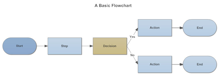
Basic Flowchart Inspiration and Research
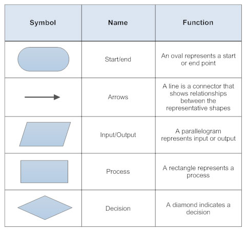
Flowchart Symbols Research
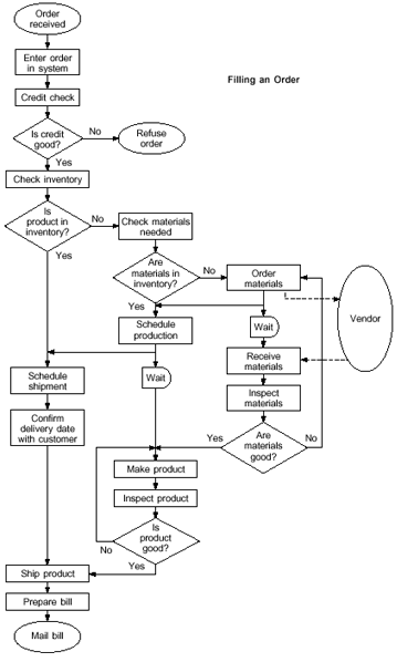
Complex Flowchart Inspiration and Research
The Final Created Flowchart
Overview
After having viewed the inspiration both above and in a previous project, I then decided to produce the final flowchart for the 'Home Sweet Home Front' website. This can be viewed below or through the link provided.
To explain the flowchart, the user would have first undertook the process of utilising their selected device to access the website. Once they would have been situated on the website, they may or may not have read or interacted with the content on the 'Home' page. In both circumstances, the question would have been asked as to whether they had visited another page on the website. If they hadn't and they had exited the website, the process would have immediately stopped. If they did visit another page, a process would have been undertaken of asking which page this was until the page was identified. Once they would have selected a page, the user would then have been navigated to that page. On particular pages, there were certain elements such as the 'Blackout Theme Switch' on the 'Blackout' page where the question would have been asked if they had selected or interacted with this. If they did, then the action would have been undertaken depending on what action this was. Once they would have finished with a particular page or if they didn't interact with certain elements, they would have then either interacted with or read the content on the page and the cycle would have then been repeated as explained before. The cycle may have also stopped when the user had navigated the whole website and was therefore ready to exit.
The Actual Flowchart
The Sitemap
Inspiration
Overview
As well as a flowchart, I also created a sitemap, as stated before, to show the navigation of the current pages I was undertaking. To begin, I viewed some inspiration online as well as viewing a previous sitemap I had created to assist. This would have helped myself to fully understand how to structure the sitemap for the 'Home Sweet Home Front' website. This inspiration can be viewed below.
From the first sitemap, I understood that the home page would have been placed at the top to signify hierarchy as well as other web pages below. With regards to the other web pages, these were divided further, displaying further website links under each page. Additionally, colour helped to indicate different aspects of the sitemap, something which I believed to have been beneficial when creating my sitemap for this project.
From the second sitemap, I understood that, again, the home page was placed at the top with different colours symbolising different aspects of the website. However, in some situations, aspects of the web pages were also specified with the form being an example. Details were included for the home page with regards to the content which would have been placed onto this page, a useful aspect to include.
The Collected Research
Sitemap Inspiration and Research Piece 1
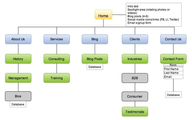
Sitemap Inspiration and Research Piece 2
The Final Created Sitemap
Overview
After undertaking the previous research and viewing a previous sitemap, I decided to create the sitemap. This can be viewed either below or through the provided link.
To explain this sitemap, the home page would have been the main page which would have also linked to the other pages. As there would have been a fixed navigation bar on each page, the other pages would have also been able to have been navigated back to the home page. Where hyperlinks were included in the text on a particular page, this was shown through an additional section underneath each page such as 'Air Raid Shelters'. However, sometimes this related to an interaction on the page with the 'Blackout Theme Switch' and the carousels for the 'Careless Talk' page being key examples. Furthermore, if links were within particular sections on a page such as the WW2 website links, these were indicated with arrows following on from each stated section underneath a particular page. One final key aspect to note is that regarding the footer section, each page would have had access to this with the footer including links to pages, both the topic pages and legal policies pages, as well as a link for the logo which would have navigated the user to the home page.
The Actual Sitemap
Review of the Work Completed at this Stage
Overview
Undertaking the processes shown above allowed for myself to gain a full understanding of how to make the website as professional and user-friendly as possible as well as how to resize the pages for different devices. Although the development and programming process had already begun during some of the processes shown above, this still enabled myself to integrate aspects learnt from undertaken research. Overall, these processes allowed for a successful programming process to be undertaken which will be displayed in the next section.
Although displayed on the web page, the document created to help with these processes with references can be viewed below.
Other Processes DocumentThe Development and Programming Processes
The Different Stages for the Semester
Overview
As was stated above, in this section you will be able to view the different development and programming processes undertaken during this project for the second semester of my third year. This demonstrates the initial stages through to the latter stages of the semester as well as displaying problems experienced and how I resolved these problems. To view these development and programming processes, please view the documents provided via the links below. These have been provided in different parts which each continue from where the previous part was stopped.
The Documents to View
Development Document (Part 1)Development Document (Part 2)
Development Document (Part 3)
Development Document (Part 4)
Making some Minor Adjustments and Refining the Project Based on Client Feedback
Overview
After having placed the current version of the website on my server for testing purposes, I then sent the link for this to the client(s). From this, I was sent a document to ask for some minor adjustments to be made to the final website. I then undertook the process of implementing most of these changes. These aspects can be seen below. Furthermore, I also organised the current code within each file to make this more professional and readable, separating aspects into relevant sections. This will have been evident with a few examples placed at the end of the development and programming processes document for part 4 above.
The Actual Client Feedback
The Client Feedback - Part 1
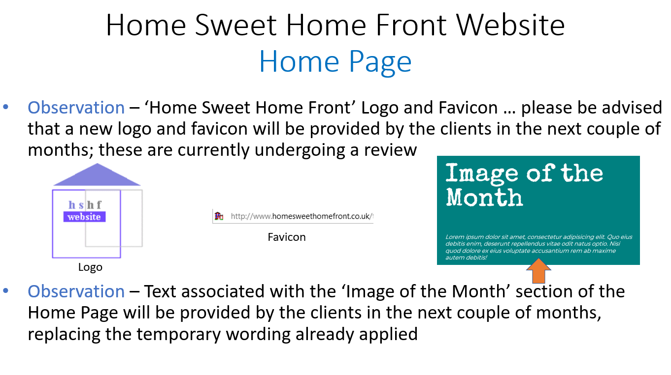
The Client Feedback - Part 2
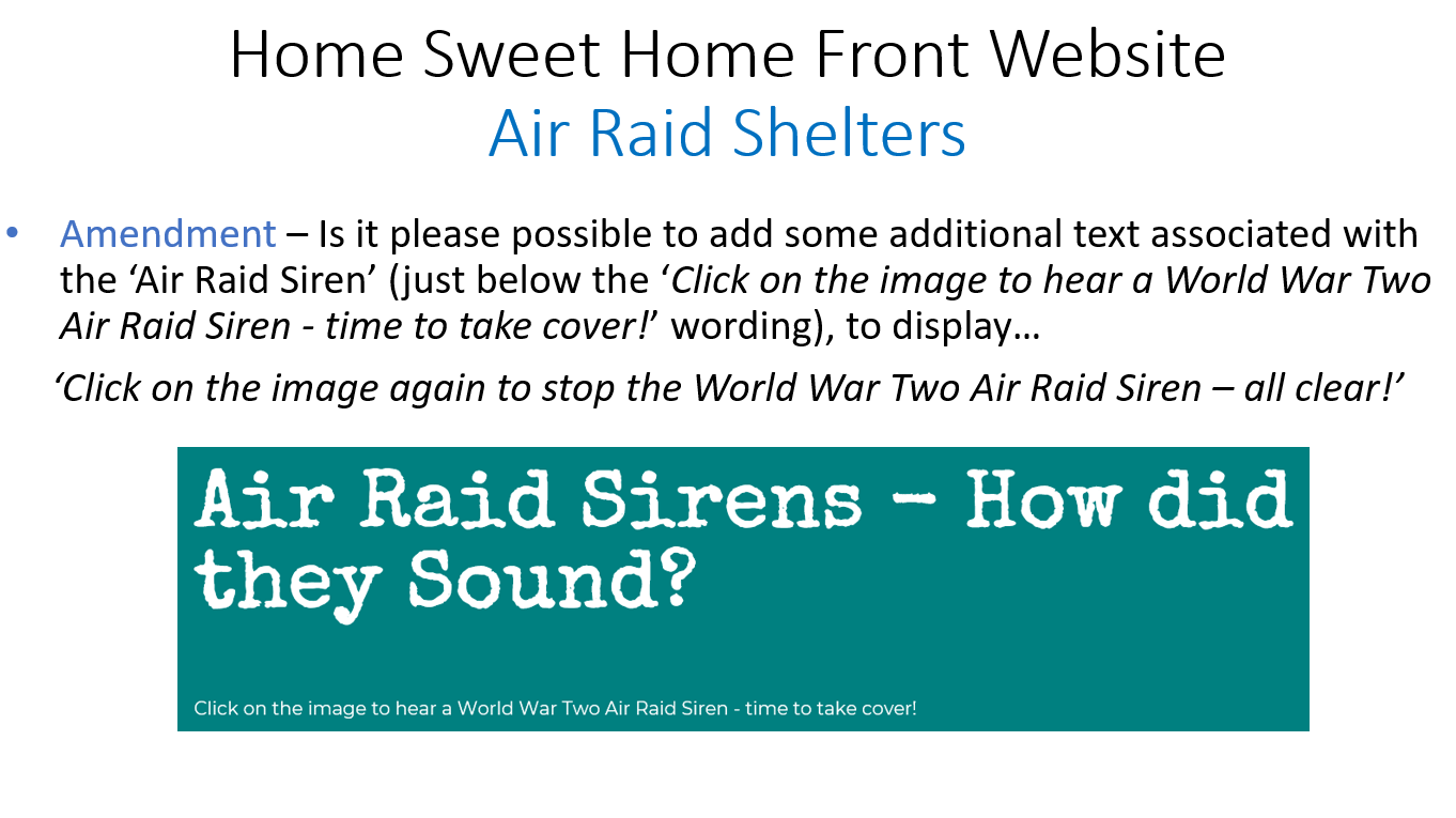
The Client Feedback - Part 3
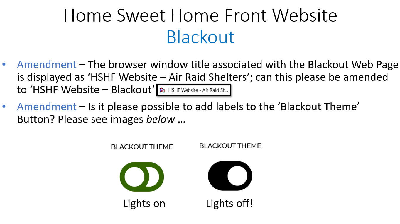
The Client Feedback - Part 4
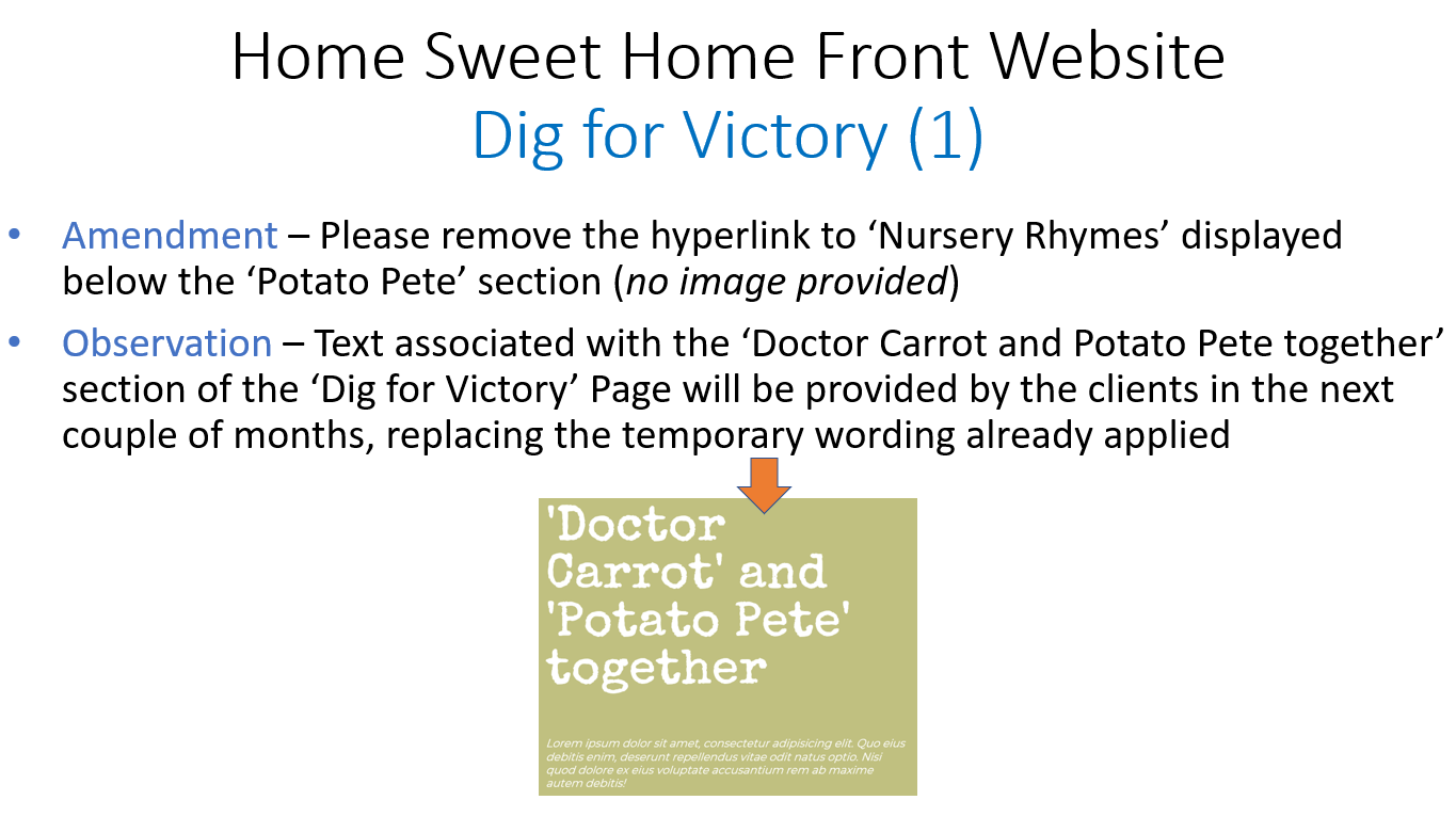
The Client Feedback - Part 5
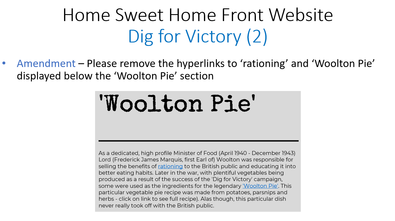
The Client Feedback - Part 6
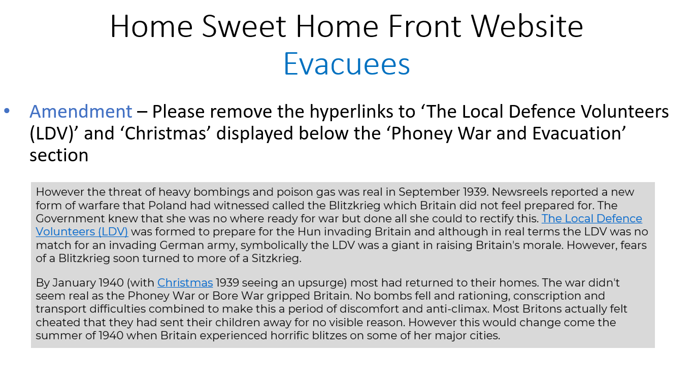
The Client Feedback - Part 7
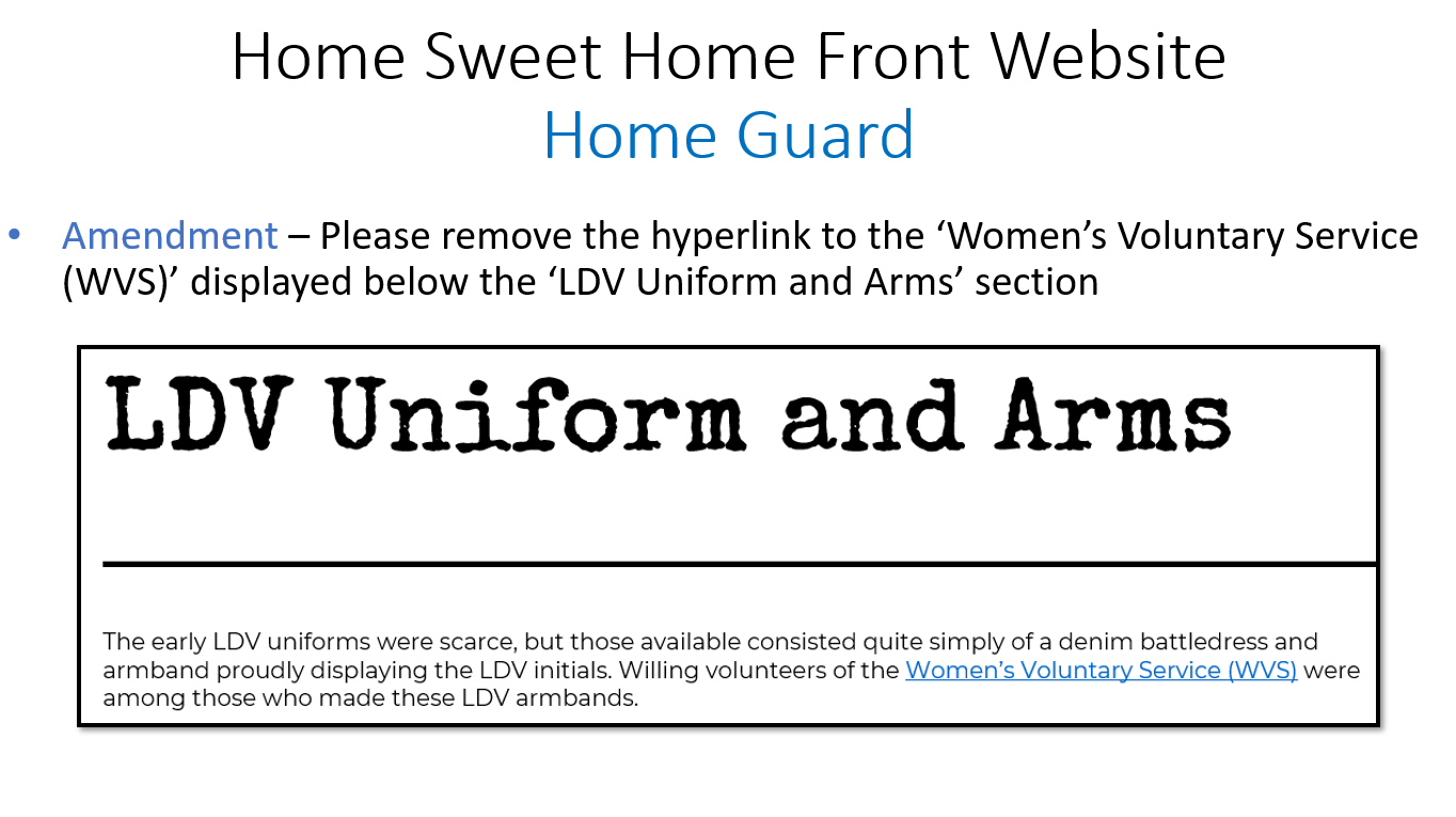
The Client Feedback - Part 8
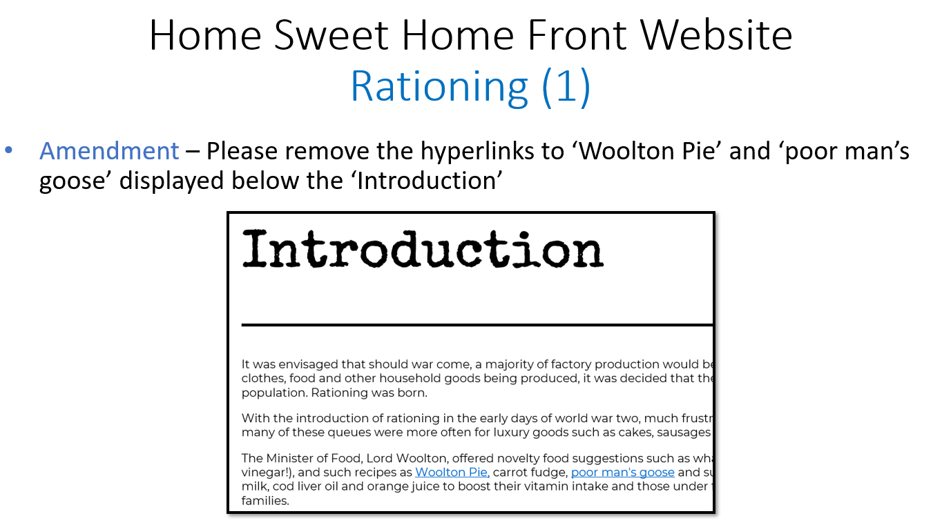
The Client Feedback - Part 9
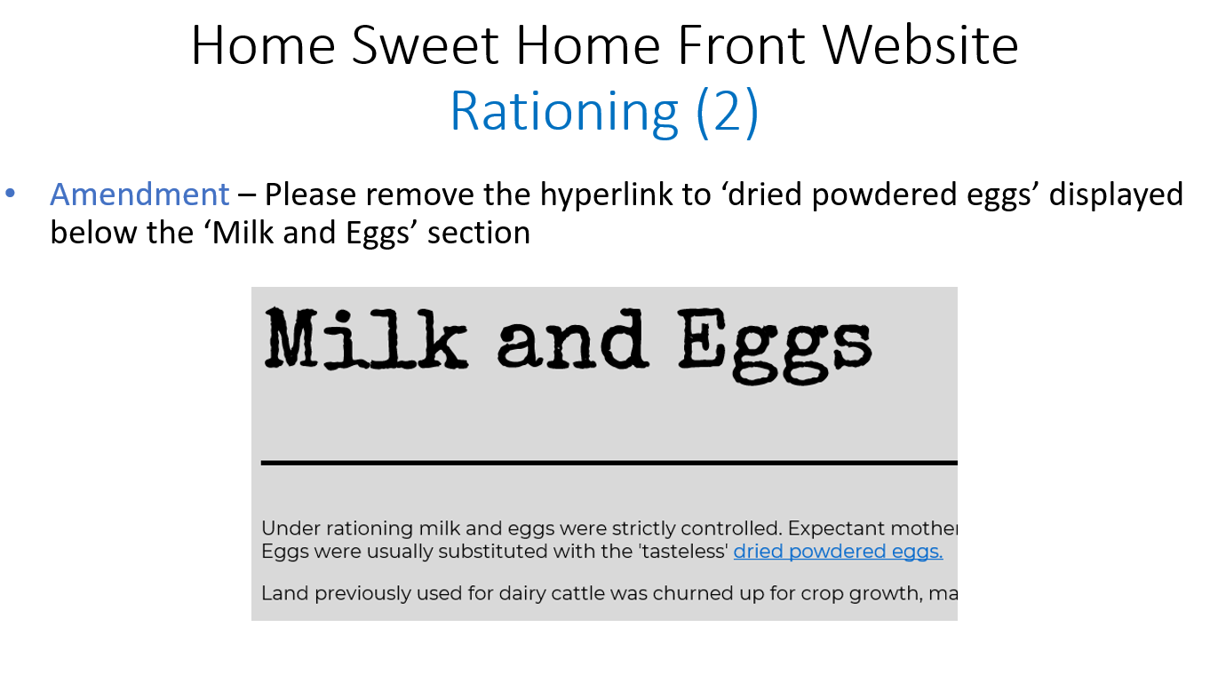
The Client Feedback - Part 10
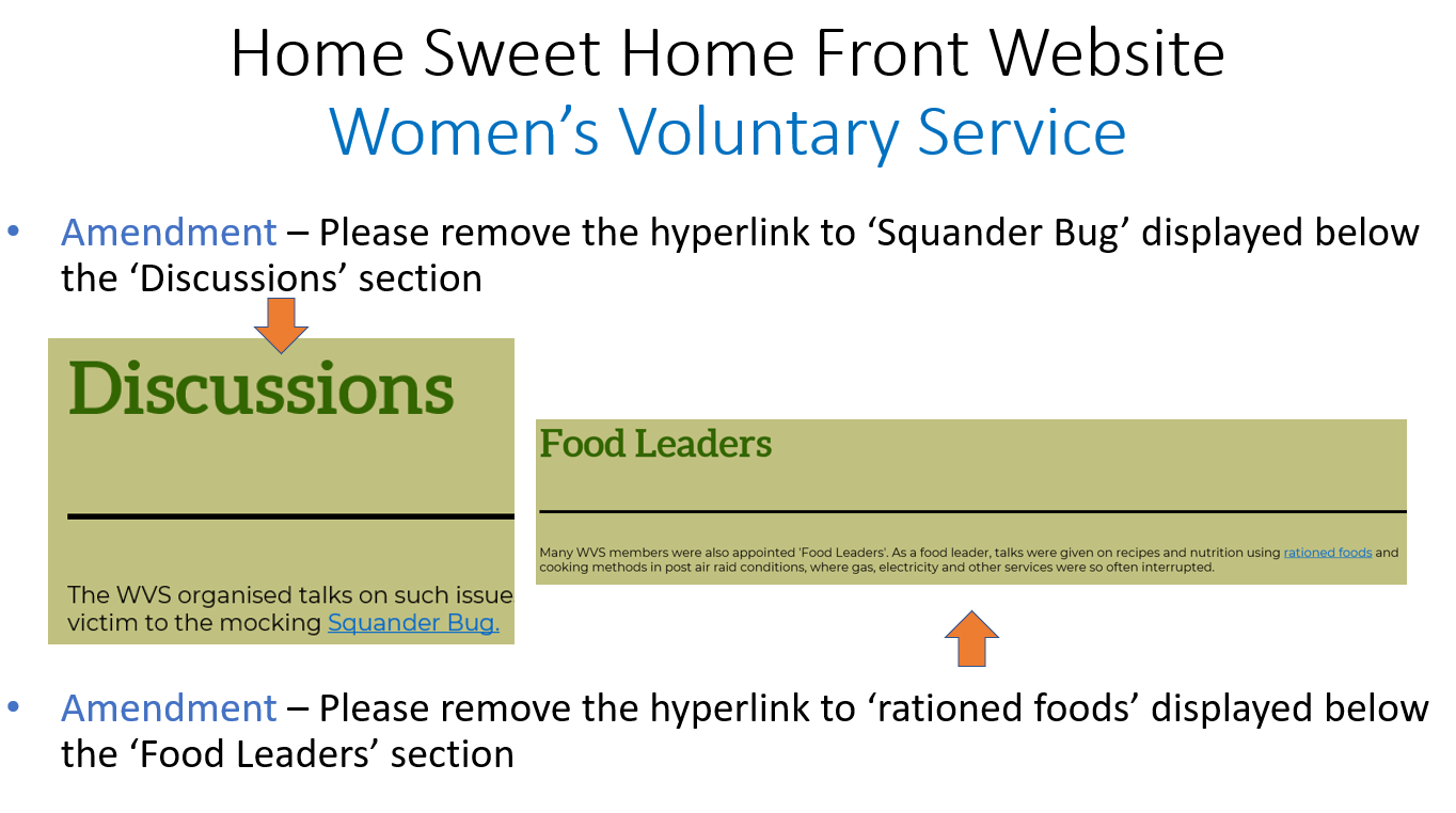
The Client Feedback - Part 11
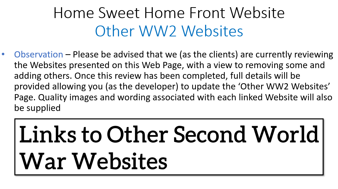
The Client Feedback - Part 12
The Result of the Semester
Overview
I believe that from the provided brief, I managed to succeed very well at this stage, being able to create a new aesthetically attractive and interactive website that resized to different sized devices effectively for 12 of the current pages. Throughout the semester for this project, I also managed to integrate new areas relating to 'JavaScript', 'jQuery' and 'PHP', being able to explore other areas of website development. I was especially proud of being able to allow for a switch to function on the 'Blackout' page to change the colours of the page, improving the user experience.
If I were to approach this aspect of this project again, I would attempt to utilise 'front-end' frameworks such as 'React' as well as utilising 'SASS'. This would allow myself to explore other programming environments as well as being able to work more efficiently through the pre-processor 'SASS'.
Overall, I enjoyed working on this project very much at this stage as it tested myself regarding exploring new areas in programming languages as well as being able to create a design that was attractive and professional, despite being a developer.
To view the final outcome of the pages that were completed as a requirement at this stage for the website (12 pages), as well as the clients' feedback, please view this either below or through the provided link at the end of this section.
The Feedback from the Clients
“Thank you so much for all of your hard work - we are absolutely delighted with our new look 'Home Sweet Home Front' Website; we now have a website to be very proud of.”
"We wanted to commend you in particular for the professionalism and attention to detail you have applied throughout the entire project and for taking the time to regularly communicate with us. This has culminated in you developing the perfect website which fully meets our requirements and target audience."
"We wish you all the very best for the future and look forward to working with you again, as new content evolves for the 'Home Sweet Home Front' Website."
- Wayne and Darren, 'HSHF'
The Final Website at this Stage
Creating High-Fidelity Wireframes for new Aspects
Overview
During the summer, I continued to work on the 'Home Sweet Home Front' website, adding the remaining pages to fully complete the website. These were the 'Christmas at Home', 'Gas', 'Hitler's V Weapons', 'Salvage', 'VE Day', 'Copyright Disclaimer', 'Thank You', 'Articles' and 'Slogans' pages.
Furthermore, I also added a new menu and modals for recipe and nursery rhymes sections included on the pages of the current website. The reason for integrating a new navigation menu was because adding more links to the existing navigation menu would have caused this to become untidy and unprofessional as a result.
To begin, I created high-fidelity wireframes which would have allowed for an easy development and programming process. Each of these can be viewed below with descriptions.
As will be evident with the wireframes below, I followed a similar professional layout as that shown in the previously created pages in order to maintain a consistent appearance. Furthermore, regarding the footer of each page, I changed this during the development and programming process and this has been reflected in some of the wireframes below. The main page links including factual and historical information were separated into a section and other page links relating to aspects not including factual and historical information were separated into another section. Legal links were removed due to their being an existing page already which covered some, if not all of these aspects. I also created more than one wireframe for certain pages to help myself decide which ideas to implement into the actual website during the development and programming process.
The Created Wireframes
For Actual Pages
Christmas at Home Page
Overview
The main aspect to note for this page was the fact that I placed snowflakes over the top of the page. This was to demonstrate that an animation would have been integrated to create an atmosphere relating to Christmas with falling snowflakes. This would have especially interested those of a younger age, causing them to become excited.
Furthermore, I placed an icon of a Christmas tree at the top of the page. This would have helped to reiterrate the theme of Christmas throughout the page.
Regarding the structure of the page, where possible, I included alternating content to add variation and more interest to the page.
The Created Wireframe
Gas Page
Overview
The first aspect to note for this page was that I included a background image for the heading section of the page. This would have helped to introduce users to the page as well as adding variation to the website as a whole. Furthermore, this would have reiterrated the fact that gas was something that was very dangerous and harmful during the war.
Another aspect to note was that I placed the images centrally in the 'Preparing for the Worst' section due to there being no content for this on the current website. This, in my opinion, was the best way to structure this section and this also differed from other sections, helping to break up the content on the page.
Regarding the structure of the page, where possible, I included alternating content to add variation and more interest to the page.
When undertaking the development and programming process, I changed the 'Examples of Gas Masks' section so that the content alternated in order to add more variation to the page. Furthermore, for the 'Animals' section, I decide to place the content in a similar position (images to the right and text to the left) due to the fact that alternating the content created an appearance which wasn't as structurally neat. Finally, I switched the positioning of the images in the 'Humourous Images from the Home Front' section as this created a better appearance.
The Created Wireframe
Hitler's V Weapons Page
Overview - Wireframe 1
As is evident for both this and the next wireframe, I implemented the current barbed wire image underneath the heading sections. This was to indicate both a hierarchy of information and to link thematically with the page.
On the current website, users were encouraged to select the image of the V-1 Rocket to listent to its drone. However, I thought that an icon could have been implemented instead in its own section. This would have then animated and made a sound after users had selected this icon.
With regards to the 'V-1 and V-2 Statistics' section, I thought it would have been more interesting for the user if icons with statistics were included to provide a visual summary of the damage caused. These would have then counted up when users viewed the page, improving the user experience.
Regarding the structure of the page, where possible, I included alternating content to add variation and more interest to the page.
Overview - Wireframe 2
The first element which was different to the previous wireframe was the interaction to cause the V-1 Rocket to make a sound. I decided to keep this the same as the current website as the image was of an actual V-1 Rocket whereas the icon in the other wireframe was not of a V-1 Rocket.
The second aspect was changing the position of the content in the 'V-2 Rockets' section. The sole purpose of this was to attempt to discover the best way in which to position the content to appear professionally on the page. I thought that placing each image underneath each other inline with the text would have helped this as both the images and text would have been of the same height.
Finally, regarding the 'V-1 and V-2 Statistics' section, I decided to place a summary of the statistics above other text with the image placed to the right as this appeared better structurally. I also removed the icons to explore another approach.
Regarding the structure of the page, where possible, I included alternating content to add variation and more interest to the page.
Overview - The Chosen Wireframe
After being advised by one of the clients to make a decision of the wireframe to utilise, due to my expertise, I decided to use the first wireframe. This was because the 'V-2 Rockets' section of the first wireframe was structured better and also included a section dedicated to interaction for users.
Despite choosing the first wireframe, during the development and programming process, I integrated the appearance of the 'V-1 and V-2 Statistics' section of the second wireframe as this was structured better. However, I decided to add in icons above the summary of statistics to add more imagery to the section.
The Created Wireframes - Wireframe 1
Salvage Page
Overview
I decided to include a recycling icon in the page heading section as this would have helped to emphasise the theme of recycling during the 1940s.
For the 'Overview' section, I included bullet points to provide clear information and decided to separate these from the images via a vertical line. This was to assist in creating a well-presented appearance.
For the 'Salvage for Aircraft/Saucepans for Spitfires' section, I decided to include some text and an image before integrating the quotation to provide context to users.
Regarding the structure of the page, where possible, I included alternating content to add variation and more interest to the page.
During the development and programming process, I decided to make the recycling icon, within the page heading section, animate. I made this rotate continuously to make the page more exciting for users and to especially interest those of a younger audience.
The Created Wireframe
VE Day Page
Overview - Wireframe 1
As is evident in this wireframe and the next, I included an image of a newspaper in the heading section as I thought this would have assisted in providing an overview to VE Day.
I included confetti which was to symbolise that this would have been something that animated. The reason for including confetti was because this related to jubilation and was suitable for VE Day, a celebration of the war being over.
One other key aspect to note was that the 'REMEMBER' section was placed centrally and in bold to make this part stand out. This was because this was an important section which helped to remember those who helped throughout the war. Furthermore, an icon of a poppy was included to relate to remembrance.
Regarding the structure of the page, where possible, I included alternating content to add variation and more interest to the page.
Overview - Wireframe 2
For this wireframe, I decided to make the quotation in the 'Victory is ours' section bigger in order to make this important statement from Churchill stand out more.
The only other aspect which changed was the 'REMEMBER' section as I changed the colour of this to red. This was to relate to the colour of poppies, hence reiterrating the theme of remembrance.
Regarding the structure of the page, where possible, I included alternating content to add variation and more interest to the page.
Overview - The Chosen Wireframe
After being advised by one of the clients to make a decision of the wireframe to utilise, due to my expertise, I decided to use the second wireframe. This was because the quotation aspect of the 'Victory is ours' section was structured better and because the 'REMEMBER' section contained the colour of red which helped to relate to remembrance more.
During the development and programming process, I decided to include the text placed below the quotation aspect of the 'Victory is ours' section within the actual quotation aspect. This was because before, the text placed on its own might have caused users to have become confused as to what the text related to on the page. Furthermore, I changed the 'REMEMBER' section to include an icon of a dove because a poppy icon wasn't available and also because a dove symbolised peace. This icon and the text were placed centrally as opposed to inline due to the fact that this created a better appearance.
The Created Wireframes - Wireframe 1
Copyright Disclaimer Page
Overview
As will be evident below, for this wireframe, I wanted to keep the image currently utilised on the current website. This was because this would have added more imagery to the page as well as helping to provide context regarding the topic of the page.
I then decided to place the 'Privacy Notice', 'Sending Comments/Online Forms', 'Copyright' in different sections with each following the same format due to there being no images provided on the current website.
For the 'Copyright' section, I decided to place the provided e-mail address in a larger and bolder font to make it easier for users to understand which e-mail address to utilise for any issues.
During the development and programming process, I added a small description with a link to sources utilised in the process of creating the new website. This was to provide credit to those who had helped with the creation of the new website. I also removed the online forms aspect from 'Sending Comments/Online Forms' section due to the fact that forms were not going to be included on the new website. Finally, I helped the copyright e-mail to stand out more by changing the colour of this to teal.
The Created Wireframe
Thank You Page
Overview
For the page heading section, I decided to include an icon which would have helped to relate to the theme of the page. The reason for placing the icon and page heading centrally was because I thought this was the best way to include both the icon and text together as opposed to placing these elements inline.
For the section informing users of how long the website had been online for, I decided to place this in a larger and bolder font and centrally with a teal background. This was to make this stand out as this was an important piece of information to provide.
Furthermore, the 'Special Thanks Goes to:' section contained text in a larger and bolder font that was centralised also. This was to make this aspect stand out too, providing credit to others in a clear way.
The 'Website Design and Development' section was styled in a similar way to the previous mentioned section, helping to again provide credit in a clear way.
For the final section of the page, I decided to keep the personalised writing of 'Darren & Wayne' as I believed this to create a more personalised touch.
During the development and programming process, the only aspect changed was the icon placed in the page heading section. This was changed to two hands shaking as this related more to the action of thanking someone than including an icon showing group of people.
The Created Wireframe
Articles Page
Overview
For this page, I chose to include an introductory section to provide context to the article placed beneath this. The actual article was then placed in a section with a teal background to differentiate this from the introductory aspect. I decided to keep the image of the front cover of the 'Sunday Times' to relate to which newspaper the article had been published in. The title and image and the actual article were separated by a horizontal white line to help create a hierarchy of information as well as providing a clear and professional structure.
The Created Wireframe
Slogans Page
Overview - Wireframe 1
For the first wireframe idea of this page, I placed the slogans in an alternating format to relate to the overall structure and layout of the website. To add further variation, I changed the colour of the borders too.
Overview - Wireframe 2
For the second wireframe idea of this page, I decided to place the slogans in a different format. Instead of placing the slogans in an alternating format, I placed these inline with three on the first row and then two on the second row. This was because I thought this would have reduced the white space seen on the previous wireframe and would have allowed users to read the slogans in one place as opposed to having to scroll further down the page.
Overview - The Chosen Wireframe
After being advised by one of the clients to make a decision of the wireframe to utilise, due to my expertise, I decided to use the second wireframe. This was because the first wireframe contained too much white space and didn't appear as professional and tidy.
I did alter aspects of this wireframe when undertaking the development and programming process. Firstly, I added an icon of two speech bubbles to relate to the theme of the page and to provide more imagery. I also thought it would have been better to make this page interactive which meant I therefore encouraged users to click on buttons to reveal the different slogans. This would have also made the page more interesting for those of a younger audience.
The Created Wireframes - Wireframe 1
For Other Aspects
The Navigation Menu
Overview
I placed each of the page links under their relevant heading sections, following the same categories as that used on the current website. This was because this was organised in a professional way.
Each of the headings would have been placed in black and in a larger font than the links included underneath. An underline would have also have been included. This was to create a hierarchy of information, providing a clear structure for users to find the links they needed.
As shown by the 'Home Page' example, when hovering over a link, the colour would have changed from green to white, indicating to users that these were interactive.
With regards to the 'DID YOU KNOW?' aspect, the information for this was provided within a white circle. This was to help increase engagement from users, informing them of the time passed since the beginning of World War 2.
One final aspect to note was that I included a cross in the top-right corner, helping users to understand how to close the navigation menu.
During the development and programming process, I removed some of the links after having spoken with one of the clients. They stated that these were no longer required for the new website. I also changed the design of the cross included in the top-right corner of the menu to make this more interesting and I changed the colour of the links, when hovering, from white to teal.
The Created Wireframe
The Curried Carrot Modal
Overview
As can be seen below, I included a title with a close button placed at the top of the modal with the content provided beneath, separated by a horizontal line. This would have helped to create a clear structure for users to understand.
Furthermore, I divided the ingredients and the method of the recipe via a vertical line. This would have helped users to understand what ingredients were required first before undertaking the method explained.
During the development and programming process, I changed some aspects of this modal. The first was the positioning of the text, changing this from being centred to being aligned to the left. This was because I believed this to be more professional. I also removed the horizontal line separating the title and close button from the content beneath as this wasn't needed and created a compact appearance. Finally, I added a border and I changed the colours of the subheadings and button to enhance the design of the modal.
The Created Wireframe
The Nursery Rhymes Modal
Overview
For this modal, I decided to place a provided image on the current website and a close button above the actual nursery rhymes to act as a title section, helping to create a clear structure for users to understand
With regards to the actual nursery rhymes, I divided these into three sections, each with different colour schemes. This was to differentiate each nursery rhyme, helping users to understand that each one was different and not interlinked.
During the development and programming process, I changed some aspects of this modal. The first was the positioning of the text, changing this from being centred to being aligned to the left. This was because I believed this to be more professional. Furthermore, I added a border and changed the colours of the button to enhance the design of the modal.
The Created Wireframe
The Woolton Pie Modal
Overview
As can be seen below, I included a title with a close button placed at the top of the modal with the content provided beneath, separated by a horizontal line. This would have helped to create a clear structure for users to understand.
Furthermore, I divided the ingredients and the method of the recipe via a vertical line. This would have helped users to understand what ingredients were required first before undertaking the method explained.
During the development and programming process, I changed some aspects of this modal. The first was the positioning of the text, changing this from being centred to being aligned to the left. This was because I believed this to be more professional. I also removed the horizontal line separating the title and close button from the content beneath as this wasn't needed and created a compact appearance. Finally, I added a border and I changed the colours of the subheadings and button to enhance the design of the modal.
The Created Wireframe
The Poor Man's Goose Modal
Overview
As can be seen below, I included a title with a close button placed at the top of the modal with the content provided beneath, separated by a horizontal line. This would have helped to create a clear structure for users to understand.
Furthermore, I divided the ingredients and the method of the recipe via a vertical line. This would have helped users to understand what ingredients were required first before undertaking the method explained.
During the development and programming process, I changed some aspects of this modal. The first was the positioning of the text, changing this from being centred to being aligned to the left. This was because I believed this to be more professional. I also removed the horizontal line separating the title and close button from the content beneath as this wasn't needed and created a compact appearance. Finally, I added a border and I changed the colours of the subheadings and button to enhance the design of the modal.
The Created Wireframe
The Dried Powdered Eggs Modal
Overview
As can be seen below, I included a title with a close button placed at the top of the modal with the content provided beneath, separated by a horizontal line. This would have helped to create a clear structure for users to understand.
I also included numbers for the instructions to help users gain knowledge of the order of the different steps required to make dried powdered eggs.
During the development and programming process, I changed some aspects of this modal. The first was the positioning of the text for the main heading, changing this from being centred to being aligned to the left. This was because I believed this to be more professional. I also removed the horizontal line separating the title and close button from the content beneath as this wasn't needed and created a compact appearance. Finally, I added a border and I changed the colours of the subheading and button to enhance the design of the modal.
The Created Wireframe
Creating a new Logo for 'Home Sweet Home Front'
Overview
As had been originally stated on the brief provided to myself from the clients, the clients wanted a new logo to be created for the new website. They also wanted a new 'favicon'. I believed that when the newly created logo had been finished, this could have been used as the 'favicon' for the new website.
The Initial and Developed Logo Ideas
Overview
To begin this process, I created some initial ideas; some which were objects, text and some which were a combination of both. I then discovered that one of the latter ones created, as shown in the first image below, was an idea that I would have then experimented with further. This was the idea relating to having a roof over the initials of 'Home Sweet Home Front'. I thought this was simplistic but effective and professional, integrating both visual aspects with text.
Therefore, I decided to implement some of the colour combinations utilised on the website. For one idea, I thought it would have been beneficial to integrate the a Union Jack flag into the roof aspect to relate to Great Britain during World War 2. I also experimented with and without including the 'Home Sweet Home Front' text underneath the initials. This provided more options to consider with regards to choosing the final logo.
The Created Ideas
Initial Logo Ideas
Developed Logo Ideas
The Chosen Logo
Overview
During the creation of the developed logos shown previously, I also involved one of the clients to help understand what they liked and disliked. Throughout this process, they suggested different colour combinations and this helped them to make a final decision.
One of the clients then stated that they wanted the logo shown below to be used for the new website. This was then checked with the other client later and was confirmed that this was the logo to be used.
I then also made another version of the logo to be used on darker backgrounds due to the fact that the included horizontal line didn't show due to it being of a similar colour.
The Final Logo

The Final Logo to be Used on Lighter Backgrounds
The Final Logo to be Used on Darker Backgrounds
The Development and Programming Processes
Overview
During the process of developing the 'Home Sweet Home Front' website further, I added in the pages and other aspects shown previously through the high-fidelity wireframes and I also refined and tested the whole website before making it 'live'. Furthermore, I ensured the website fitted across different devices and worked in different browsers, improving its cross-browser and cross-device compatibility. I also made sure that some elements were integrated to make the website more accessible including 'active' and 'focus' elements.
With regards to animating falling snowflakes and confetti on the 'Christmas at Home' and 'VE Day' pages, I integrated a plugin(s) discovered from the Internet and provided credit to the person who had created this.
For the navigation menu, I viewed a 'YouTube' tutorial, using this to help create the functionality of the menu, changing the design to reflect that of the 'Home Sweet Home Front' brand.
I continued to utilise 'JavaScript' and 'jQuery' for functionality of interactive elements, such as modals, and 'Flexbox' for structuring. However, in some situations, I utilised 'CSS Grid' as this provided an easier method for structuring certain aspects. Furthermore, I continued to use 'CSS' animations to create animating elements.
Please note that although not all aspects for the development and programming process may have been mentioned above, the above provides an overview of this process.
References for Sources Utilised
Although some of the sources referenced in the document provided below might have already been shown before, the document below also includes credit to further sources used during the summer stage of this project.
References DocumentMaking the new Website 'Live' and Final Feedback
Making the new Website 'Live'
Overview
After having undertaken thorough testing and having checked with the clients that they were happy with the outcome of the whole website, it was then agreed that I could have now uploaded the new website to the current server, overwriting the current website. This was then undertaken and signalled the end of the project.
The Final Feedback
Overview
After having informed the clients that the new website had been uploaded to the current server, the clients then provided myself with a testimonial which can be viewed below.
The Received Feedback
"We just wanted to say a 'BIG' thank you Daniel for crafting such a wonderful 'Home Sweet Home Front' website."
"The time spent, your dedication to the project and genuine hard work has taken, what was a rather tired and uninspiring website, to one which is now so much more appealing to our audience; a 'Home Sweet Home Front' website which we are now proud to showcase!"
- Wayne and Darren, 'HSHF'
The Final Outcome
Overview
With regards to the final outcome for this project, this is something which can be viewed at the end of this page.
Reflecting on the Project
Overview
For this project, I was very pleased that I had managed to design and develop a professional and well-presented website from initial stages to the final outcome. This provided myself with experience of completing a website of a large scale due to the quantity of pages required to complete.
From completing this project, I felt that I managed to improve my skillset as a website developer through exploring new aspects such as using 'JavaScript' and 'jQuery' to implement interaction. This project helped to test my front-end skills, especially with regards to creating interactive elements and ensuring that all pages of the website functioned on several different browsers and devices.
Overall, this was a project that I thoroughly enjoyed working on and I am extremely pleased that the clients are proud of the outcome in addition to myself. I look forward to continuing to add to the website where required in the future.