Brief
"Make a 30 second video on Adobe After Effects using kinetic typography either showing lyrics from a song or a script from a film. The actual audio has to be included as well in the video."
Overview
I based this project on my favourite band, 'Coldplay', and chose one of their songs ('Adventure of a Lifetime') which I thought would have appealed to everyone. I also chose an upbeat song to make the kinetic typography piece exciting and fun. This was my first proper time of using 'Adobe After Effects', so I was proud of the end result.
I made sure that lots of images, constructed of lyrics from the song, were included to produce an effective and professional piece.
References for this project can be viewed in the document supplied at the end of this page.
Inspiration
Overview
To gain a general understanding of the sort of thing I had to do, I watched some examples in the actual lecture but to reinforce my understanding I looked at some more examples along with the same ones from the lecture again. These are viewable below.
A couple of the videos below have not been embedded due to the fact that they don't function when embedded. Therefore, please select the provided links instead.
The Kinetic Typography Examples Viewed for Inspiration
All of the words used came together and appeared as the word ‘language’ which inspired me to make up some images in my piece out of the lyrics that I used.
Smooth animations were included which made the video exciting and interesting and I thought therefore I would include animations in mine to give the same type of impact.
Again, there were animations/effects used on the text which increased the emphasis on certain words, making them clear and easy to understand.
I took inspiration from this one, as it was professional and easy on the eye with lots of images made up of text which is what I really admired and so therefore included it in my piece. It also added focus to some of the most important words in order to convey a clear message.
My Sketches and Ideas
Choosing a Project Topic
Overview
First of all, I chose to base my piece of work on a song and I thought I would choose a piece of music from my favourite band 'Coldplay'. I then thought about a piece of music which would have been quite fast and upbeat to make the video fun and exciting so I chose ‘Adventure of a Lifetime’. I also chose this piece of music because it was well known so therefore more people would have been likely to pay more attention to the actual piece.
Drawing a Storyboard and Listing Some Ideas
Overview
After completing the previous aspect, I drew out a storyboard to gauge when and where each set of lyrics would have come in and what types of effects or images would have been created through text. I chose to include the lyrics from the first 30 seconds (approximately) of the song.
I then wrote down a list of ideas on a piece of paper of the types of things, in relation to visual imagery, to include in my kinetic typography piece. I thought a variety of colours and effects would have been a good combination and would have therefore worked effectively.
The Storyboard and Ideas

Noting Down the Lyrics for the First 30 Seconds of the Song
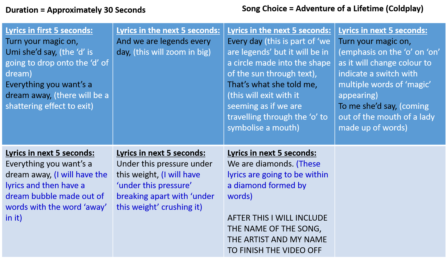
The Storyboard for the Kinetic Typography Piece
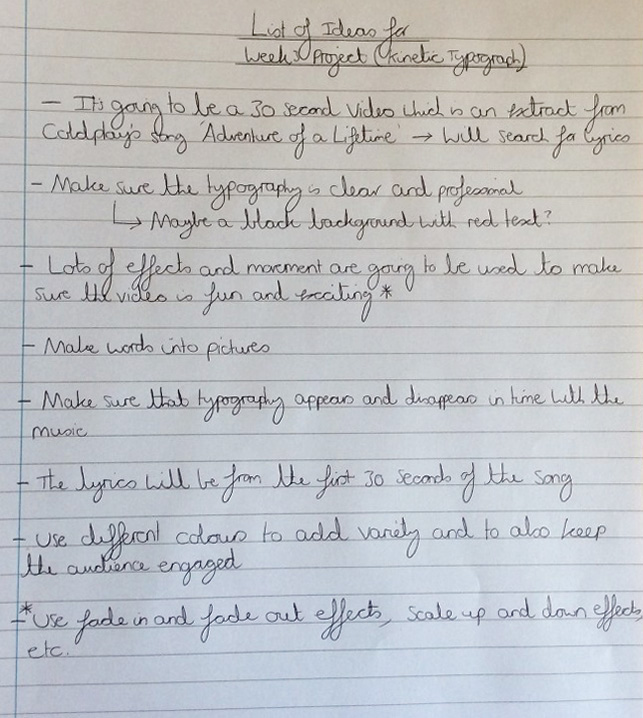
A List of Ideas Relating to Visual Imagery
Creating my Final Ideas/Piece
Overview
Following on from conjuring up some ideas, I then started to make my kinetic typography piece. First of all, I imported the music track from my laptop and cropped it down to the section I based my work on. This then allowed me to create text that came in on time with the audio track. To add to this, I altered the decibel level near to the end of the audio track to create a fading out effect, rather than it stopping straight away, so that it had a professional feel to it.
I trialled some of the effects when creating the work in order to see what was effective and what wasn’t. I also used the opacity, rotation, scaling and positioning tools to create some impact without having to use effects continuously.
I ensured that the font style was the same throughout, using ‘Kozuka Gothic Pro’ in the colour red. I only used different colours when either trying to add emphasis or create images out of text.
The images I created out of text were to reinforce what the lyrics were stating, for example with the lyrics ‘To me she’d say’ I created a picture of a lady’s face opening her mouth and releasing these actual lyrics.
After completing my final piece, I then added it to the rendering queue in 'Adobe After Effects' and chose to export it as a ‘avi’ file, selecting the quality as ‘best’ and the resolution as a ‘third’ in order to reduce file size.
References for this Project
Overview
As explained previously on this page, below is a document which contains the references for this project.
References Document