Brief
"Design a piece of ‘digital art’ (static) which references to an artist/ art movement/ designer/ illustrator which isn’t Andy Warhol or Salvador Dali."
Overview
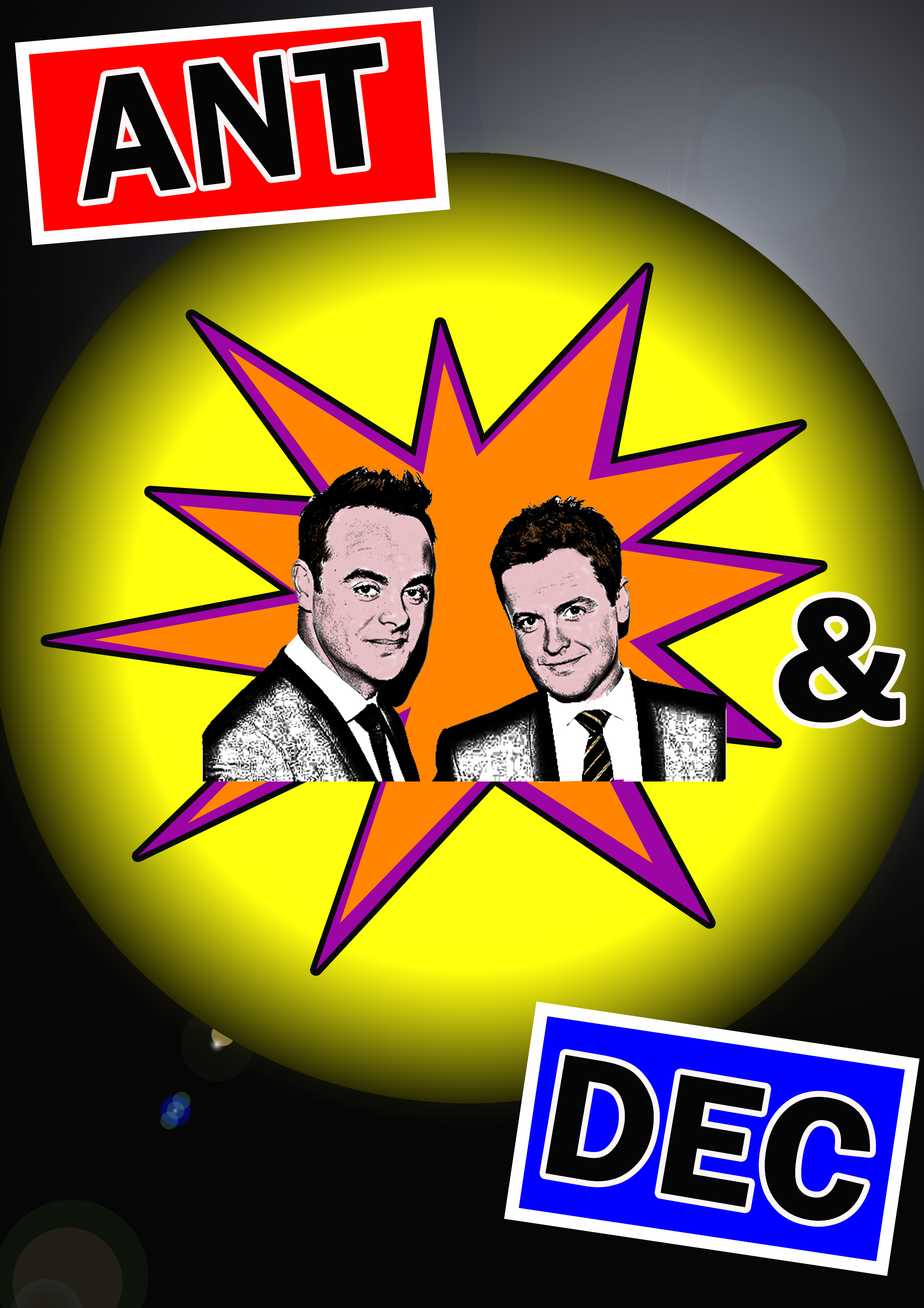
With this piece of work, I chose to try and integrate both the style of Roy Lichtenstein and the 'Pop Art' movement through the use of bright colours and clear, bold typography. As my class colleagues and I had to base the poster on a celebrity, I chose Ant and Dec, highlighting their show called 'Saturday Night Takeaway' through the use of red and blue around their names.
References for this project can be viewed in the document supplied at the end of this page.
Inspiration and Research
Selecting Movements and Analysing Styles
Overview
Before beginning to choose an artist I wanted to base my piece of digital art on, I first of all selected a few art movements which interested me. These were the 'Fauvism' and 'Expressionism' (1900-1935) and 'Pop Art' movements (1960s). I then looked at artists from each movement and undertook further research to investigate types of styles they used. I then thought it would have been a good idea to write this information down so I could refer back to it when I started my piece.
The Research Collected for the Different Movements
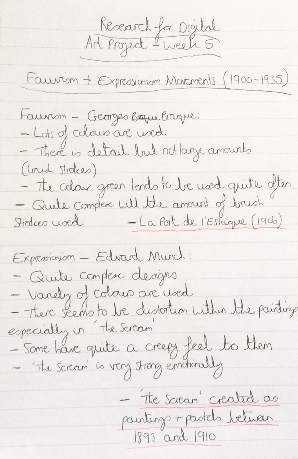
Listing Research for the 'Fauvism' and 'Expressionism' Movements
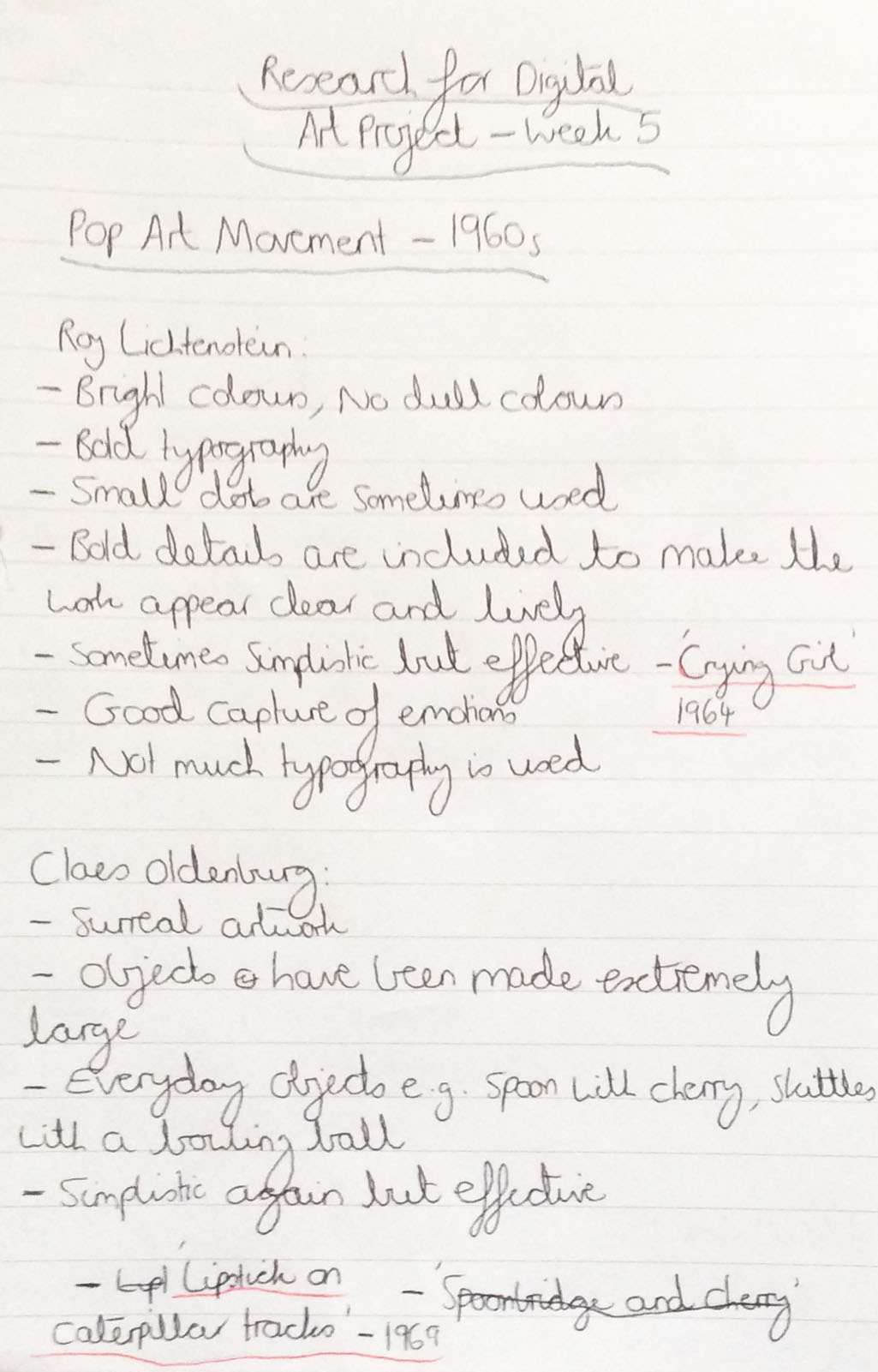
Listing Research for the 'Pop Art' Movement
Analysing Work Pieces
Overview
For each artist, I then chose a piece of work which appealed to me (after viewing varieties of work) that I could have potentially used to inspire my own piece of work. These are viewable below.
The Pieces of Work Collected
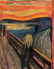
For Edvard Munch I looked at ‘The Scream’ (1893 – 1910)
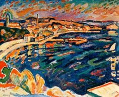
For Georges Braque I looked at ‘La Port de l’Estaque’ (1906)
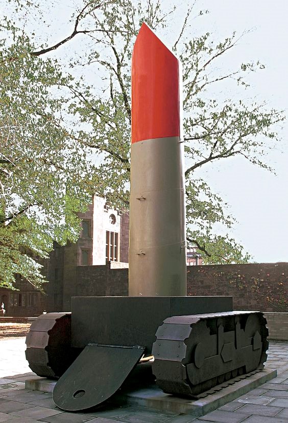
For Claes Oldenburg I looked at ‘Lipstick on Caterpillar Tracks’ (1969)
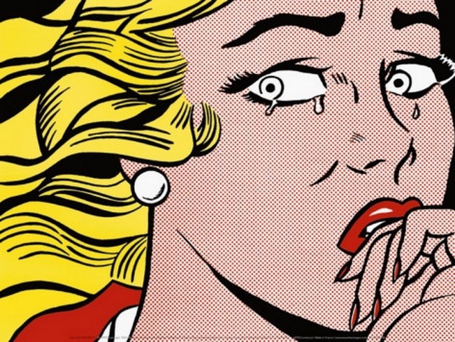
For Roy Lichtenstein I looked at the ‘Crying Girl’ (1963)
Specifying a Movement and Artist to Represent
Overview
After conducting my research, I thought I would then specialise in the 'Pop Art' movement of the 1960s. So, in order to broaden my understanding of the characteristics, I undertook further research. I wrote down a list of characteristics which I would have tried to integrate into my piece of digital art.
From looking at Lichtenstein’s work, I became inspired to create a piece of digital art which would have reflected his ideas and work because I was really interested in the bright colours he used and the type of cartoon effect he conveyed through his work. In particular, the ‘Crying Girl’ (1963) impressed me because it was very powerful in displaying the emotions of feeling trapped and controlled by a man which according to my research, Lichtenstein tried to relate to society in the 1960s where men were superior to women. I understood that bold colours were used, the 'ben-day' dots provided a good effect of creating some colours of the face and the design was simplistic but very effective.
Listing the Characteristics and the 'Crying Girl' (1963)
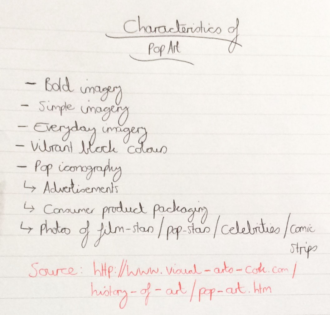
Listing the Characteristics of 'Pop Art' from Research

Roy Lichtenstein's 'Crying Girl' which Inspired Myself the Most
My Sketches and Ideas
Choosing a Celebrity(s) to Include for the Piece
Overview
From gaining some inspiration, I thought it would have been a good time to start thinking about the type of art I would have wanted to produce. After reading that one area 'Pop Art' based its pieces on was celebrities, I decided to make a little list of celebrities which I could choose to include in my digital piece of art work. I decided to select Ant and Dec because they were well-known celebrities which were likeable characters.
The List of Celebrities
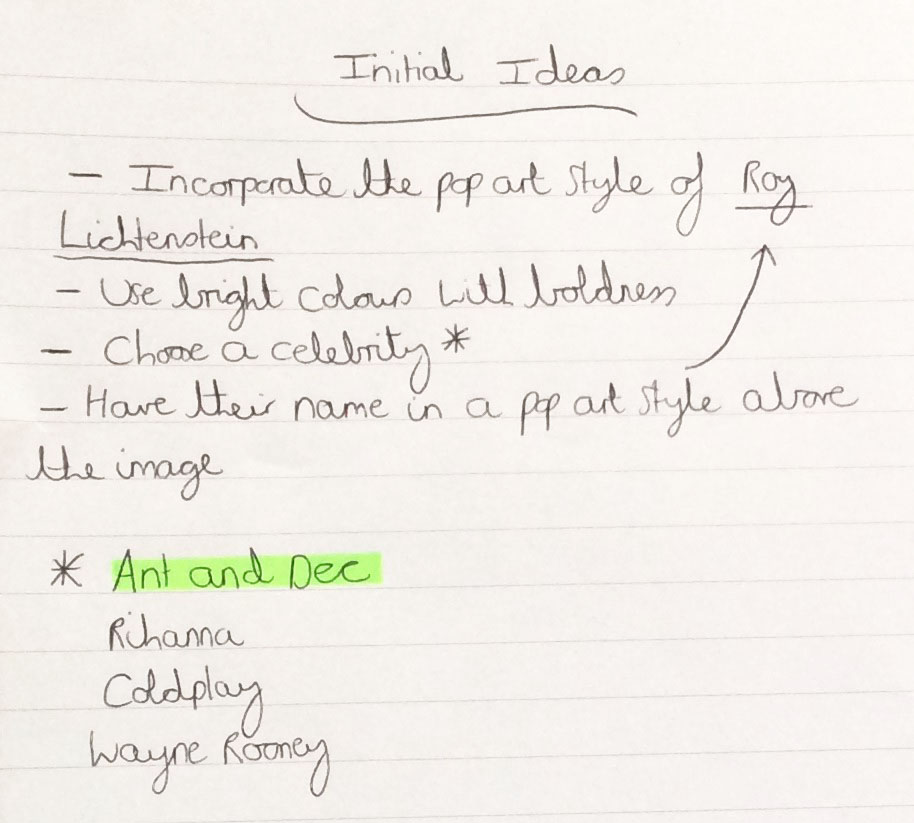
Initial Ideas Including the List of Celebrities
Sketching the Design
Overview
Following on from the previous stage, I then started to sketch some ideas on paper and thought I could have had Ant and Dec in the middle of the piece to act as a focal point with their names surrounding them. I also noted down some ideas as annotation in order to enable myself to think about the types of visuals I would have included as well in this digital piece of artwork.
However, I thought to add more impact to the piece, I should have tried to only centralise Ant and Dec and tried to incorporate the 'rule of thirds' and 'Golden Section'. As will be seen below, I thought it would have been beneficial to place the text ‘Ant’ on one side of the work and the text ‘Dec’ on the other side and the ‘&’ somewhere inbetween. To help with the 'Golden Section' integration, I drew a rough sketch, annotating where some of the assets would have been placed.
Various Sketches of Ideas
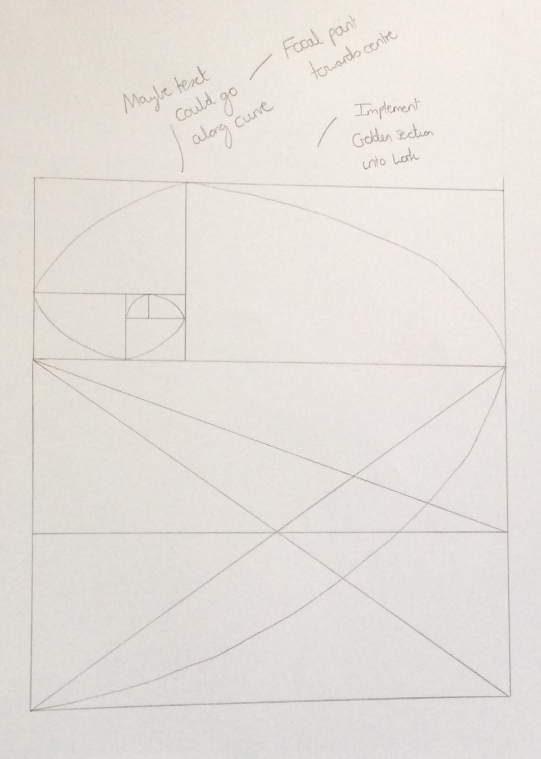
Sketching the 'Golden Section' and Adding Annotations
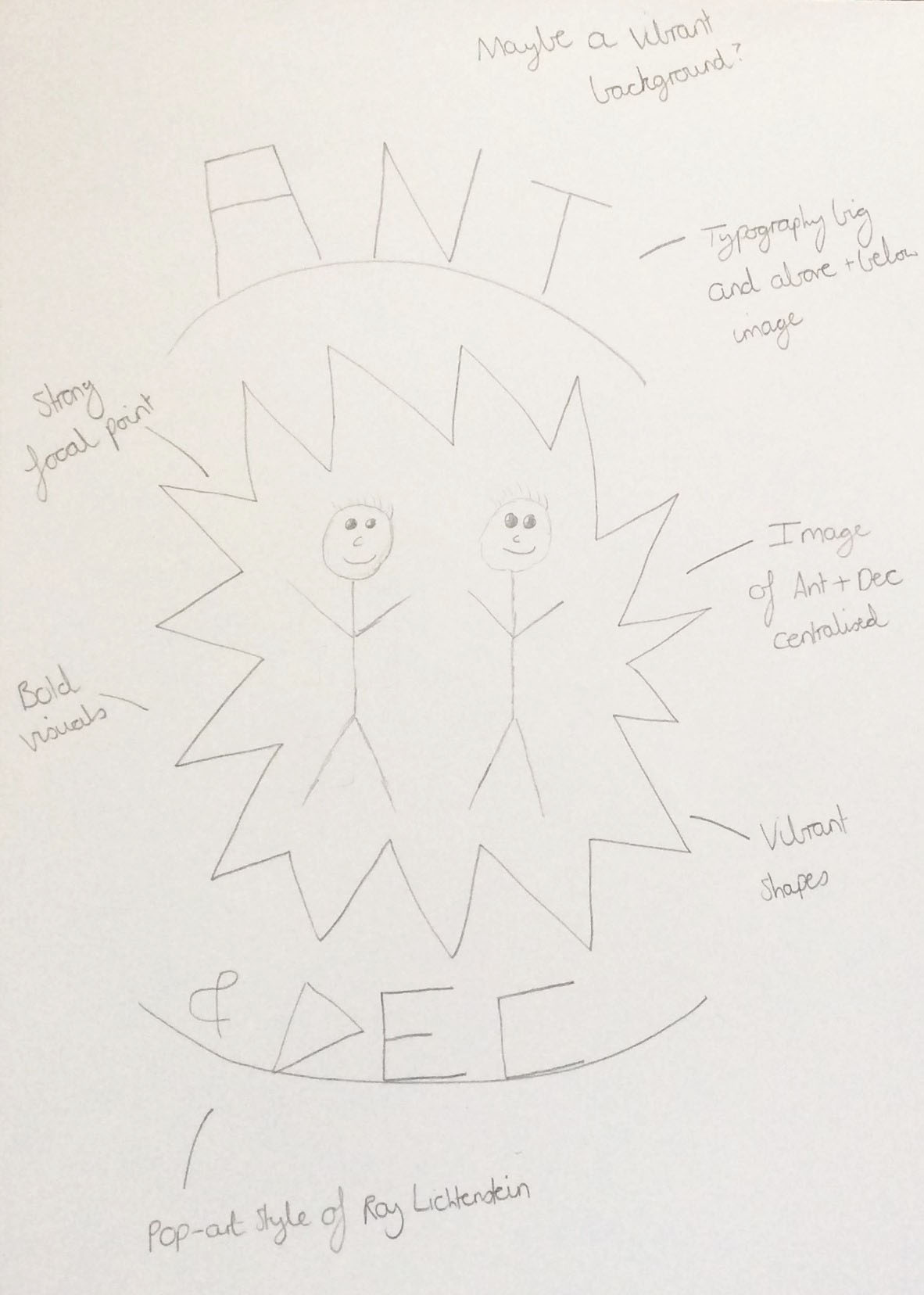
The Initial Sketched Design

The Improved Sketched Design
Creating a Cartoon Version of Ant and Dec
Overview
In order to create a cartoon/sketch effect on Ant and Dec to fit with the style of the poster, I saved an image off of the Internet and then researched how to do this on 'Adobe Photoshop'. You can see the end result below.
After completing this, I exported this as a ‘PNG’ file so I would receive the best quality image and imported it into another 'Adobe Photoshop' file. I then added colourful shapes, typography and effects to create my piece of digital art.
The Ant and Dec Image Before and After Changes
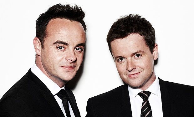
The Ant and Dec Image Before Changes
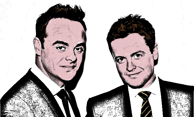
The Ant and Dec Image After Changes
Creating the Piece in 'Adobe Photoshop'
Overview
I added rulers to create thirds so that I could relate to the 'rule of thirds' when creating my piece in 'Adobe Photoshop'. I also added the yellow circle with lighting effects to try and link the 'Golden Section' into this work with the focal point being Ant and Dec, with the coloured stars surrounding them, in the middle.
The Created Poster in the Software 'Adobe Photoshop'
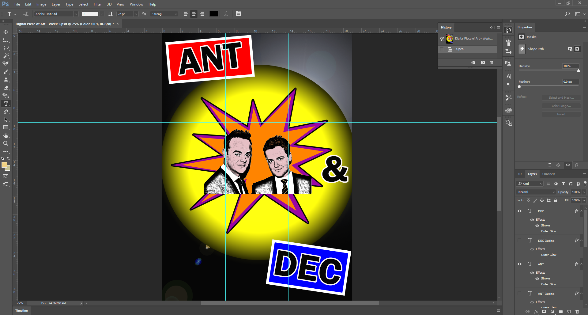
The Created Poster in 'Adobe Photoshop'
Creating my Final Ideas/Piece
Overview
After finishing my work in 'Adobe Photoshop', I exported the file as a ‘PNG’ file so that the quality of the image would have been much better than a 'JPEG' file. However due to this, the file size was bigger. You can view the finished article below.
As will be evident below, I included several bright colours with bold and clear typography, just as Roy Lichtenstein had in his work. I chose yellow, purple and orange especially because Lichtenstein used these colours quite frequently in his work. I added a lens flare to convey that Ant and Dec were presenters, to display a show business style and I chose a red background for the text ‘Ant’ and a blue background for the text ‘Dec’ to relate to their famous show ‘Saturday Night Takeaway’. When competing against each other, Ant is always on the red team and Dec is always on the blue team. This was my reason behind the selection of these colours. Finally, I added strokes to the text and the purple star to portray a cartoon effect which was exactly what Lichtenstein did in his work to add emphasis. Overall, I believed my piece demonstrated some of the ideas of Lichtenstein and 'Pop Art' in general as it was colourful and powerful which immediately attracted the viewer’s eye and because it appeared to have a cartoon effect.
References for this Project
Overview
As explained previously on this page, below is a document which contains the references for this project.
References DocumentThe Final Outcome
