Brief
"Design and produce a promotional flyer in which colour is explored and emphasises the information to be portrayed. This can be via the use of software or without i.e. watercolour, crayons, markerpens, collage."
Overview
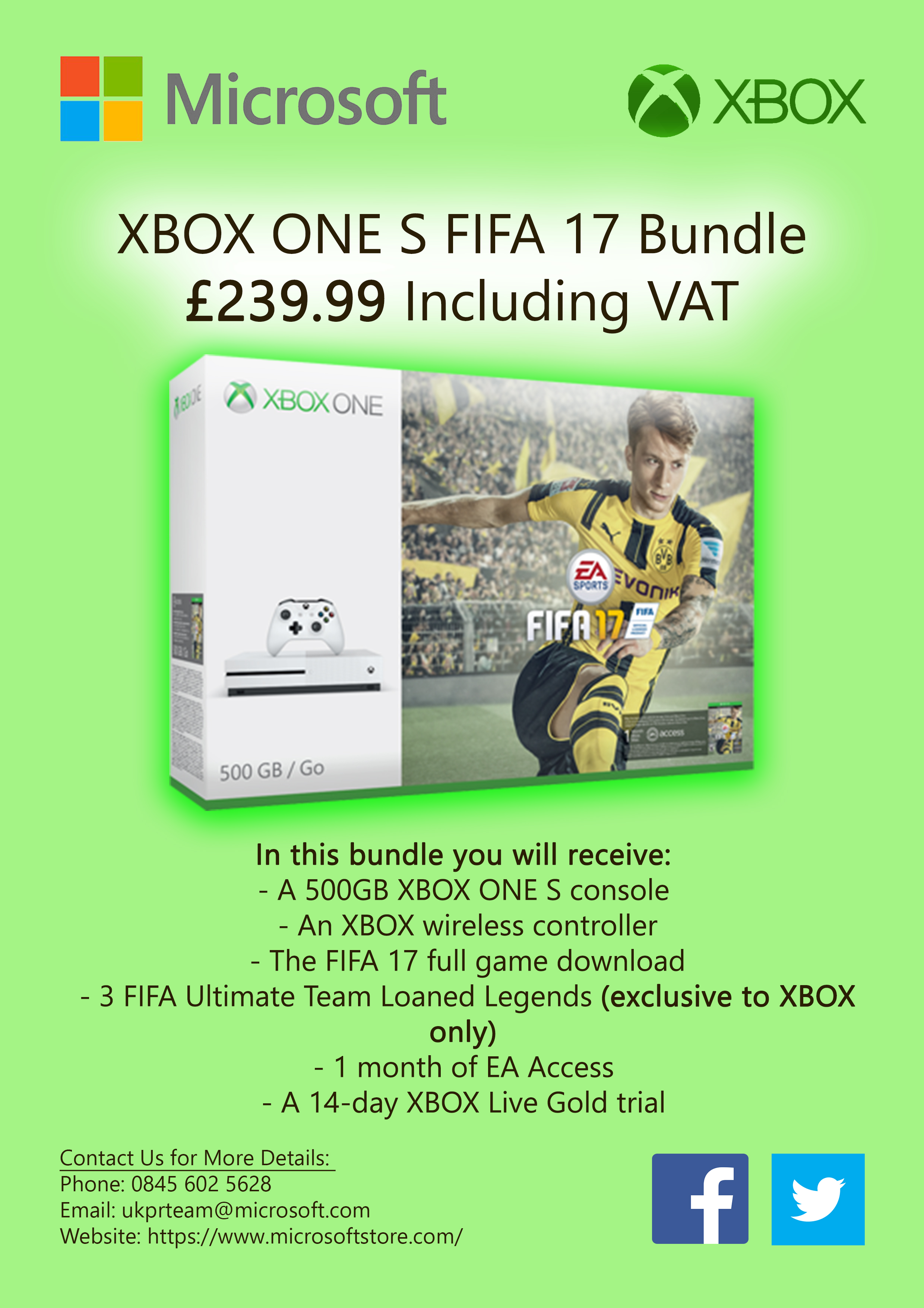
For my promotional flyer, I focused on the company 'Microsoft' by promoting one of their products. This was the 'XBOX ONE S FIFA 17 Bundle'. As will be evident, the colours of green, white and black were utilised to portray the colours of 'XBOX' as well as using the font used by 'Microsoft'.
To make certain aspects of the flyer stand out, I added effects to both the picture of the product and the name of the offer above.
References for this project can be viewed in the document supplied at the end of this page.
Inspiration and Research
Choosing a Company
Overview
I first of all decided to note down a list of companies which I would have been interested in choosing to base this project on. After this, I then decided to choose the company 'Microsoft'. From this, I undertook further research to identify the colours used in the logo and also the fonts.
The Processes of Choosing the Company 'Microsoft'
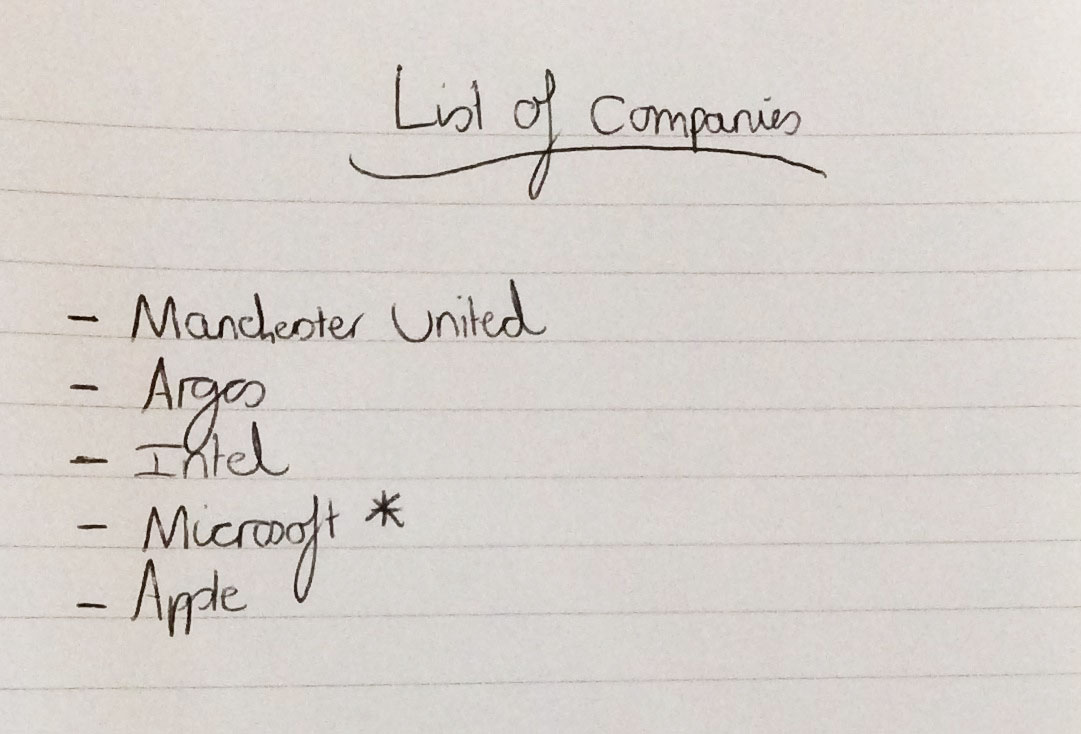
Listing Companies to Base the Project on
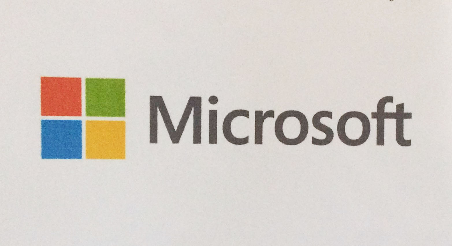
The Chosen Company ('Microsoft')
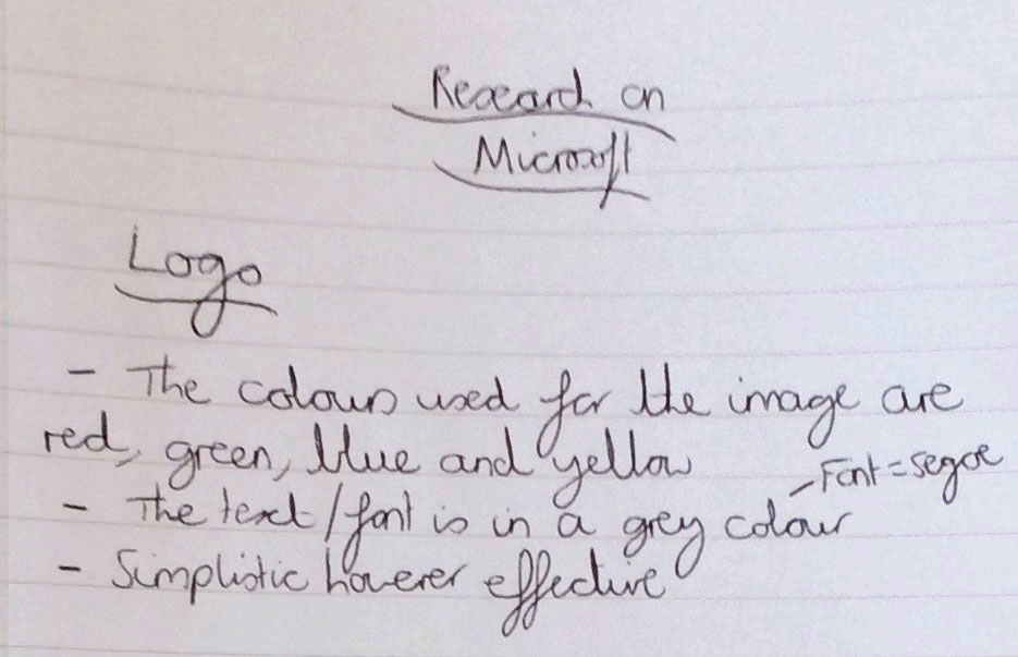
Colours Research Regarding the Logo and Font
Creating Colour Palettes
Overview
Following on from the previous stage, I then made some colour palettes for 'Microsoft', 'XBOX' and 'Microsoft Office'/'Office 365' because I was struggling to make a decision on what type of product I should have promoted. I simply created these colour palettes via 'Adobe Color' online.
The Created Colour Palettes

The Created 'Microsoft' Colour Palette

The Created 'XBOX' Colour Palette

The Created 'Microsoft Office/Office 365' Colour Palette
Choosing a Product to Promote and Viewing Flyers
Overview
After completing the previous tasks, I undertook some more research on 'Microsoft’s' official website to see what types of products they were promoting at the current time. I brainstormed some of the products down on paper and had a think about which one would have been the best to choose. I then selected the 'XBOX' offer, it was an ‘XBOX ONE S FIFA 17 Bundle’ and I thought I would base my flyer on this.
After coming to a final decision, I started to look at a couple of other flyers from 'BT' and 'Dominos' to understand what types of colours and layout they used along with the typography. I then created a list of key things to take from both of the flyers as a form of inspiration for my piece.
The Processes of Selecting a Product and Viewing the Flyers
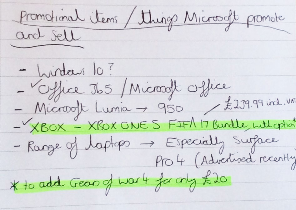
Selecting a Product to Promote
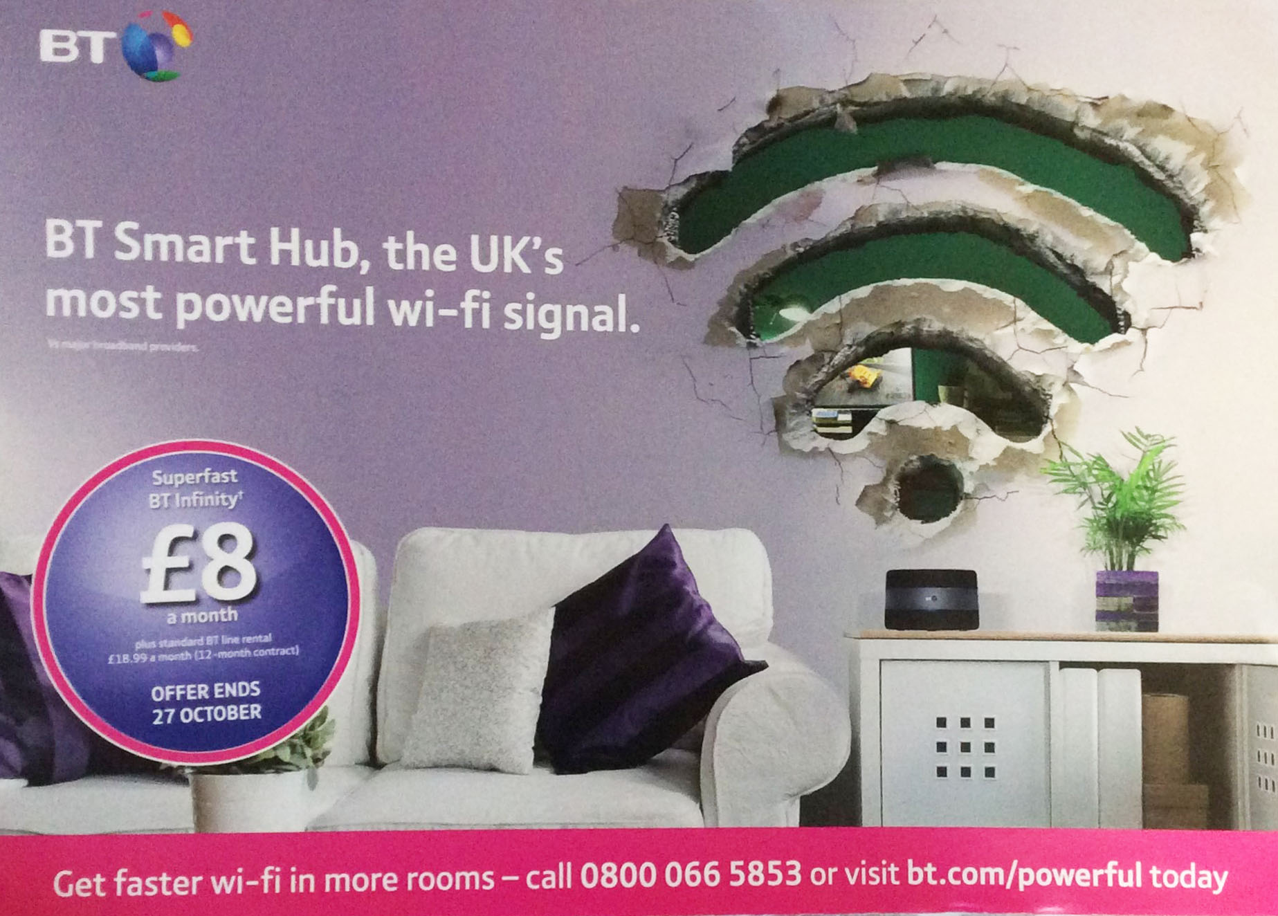
'BT' Flyer - Front Page
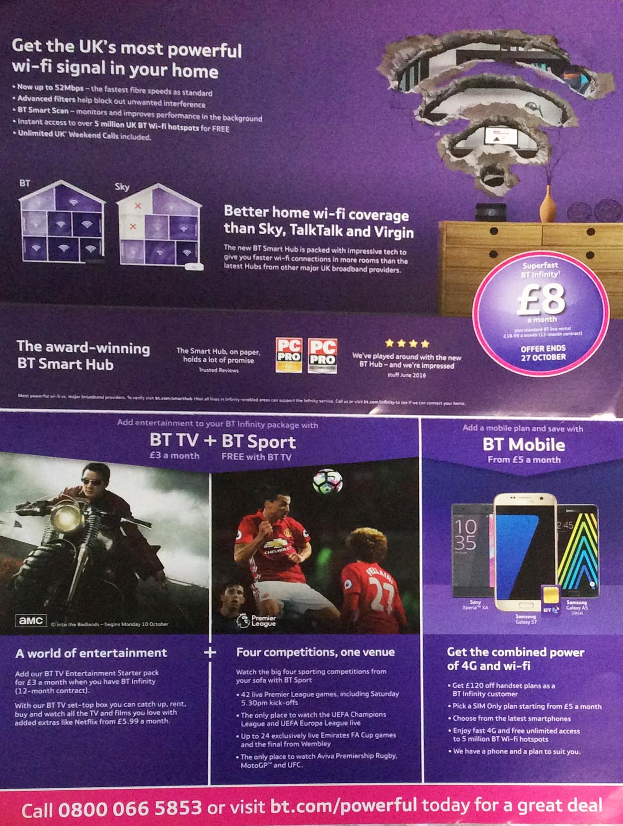
'BT' Flyer - Inside Pages
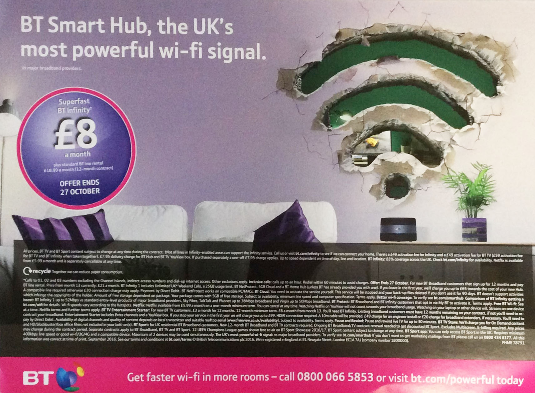
'BT' Flyer - Back Page
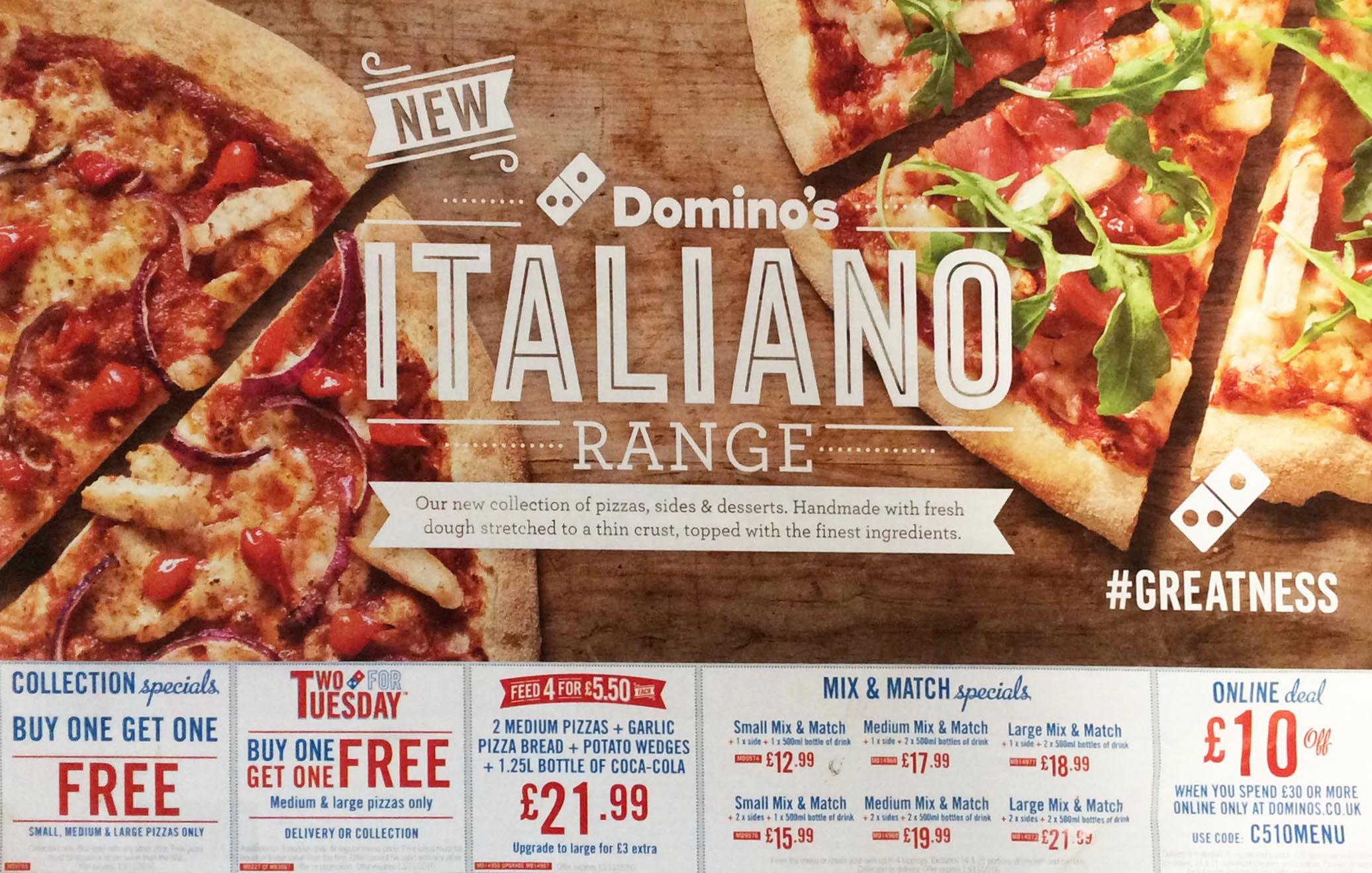
'Dominos' Flyer - Front Page
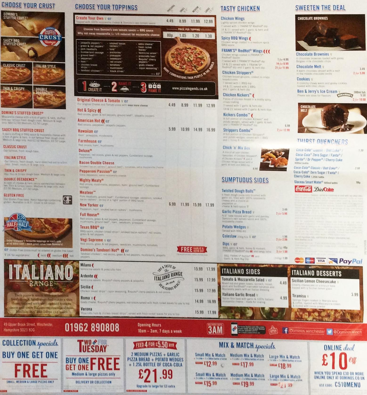
'Dominos' Flyer - Inside Pages
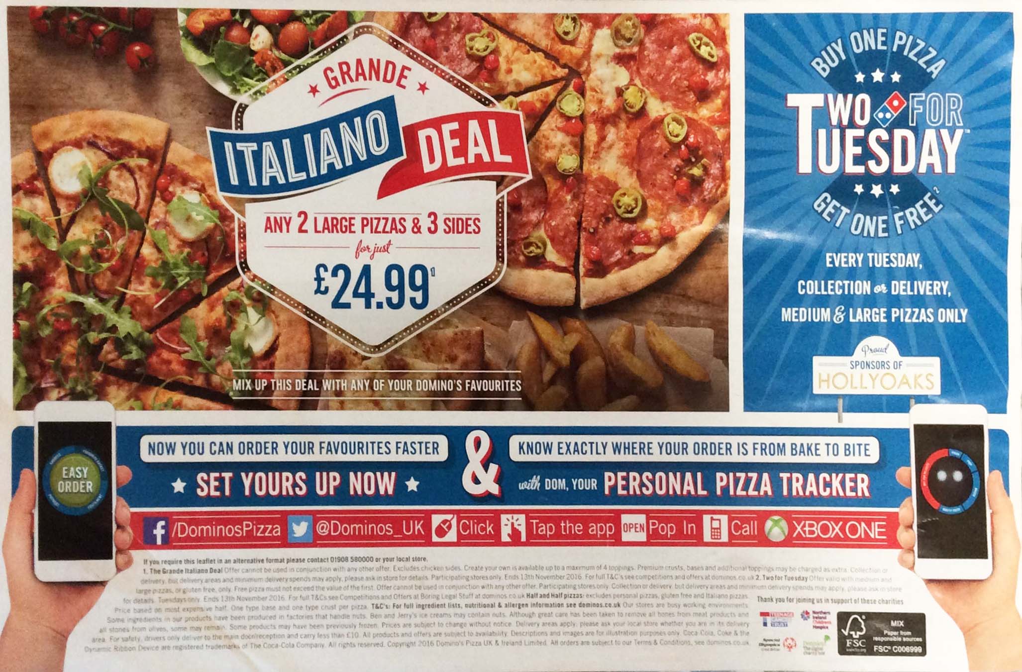
'Dominos' Flyer - Back Page
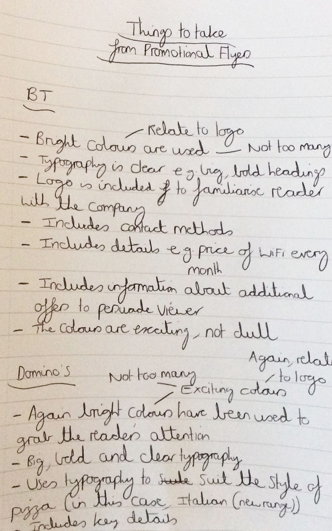
The List of Key Aspects to Take from Both Flyers
My Sketches and Ideas
Initial Ideas
Overview
Following on from my research and inspiration I then considered that it would have been a good idea to start making some ideas in the program ‘Adobe Photoshop’. With my colour palettes, I used the same types of colour to try and create a theme revolving around the 'XBOX' as it was an 'XBOX' product that I was promoting.
My reasoning behind the green background was because the 'XBOX' logo contained the colour green, I therefore thought it would have been beneficial to the viewer if they could have familiarised themselves with the product I was trying to advertise. I tried to include the 'Microsoft' logo in the top left to also help familiarise the user with the company involved and my understanding was that if I could centralise the main information it would have therefore appealed and stood out more to the viewer, hence therefore persuading them to do some further reading on the offer being aimed at them. With the contact details, my initial thoughts were to have this information smaller and at the bottom of the flyer because it was additional information which didn't need to be as big and to also add some contrast to my piece.
The Initial Ideas in 'Adobe Photoshop'
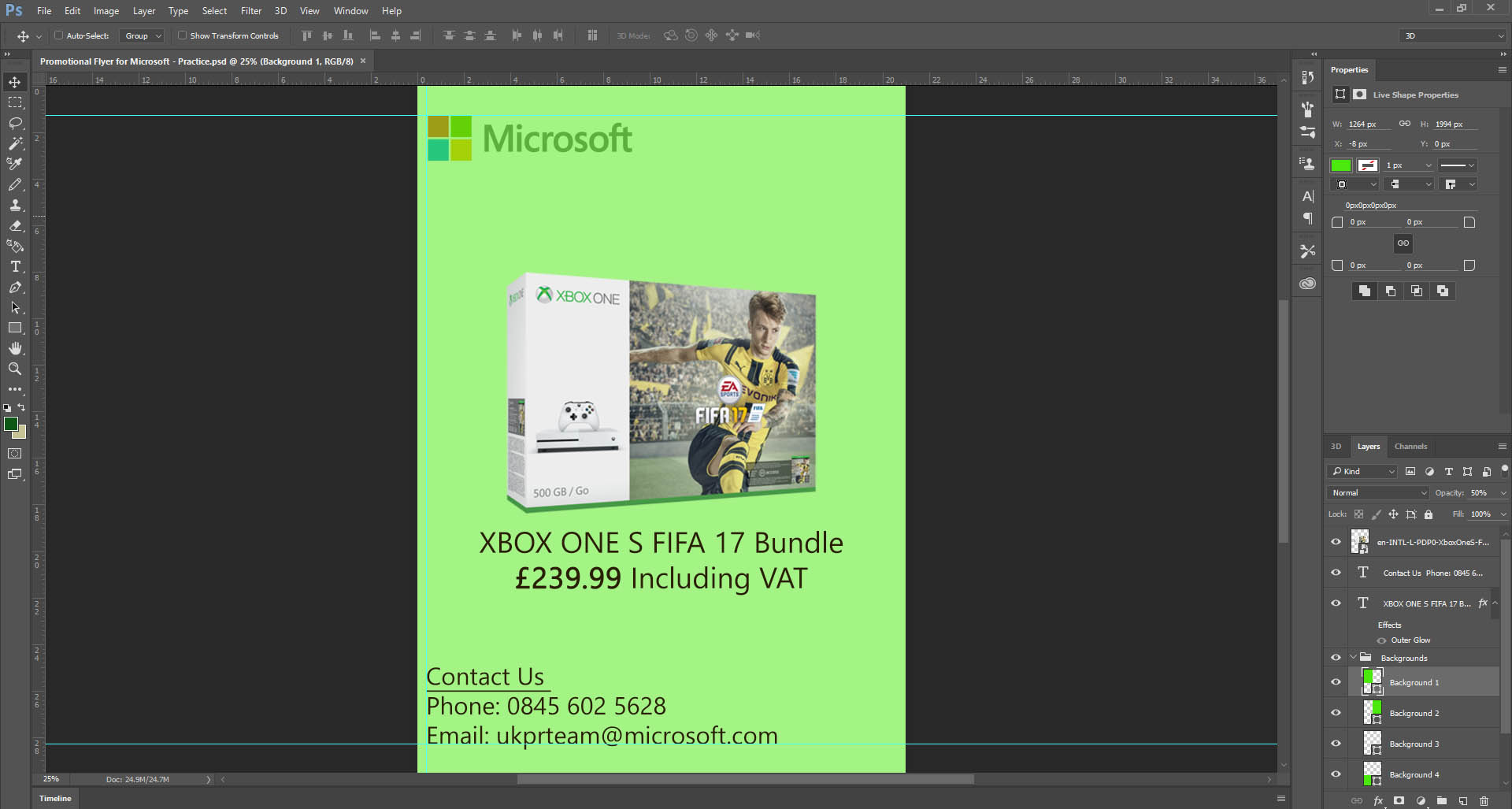
My Initial Ideas on 'Adobe Photoshop'
Developing my Initial Design
Overview
Subsequently following on from the previous aspect, I added to my first initial design to experiment with different colours and tools as well as layout.
As will be evident on the design below, I added the 'XBOX' logo due to the fact that it was an 'XBOX' product that I was promoting and added some effects to the typography and image as well, giving them both tinges of different colours (green and white) to correspond with the theme of 'XBOX'. I also included the social media icons, 'Facebook' and 'Twitter', to inform the audience that they could follow 'Microsoft' on these social media networking sites. From undertaking my research, I also included extra information about the fact that you could add ‘Gears of War 4’ for £20 more. To ensure that everything was positioned correctly I used the rulers as is evident on the piece of work below.
The Improved Design
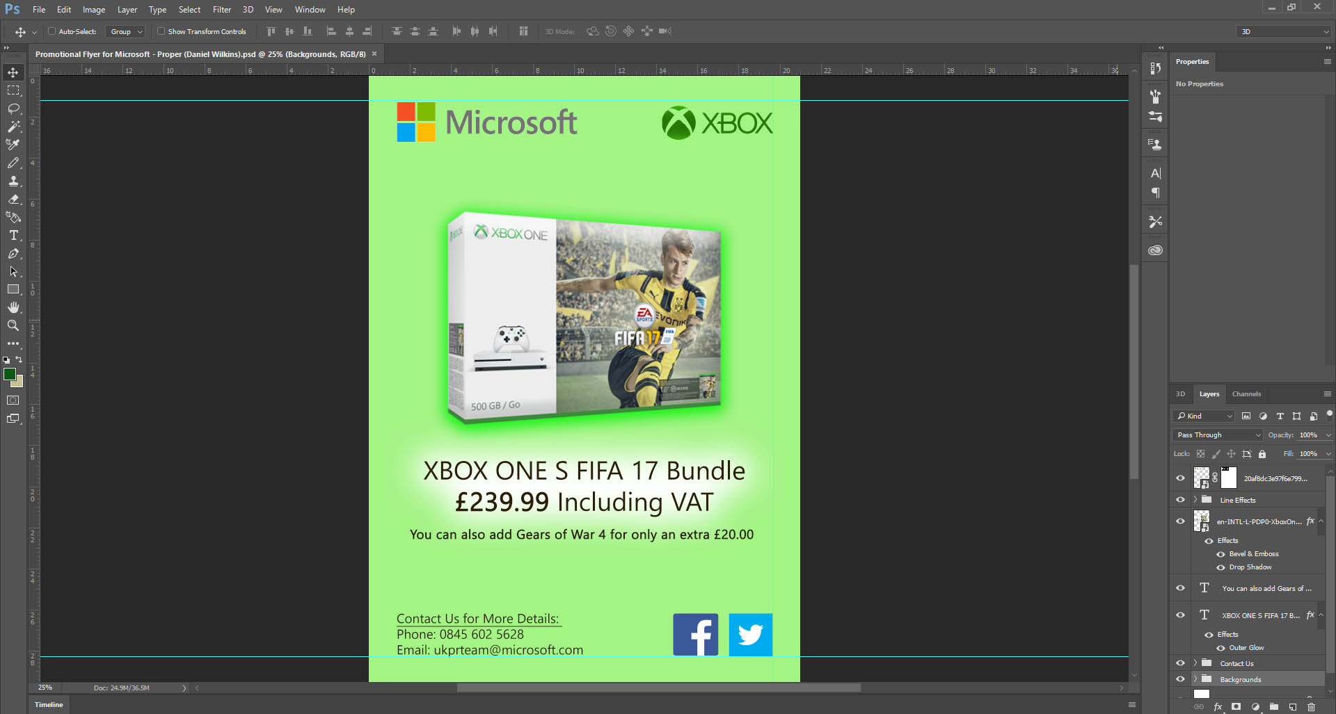
The Improved Promotional Flyer
Creating my Final Ideas/Piece
Overview
The next stage involved combining all of my ideas together, adding more details to my piece of work to create the finished article.
I looked at the information that 'Microsoft' were mentioning with regards to what was included in the bundle and I came to a decision to include the same information because it was imperative to do so. It stated what the customer would receive as part of the bundle which therefore informed them quickly of all the key details which they needed to know. On the contact details, I added the website address so that the customer would have an extra option to look on the website rather than emailing or having to make a phone call to 'Microsoft'. After finishing my design, I then exported it as a 'JPG' file as this had the smallest file size. However, with relation to colour, when the image was made bigger, it would pixelate which was a disadvantage. However, I realised that my poster didn’t consist of too many colours, so I therefore thought it would suit it well. I decided to also keep the size of the canvas to 'A4' size because it was a flyer which didn't need to be considerably large in size. This was therefore reasonable for the outcome.
References for this Project
Overview
As explained previously on this page, below is a document which contains the references for this project.
References DocumentThe Final Outcome
