Brief
"Choose a chapter from a banned book and visually interpret it as a digitally dynamic book. The chapter should resonate with you for some reason or encapsulates what you believe to be its inciteful nature. Consider how audiences of the book would have reacted to it when it was initially released. What was or is the aspect of censorship at play? Look to use potential of the digital form to interpret your text: consider movement, interaction, reader behaviour and experience. What can you do that would not be possible to do in print?"
Overview
For this project, I chose to base this on chapter 1 of 'Alice's Adventures in Wonderland' which was banned in China for its use of talking animals as this was seen as animals being equal to humans. I ensured that my piece was visually old, reflecting the age of the book.
Due to the fact that this was a two-week project, I wasn’t expected to show the finished article. I had to only show a section to convey across the sort of thing I was trying to implement along with all of my ideas and research.
It was also worth noting that there were other briefs to choose from regarding the 'ISTD' but I chose to focus on the brief displayed previously as I thought that this would have been the easiest to create ideas for. This would have ultimately caused for a better outcome.
References for this project can be viewed in the document supplied at the end of this page.
Inspiration and Research
Initial Inspiration
Overview
From looking on the module outline brief for this project, I found a couple of links to videos on 'YouTube'. One was a kinetic typography piece relating to the song ‘Wake Me Up Before You Go-Go’ by ‘Wham!’. I personally thought that the movement and animations made the piece seem very lively and energetic which, in relation to the song, matched the rhythm. The typography chosen also related to the time in which the song was written (during the 1980s) and overall I thought that this was a very professional and effective piece. Unfortunately the link to this video has expired and cannot be displayed below.
The second video on 'YouTube' was the opening title sequence from the film ‘Catch Me If You Can’ and the aspect that I liked the most was that it subtly connected the credits with visuals and the animations were smooth and easy on the eye. The piece used images but also used the typography as a focal point for making other images, for example when the person came out of the swimming pool, a ladder was created from the ‘m’ on ‘Amy Adams’. Generally, I was very impressed by this piece. This video can be viewed below.
From viewing the two videos, this then made myself think about what I would have liked to do and I thought that I would try to make the typography in my piece of work the main platform for creating visual images. I would try to highlight the most important words in each section and use them to inspire these images. In addition to this, I thought it would have been a good idea to find a type of font which related to the time period my banned book was written/published in.
'Catch Me if You Can' Title Sequence Inspiration
Research
Font Experimentations
Overview
Firstly, I undertook some research on which books had been banned and I found a list of banned books on 'Wikipedia' viewable here which I then looked through. After doing this, I then chose the book ‘Alice’s Adventures in Wonderland’ by Lewis Carroll, published in 1865. From my research, I formed an understanding that it was banned in quite a few countries but decided to focus on China which banned the book in 1931 for its use of talking animals. The Governor of the Hunan Province stated that ‘animals should not use human language, and that it was disastrous to put animals and human beings on the same level’ (Rosenthal, 2014:[online]).
I then undertook some research on finding fonts which would have related to the time period the book was published in which was the Victorian Era (1837-1901). I thought it would have been a good idea to look at 'Serif' fonts as these contained flicks which gave them an old-fashioned feel. I found a collection of websites which provided a few examples. From this, I then viewed these within 'Adobe After Effects', the program I would have been using to create the final piece.
The Viewed Fonts in 'Adobe After Effects'

'Times New Roman' Font Experimentation

'Bodoni MT' Font Experimentation

'Garamond' Font Experimentation

'Minion Pro' Font Experimentation
Discovering more Fonts
Overview
As well as trialling different fonts in 'Adobe After Effects', I also found some images of different styles of fonts which further helped myself gauge how well they would have worked with my final piece.
The Further Discovered Fonts
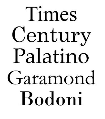
The First Discovered Image of Different Fonts
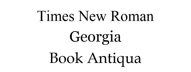
The Second Discovered Image of Different Fonts
Viewing Digitally Dynamic Books
Overview
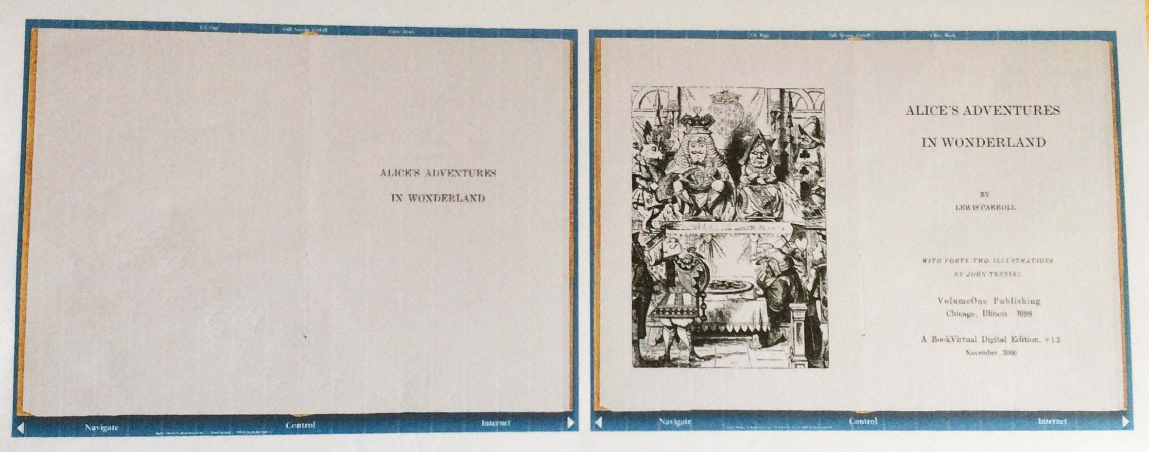
As well as undertaking research for the context of why the book was banned and fonts I could incorporate into my piece, I also viewed a couple of digitally dynamic books on the ‘editionsatplay’ website, provided in the brief, to gain an understanding of the type of work I would have been creating. This enabled myself to then start producing ideas and sketches of what I could have included in my work. To view the 'editionsatplay' website, either view this below or via the provided link.
The Digitally Dynamic Books Source
View the 'editionsatplay' WebsiteMy Sketches and Ideas
Brainstorming Initial Ideas
Overview
First of all, I thought it would have been beneficial to brainstorm some ideas for the 'ISTD' project in order to help myself plan out my piece of work. These ideas are viewable below.
The Brainstorm of Ideas
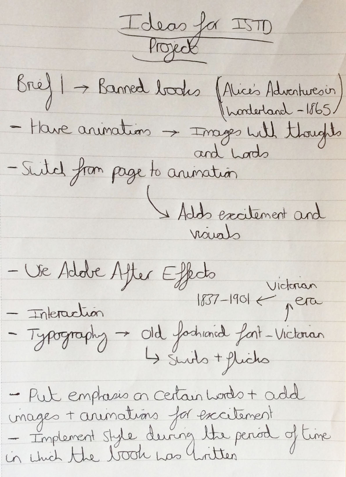
The List of Initial Ideas for this Project
Analysing the Book
Overview
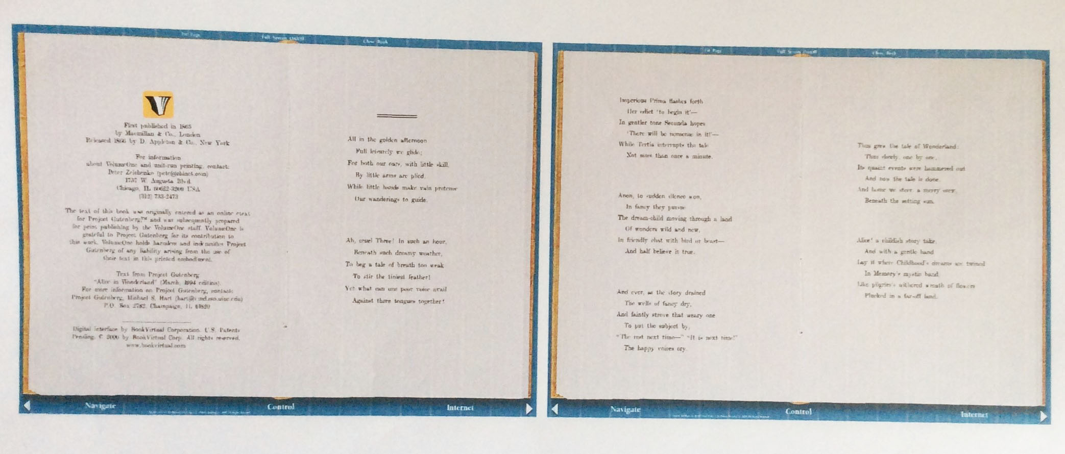
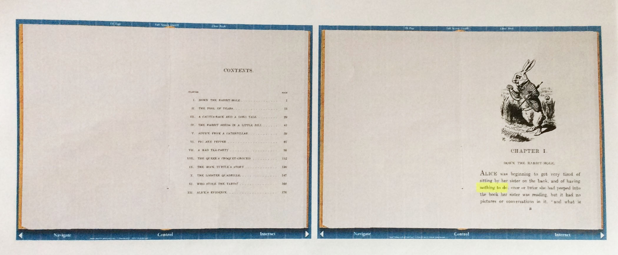
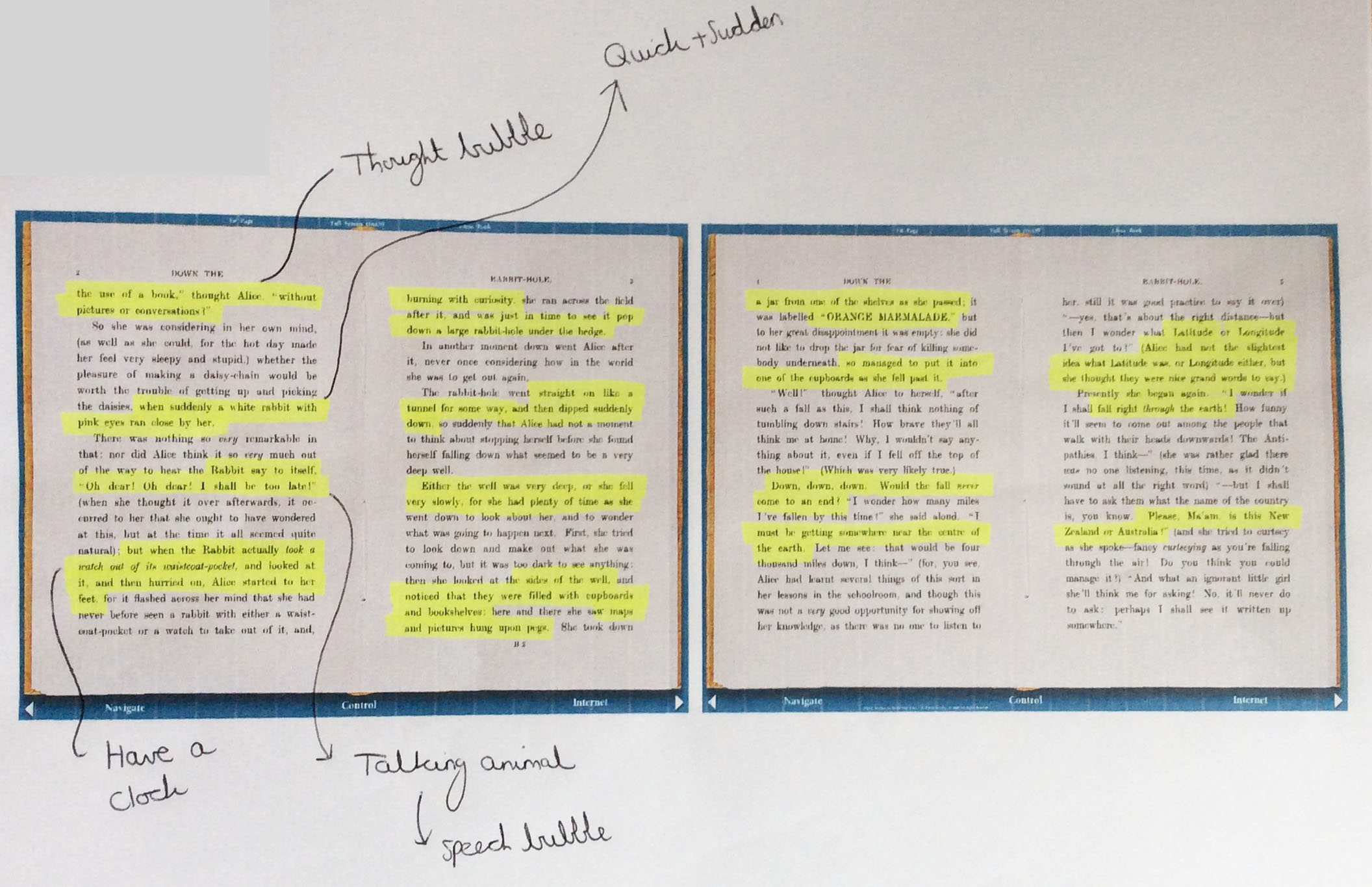
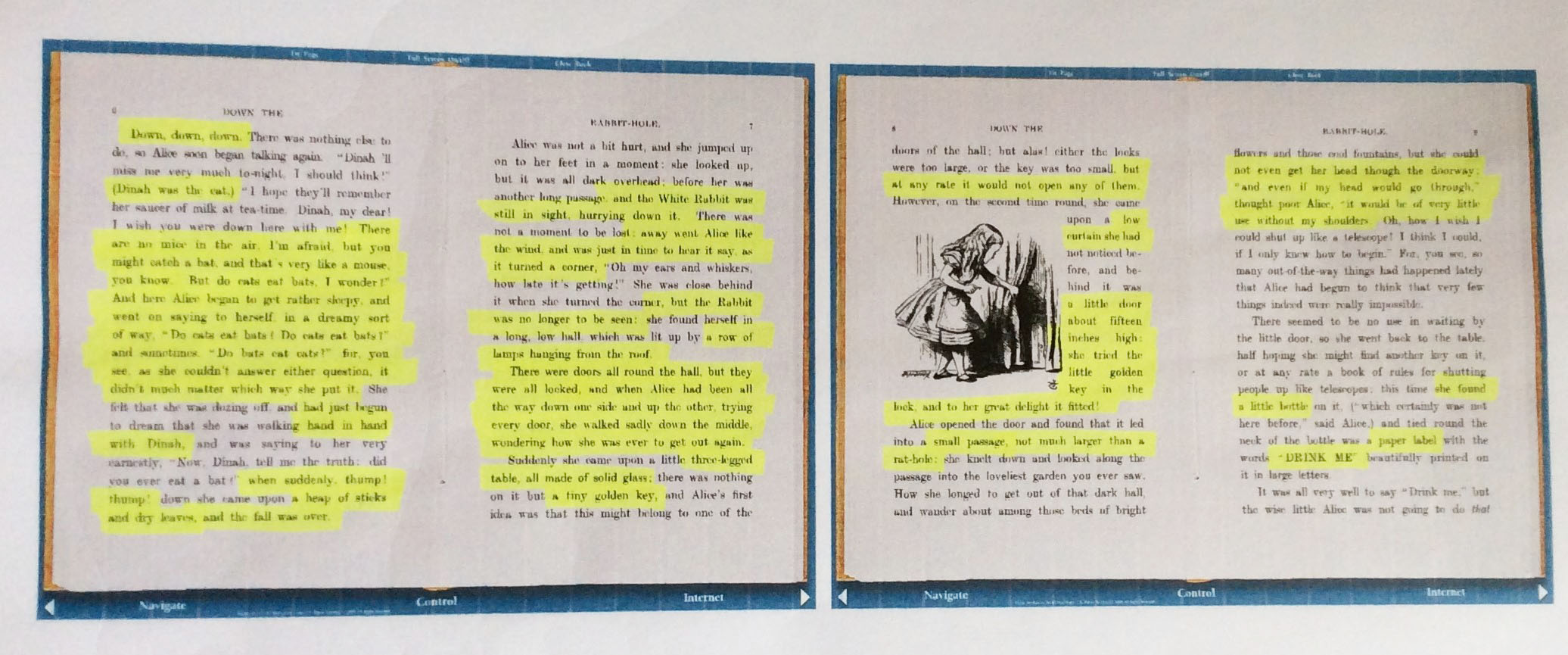
Following on from the previous stage, I then managed to find a copy of the book online which I then started to read the first chapter of. I thought it would have been best to focus on the first chapter where I would have fully understood what was occurring in the story. This was due to the little amount of time I had. After reading the chapter, I then printed it out in paper form and read it again but highlighted the important parts of it so I could have then created ideas. This process can be viewed below.
The Analysis
The First and Second Pages of the Book Analysed
The Third and Fourth Pages of the Book Analysed
The Fifth and Sixth Pages of the Book Analysed
The Seventh and Eighth Pages of the Book Analysed
The Ninth and Tenth Pages of the Book Analysed
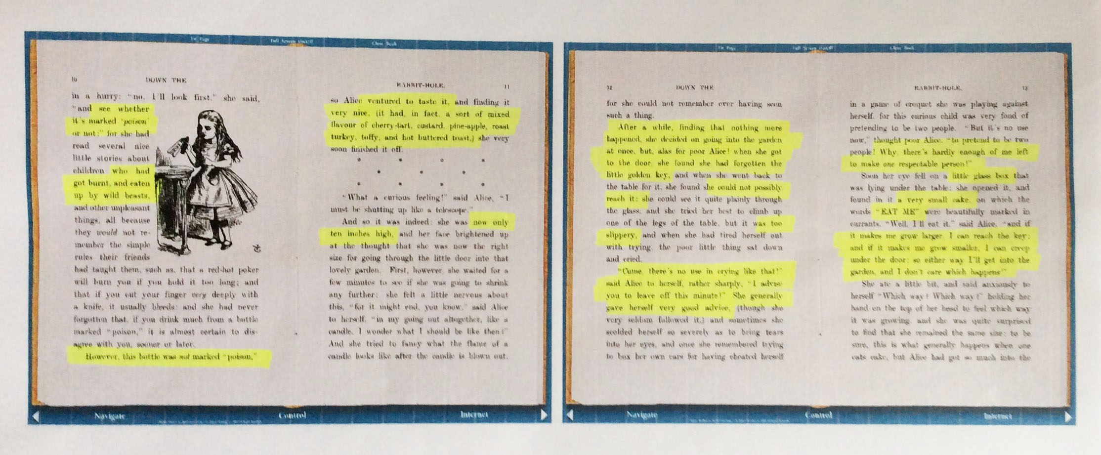
The Eleventh and Twelfth Pages of the Book Analysed
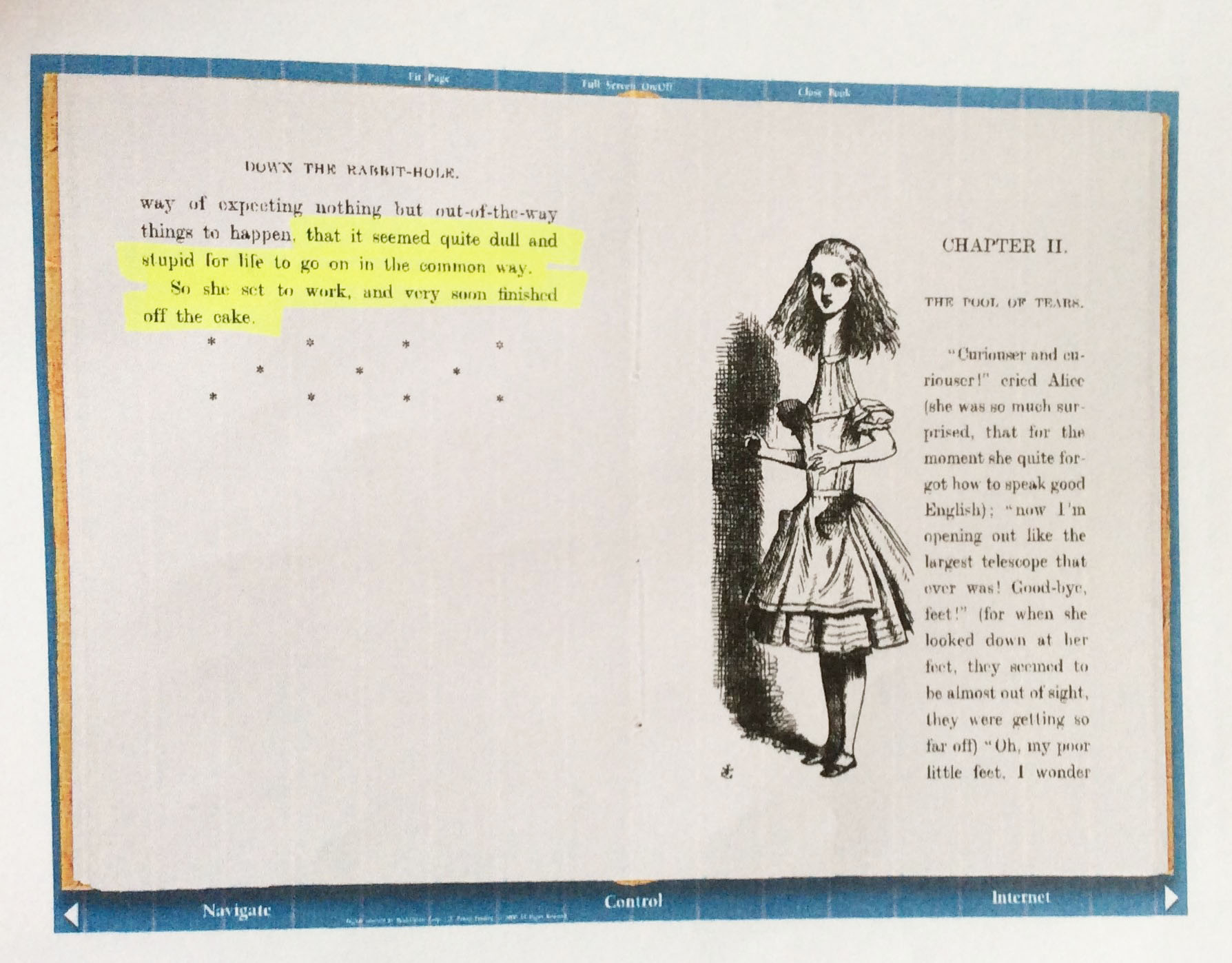
The Last Page of the Book Analysed
Drawing Sketches of Ideas
Overview
Next, I drew some sketches based on the parts I highlighted in the book to try and create some ideas showing how typography would have been used, whether assisting images or actually making up the images. My thinking behind this was that if I could draw some sketches it would have therefore made it easier for myself to implement these ideas into my work. These sketches can be viewed below.
The Sketches of the Ideas
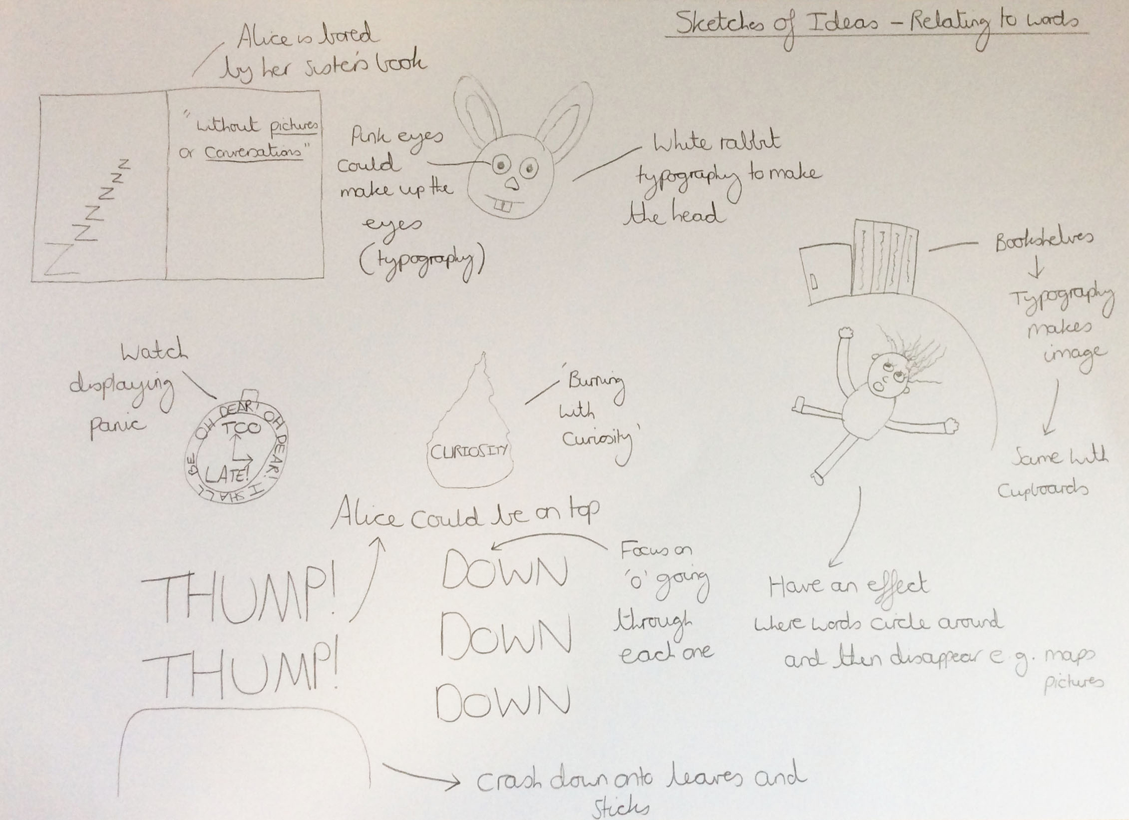
The First Page of Sketched Ideas
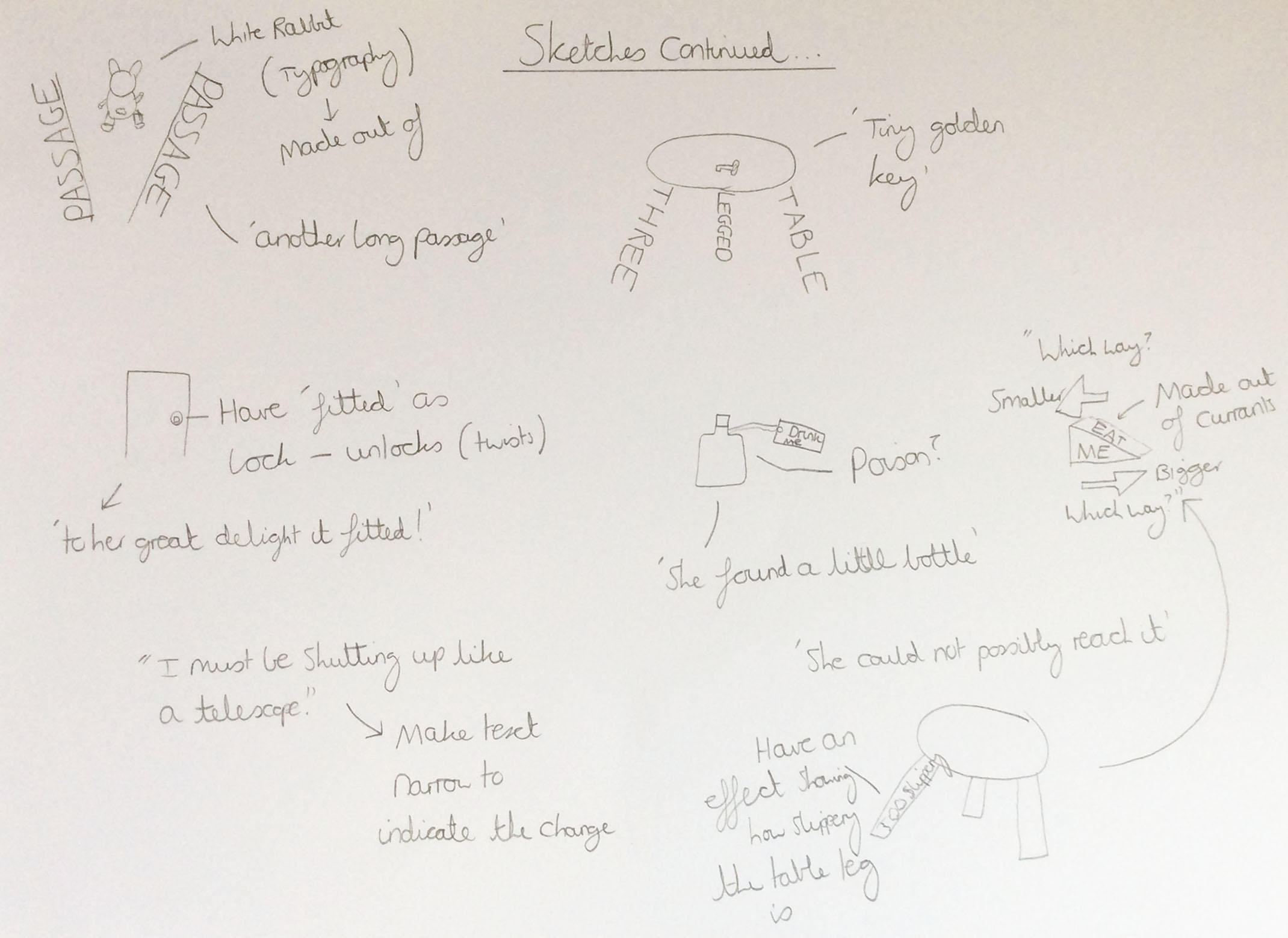
The Second Page of Sketched Ideas
Creating Wireframes
Overview
Following on from drawing sketches, I then drew some wireframes to show how I could have structured my digitally dynamic book. I produced three different approaches so that I could have analysed all of the options available to myself and I chose to incorporate approach 1 because I thought it would have been good to allow the reader to read some of the chapter first and then show them an animation. This was due to the fact that if I chose approach 2 then they might have become distracted when reading and additionally potentially have missed the animation whilst reading. With regards to approach 3, I thought this may have revealed some of the events before the reader had had an opportunity to read the book, hence ruining the story for them.
The Created Wireframes
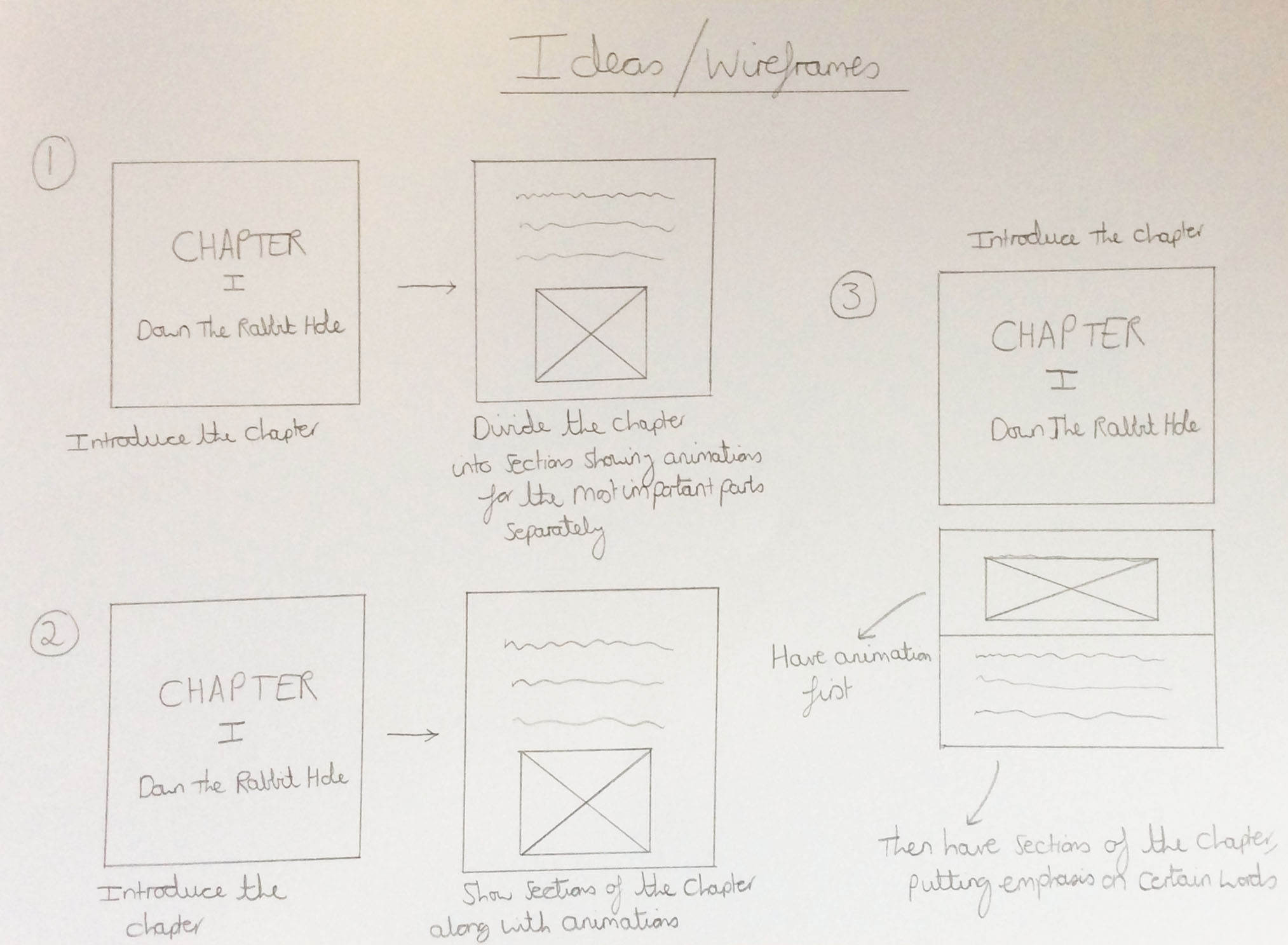
The Different Wireframes Demonstrating Various Approaches
Creating a Storyboard
Overview
Additionally to the wireframes, I drew a storyboard of what I would have contained in my short section of my digitally dynamic book. This was again to aid myself in creating my piece of work as it would have made it easier for myself to start working on my piece by having a plan to follow.
The Storyboard
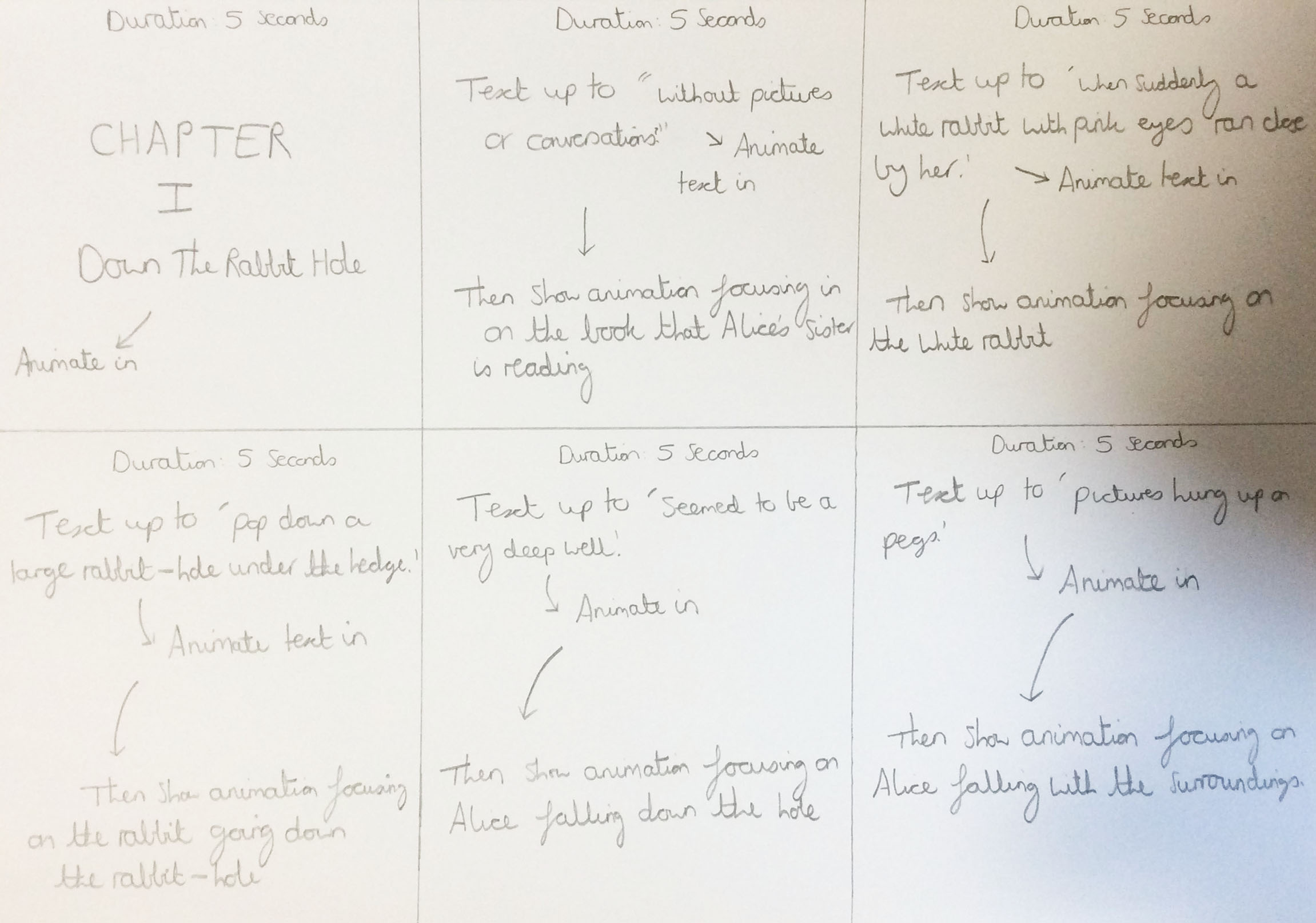
The Created Storyboard
The Chosen Font
Overview
Later on, I returned to choosing the final font which I would have used in my digitally dynamic book and I found a font on ‘Adobe After Effects’ called ‘Bookman Old Style’. This font was similar to the fonts I have previously shown in my research on this page but it appealed to myself more than the others so I decided to choose it. You can see the font below.
The Actual Font

The 'Bookman Old Style' Font
Creating my Final Ideas/Piece
Overview
After conducting all of my research and combining all of my ideas together, I then made the first 90 seconds of my digitally dynamic book in ‘Adobe After Effects’ utilising effects and typography to ensure my piece was engaging and interesting. However, I didn’t manage to include all of the scenes that I planned out on the storyboard because each section took longer than I planned.
When I had finished, I then used ‘Adobe Media Encoder’ to export my ‘Adobe After Effects’ file as an 'MP4' file. I thought I would choose this format because it didn't require much disk space and was therefore easier to load onto this web page. As you can see, my finished piece is below.
References for this Project
Overview
As explained previously on this page, below is a document which contains the references for this project.
References Document