Brief
"Work in teams to create a game design concept for an instructional computer game aimed at 11-15 year old children."
Overview
The story of our game was that, as a selected character of your choice, you had to fight through the 'World Education Boxing Association' against a variety of characters whilst answering quiz questions before each fight to gain more health, acting as the educational aspect. You would fight three characters in the 'Home Zone', four characters in the 'Regional Zone' and six characters in the 'Global Zone'. The purpose of the game was to defeat these characters and then a special skilled character at the end to receive the title of 'Heavyweight Quiz Champion of the World'.
For this project I assisted in the design aspects of the game as I produced ideas for the character select menu, quiz aesthetics and ideas in general.
References for this project can be viewed in the document supplied at the end of this page.
Sketches and Ideas
'Pumpkin Kid'
Overview
First of all in our group, we brainstormed down some ideas on paper looking at two different types of games. These were ‘Beat em’ up’ games and platformer games. We then analysed the advantages and disadvantages of both. We thought that platformer games were too simplistic and overused ideas so we decided to choose to make a ‘Beat em’ up’ game in '8-bit' style. After doing this, we thought it would have been a good idea to think of a genre and thought that horror was a popular one currently. After discussing with each other, we decided to think about the idea of ‘Pumpkin Kid’, a child who would have gone out on Halloween with his brother. They would have travelled to one house trick or treating and received some sweets which wouldn't have been what they seemed. His brother would have then eaten one and changed into a werewolf, chasing his brother. The objective of the game would have been to return home safely.
I started to produce some designs of menus which could have been made along with a title for the game. I also drew some ideas of enemies which could have appeared in the game. To add to this, I also undertook some research about horror games, especially why they were so popular.
Title Screens
Overview
As will be seen below, with regards to the first menu design, I attempted to implement the idea of a pumpkin theme due to the fact that the main character was ‘Pumpkin Kid’. I added pumpkin heads next to each of the options on the menu along with an orange tinge to the text and pumpkin faces in each of the ‘p’s on the title in order to emphasise this. I also thought it might have been a good idea to have ‘Pumpkin Kid’ on one side of the page and the enemy (in this case the witch) on the other side to differentiate between the sides of good and evil.
The second design included the head of ‘Pumpkin Kid’ which acted as the main focal point. As is shown, the title could have been included inside of the eyes with the options below (possibly centred). Then I thought it would have been a good idea to position the monsters/enemies surrounding the head to display the types of characters ‘Pumpkin Kid’ had to encounter along the way on his journey back home.
The Title Screens Research and Ideas
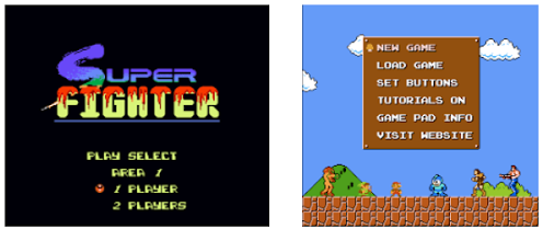
Examples of Game Menus Viewed - '8-bit' Game Menus
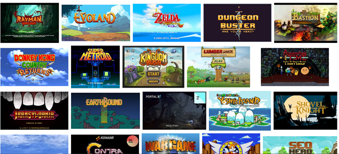
Examples of Game Menus Viewed - Game Menus in General
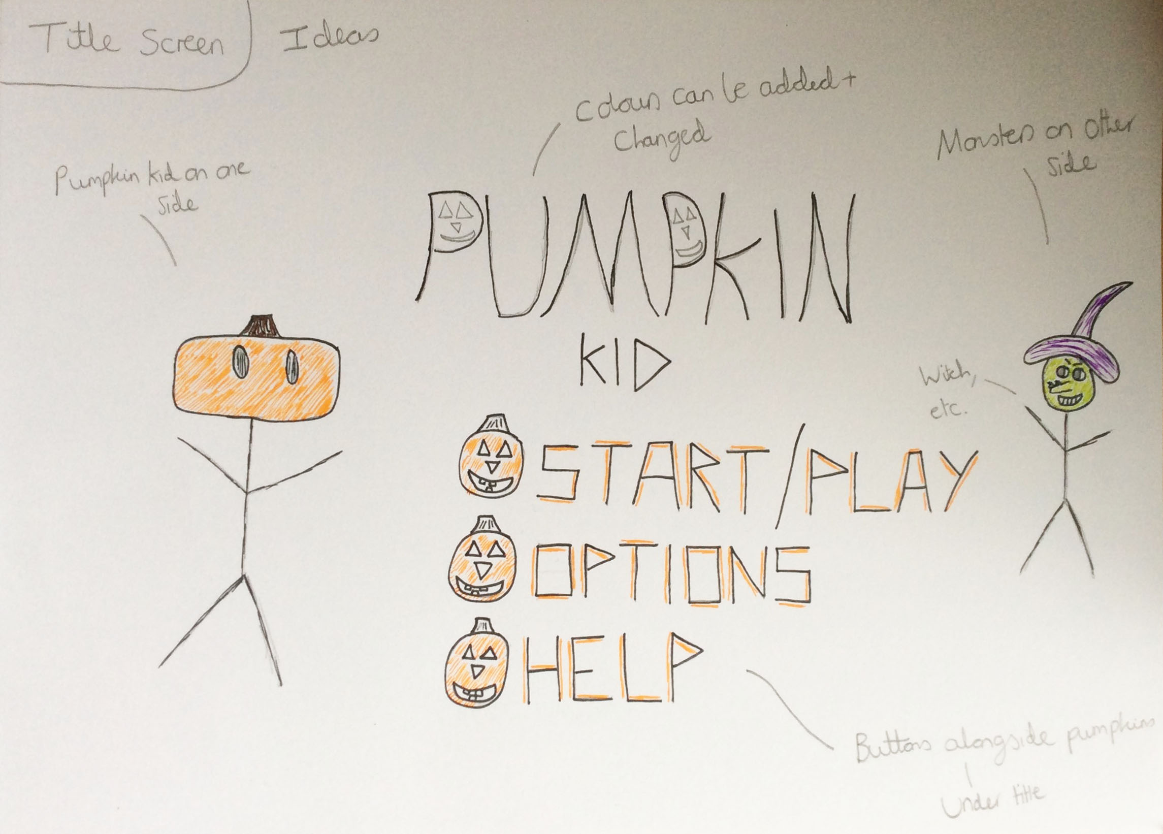
The First Title Screen Design
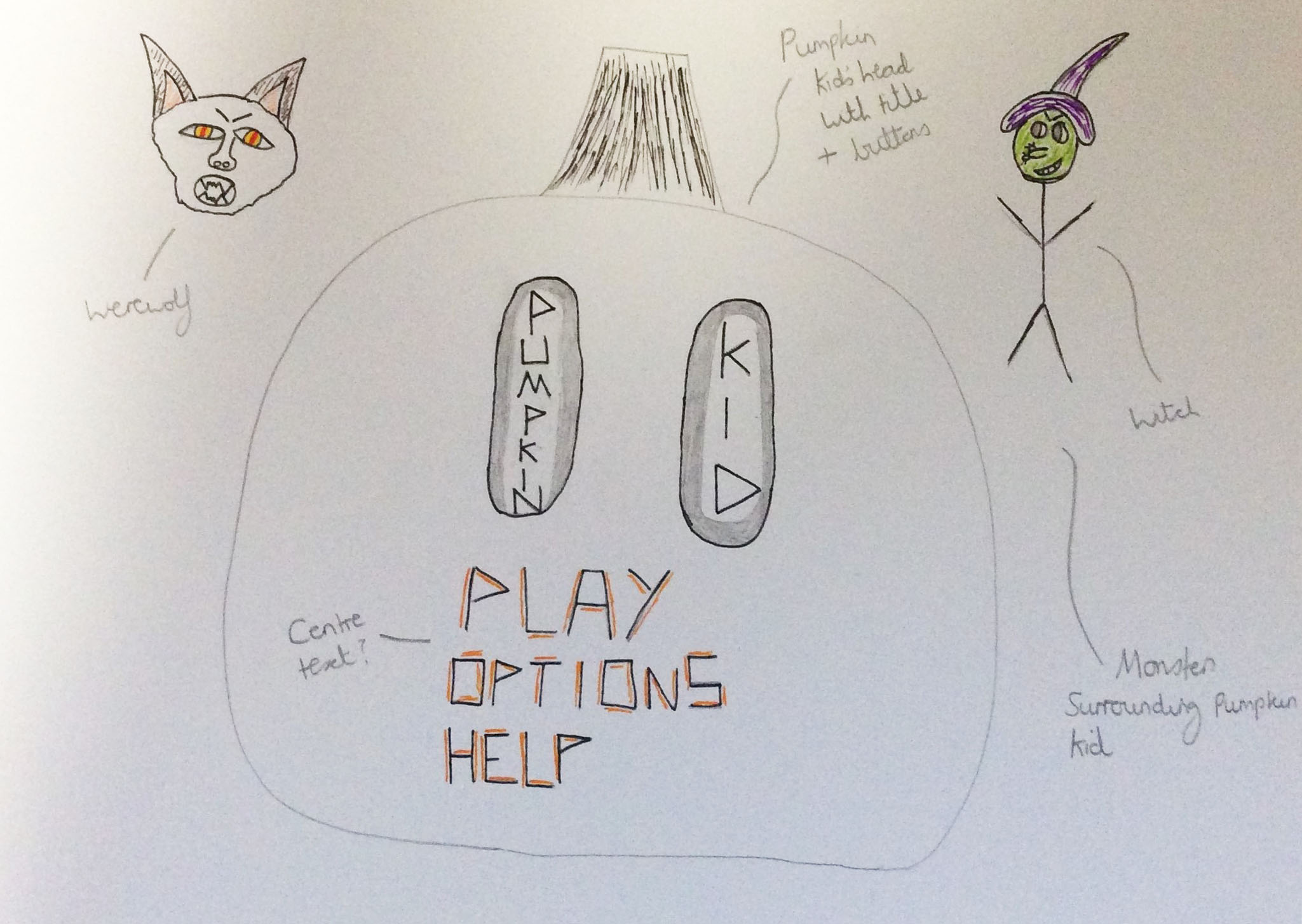
The Second Title Screen Design
Title Idea
Overview
For 'Pumpkin Kid', I produced one title idea which is the one viewable below. I implemented a scary presence about the typography but also, in contrast, a friendly presence as well. This was because the typography was crooked but had friendly pumpkin faces within each of the ‘p’s. This therefore would have invited people to play the game. Orange was a common theme as well as being the colour of the head of ‘Pumpkin Kid’. A pumpkin had been used again which held the title within itself.
The Actual Title Idea
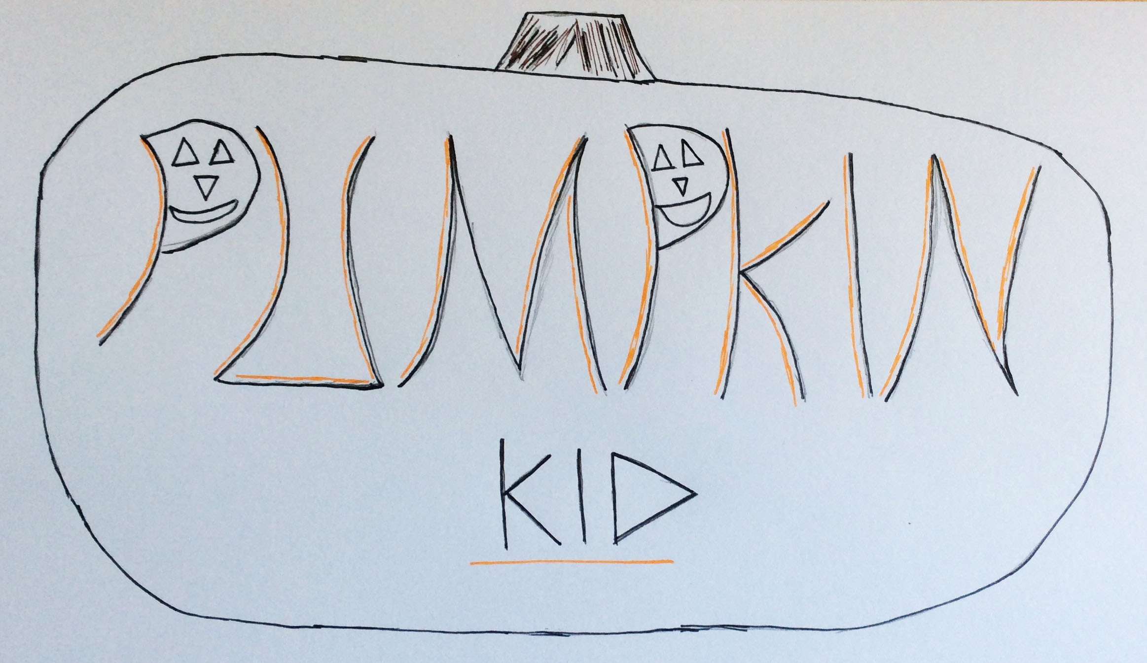
'Pumpkin Kid' Title Idea
Characters Ideas
Overview
After deciding to change our game slightly due to the fact that we had to make it educational, I produced some ideas of enemies that ‘Pumpkin Kid’ could have fought against. I viewed different images on the Internet to gain an idea of how to draw each of the characters. However, I tried to add a sinister feel to each one to convey that they were evil and the enemy. This was portrayed through mainly the red eyes, malevolent eyebrows and unnerving smiles. I also named them with catchy names through the use of alliteration, for example ‘Sinister Spider’.
The Inspiration
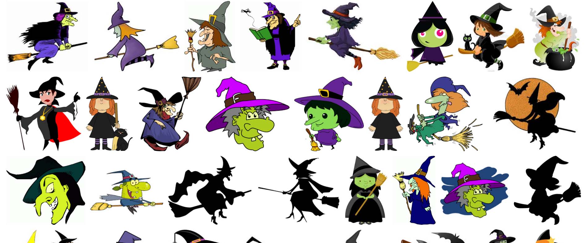
Witch Character Inspiration
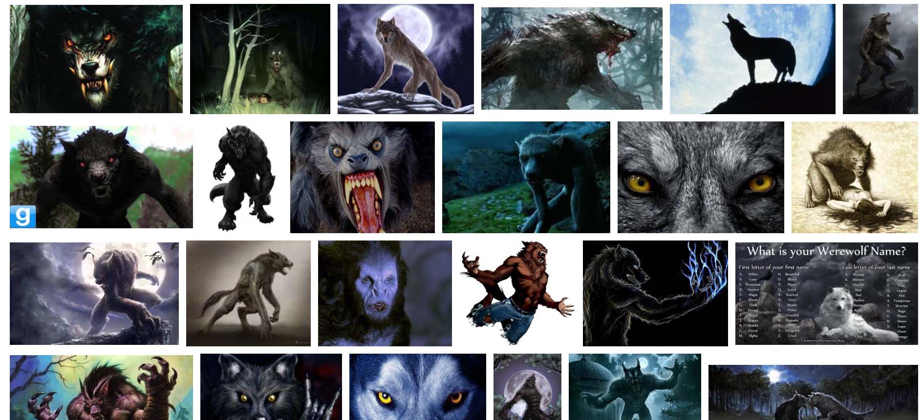
Werewolf Character Inspiration
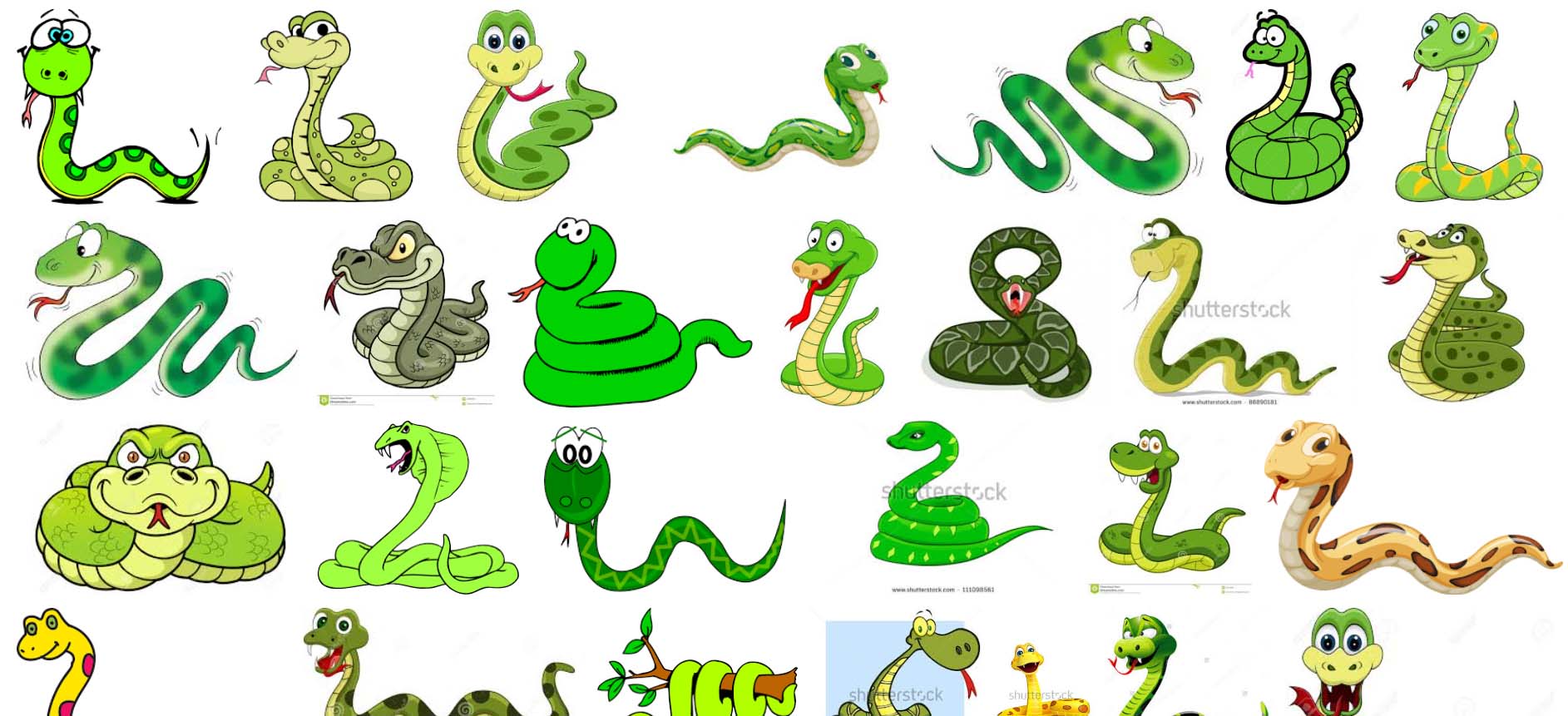
Snake Character Inspiration
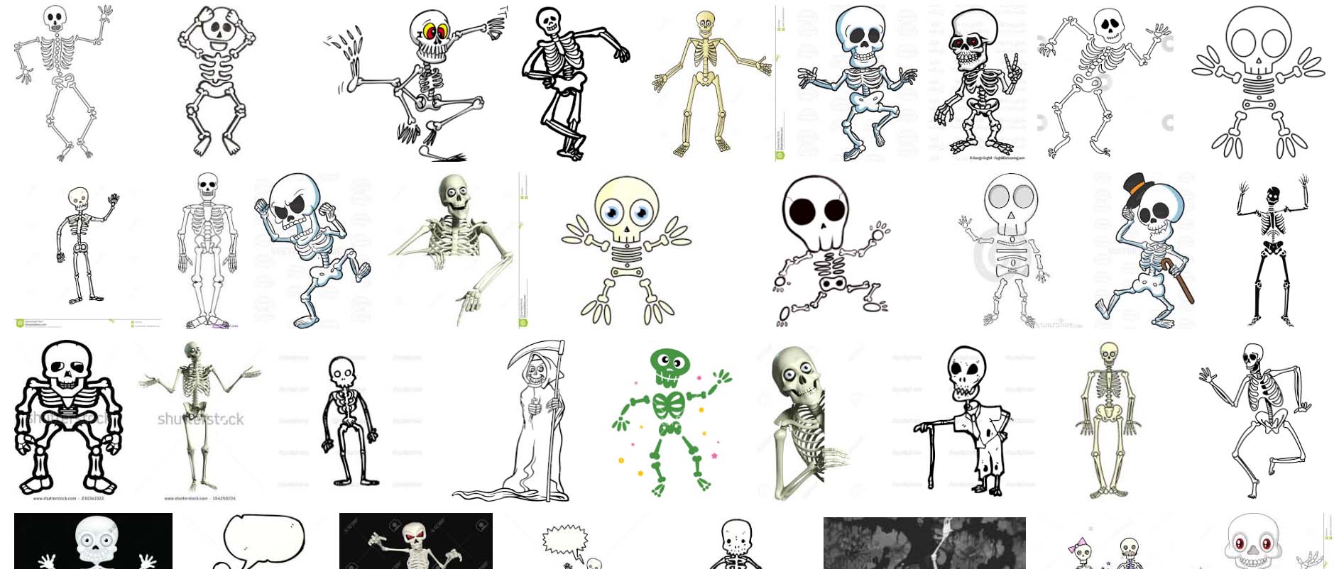
Skeleton Character Inspiration
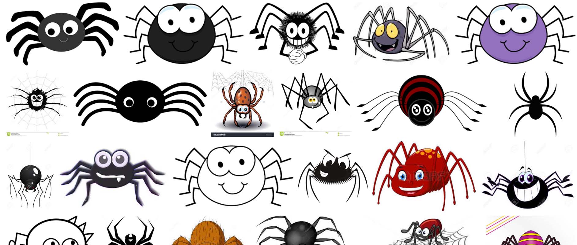
Spider Character Inspiration
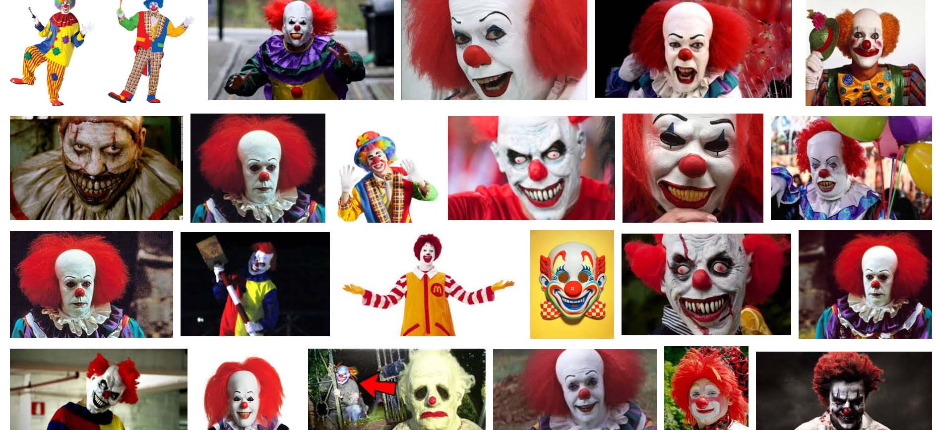
Clown Character Inspiration
The Created Character Ideas
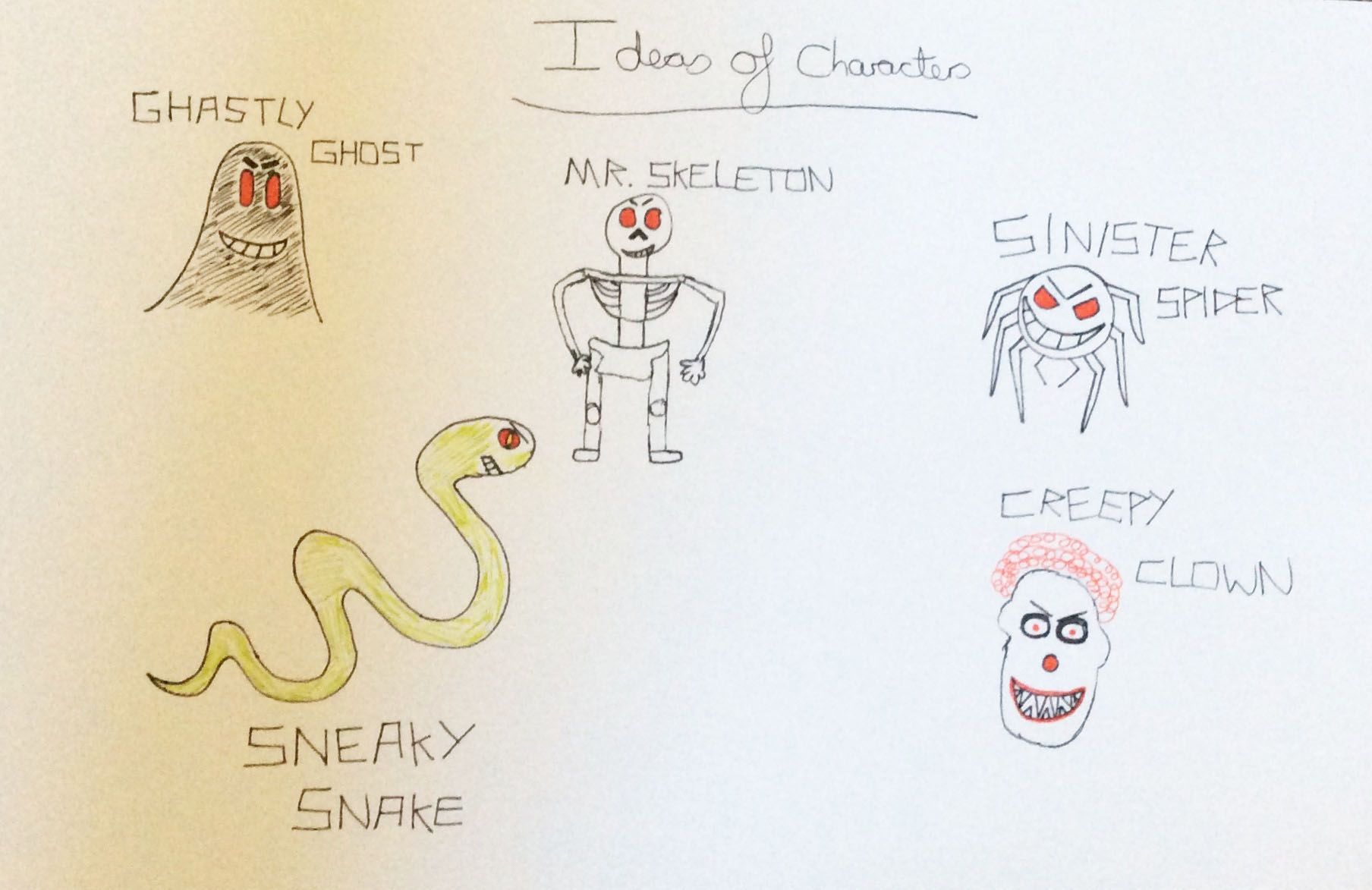
My Character Ideas
Horror Games Research
Jamie Madigan stated researchers had looked at various reasons why horror games were popular, one being ‘It helps us master our fears by experiencing them in a safe way’ (Butler, 2016 [online]).
Philippe Morin was the co-creator of ‘Outlast’ and he had stated in relation to players ‘with horror experiences, they get a range of emotions most games don’t give them’ (Butler, 2016 [online]).
From viewing a blog online, a good point was made about 'Minecraft'. It stated it contains many different parts which can be linked with the survival horror genre (Lamble, 2014).
A Change of Approach
Overview
Despite all of the thought with 'Pumpkin Kid', we decided to change the concept of the game completely to try and implement the instructional/educational part. We then started to conjure up some more ideas which can be viewed below.
'Mr Unstoppable'
Overview
I produced an idea based on the theme of football, a game called 'Mr Unstoppable'. The concept of the game was that the user would have played as ‘Mr Unstoppable’ but they would have had to keep kicking footballs at the opposition’s defenders until they fell over. There would have been obstacles which would have been aspects including sliding tackles and turfs of grass. Once getting to the goal the user would have had the chance to score, however they would have had to answer a multiple-choice question first. If answered correctly, then it would have been easier to score a goal, however if answered incorrectly then it would have been quite hard to get past the goalkeeper. The objective of the game was to score as many goals as the user could to win the match. Progressing onto the next level would have meant that it would have become more difficult with different opposition but the user would have been able to play as different characters. We didn’t choose this idea due to the fact that it was very complicated and we felt that we needed to keep the game fairly simple so we could achieve as much as possible in the short amount of time we had left.
The Game Concept Image
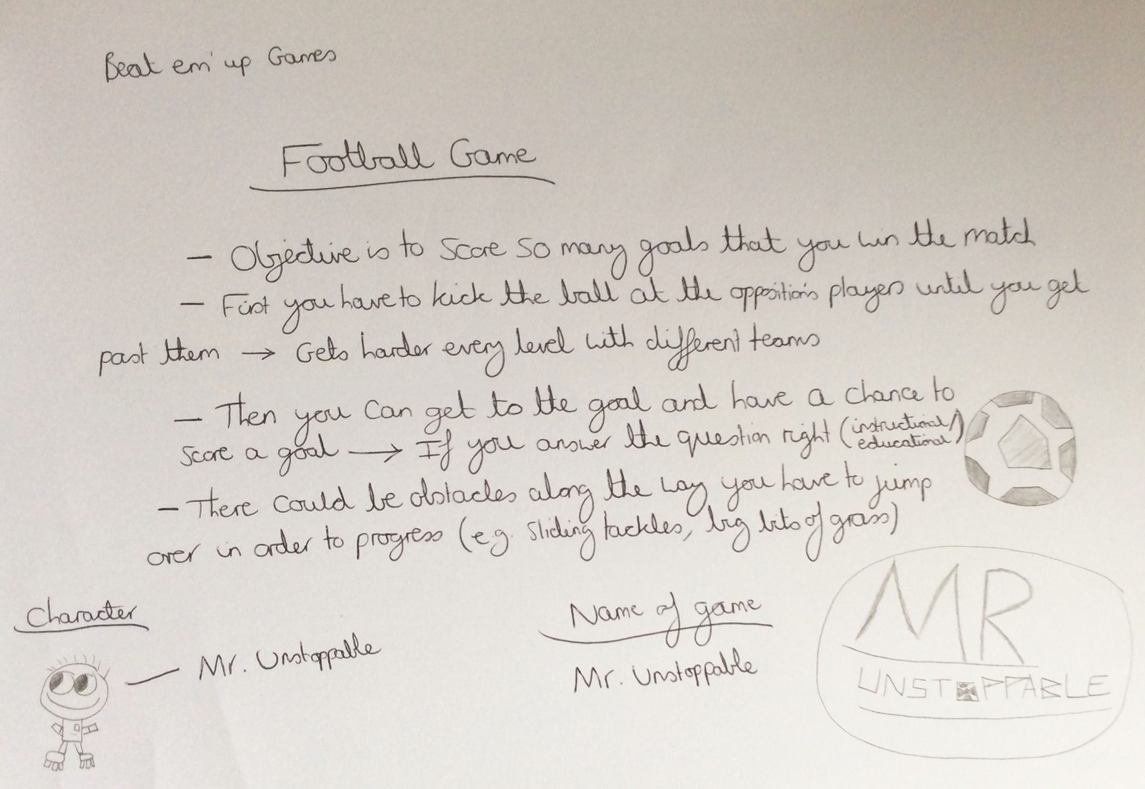
The 'Mr Unstoppable' Game Concept
'Puzzle Explorer'
Overview
In addition to the other idea, I also thought of another where the user, as the explorer, would have had to have found different pieces of a puzzle in several locations (different levels). In order to pick the pieces up, the user would have had to answer a multiple-choice question first. If answered incorrectly, the piece would have disappeared and reappeared elsewhere in the level. Eventually, when the game had been completed, the whole of the puzzle would have been revealed. This didn’t appeal to everyone in the group so we decided not to choose this idea.
The Game Concept Image
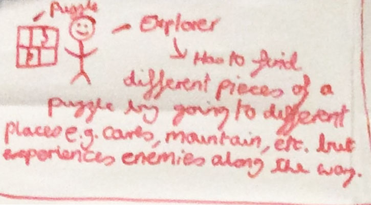
The 'Puzzle Explorer' Game Concept
'Quiz Fighter' (The Chosen Idea)
Overview
Here is an idea which we all agreed with. The concept of the game was that the user, as the player, would have had to answer a series of multiple-choice questions before each level. Depending on how many they would have answered correctly, the user would have gained increased health. Once the questions had finished, the user would have then entered a fighting scene where they would have fought against another character/player. As the user would have progressed through the levels, the questions would have become progressively harder along with the opposition characters/players.
The Game Concept Image
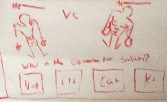
The 'Quiz Fighter' Game Concept
We all decided to choose this idea to base our game on and we decided to have this in the form of a platformer game as well due to time constraints.
'Quiz Fighter'
Brainstorming Prologue Ideas
Overview
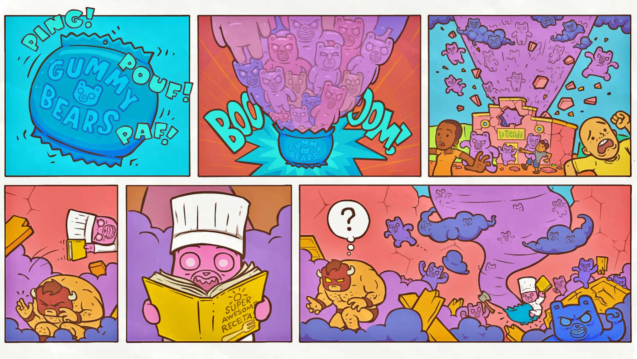
Although I had viewed some prologue comic introductions before with the initial idea of ‘Pumpkin Kid’, we still wanted to include one for 'Quiz Fighter'. Therefore, one of the introductions I was instructed to view in detail was of the game called ‘Burrito Bison: Launcha Libre’. We quite liked the fact that it introduced the story before the player had an opportunity to play the game as it added narrative. Additionally, bold colours had been used which added excitement to the story as well.
After taking inspiration from this, I drew a storyboard idea of my own for ‘Quiz Fighter’. The idea for the story was that the character was an ordinary person who went to school but was ridiculed as people believed he wasn't very clever at all and weak. His friends even laughed at him and offered no support when he was being bullied. However, one day he heard about a fighting competition which was based on knowledge and strength and it was about to begin. So therefore, he sent an application form in to the competition so he could prove everybody wrong. He was then accepted, and after hard training, he packed up to go to participate in this competition.
The Prologue Inspiration
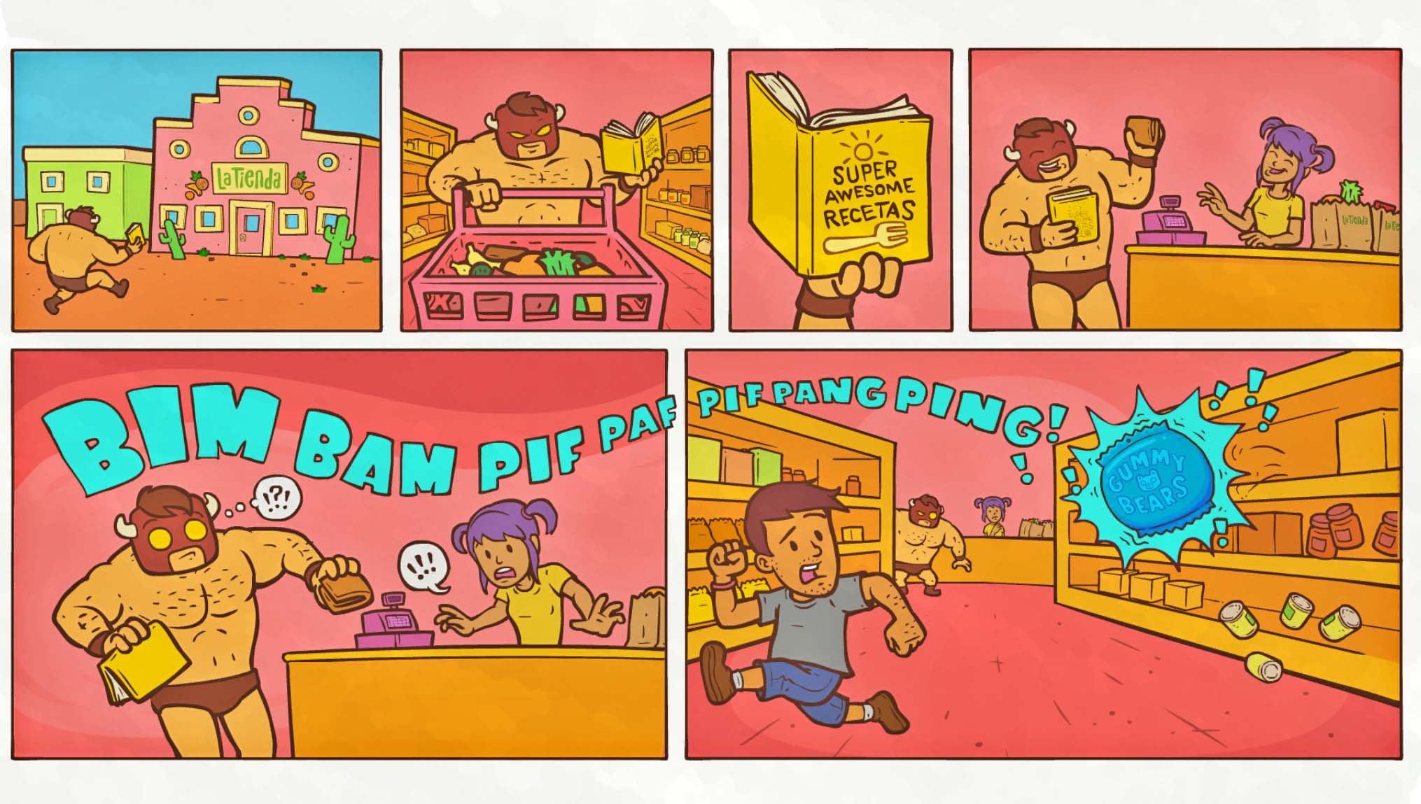
'Burrito Bison: Launcha Libre' Prologue Part 1
'Burrito Bison: Launcha Libre' Prologue Part 2
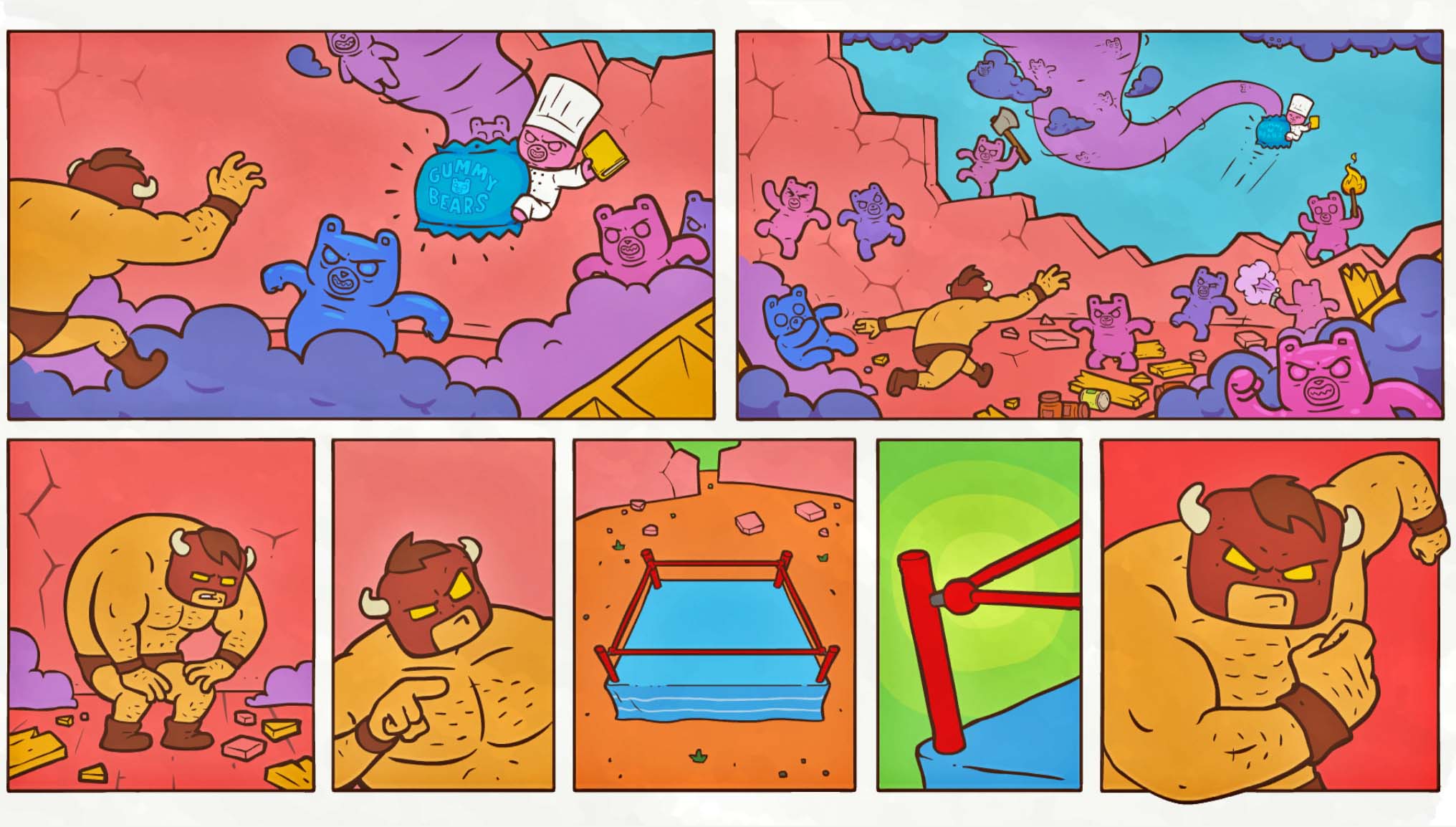
'Burrito Bison: Launcha Libre' Prologue Part 3
The Prologue Ideas
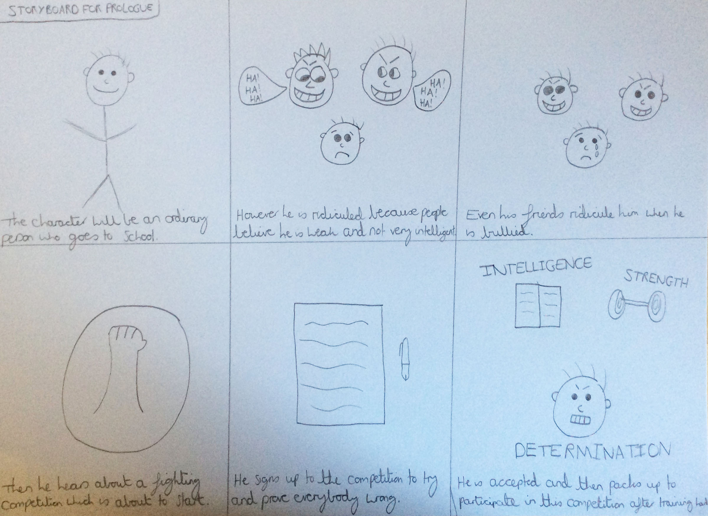
My Created Prologue Ideas for 'Quiz Fighter'
The Oral Presentation (23rd January 2017)
Overview
Throughout this project, my group and I were required to create different documents/presentations to demonstrate our ideas. The first related to creating a presentation to showcase our initial ideas with all of us speaking to our lecturers and peers. This can be viewed below.
I structured this presentation and completed slides 3, 4, 7, 10, 11 ('Mr Unstoppable' section) 12, 13, 15, 17, 19, 20, 22 (apart from the illustration), and 24 (apart from the illustration).
The Actual Presentation Slides
Written Proposal (Due on 27th January 2017)
Overview
Another document my group and I created was a written proposal which would have promoted our game idea. This was completed after presenting our ideas with the presentation displayed above. We were all assigned different sections and I completed the sections of ‘the game story and game levels’, the ‘market research’ and ‘research’ as well as summarising the ‘USPs of the proposal’. This can be seen below.
The Actual Written Proposal Document
Further Ideas for 'Quiz Fighter' After the Oral Presentation and Written Proposal
Character Select Menus
Viewing Current Examples and Creating a List of Ideas
Overview
After a written proposal had been completed as part of the course requirements, my group and I then undertook different roles/tasks to try and finish the game as early as we could. My responsibility was to draw different character select menu designs. To take inspiration I viewed ones we had previously discussed as well as a few more that I had considered.
After viewing these menus, I then decided to write a list of the things which were used to try and implement some of the ideas into my designs. The elements which appealed to myself the most were the two characters on each side, the selection boxes and the colours for the different players.
The Examples Viewed
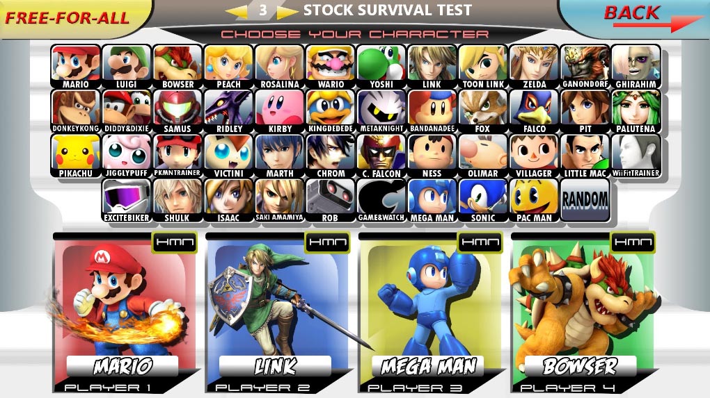
'Super Smash Bros Brawl' Character Select Menu
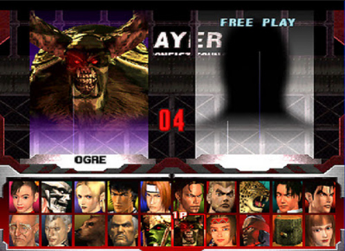
'Tekken 3' Character Select Menu
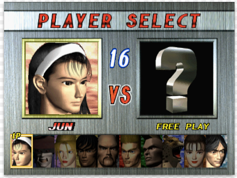
'Tekken 2' Character Select Menu
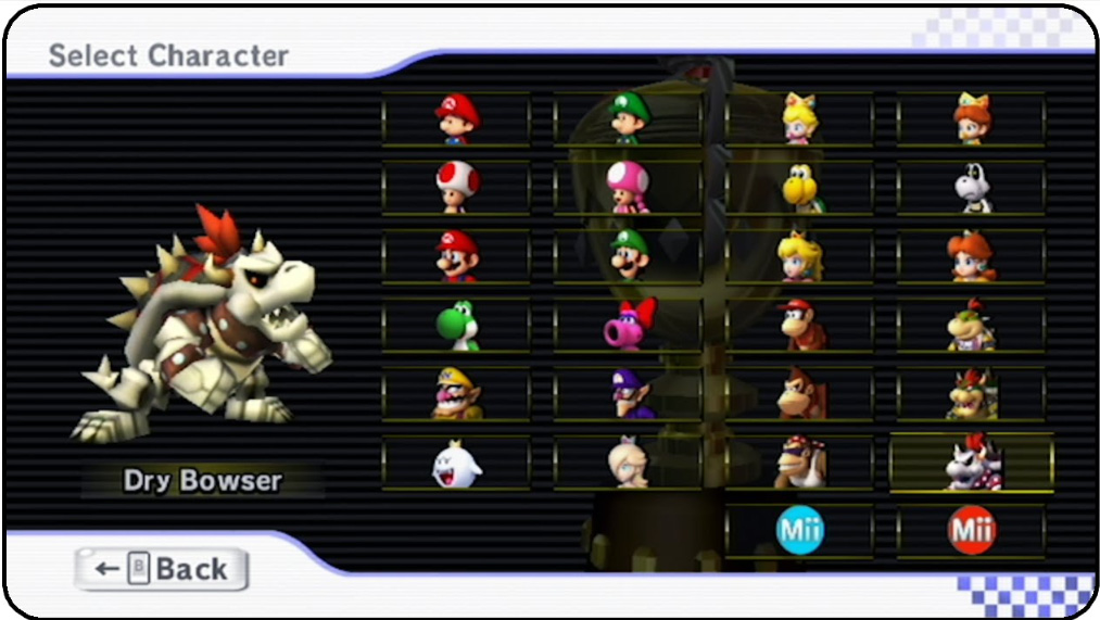
'Mario Kart' (Wii) Character Select Menu
The List of Ideas Created
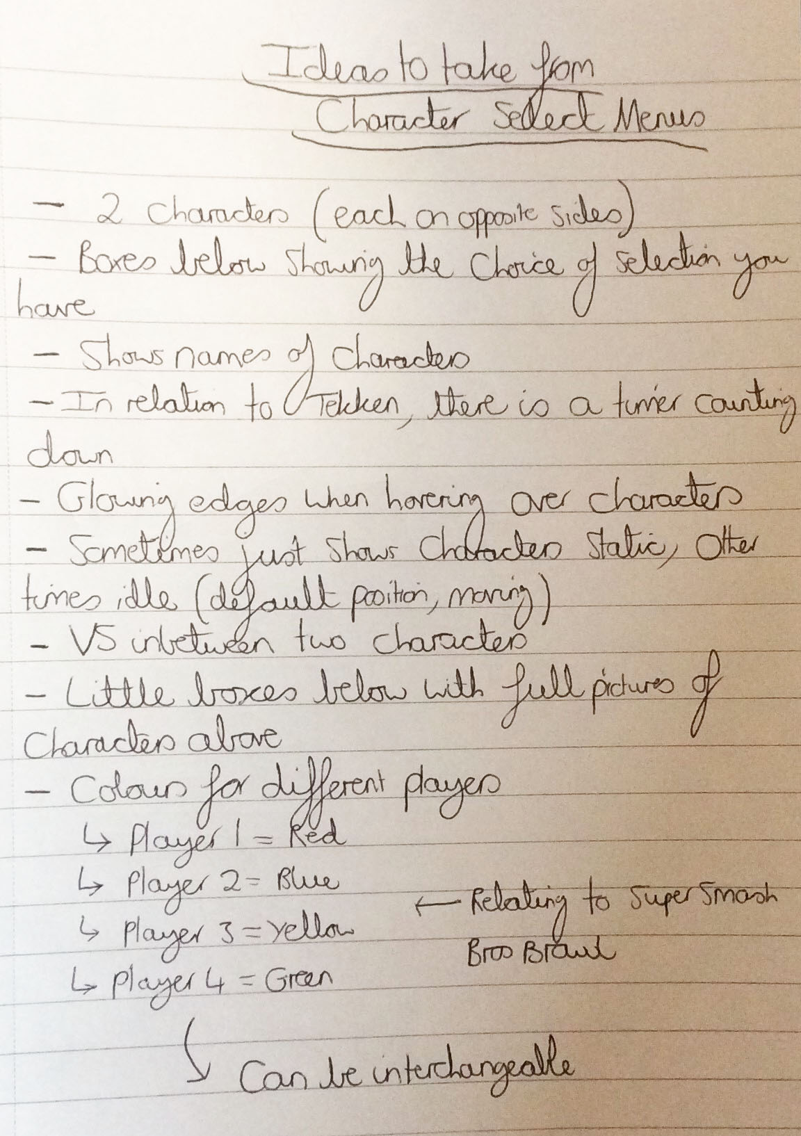
A List of Ideas to Consider
The Created Character Select Menu Designs
Overview
As can be seen below, I placed each character on either side of the boxing ring with ‘VS’ text in the middle in different colours to represent the different sides. I also decided to place the names of each of the characters at the top of the design due to the fact that it was clearer than putting them elsewhere. The character selection boxes were positioned underneath the boxing ring to convey a clear understanding that these were the characters the user would have been able to choose from and the two characters at the top were the ones which would have been selected currently. There were different colours surrounding each of the boxes which the users would have been hovering over/selecting to create a clear display of who was selecting what.
For the second design, this was quite similar in terms of the fact that it contained different colours for different players and each character was facing each other on either side. However, only the face was displayed and inside a jagged shape e.g. a star with their names appearing above and below. Another thing to add is that the selection boxes were placed around in a circular shape as circles rather than in lines as squares.
Regarding the final idea, the concept was the same again with the different colours for different players and each character facing each other on either side. In contrast to the previous designs, I decided to place the player names on each side by each character because I thought it would have given it a unique look and I decided to add a title to the design called ‘SELECT YOUR CHARACTER’. This was to try and consider the user, making the interface more user friendly.
The Actual Character Select Menu Designs
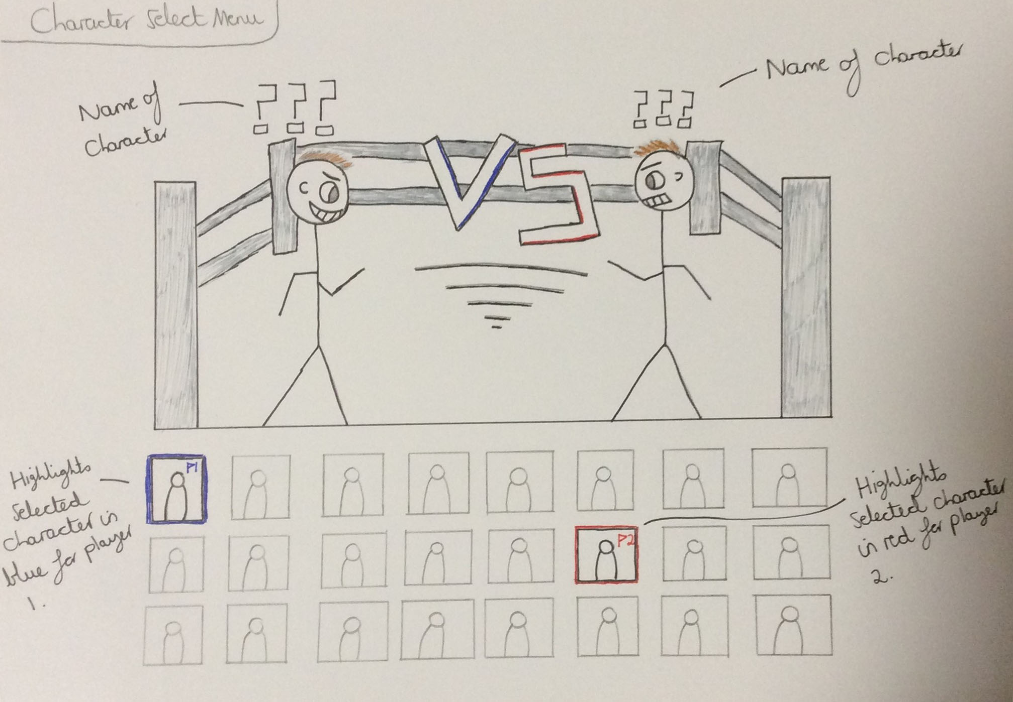
Design 1 for the Character Select Menu
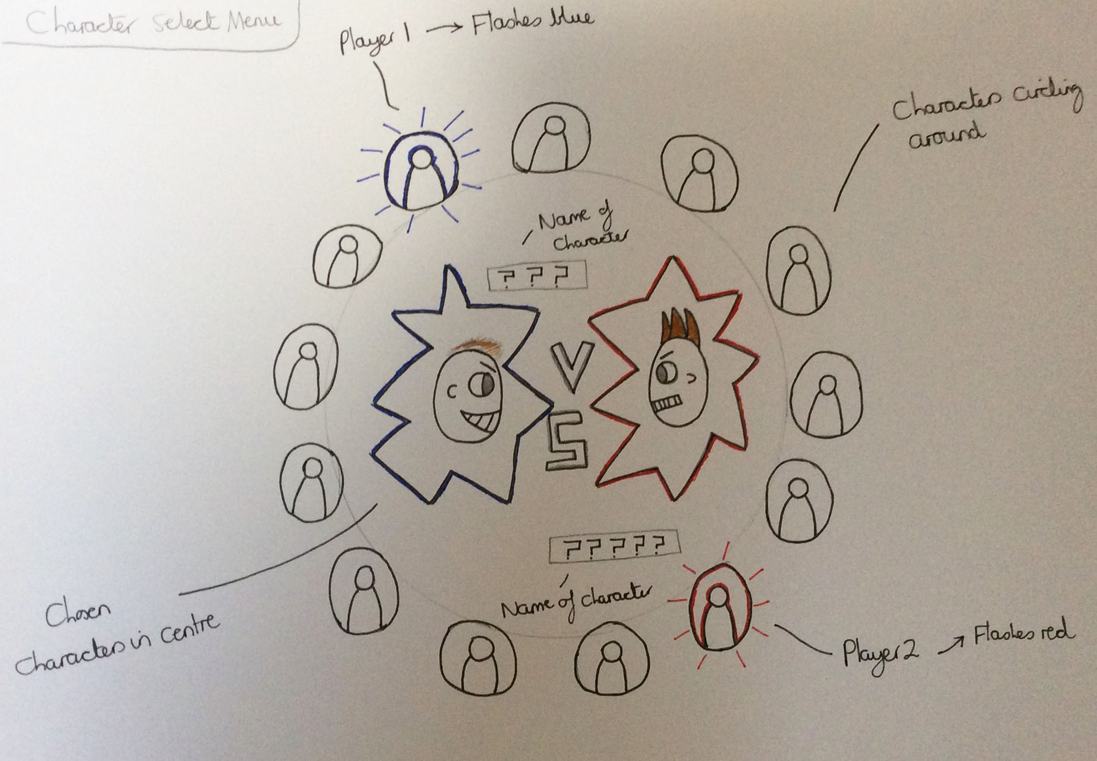
Design 2 for the Character Select Menu
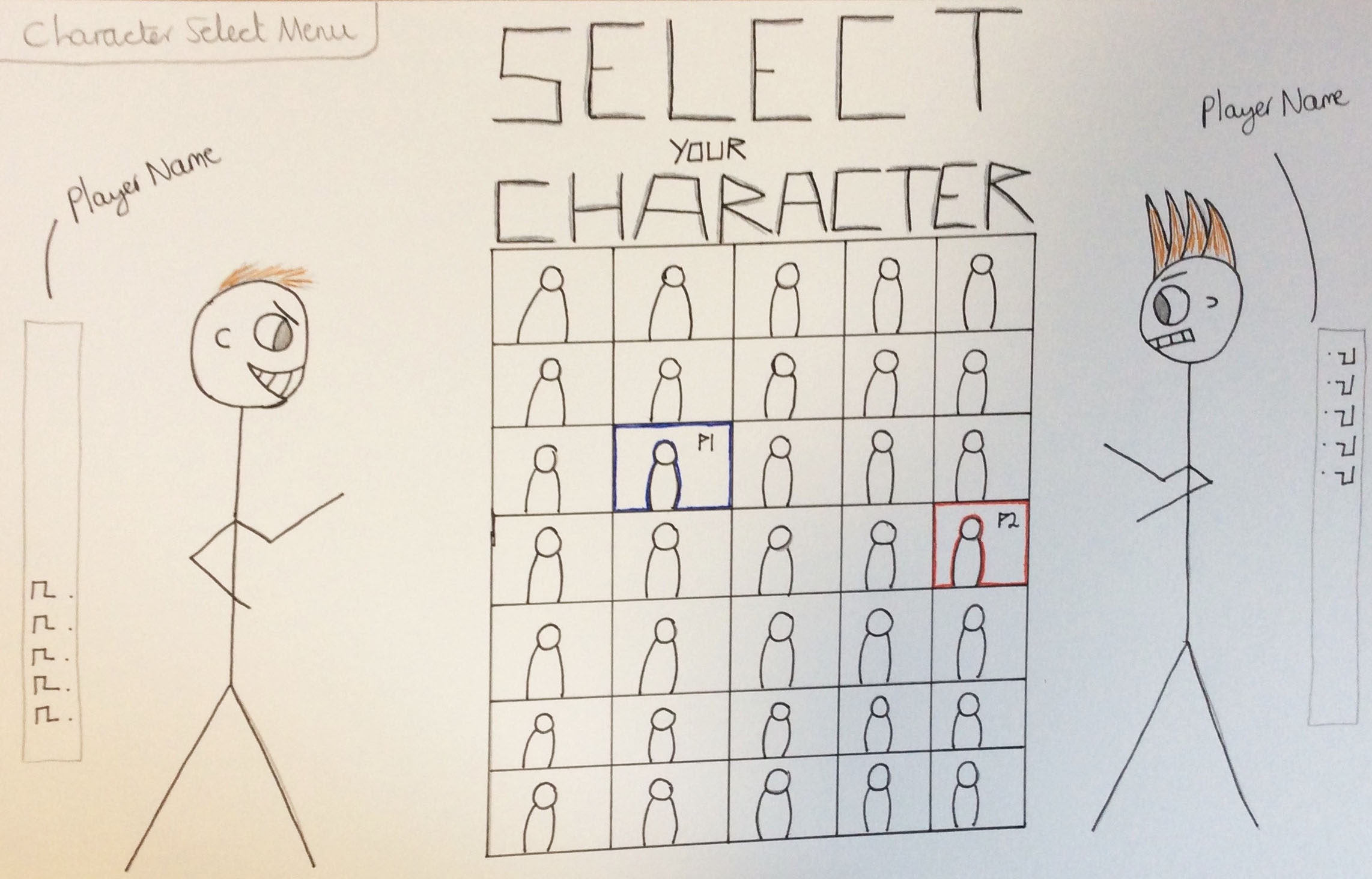
Design 3 for the Character Select Menu
As a group, we made a decision to choose the first design due to the fact that it had the characters standing in a boxing ring which we thought would have been good to relate with the theme of the game.
Creating a Digital Version of the Agreed Character Select Menu
Overview
Following on from choosing the first design, I then produced a digital copy using ‘Adobe Photoshop’ which I then exported as a 'PNG' file to send on 'Facebook' to the rest of my group. Another member of my team could have then altered the appearance of the menu, adding an '8-bit' style to relate to our game.
I chose to not include the characters in this design as we had our own characters which had already been created. Additionally, it was my intention to leave it blank due to the fact that this would have needed to be in this form to use in ‘Unity’.
The Actual Character Select Menu
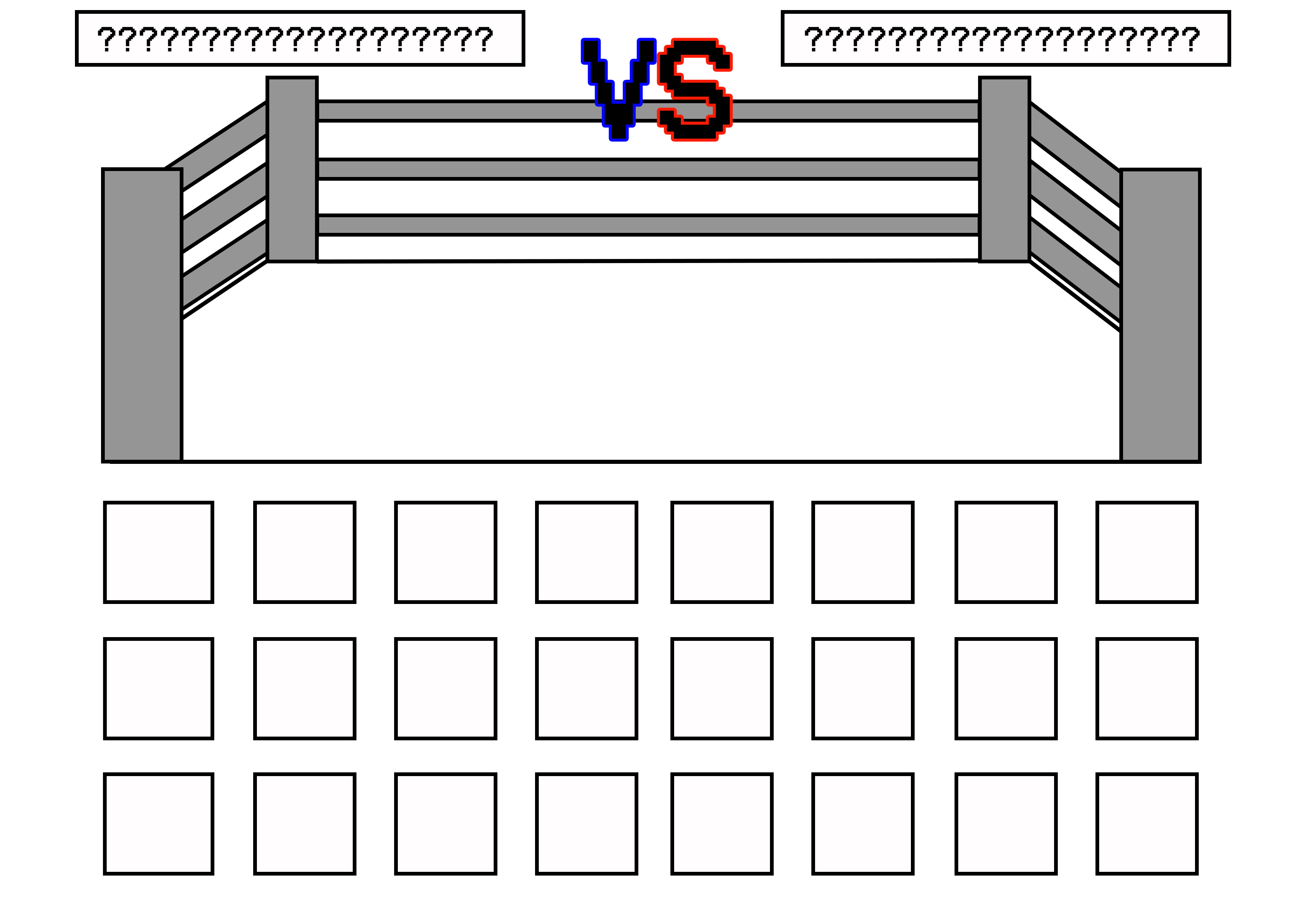
The Digital Version of the Character Select Menu
Aesthetics Ideas for the Quiz Section
Undertaking Research
Overview
As well as completing the previous work, I considered some aesthetics for the quiz aspect of our game, looking at both colours and typography. Before actually doing anything though, I undertook some research to aid me in completing this task as can be seen below.
The aesthetics which appealed to myself the most were those shown in the highlighted menu below. This was because I liked the fact that different shades of blue were utilised for the question box and the answer boxes. The generic colours for answering questions correctly and incorrectly were green and red with the text being either black or white. After conducting this research, I used ‘Adobe Color’ to create a couple of colour palettes as will be seen in the following section.
The Collected Research
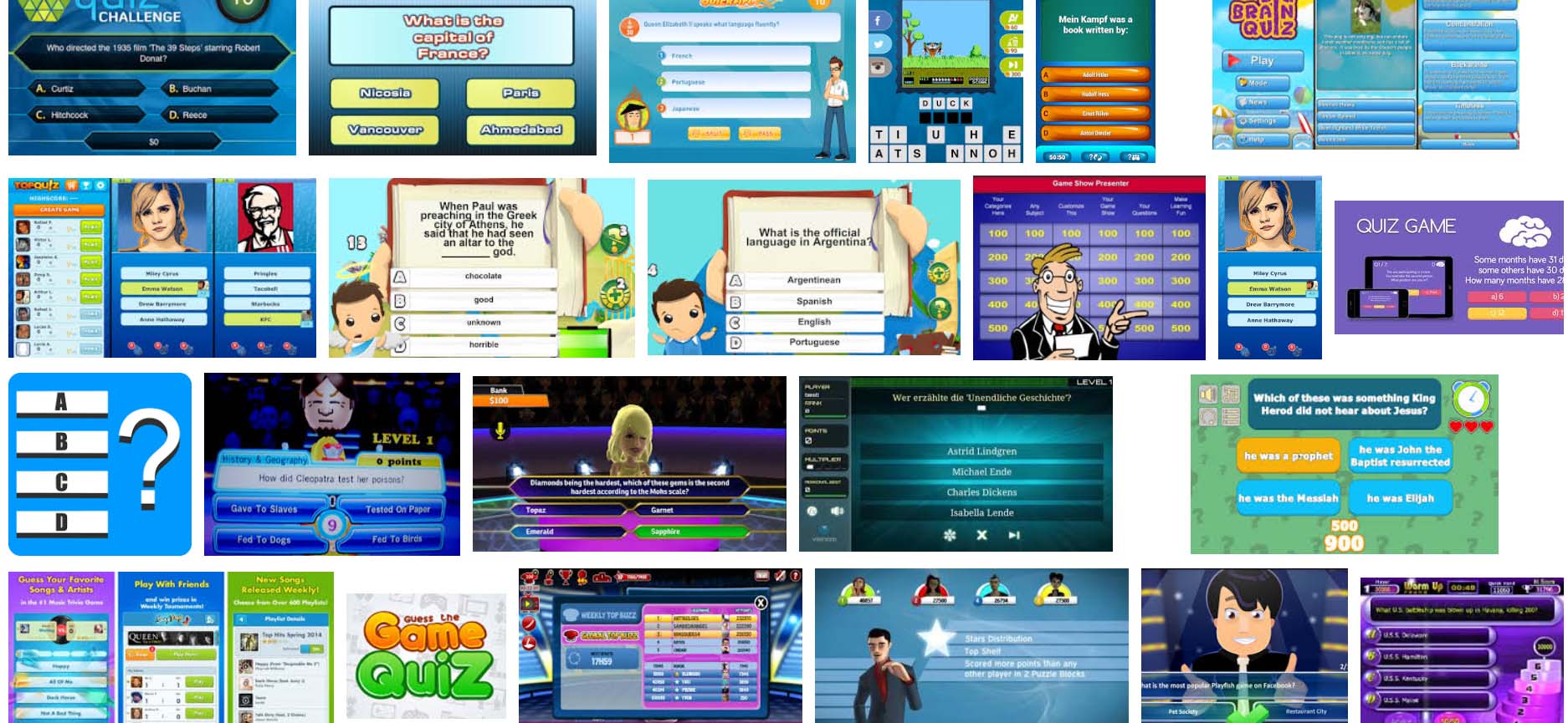
The Variety of Aesthetics Viewed for Quiz Sections of Games
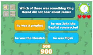
The Preferred/Highlighted Aesthetics
The Created Colour Palettes
Overview
As can see below, there were a variety of colours and each one had a different meaning in relation to the quiz. The green represented if a player answered a question correctly and the red signified if a player answered a question incorrectly. The different shades of blue in the first colour palette portrayed the boxes in the quiz with the darker shade for the question box and the lighter shade for the answer boxes. This was the same for the orange (question box) and the yellow (answer boxes) in the second colour palette. The white in both palettes represented the colour of the font/text, however, this could have been interchangeable with black depending on the colour of the background it was placed on.
However, after making these colour palettes my group decided to choose to have the colours of navy blue and orange instead, including the whole game. According to a website, orange conveyed a sense of creativity/passion and determination and navy blue represented intelligence, which we thought related to the educational aspect of our game.
The Actual Colour Palettes

The First Created Colour Palette

The Second Created Colour Palette
Highlighting Fonts to Utilise
Overview
In relation to typography, I opened the program ‘Adobe Photoshop’ and viewed the different font types, identifying any which had a pixelated effect (relatable to the '8-bit' style). I then made a list with the name of each font underneath to act as a reference if we decided to choose one of them to use.
We did decide to choose an '8-bit' style font to emphasise the '8-bit' feel of our game but it’s uncertain that it was one of the fonts below.
The List of Highlighted Fonts
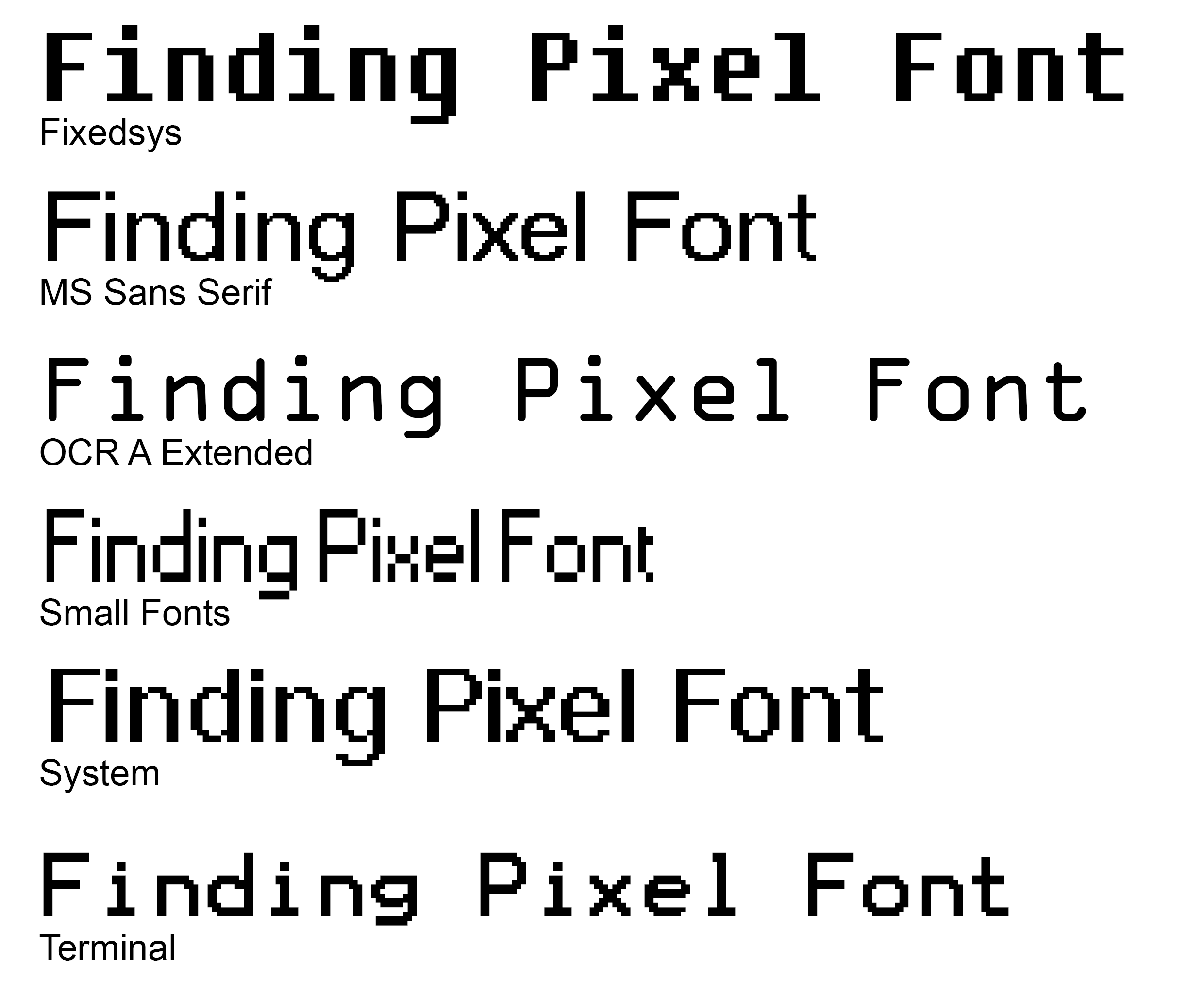
The Highlighted '8-bit' Styled Fonts
Fighting Games Research Relating to 'Quiz Fighter' - Undertaken at a Previous Stage
From looking online at personal opinions, 'Tekken' was so popular due to the fact of the amount of characters you could choose from and with each one came different styles of fighting (Cruz, 2016).
According to one person, there are hardly any big special moves in 'Tekken' like a big spell of magic because all of the special moves are made to be realistic (Khan, 2016).
According to an article online, 'Tekken' was the top selling fighting franchise with 42.5 million copies being sold around the world (Grey, 2013, [online]).
Final Outcome Presentation (13th February 2017)
Overview
Our group had to then create final presentation, showing the final outcome of the project to our lecturers and peers. My parts I completed for the presentation were slide 2, my team role on slide 3 and slide 6.
In addition to completing the previously mentioned sections, I structured the presentation in relation to the points stated on the assessment sheet. This allowed for my team to add extra elements in or change sections. As is evident, it doesn’t appear like I had contributed much towards this presentation but this is due to the fact that I became ill during the latter stages of creating the presentation.
The Actual Presentation Slides
The Final Game Screens
Overview
Unfortunately, you will not be able to play the game from this website, but in the following section are some images of each different screen that my team and I contributed to at some point within the project. These display the final outcome of the created 'Quiz Fighter' game.
References for this Project
Overview
As explained previously on this page, below is a document which contains the references for this project.
References DocumentThe Final Outcome
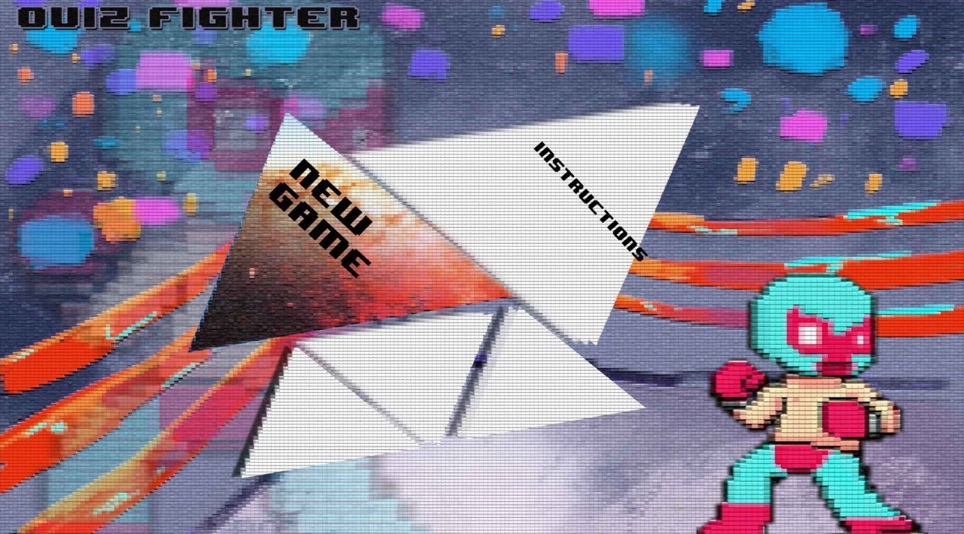
The Main Menu Screen
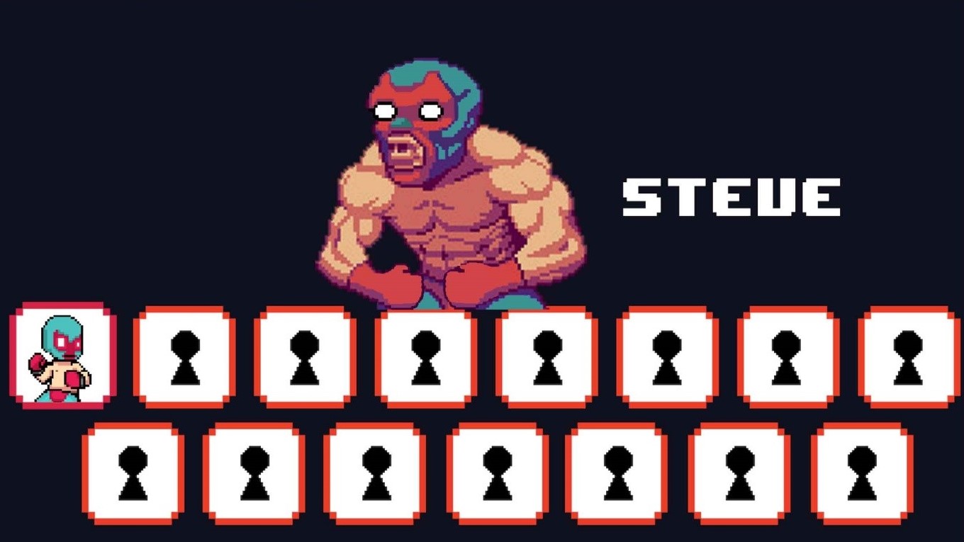
The Character Select Menu Screen
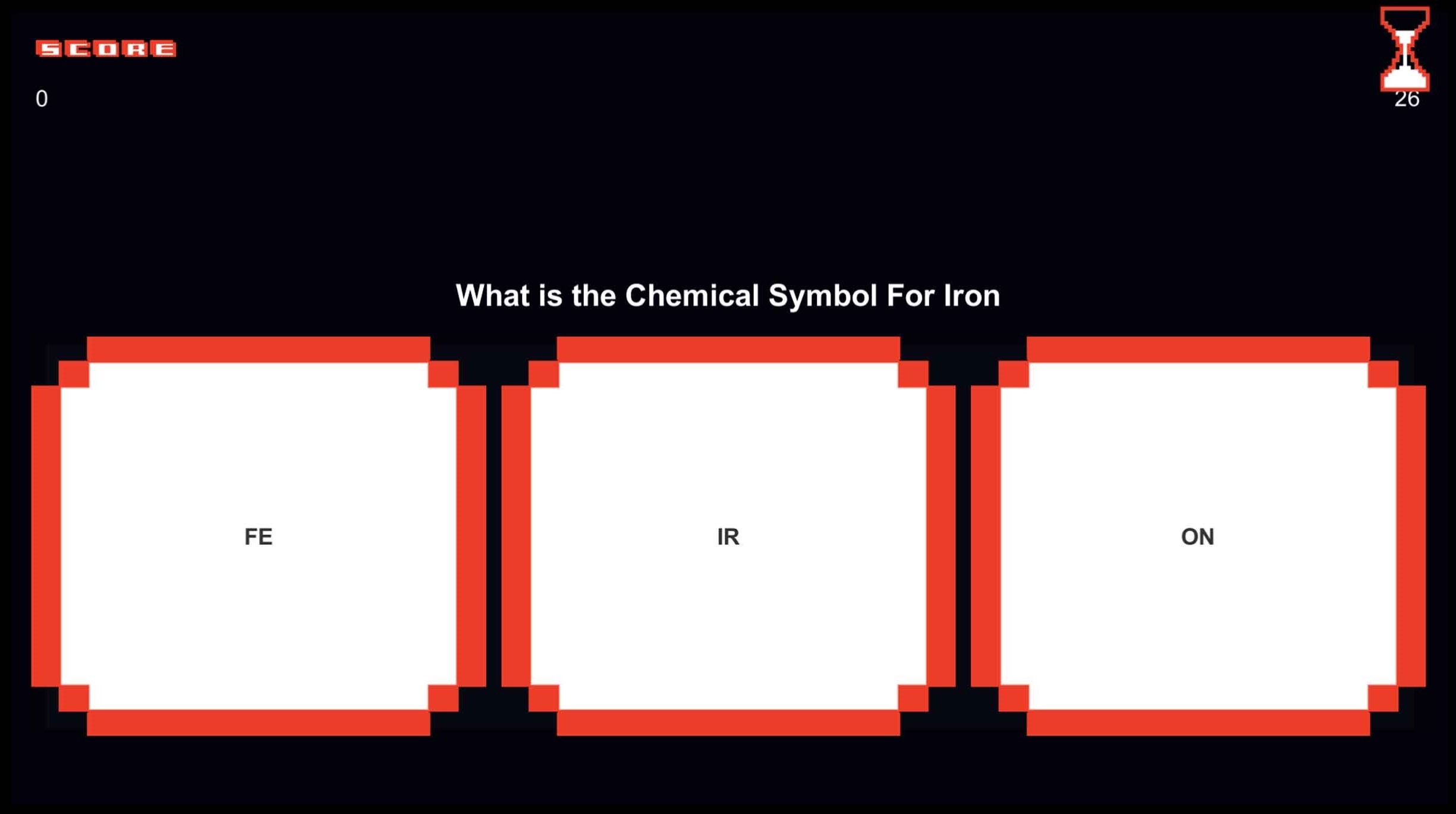
The Quiz/Questions Screen
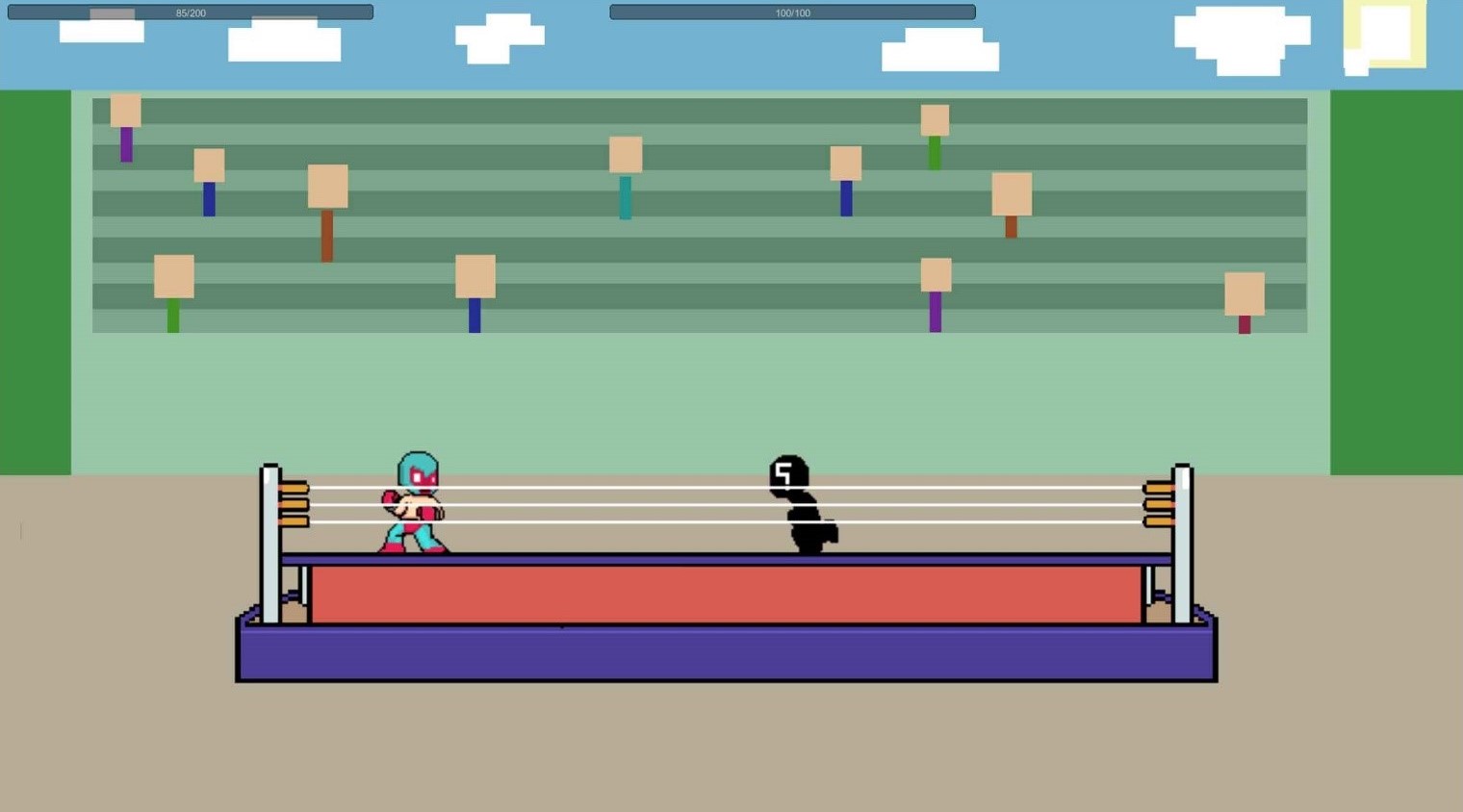
The In-game Fighting Screen
