Brief
"During the whole of semester one you will be engaged in a large scale project to develop a website for your year group. This will be undertaken in small production teams which will give you the opportunity to experience a number of design and production roles. The project will give you an opportunity to practice and apply your learning on the four modules that you’ll be doing in the semester and will form the bulk of the assessment of these modules. At the end of the semester, the student group will vote on their preferred site and this will become the cohort site for the remainder of your time at Winchester, with updates each year."
Overview
Within this group project, I undertook the role of being the main website developer, following provided designs. As this was my first semester of learning website development, there were some issues with the final outcome. Despite these issues, this provided a successful learning process which I was able to learn from in subsequent projects after. This helped to enhance my skillset as a website developer as a result.
References for this project can be viewed in the document supplied at the end of this page.
Inspiration and Research
Overview
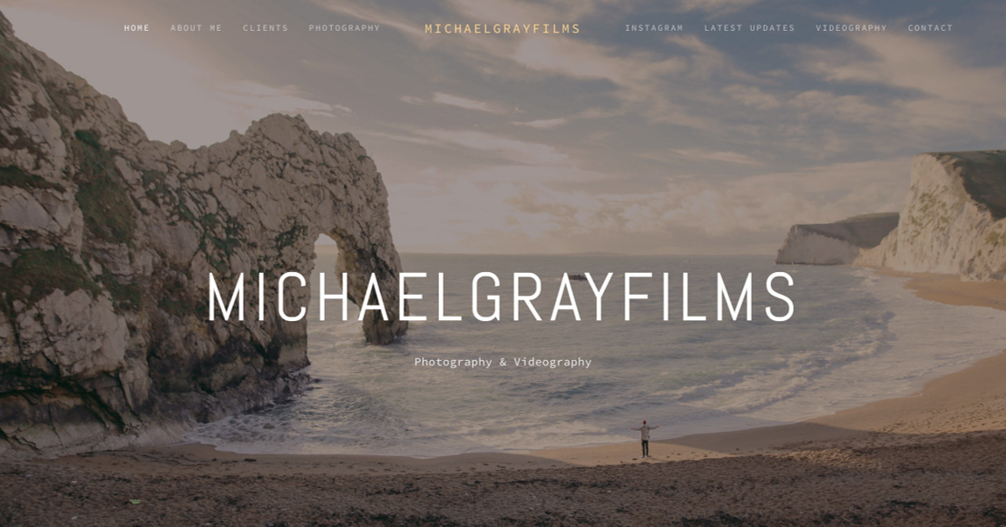
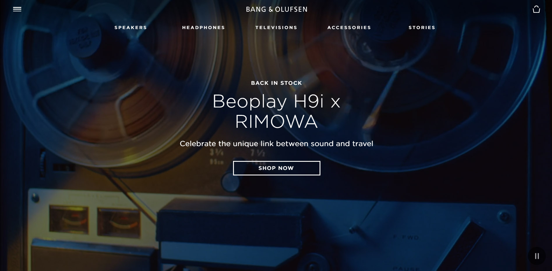
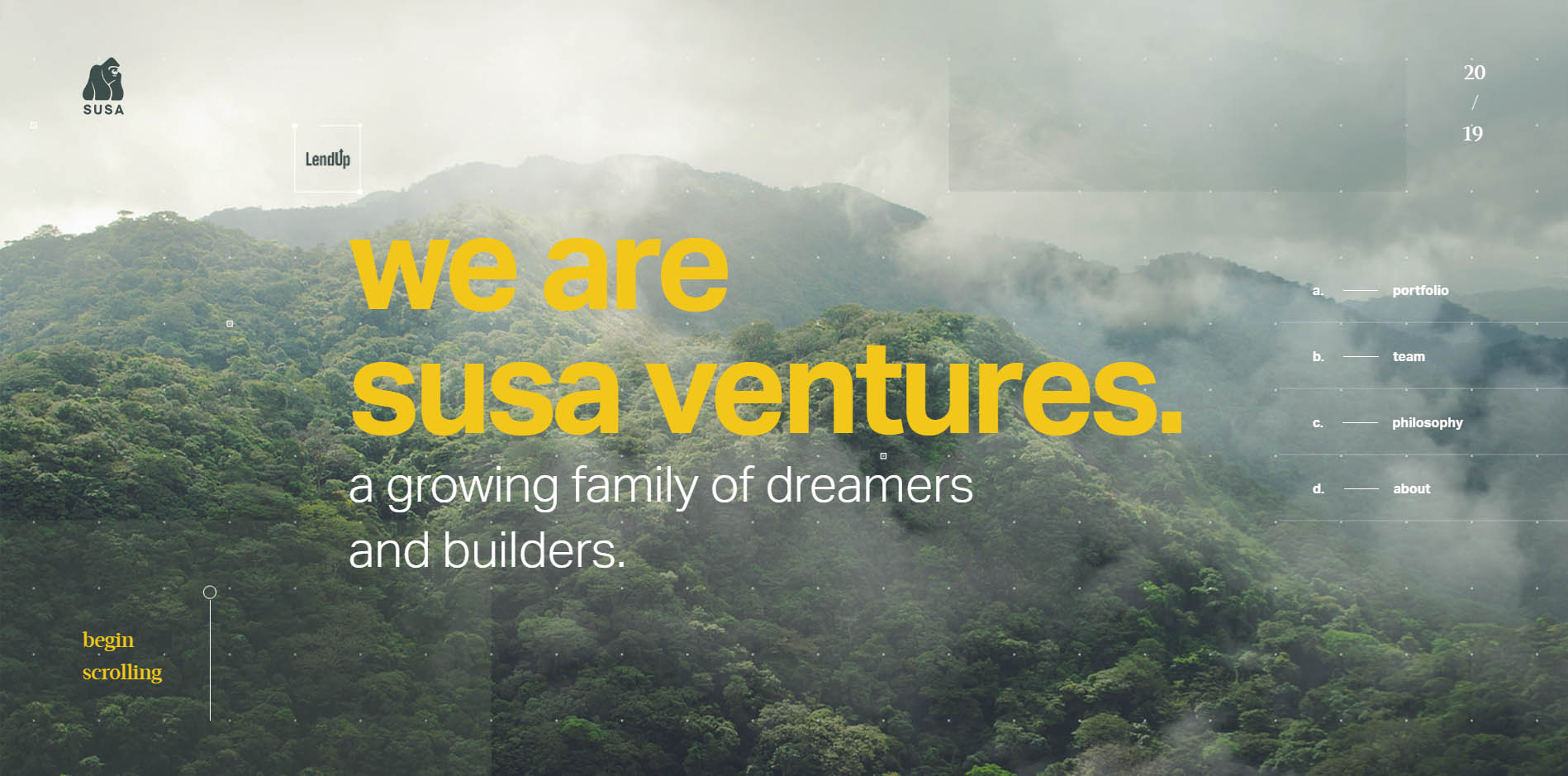
As a group, we took lots of inspiration from a range of different websites, looking at the more modern appeal with one-page scrolling/parallax websites. We identified three different websites which appealed to us. The first one, called ‘MichaelGrayFilms’ inspired us due to the fact that it was a parallax website, using background images to fill the white space and making the website look more professional. The second website, called ‘beoplay’ had a good navigation system down the side in the form of dots which took the user to every section depending on which button they selected. It was also fixed which meant it stayed in the same position when scrolling which was useful for the user when utilising the website. Finally, the third website, which was ‘susaventures’, inspired us due to the fact that again it had a good navigation system which was modern down the side and that was also fixed.
Both the 'beoplay' and 'susaventures' websites are viewable below. However, due to the link expiring, the 'MichaelGrayFilms' website is unavailable.
The Websites Viewed
The 'MichaelGrayFilms' Website
My Sketches and Ideas
Brainstorming Initial Ideas and Creating a Sitemap
Overview
As a group, we conjured up some initial ideas before we started to actually design and make the website. We thought we would have had a parallax website due to the fact that it was the modern trend and we wanted to match this. In addition to this, we wanted to incorporate the navigation bar on the side in the form of dots as we thought it would have been beneficial to the user to have this rather than scrolling to the top of the page and having to use the navigation bar at the top. We also decided that having the pictures of each student in a clean layout would have been good to have as well as it would have increased the professionalism of our website. Knowing that we had to display more information about each student, we believed it would best to have an animation that displayed this information when a user hovered over each image.
After having completed this thought process, we then moved on to begin drawing some ideas. One of the other team members in my group created the sitemap for the website which is viewable below.
I believe the idea was because the website was going to be a one-page scrolling website, the only other links would have been from the pictures of us to our individual websites and from the games section to another page where the game would have been displayed.
The Created Sitemap
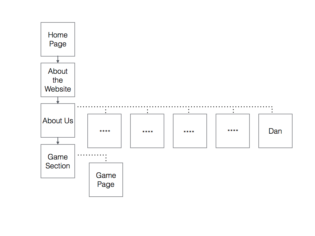
The Cohort Website Sitemap Created by Another Team Member
Creating Desktop and Mobile Wireframes
Overview
Following on from the sitemap, we then as a group drew some wireframes which one of the other team members converted into digital visuals. These can be viewed below.
As will be seen from our desktop wireframes below, we intended to keep the design simple due to the fact that we believed that less was more and we didn’t want to overcomplicate it. We implemented the dot navigation down the side and we decided that it would have been best to have the information centralised as it appeared more professional. With the ‘About Us’ section, we thought it would have been best to have the images in a tile format as it was clean and simple, with the information about each student coming out of the side when hovering over it.
With regards to the mobile wireframe, as can be seen from the design below, the plan was to have the same idea. However, our group decided that we would have had the navigation as a ‘hamburger menu’. Everything would have still been centralised but scaled down to fit onto a mobile phone screen.
The Created Wireframes
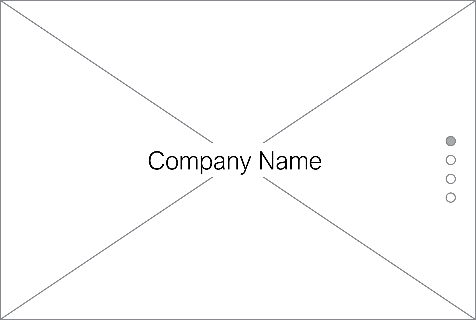
The Home/Welcome Section Desktop Wireframe
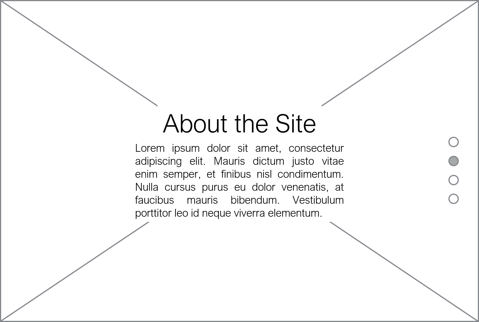
The About the Website Section Desktop Wireframe
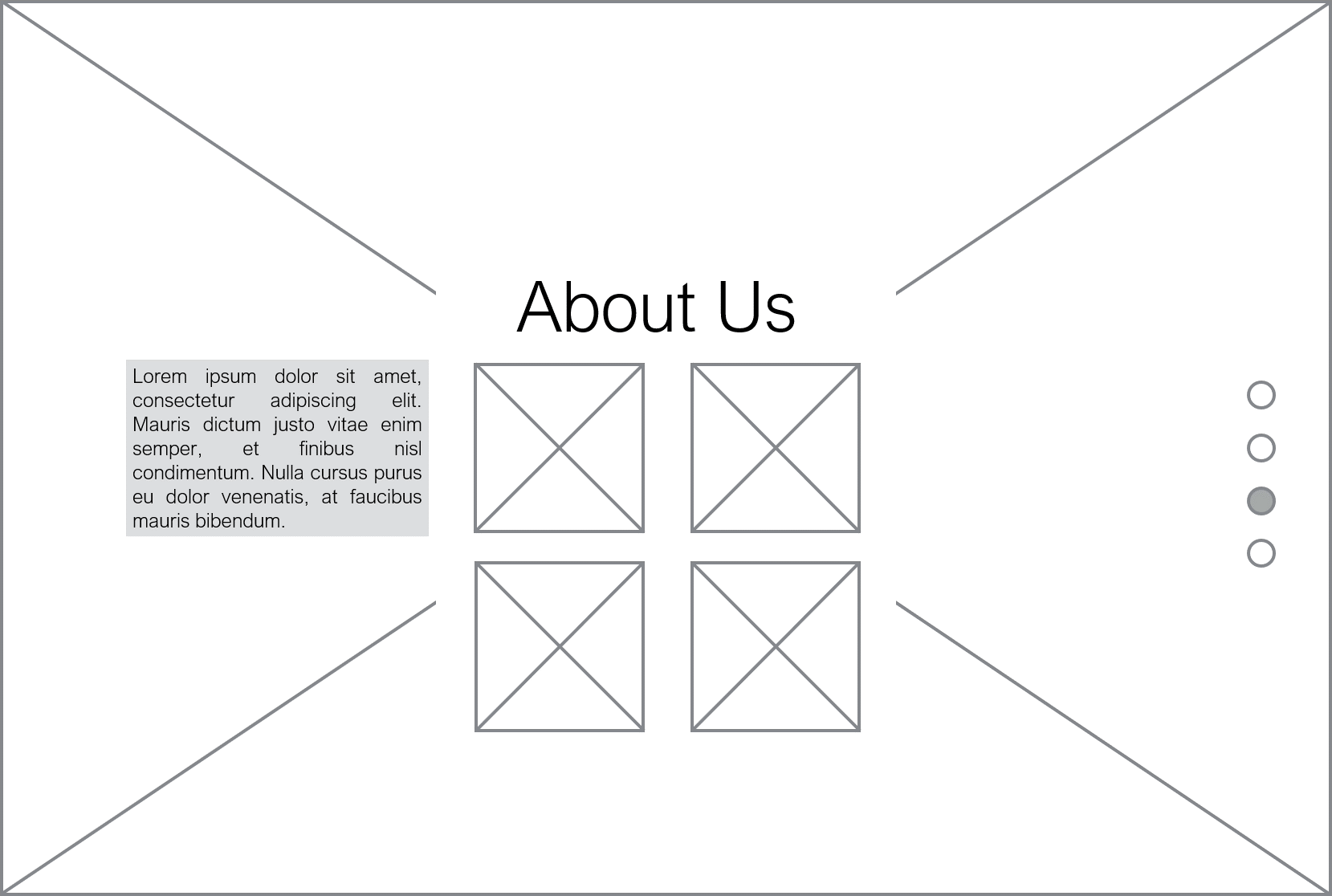
The About Us Section Desktop Wireframe
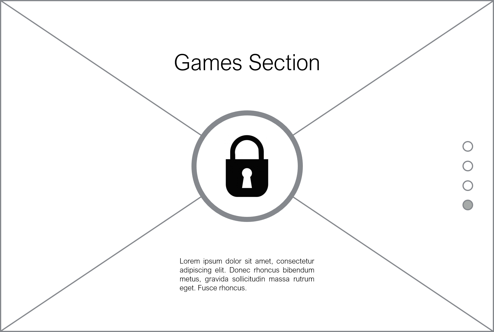
The Game Section Desktop Wireframe
The Actual Game Page Desktop Wireframe
The Mobile Example Wireframe
The Development Process
Stage 1
Overview
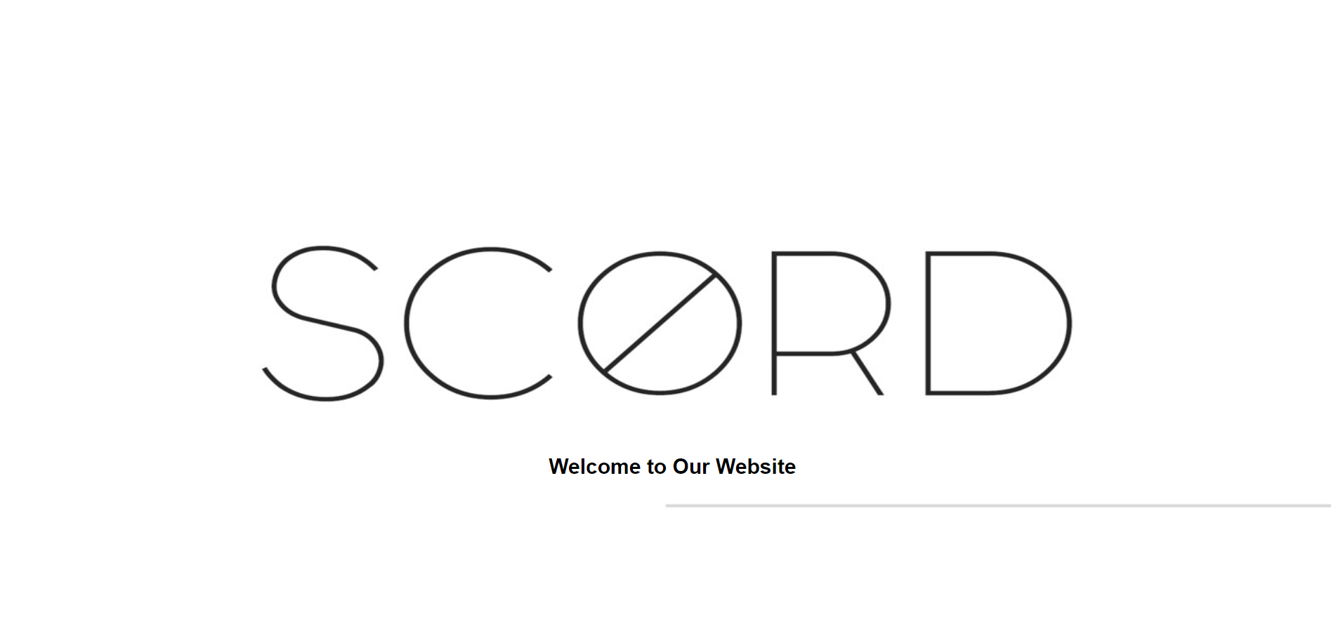
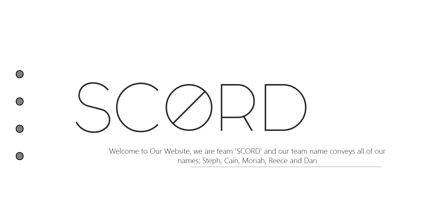
As it was my job to code the website (I was the developer), apart from the game which another team member created, I thought it would have been best to first of all layout the foundations. I created the different sections and used some temporary background images to gain a general idea of how the website would have appeared. I also included our logo in the home section ('SCORD').
The Outcome at this Stage
The Welcome/Home Section
About the Website Section
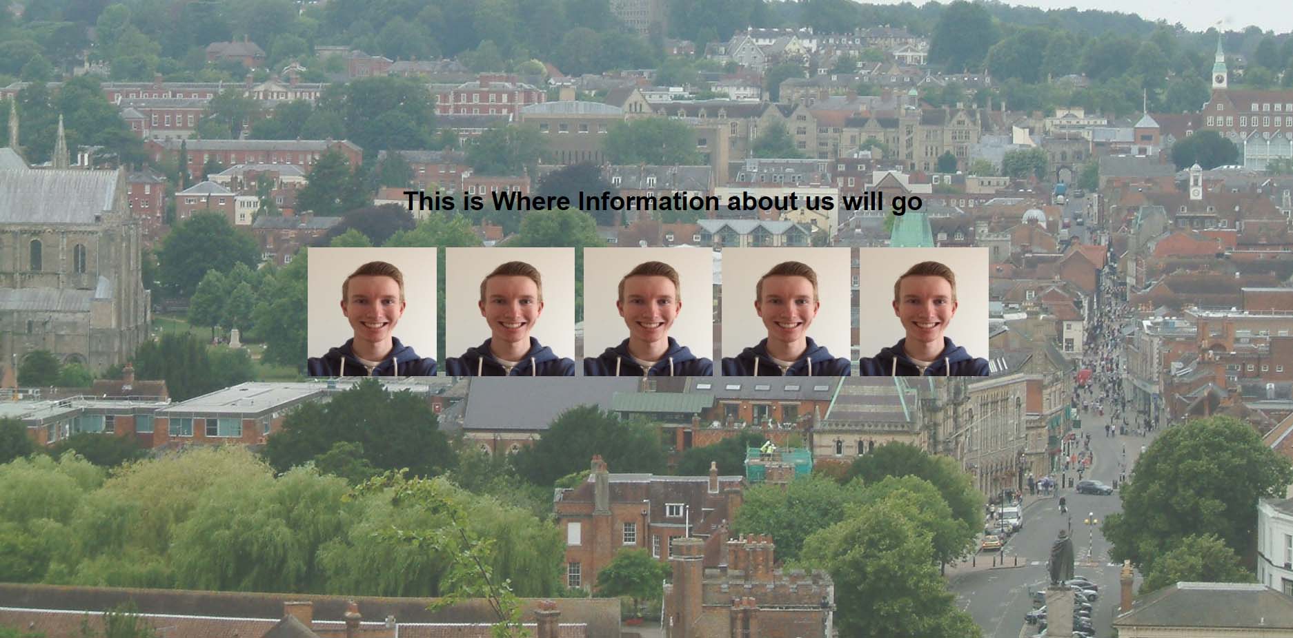
About the Students Section
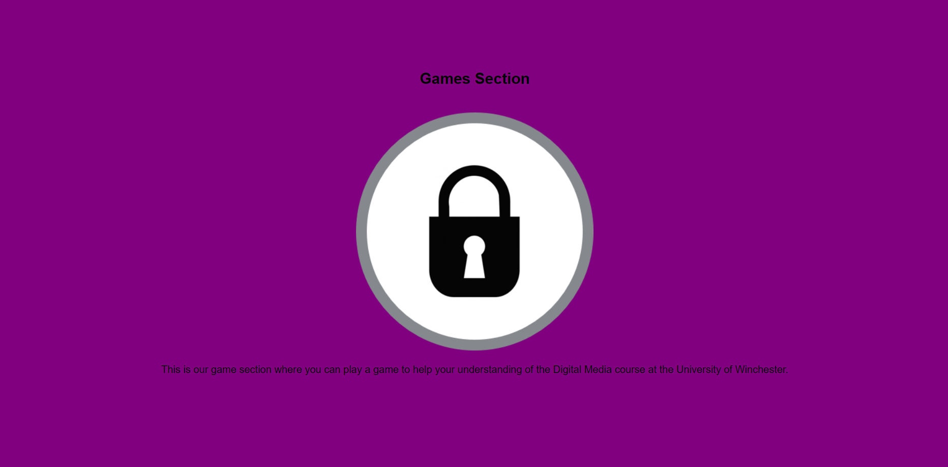
The Game Section
Stage 2
Overview
After creating the foundations of the website, I then started to try and integrate the dot navigation. I thought it would have been good to include little pictures, one being the icon for the games section (created by another team member), to aid the user in navigating through the website. I also changed the text to try and start to centralise it.
The Outcome at this Stage
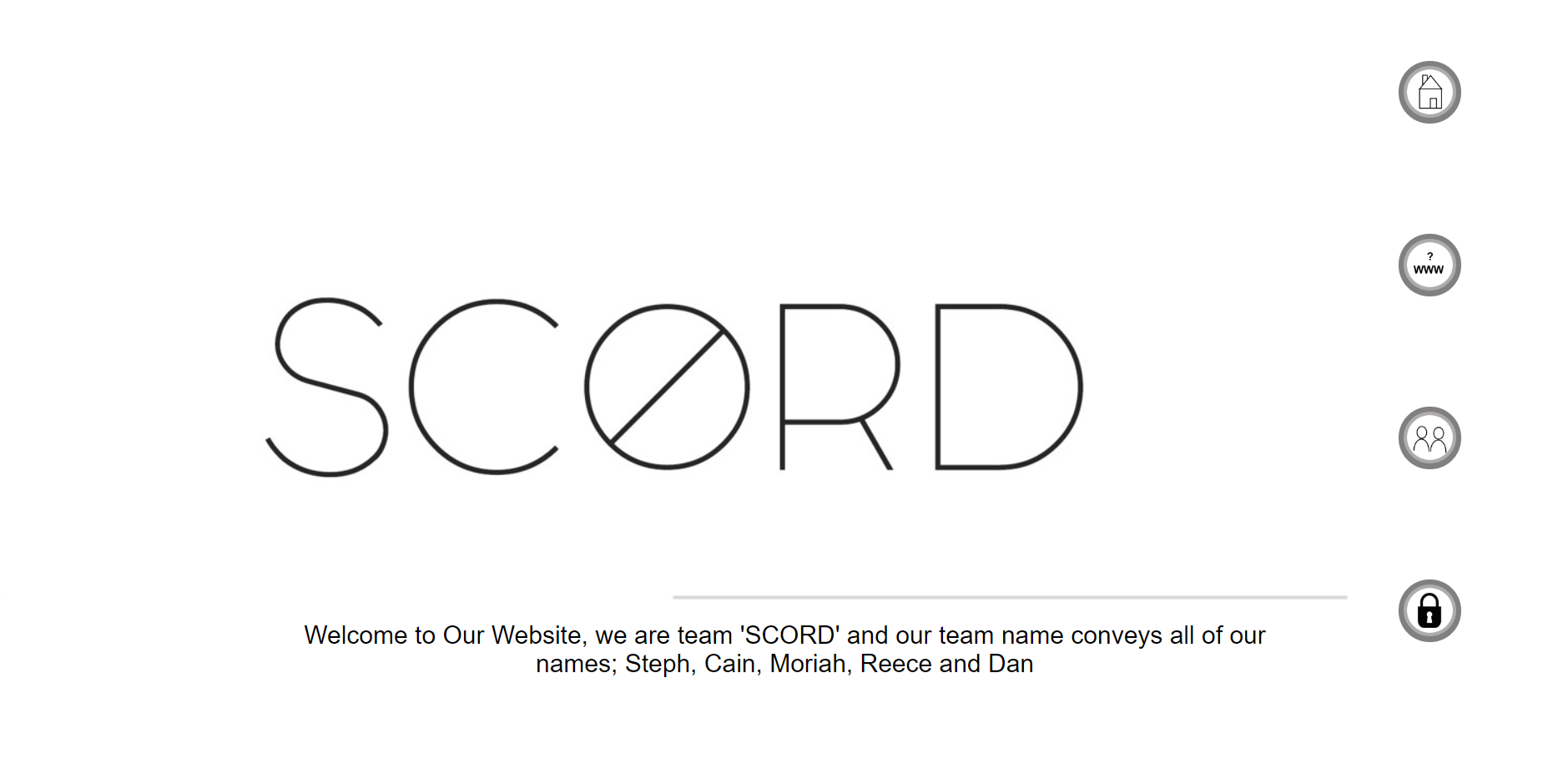
The Welcome/Home Section
About the Website Section
About the Students Section
The Game Section
Stage 3
Overview
Following on from creating the dot navigation down the side, we decided it would have been best without the visual images to keep it as professional and clean as possible. We also decided to have the navigation bar down the left-hand side with the names of the different sections appearing when hovering over the dots. I found a website which I integrated the code from to achieve this. Furthermore, in this stage, I coded in the pictures of our group members and applied an animation to them so when hovering over them, the information would have appeared. I again found this piece of code on a website as I didn’t have any experience of how to do this at this time.
The Outcome at this Stage
The Welcome/Home Section
About the Website Section
About the Students Section
The Game Section
Stage 4
Overview
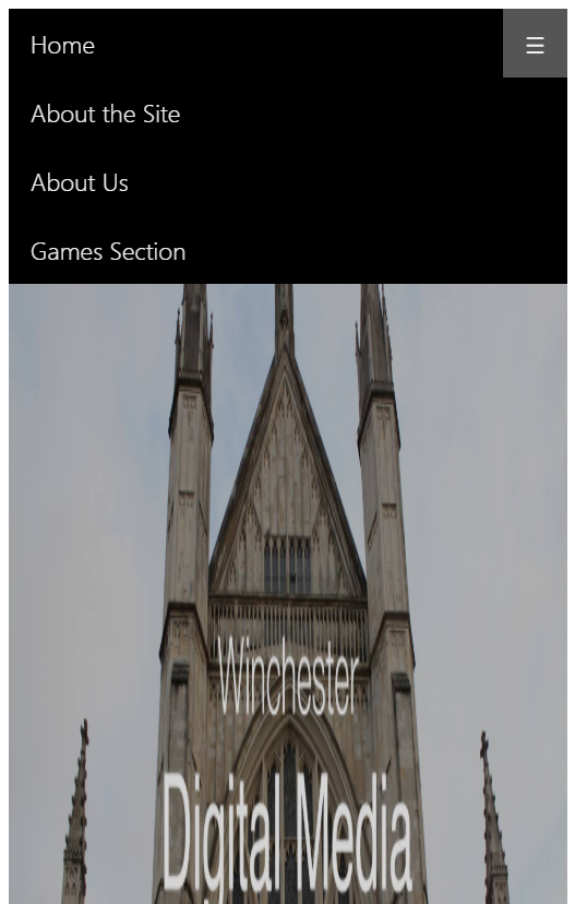
After the previous stage, I didn’t change too much. However, I did change the navigation down the side so that when hovering over each dot there would have been a smooth effect where the names of the sections would appear. This was from communicating with my group because we all decided it would have been better to have an animation which was smoother rather than sudden. Although it was rather faded, I also added in a navigation bar across the top which would have been used primarily to have a responsive navigation bar on a mobile phone. I discovered how to do this on a website called ‘W3Schools’.
The Outcome at this Stage
The Welcome/Home Section
Stage 5
Overview
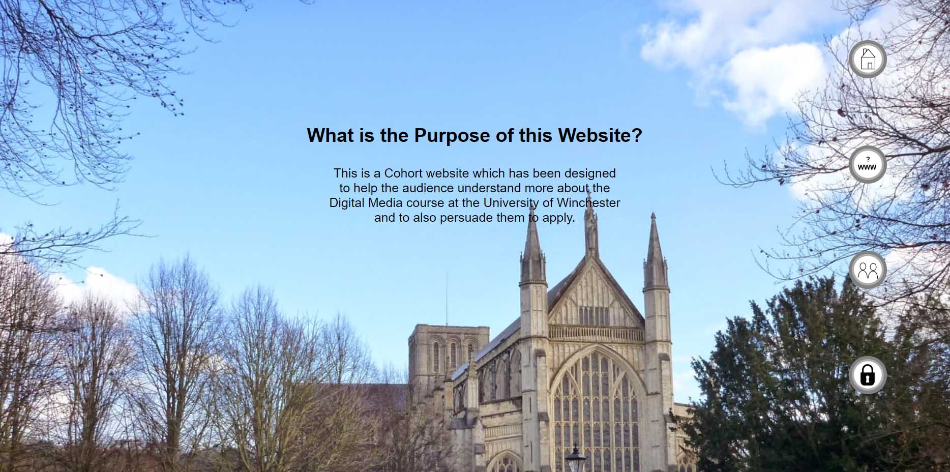
Again, the navigation bar down the side was changed as I wanted to experiment with different colours as I believed the designer(s) mentioned about the colour scheme being black and white. I also changed the top navigation bar to have a 'sandwich' button. I integrated this code from ‘W3Schools’ as I didn’t possess enough knowledge of how to do this. I also changed the font to try and experiment again with how the website would have appeared with different fonts. The designers then travelled around Winchester to take some pictures so that I could include them as background pictures on the website. They then designed the home section’s image with our team logo ‘SCORD’ on it. I changed the opacity of some of the sections so that the information would have stood out more on the website.
The Outcome at this Stage
The Welcome/Home Section
About the Website Section
About the Students Section
The Game Section
Stage 6
Overview
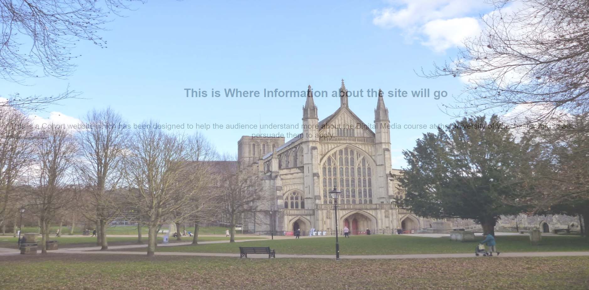
Throughout this stage, I modified many different sections. After showing my team what I had completed thus far, we came to an agreement that the website would have been better without having the opacity change on the images. The designers changed the home page to relate more to the course and again I entered the code to reflect this. This was in the form of an image because I believed it would have been quite difficult to code this. Once again, the dot navigation down the side was altered because the designers didn’t want it to be too big or unattractive. As you can see when hovering over the dots, the text only displayed and not the bar as was the case in previous stages. More images were added to the ‘about us’ section to show the whole cohort and the designers in my group added a filter to make them all black and white. The font again was changed, however, this time it was changed to ‘Helvetica’ as this was the font that the designers agreed on.
The Outcome at this Stage

The Welcome/Home Section
About the Website Section
About the Students Section
The Game Section
The Final Stage - Desktop Versions
Overview
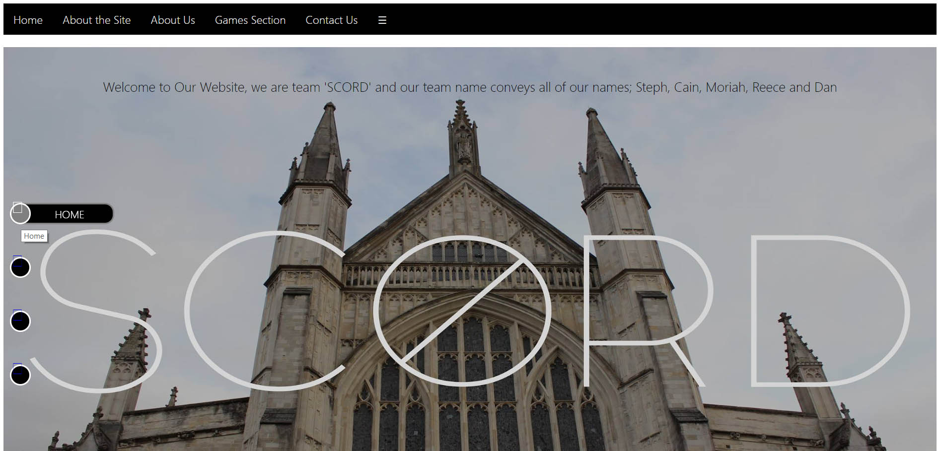
Regarding the final home page section of our cohort website, I managed to hide the sandwich button across the top navigation when in desktop view. This would have only appeared when in the mobile version.
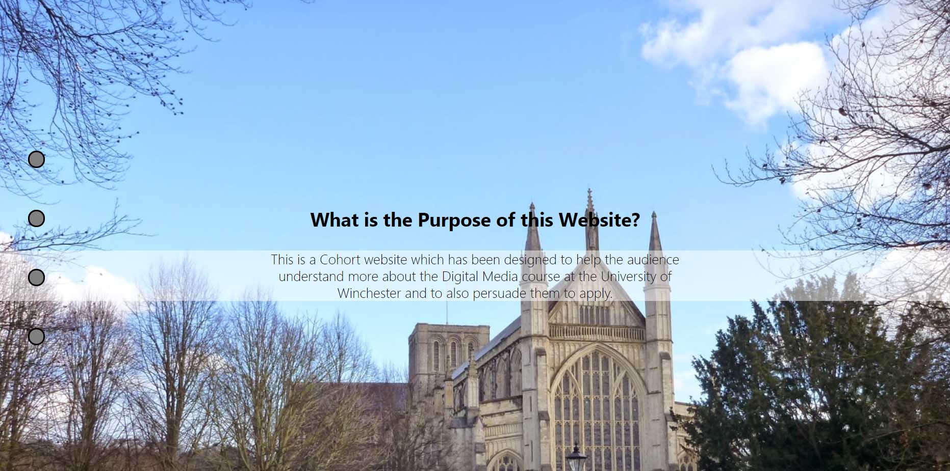
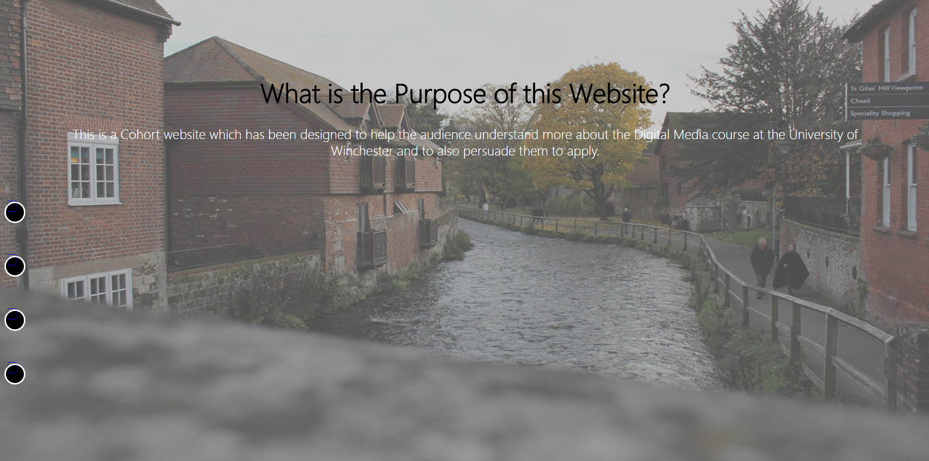
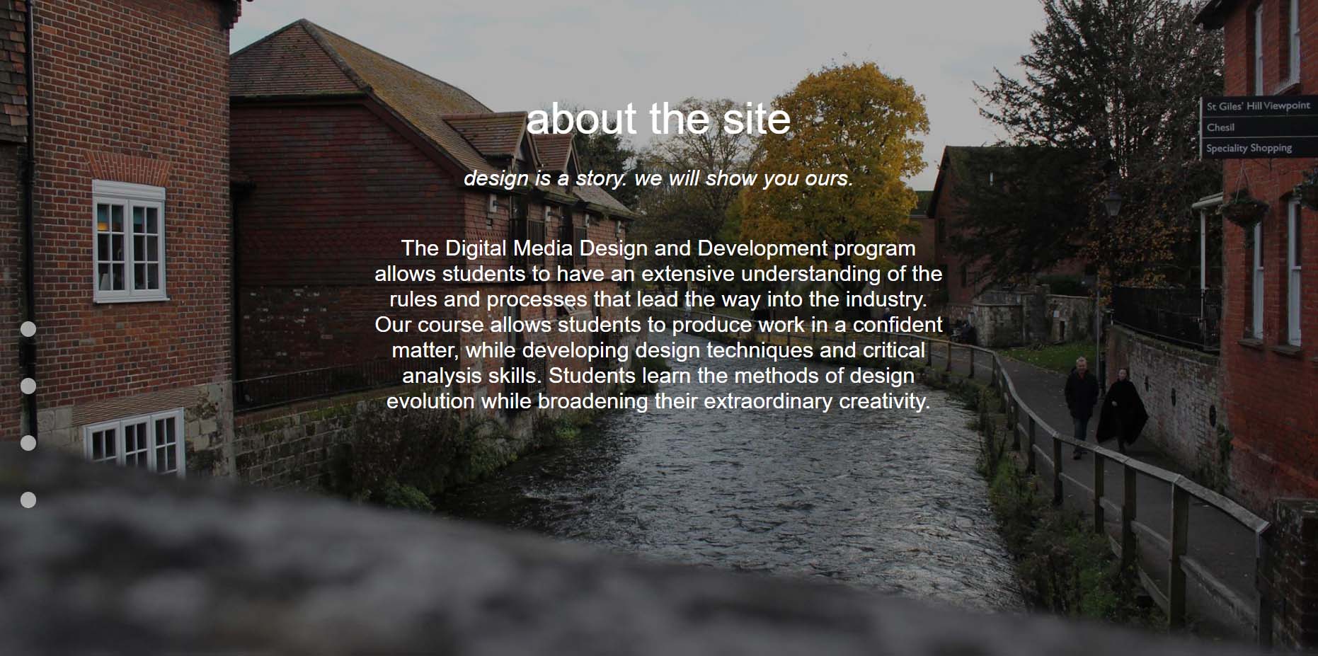
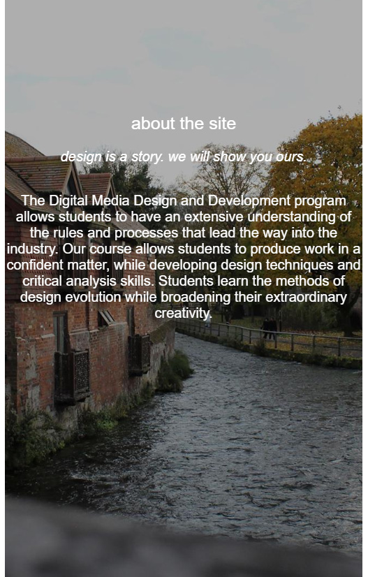
For the the final ‘about the site’ section of our cohort website, from being provided a ‘mock-up’ by one of my fellow designers, I ensured the website I made appeared exactly the same, if not at least similar. Due to a few technical problems, the titles of each section, including the title for this section, had to be centralised rather than aligned to the left so that they displayed properly on a mobile device.
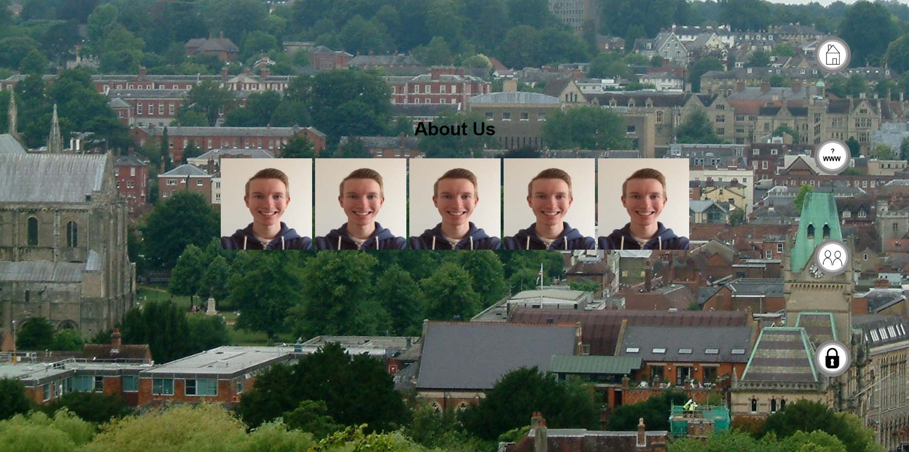
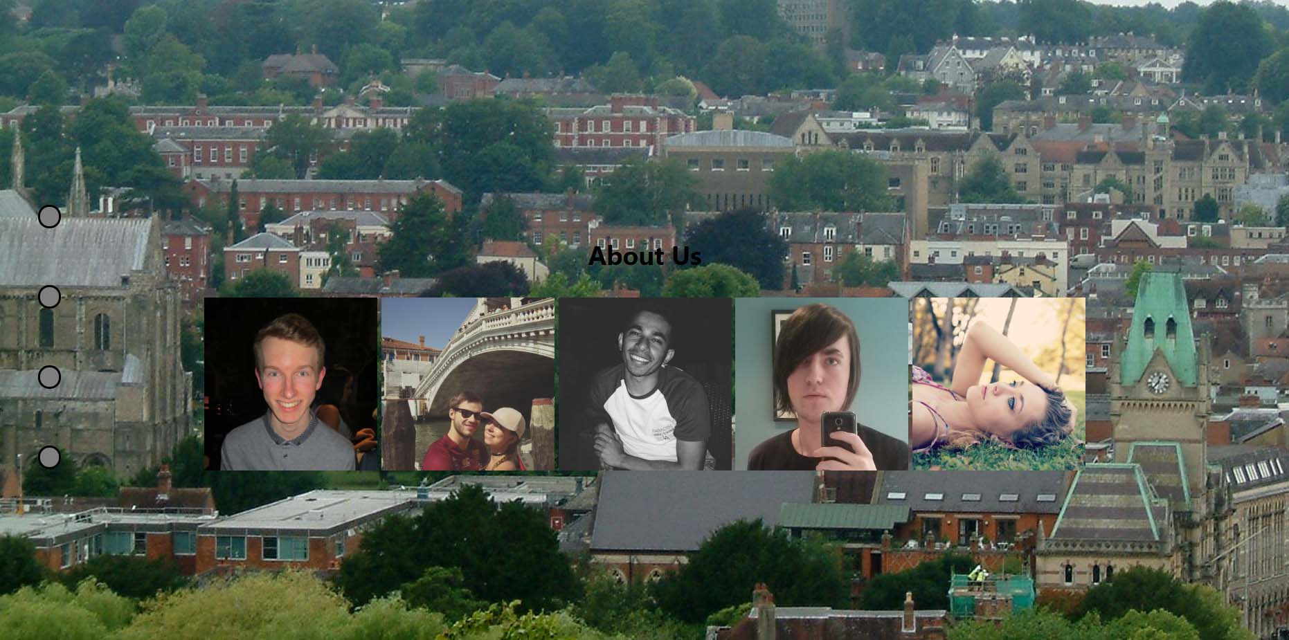
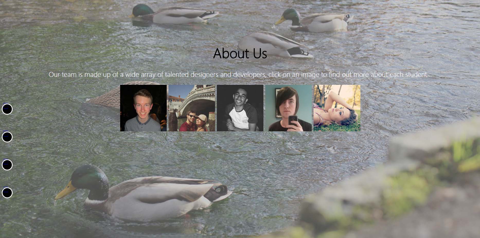
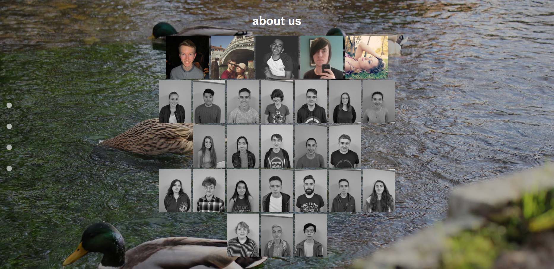
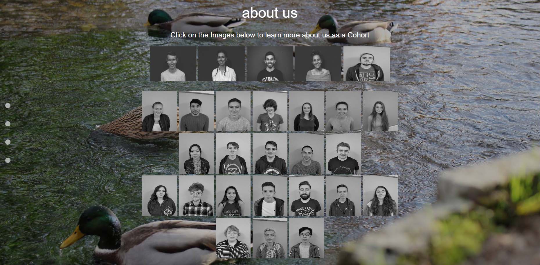
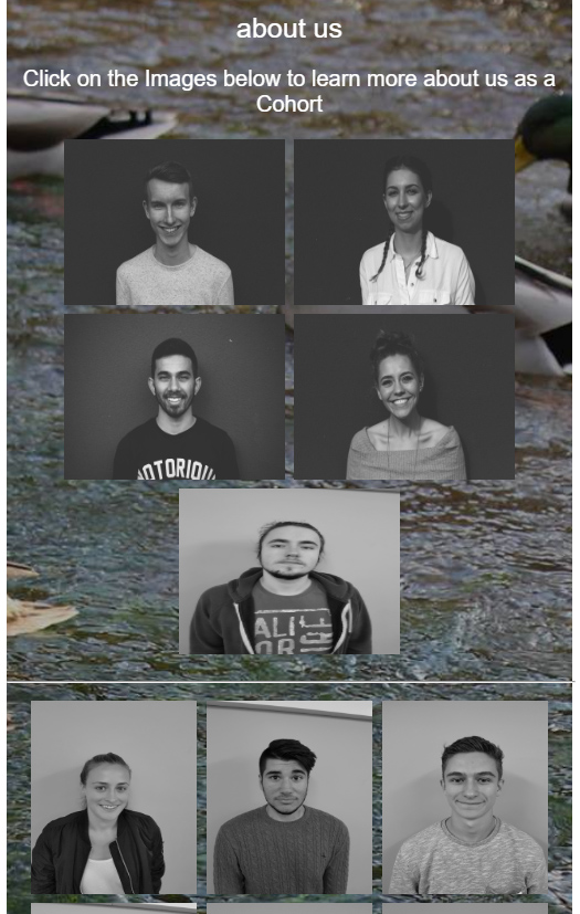
With regards to the final ‘about us’ section of our cohort website, the idea was to have a pattern in which the students were displayed. This design idea was created by the designers and they wanted the picture of the members in our group to be at the top to signify we were the ones who were involved in the process of this created website. As is evident, the pictures of our group had been changed and these were taken by some of the designers apart from the member on the right, which unfortunately wasn’t there on the day we planned to do it. Then the designers applied a filter to them in order to change them to black and white. To add to this, I added in hyperlinks to the images which would then have taken the user to a new page with each individual’s website when being supplied with these links later. A demonstration of this was displayed through selecting my image (the first image), displaying a concept of how this would function. As was suggested by the other designer/developer, I entered 'target="_blank"' to make the individual websites appear on a separate page.
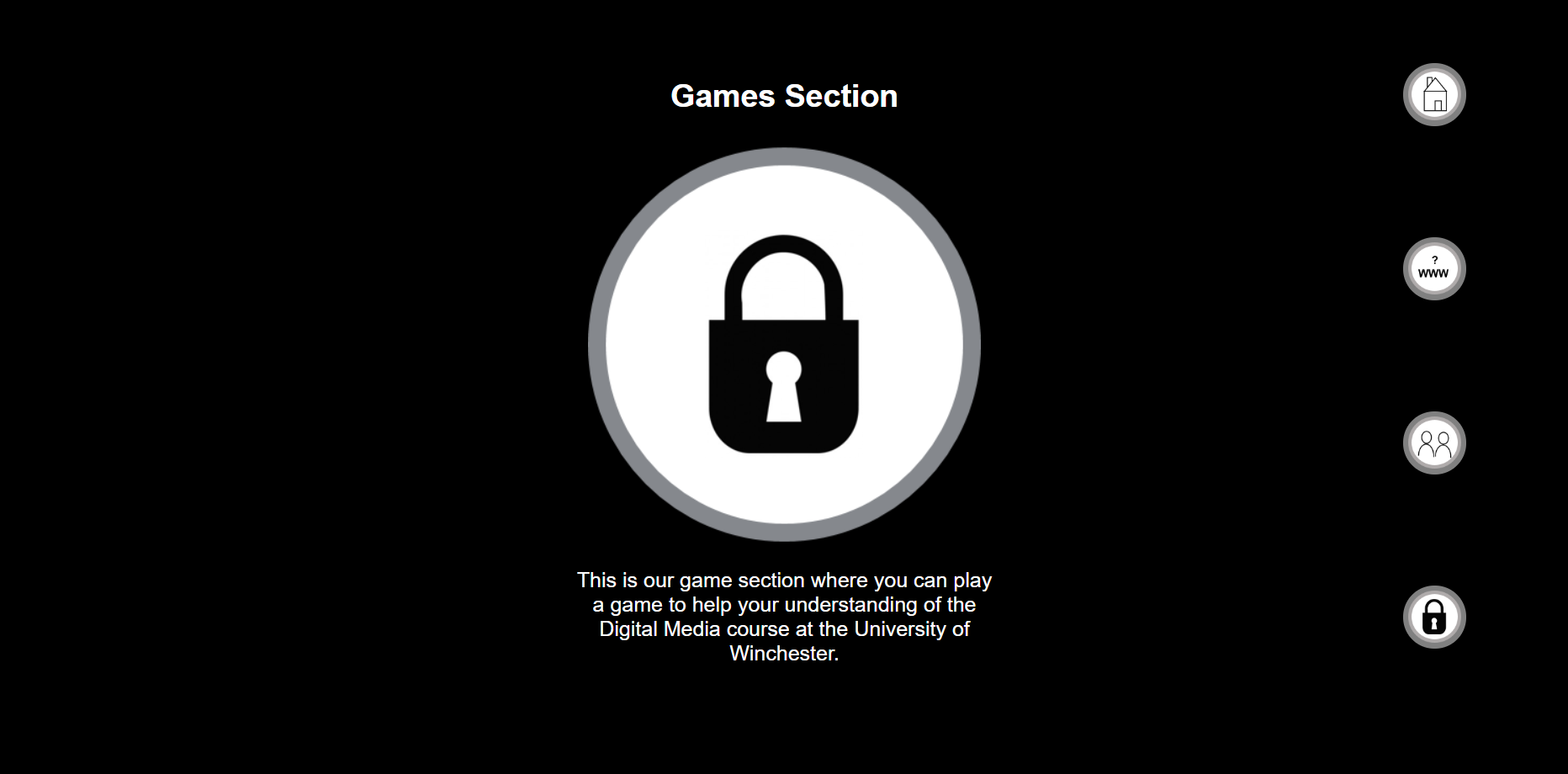
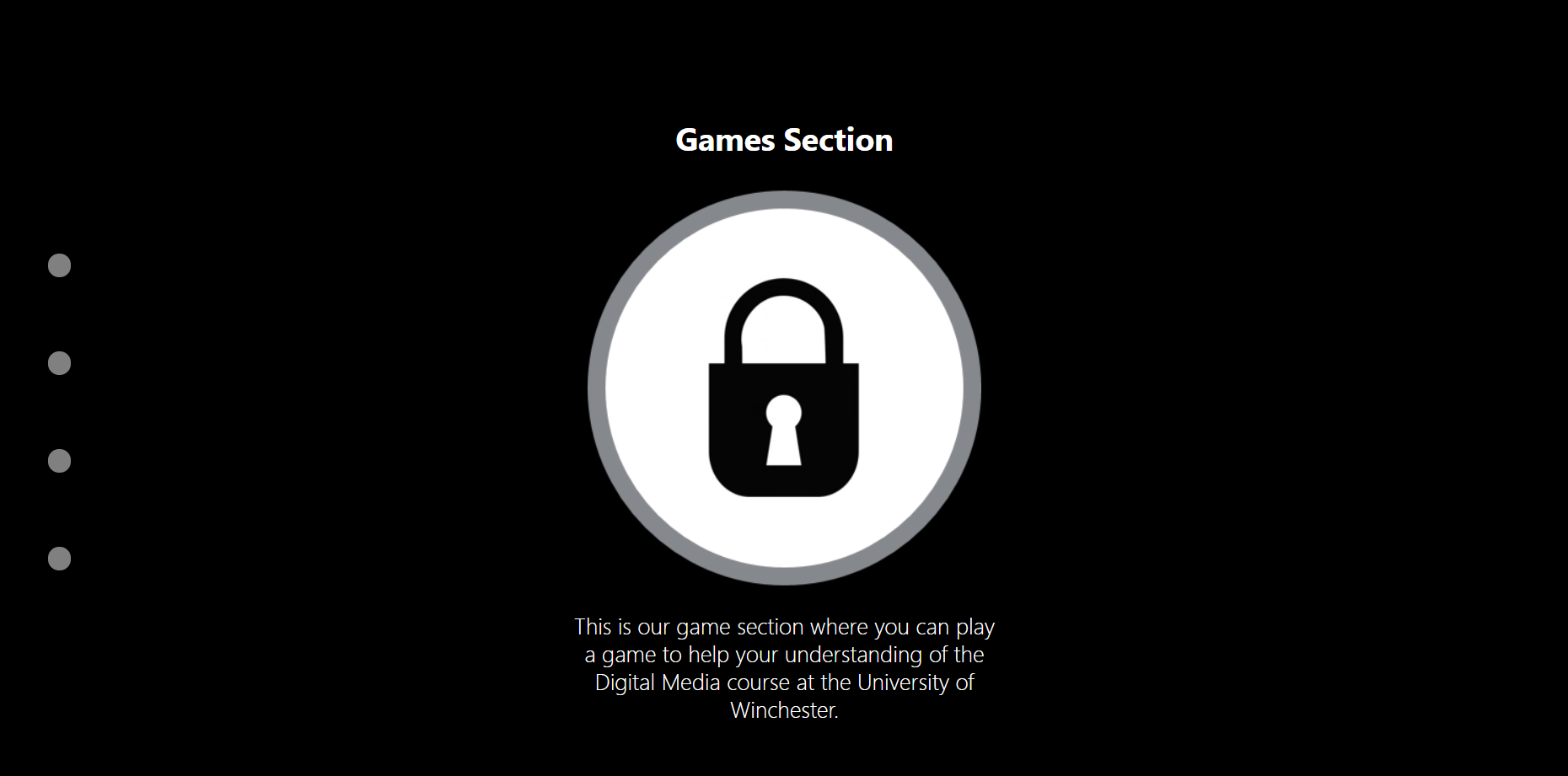
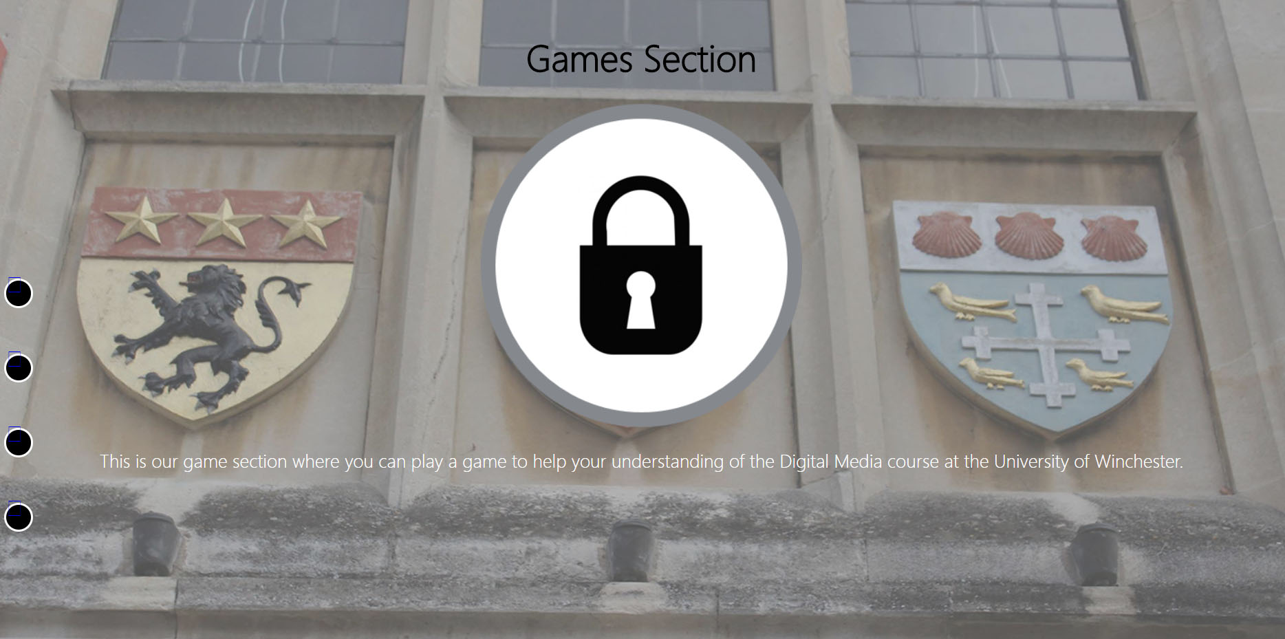
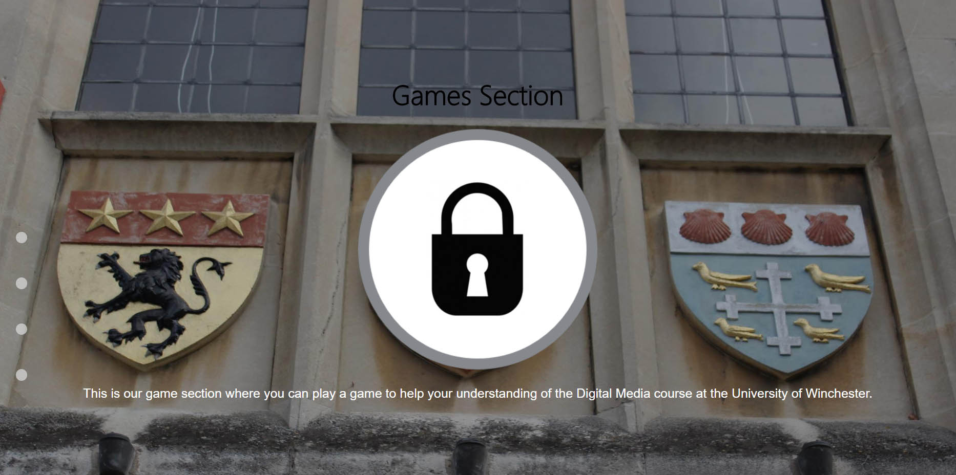
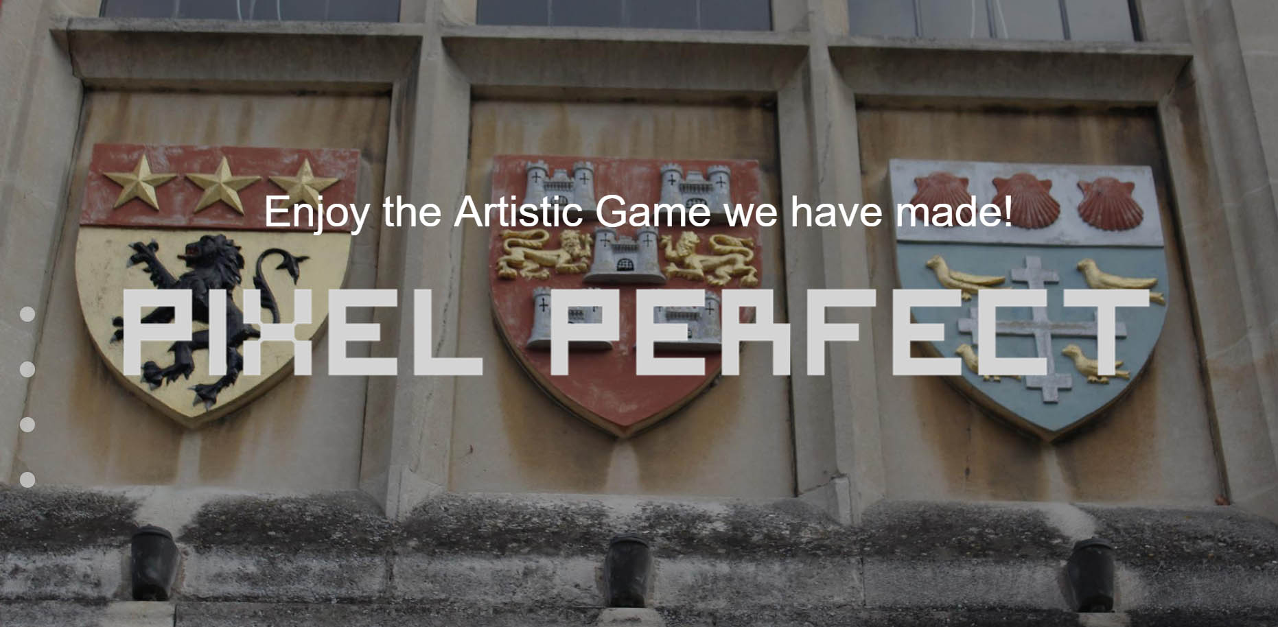
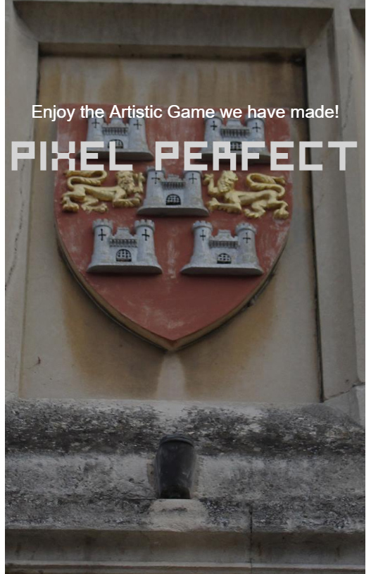
For the final ‘Games Section’ section of our cohort website, the logo was changed. We all decided that it would have been best to not have the padlock as we thought it didn’t relate to the game in anyway. Instead the designers created a new icon/logo for the games section, showing the name of the game in a font which related to games. After receiving the code from one of my fellow team members, I then added a hyperlink to ‘Pixel Perfect’ which would have taken the user onto a separate page where they could have played the game.
The Outcome at this Final Stage

The Welcome/Home Section
About the Website Section
About the Students Section
The Game Section
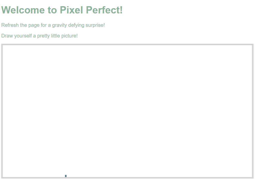
The Actual Game Created by Another Team Member
The Final Stage - Mobile Versions
Overview
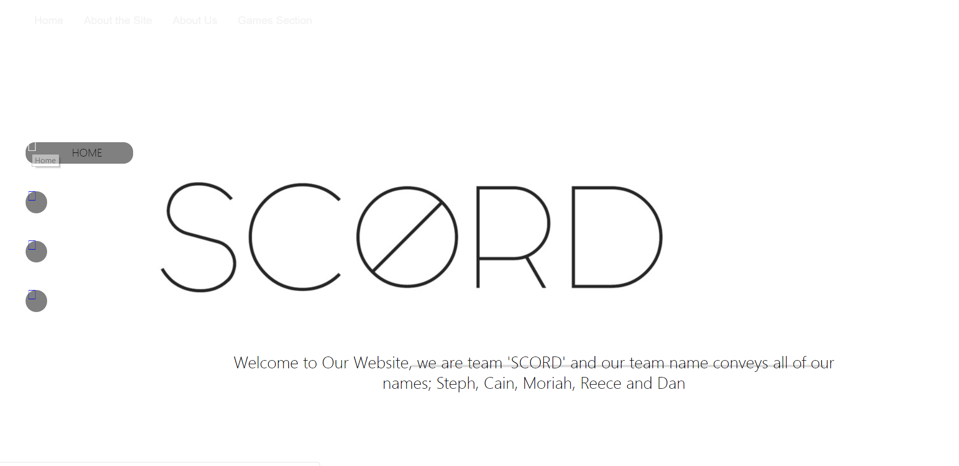
As can be seen below, this is what the final version of our cohort website looked like on a mobile device. There were some issues as can be seen with the home section because the image had become narrow and difficult to see. Also, with the pictures of the cohort, they did overflow into the games section as I could not get this to scale down. The images were hidden in the image of the games section so that the games section can be viewed. Apart from these difficulties, everything else seemed to appear perfectly fine on a mobile phone. Another aspect to take notice of is the ‘hamburger menu’. This appeared when on a mobile phone. This now signalled the end of the project.
The Outcome at this Final Stage
The Welcome/Home Section
About the Website Section
About the Students Section
The Game Section
References for this Project
Overview
As explained previously on this page, below is a document which contains the references for this project.
References Document