Brief
"Design a poster based on the information learned within the session today, for a sporting event using multiple assets to create the layout."
Overview
I thought I would base my poster on a football charity match as football was a sport which I was very interested in. I then decided to include both 'Manchester United' and 'Chelsea' and try to incorporate the colours of blue and red into the poster. However, red was used the most as the venue in which the match would take place would be 'Old Trafford', the home of 'Manchester United'.
It was ensured that many techniques and assets were included. The most evident technique utilised is the 'Golden Section' with the footballer kicking the ball and the curves coming off of it.
References for this project can be viewed in the document supplied at the end of this page.
Inspiration
Viewing Sporting Posters
Overview
I undertook some research on the Internet to gather lots of different ideas for my sporting event poster, based on the theme of football as this was my favourite sport. First of all, I looked at some sporting posters in general to grasp an understanding of the sort of thing I needed to make. I then looked at some matchday posters from 'Manchester United' to see how they designed theirs and what techniques they used. From this, I understood that bright colours were used in the first poster to attract your attention and to make the poster look exciting. Furthermore, both posters utilised small text for the information so that the emphasis was placed more on who would have been playing. One more aspect I noticed with the second poster was that there was a faded effect with red blending into the image.
The 'Manchester United' Matchday Posters Viewed
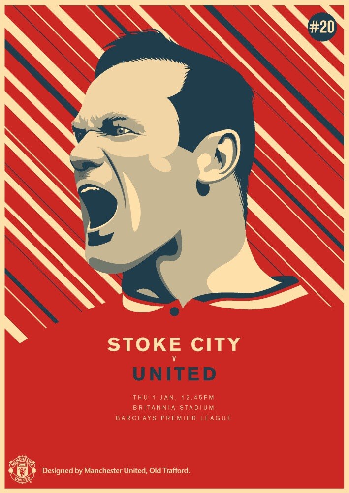
Manchester United Matchday Poster 1
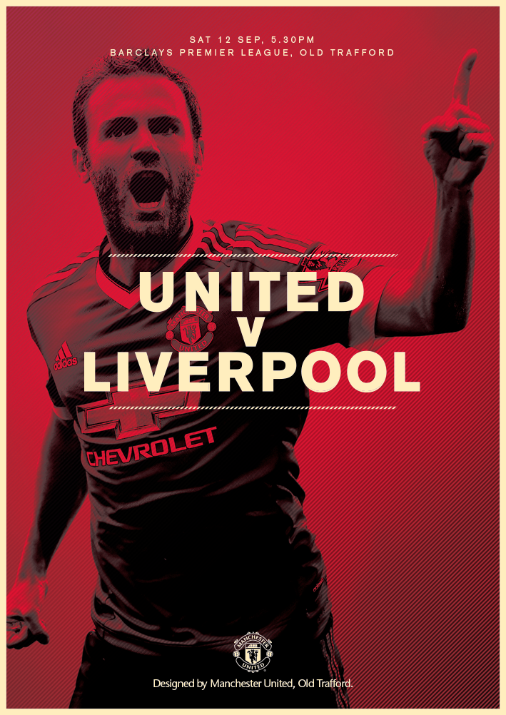
Manchester United Matchday Poster 2
Typography Inspiration/Research
Overview
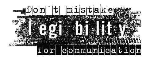
I then undertook further research and looked at lots of different artists and designers to gain an understanding of the types of typography used within their work. I found a couple of pieces of work from David Carson and analysed them in detail and I took inspiration in the way in which he displayed his typography. From the first piece, I understood that big typography was followed by small typography to add emphasis to the piece. Regarding the second piece, I understood that sometimes the writing was spaced out for impact.
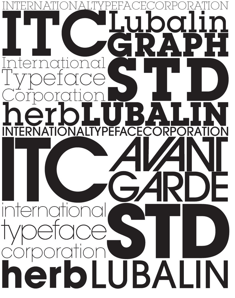
I continued to study the way in which typography was used but this time I looked at Herbert Lubalin’s pieces of work and I found one piece which used lots of different techniques, especially italics in some places. I then thought I could have used something like this in my sporting poster. From viewing this piece I understood italics were used along with sometimes bold writing to add emphasis and to make the piece stand out more, to engage the audience in a better way.
The Typography Pieces Viewed
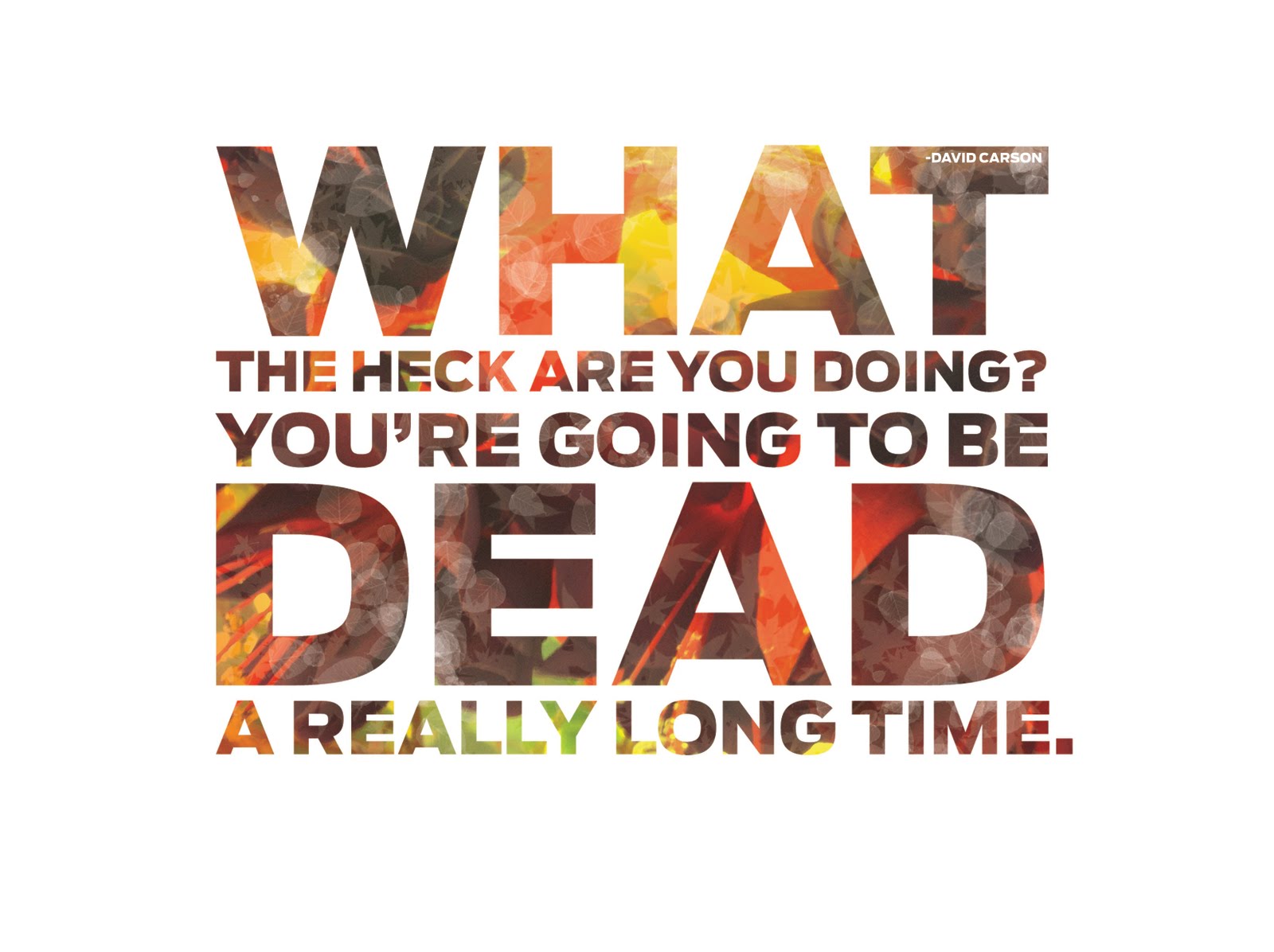
David Carson Work Piece 1
David Carson Work Piece 2
Herbert Lubalin Work Piece
My Sketches and Ideas
Overview
Whilst conducting my research, I noted down the important assets to take from my inspirational pieces and started to sketch some ideas down on paper to experiment with what ideas would have worked and which wouldn’t have.
Initial Ideas
Overview
With regards to the second image below, first of all, I thought I would have a background picture of a football pitch with a football in the centre and the two teams playing in different halves of the pitch. However, then I changed my idea because I thought I would try to integrate the 'Golden Section' theory into my work in a better way so I came up with the idea to the right of the original one. This idea was to have a ball curling into the goal net.
The Sketches of my Initial Ideas
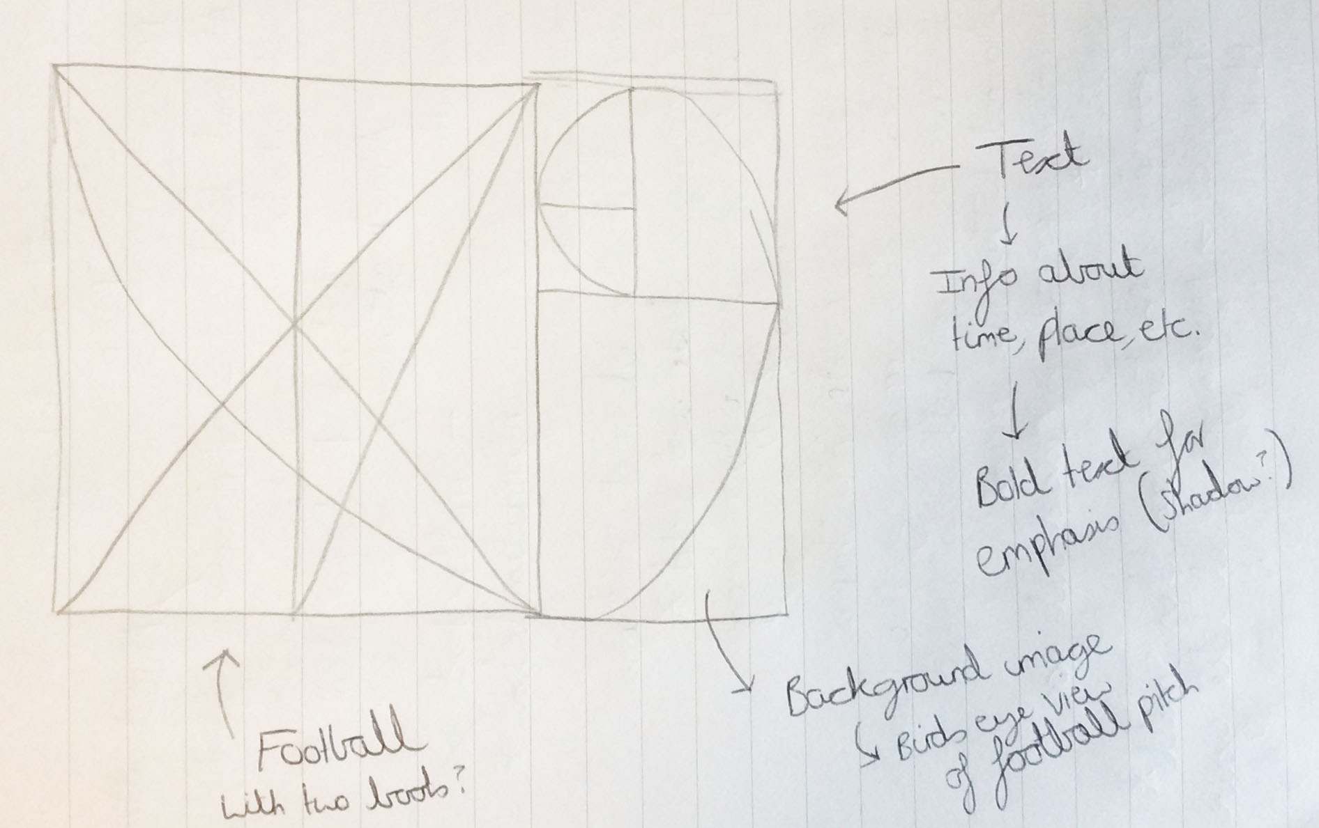
Ideas for the Original Design Before I Changed it, Trying to Incorporate the 'Golden Section'
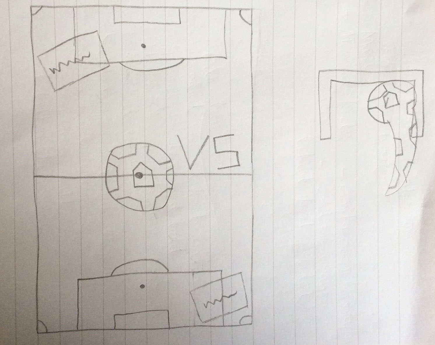
Sketches of the Original (Left) and Changed (Right) Ideas
Noting Important Aspects and Creating a List of Ideas
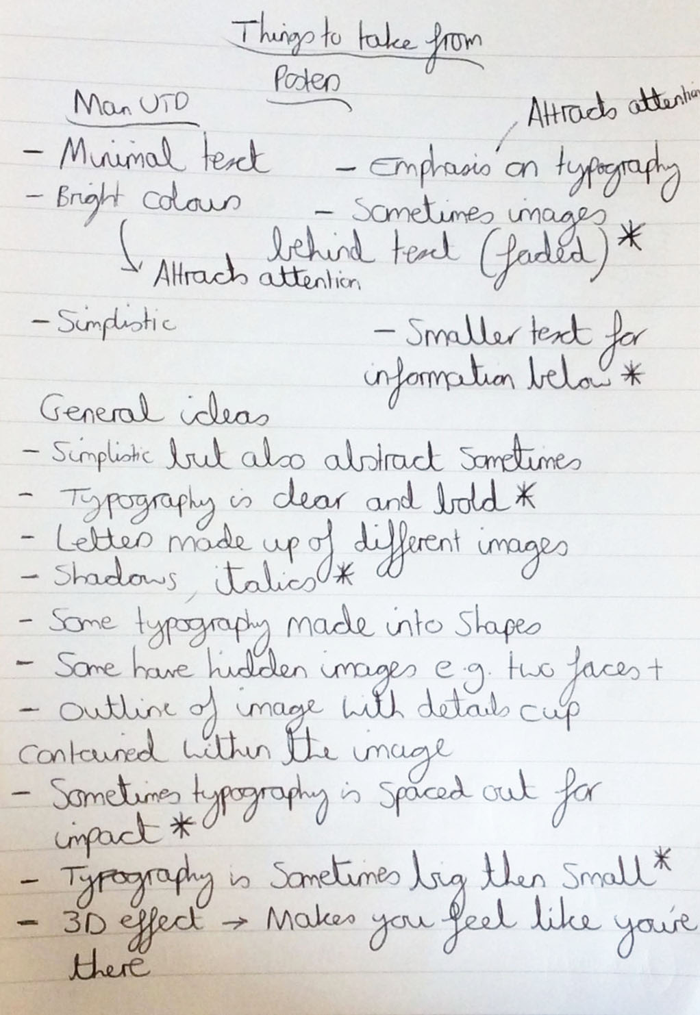
Overview
I then wrote down, on another piece of paper, all of the important techniques and assets to take from my research and put a star next to the ones which I would have integrated into my sporting event poster. As will be evident below, I divided the notes into two sections, one with the key things to take from the 'Manchester United' matchday posters and the other with general ideas taken from a variety of artists.
After compiling a list of useful ideas to take from my research and inspiration, I then created a list of ideas for my sporting event poster, a football charity match where 'Manchester United' would be playing 'Chelsea' in an attempt to raise money for 'Cancer Research UK'. I thought about information such as the venue it would have been held in and at what time and how you would have been able to access more information through the website addresses provided. I also included details of how the poster would have been presented, for example what colours and images would have been used. This was to help myself visualise all of the different parts I wanted to include in my poster.
The Notes and Ideas
Identifying Key Techniques/Assets to Integrate into my Final Piece
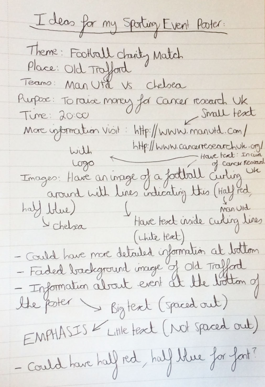
A Brainstorm of Several Different Ideas to Include in my Sporting Event Poster
Creating Initial Visual Ideas
Overview
After making a list of ideas, I then started to draw a rough sketch of my poster to gauge how it would have appeared and where everything would have been placed. I then experimented with the curl behind the ball, making half of it red with 'UNITED' text in that half and the other half being blue with 'CHELSEA' text. I also placed the 'VS' text in the middle of both halves. To add to this, I experimented with big and small text on the bottom half of the poster, spacing each of the letters out on 'VENUE' and 'TIME' to gain an understanding of how much emphasis it would have conveyed.
Furthermore, on another piece of paper I wrote down some of the information on the poster and added shadows to 'VENUE' and 'TIME' to see how much of an impact it would have had. Furthermore, I drew a picture of the football and drew a rough copy of the 'Cancer Research UK' logo inside of it to analyse how well it would have appeared if I were to do this on the actual poster.
The Sketches/Visual Ideas
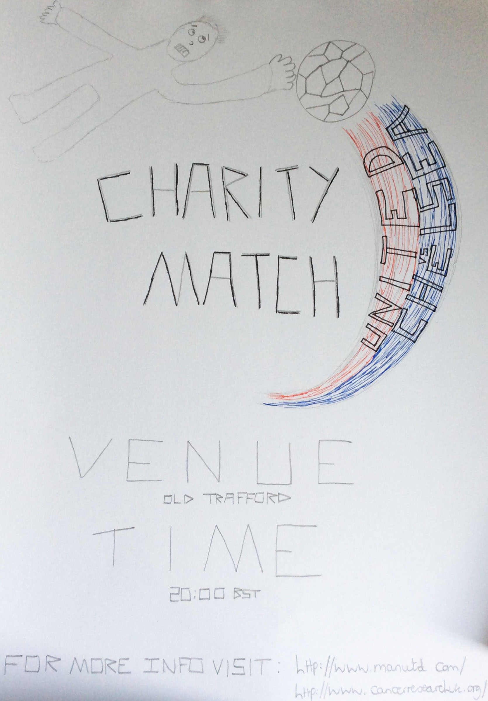
The Initial Sketch of my Poster
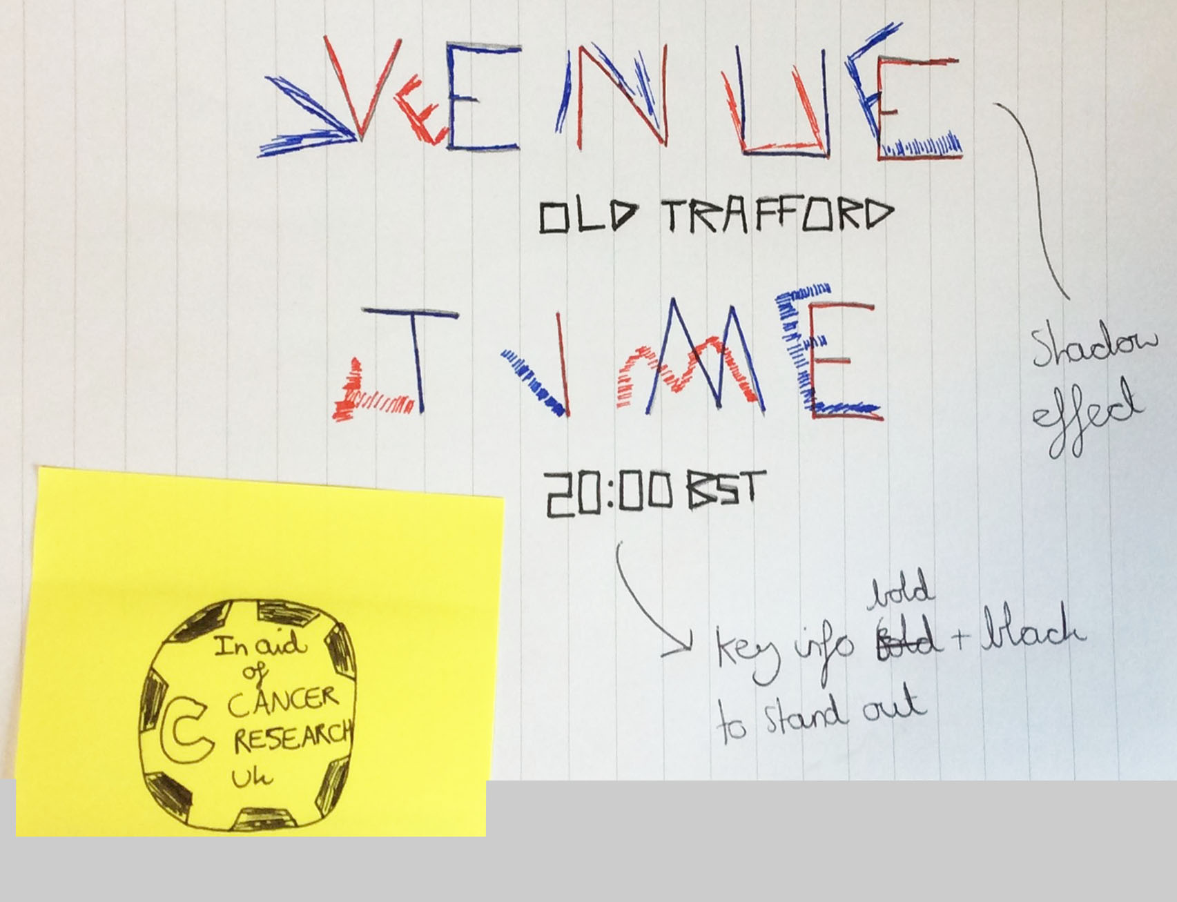
Trial and Error with Adding Shadows and Including the 'Cancer Research UK' Logo Inside a Football
My Final Ideas
Overview
Following all of my research, brainstorming and sketching, I then decided it was a good time to start putting all of my ideas together on 'Adobe Photoshop'. I first of all placed the background and information onto the poster and then I started to design the ball and its curl, I tried lots of different techniques and then picked which one was the best. I also tried to ensure that the 'rule of thirds' was present in my design by having the football to the right, some of the information to the right and some to the left. In addition to this, I made sure that the 'Golden Section' was evident with the football and the curves coming off of it.
The Different Designs
My First Design
Overview
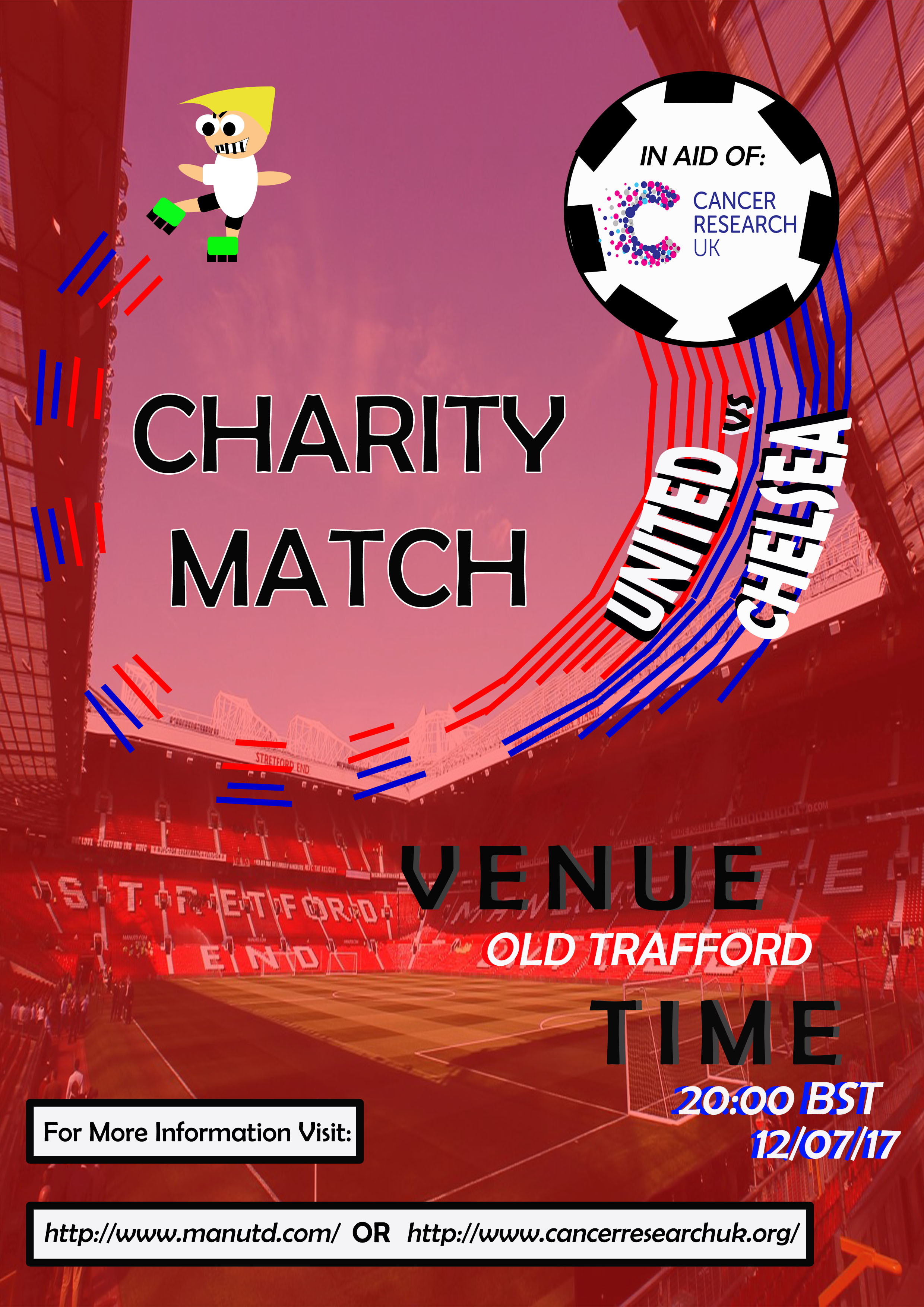
For this design, firstly, the 'Charity Match' text was presented in a large font with a yellow shadow around it to make it the focal point of the piece. Secondly, I decided to include the football with the 'Cancer Research UK' logo inside of it and to add a curl coming from the football, divided into red and blue with 'UNITED VS CHELSEA'. Furthermore, I included a faded background image of 'Old Trafford' with a faded red colour, blending in well with the poster. The final aspect to note is that the main information was placed down at the bottom to the right along with how to find more information in smaller font, being centred.
The Actual Design
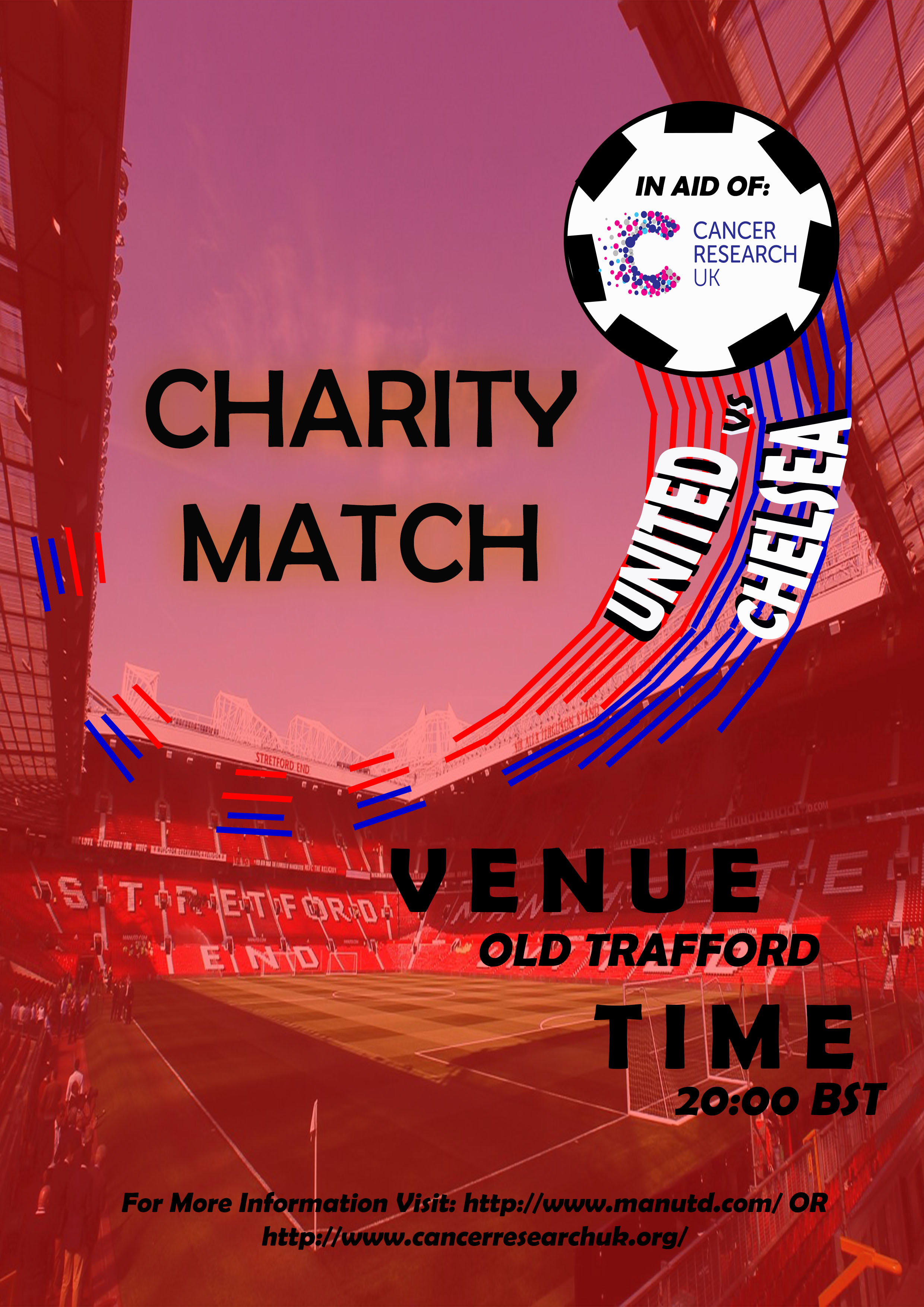
The First Design Version for my Sporting Poster
My Improved Design
Overview
Here, I added to the original including a picture of a footballer which I created myself along with changes to the appearance of some of the font and layout. This was to ensure that all of the items of the poster didn’t seem excluded and that they all had some significance in this piece. This would have therefore increased the amount of harmony in my sporting event poster. Including the footballer added purpose to the curling lines behind the ball, to symbolise movement within the piece, hence adding more excitement. Again, with the 'rule of thirds', I tried to make sure it was present with the footballer to the left with the ‘for more information’ boxes at the bottom and the football with the other information to the right.
I changed the shadow around the 'CHARITY MATCH' text to a white outline instead as I thought it would have added more emphasis to the focal point of the piece. Furthermore, I created a shadow effect for some elements solely for the purpose of adding impact to the important pieces of information. Different positioning of the shadows helped to add a better sense of flow to my work. With regards to the information content at the bottom of the poster, I included some rectangles, creating a box around each piece of text. I also moved the pieces of text to the left to make the poster flow better.
The Actual Design
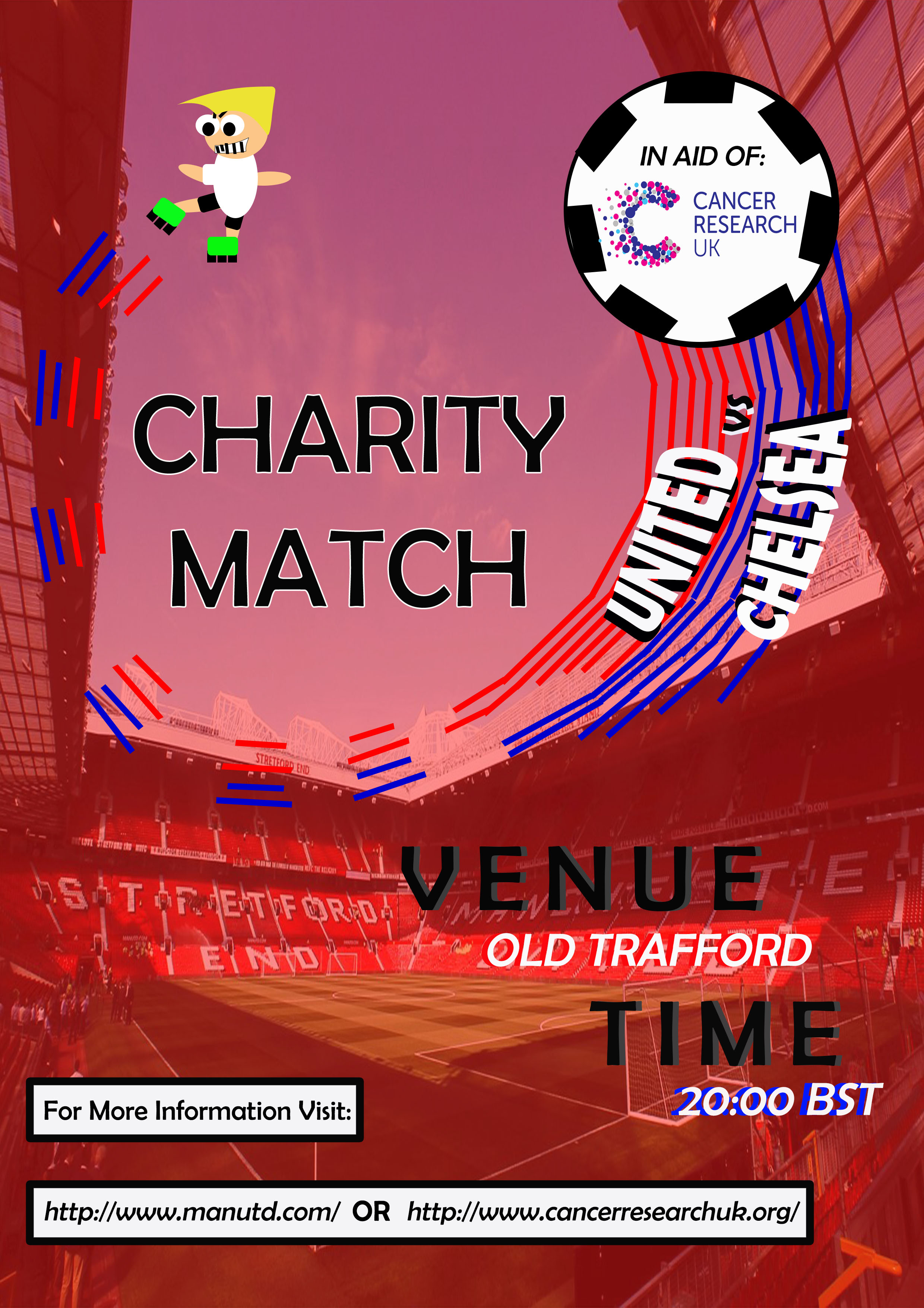
The improved design for my sporting poster
References for this Project
Overview
As explained previously on this page, below is a document which contains the references for this project.
References DocumentThe Final Outcome
For the final design, I altered the poster to include the actual date the football charity match would have been taking place on as this was vital information to include. When I had finished, I saved another copy as a 'JPG' file so that it would have been accessible as 'JPEG' is a generic format.