Brief
"This is an individual mini project over two weeks. You will create a 3D logo for a title sequence or channel ident."
Overview
I chose to make a 3D logo for a channel ident. Thinking that the 'BBC' was a well-known channel, I decided to base my piece on this and picked animations which would have reflected the fact that the 'BBC' was a television channel. The 3D aspect of the logo was implemented nearer to the end when there was a stamp which changed the colour from white to black. Likewise to the 'ISTD' and kinetic typography projects, I utilised 'Adobe After Effects' as this was a program which I was fairly confident in using to create the final piece.
References for this project can be viewed in the document supplied at the end of this page.
Inspiration and Research
Initial Inspiration
Overview
From looking at some of the links provided on the module outline brief, I found a couple which really appealed to me. One was a 3D text shatter animation which showed the logo 'Orthia'. What really impressed me with this piece was how all the shards of glass came together to make the logo. Then the same effect was applied but in reverse order when exiting, with the shards of glass dispersing off of the animation.
The second was of 'SyFy' and what excited me about this was the fact that the purple balls all came together to make up ‘SyFy’. It was a gradual process in which everything built up and this appealed to me because I thought it would have been better to have a title sequence/3D Logo which built up slowly rather than quickly revealing it. This would have built more suspense as a result.
Both of these pieces of inspiration can be viewed below.
The Sources of Inspiration
Research
Listing Television Channels and Collecting Logos
Overview
After taking some time to look at pieces of work which inspired myself, I then started to undertake some research and thought of some highly credible television channels which I could have created a title sequence/channel ident for. I produced a list which consisted of ‘Channel 4’, ‘BBC’ and ‘ITV’.
I thought I would choose the ‘BBC’ channel as I thought it would have been the easiest to work with. So, following on from this, I then researched the logo used and the fonts as well.
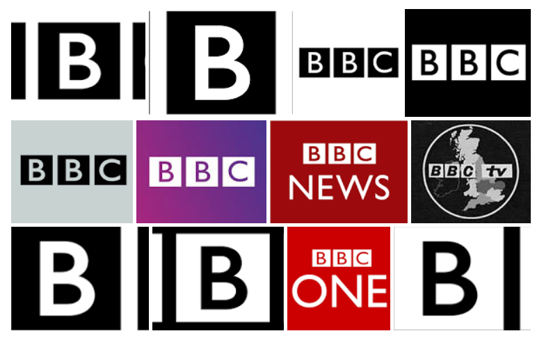
As can be seen below, I found a collection of 'BBC' logos that I could have based my piece of work on and I decided to choose the one which was placed on the top row, being third in the row.
Immediately after conducting this piece of research I then researched the font used in the logo and I found some information which stated that it was similar to ‘Gill Sans Std’.
The logos research can be viewed below.
The Logos Research

The Researched 'BBC' Logos
My Sketches and Ideas
Brainstorming Initial Ideas
Overview
After undertaking my research, I thought it would have been a good idea to start noting down some ideas of the sorts of things I could have produced for my piece.
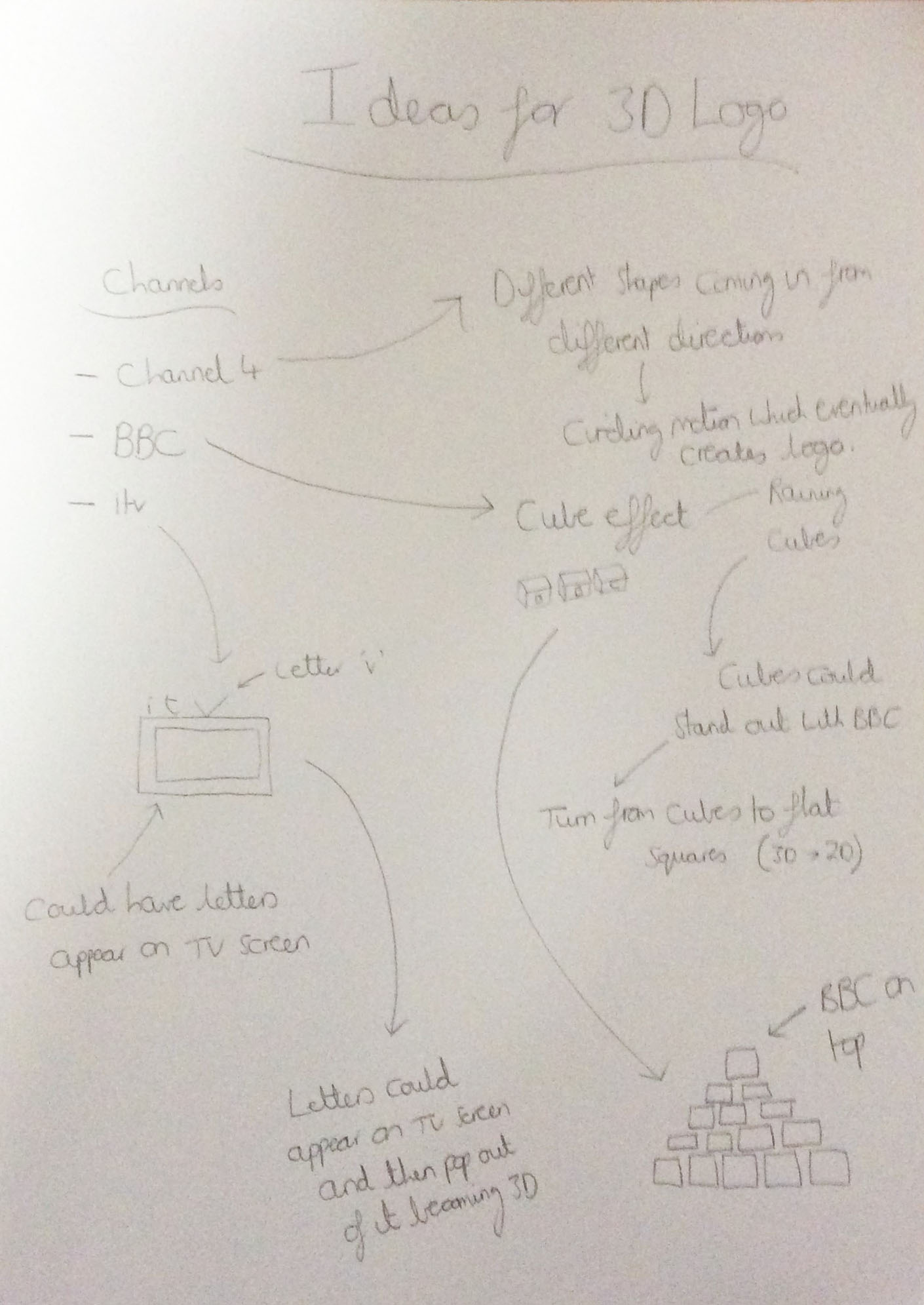
As will be seen below, this was undertaken before the stage of choosing the television channel which I would have been interested in basing my piece of work on. I thought of some ideas for each channel before arriving at my final decision of the ‘BBC’. For ‘ITV’ I thought it would have been a good idea to have the letter ‘V’ as the antennae of the Television (even though most televisions didn't have these on top of themselves anymore) and for ‘Channel 4’ I thought I could have had all of the different blocks circling around and then coming together (similar to the old 'Channel 4' ident). After deciding to choose the ‘BBC’, I started to draw some more ideas as can be seen below e.g. the pyramid with 'BBC' on top.
The Ideas for Different Television Channels

Brainstorming Ideas for Different Television Channels
Brainstorming Ideas Specifically Relating to the 'BBC'
Overview
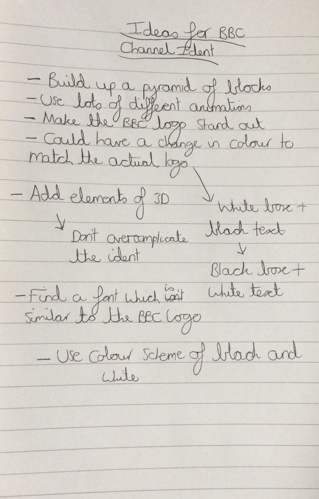
Following on from my sketches shown above, I then started to fully focus on ideas for the ‘BBC’ ident which I was going to create. This can be seen below and I continued to think about the pyramid design, however I thought it would have been better to integrate the logo into the middle of the pyramid rather than placing it on the top. I wanted to use as many animations and effects as possible in the little time I had in order to make my piece the best it possibly could have been. As stated below in the image, I didn’t want to make my ident too complicated with lots of 3D animations as I thought it would have made it look unprofessional.
The Ideas Regarding the 'BBC'

Brainstorming Ideas Specifically for the 'BBC'
Choosing a Font and Replicating the 'BBC' Logo
Overview
Due to the fact that ‘Adobe After Effects’ didn’t contain the font which I discovered online ('Gill Sans Std'), I made the decision to choose another font from the 'Gill Sans' collection. The font I picked was called ‘Gill Sans MT’.
After conjuring up some ideas and obtaining all the important assets required, I then made my channel ident in ‘Adobe After Effects’. I made a replica of the ‘BBC’ logo I was interested in as can be seen below.
The Actual Font and Replicated Logo

The Chosen Font in 'Adobe After Effects'

The Replica Created for the 'BBC' Logo
Creating my Final Ideas/Piece
Overview
During the creation of my work, I viewed some tutorials in order to provide myself with an understanding of how to create 3D assets. Both of these are viewable below.
Once I had finished creating my piece of work in ‘Adobe After Effects’, I then exported the file in 'MP4' format via ‘Adobe Media Encoder’ due to the fact that the file size was small.
From creating my 3D channel ident, I felt I managed to create a simple but effective piece of work with some evidence of 3D animation. I used a simple colour scheme to correspond with the ‘BBC’ and tried to make my piece as professional as it could have been.
The Tutorials Viewed
The First Tutorial Viewed
The Second Tutorial Viewed
The final outcome of this project can be viewed below.
References for this Project
Overview
As explained previously on this page, below is a document which contains the references for this project.
References Document